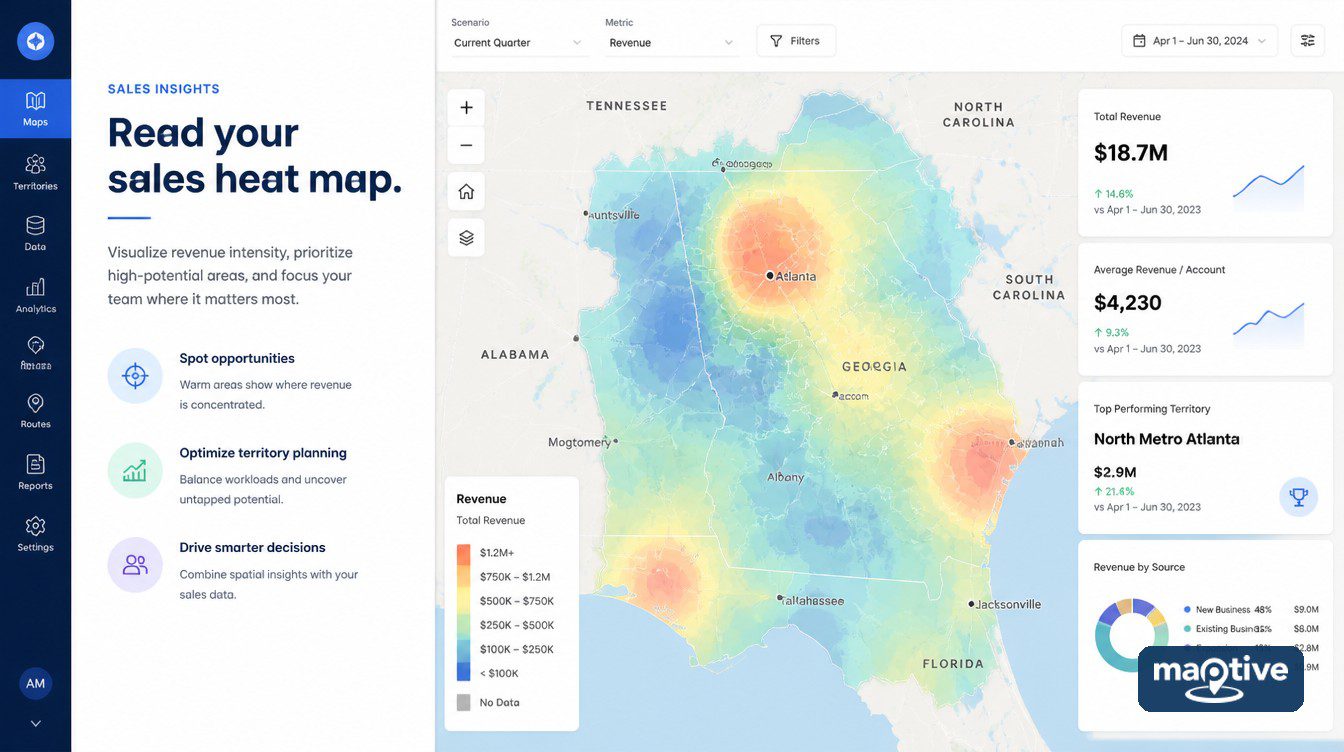
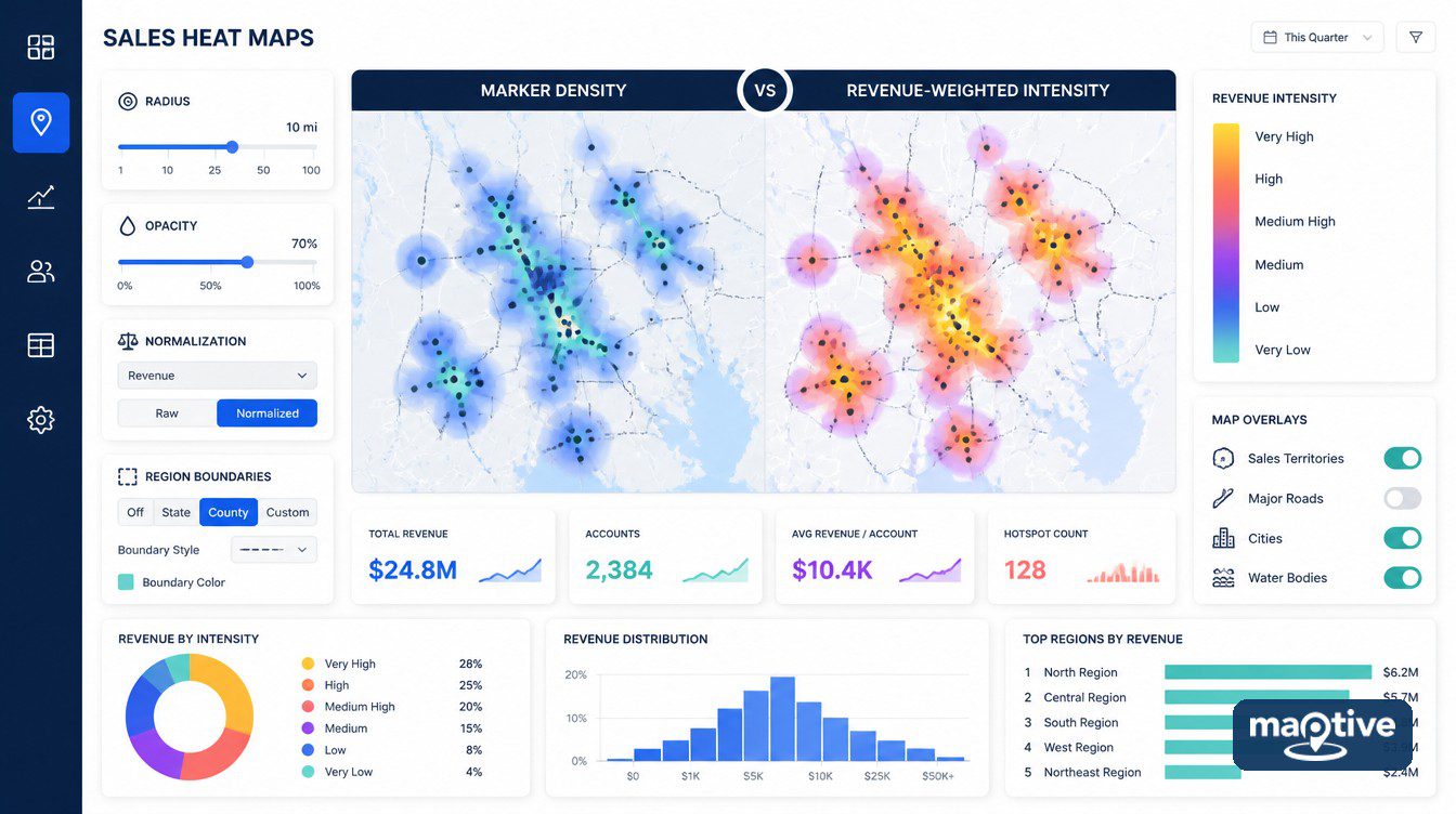
Build two surfaces from one customer file, one counting every account as a single marker and the other weighted by revenue. They will disagree about which regions matter. The disagreement comes out of the settings behind each surface.
A sales heat map reports whichever question its configuration was set to ask. The defaults ask where your records are rather than where your revenue comes from, so the first job in front of any finished image is to establish which of the two it answers.
What a Sales Heat Map Measures
Two different objects are both called a sales heat map. One is a smooth density surface, a blur of color laid over the map that shades each location by how concentrated the underlying points are there, calculated without reference to state or county lines. The other is a filled regional map, where a defined area such as a state, a county or a ZIP code takes one color based on that area’s value. Business mapping tools use the same word for both. An analyst builds one and then discovers that the question required the other.
Only one of them answers a question phrased around regions. A density surface does not stop at the Ohio border, which is correct behavior for something modeling concentration and unhelpful for a conversation about where to add headcount. Use the density surface to find the parts of the country that need a boundary read at all. The regional question then goes to a boundary fill.
Either object measures whatever column it was told to count. Feed it a customer list and it maps customers. Feed it a revenue column and it maps revenue. Neither result measures demand, penetration or opportunity unless a column containing one of those things was supplied before the upload.
Marker Density Against Sales-Weighted Surfaces
A $2,000 account and a $400,000 account raise the color by an identical increment in Marker Density mode. Every row in the file contributes the same amount to the surface. That surface maps where customers are located and nothing else.
Represents Numerical Data changes the calculation. Each point contributes in proportion to the value in a numeric column you nominate. One large account can then outweigh a cluster of small ones, and the sales-weighted surface describes revenue distribution rather than account distribution.
Neither surface is worth much alone. The two disagreement patterns between them name different problems. A region bright on marker density and cool under revenue weighting has many small accounts and a low average order value, an expensive way to hold coverage. The reverse pattern describes a market that depends on two or three accounts.
A region that can support a hire is one where the top two names account for a small part of the regional total. That share has to be computed from the account list.
Why Your Sales Heat Map Looks Like a Population Map
Is a Sales Heat Map Only a Population Map
A website’s user map, a magazine’s subscriber map and a consumer-segment map of the US come out looking identical. A presenter will draw business implications from all three. The joke has been in circulation since 2012 and it describes most unweighted business maps accurately.
Raw counts scale with how many people and businesses are in an area. Raw revenue scales the same way, since more potential buyers produce more actual buyers even where performance is mediocre. Los Angeles will out-bill Boise on almost any national sales file.
Why the Population Explanation Is Not Enough
The 23 metro areas producing half of US output contain only 39% of the population. Their per-capita gross metropolitan product is 50% above the rest of the country, and San Jose’s per-capita figure is close to double Phoenix’s. A distribution like that looks like a population map and reports something else. The dismissal is wrong about as often as it is right.
The population confound is a hypothesis that has to be tested before it becomes a verdict. Divide the metric by the denominator that would produce it, rebuild the surface on the divided column, and put the two images side by side so a reader can see which regions changed rank.
How to Normalize Sales Data Before You Map It
A rep covering Los Angeles and a rep covering Boise are not comparable on raw revenue and never will be. Normalizing closes that gap by dividing a raw count by whatever generated it. For sales geography the standard denominator is market potential and the standard expression is penetration rate, actual customers or sales in an area over total potential customers or category spend in that area, multiplied by 100.
Revenue per household serves consumer businesses. Share of wallet, approximated as account revenue over estimated account category spend, serves B2B.
Maptive does not compute a per-capita or per-opportunity rate inside the heat map tool. The normalized column has to exist in the spreadsheet before upload. Add a field called Penetration or Revenue per Household, populate it from whichever denominator your industry accepts, and map that field.
How to Build a Sales Heat Map in Maptive
A sales heat map is built in the Heat Mapping Tool. Every setting there is chosen once at build time. Write them down while they are still on screen, because the next person to open the exported picture will ask.
How to Weight a Heat Map by Revenue
The choice between those two surfaces is made in one dropdown, and the weighted version inherits whatever the nominated column already contains, including its blanks.
Open Map Tools and click the Heat Mapping Tool, then choose Represents Numerical Data in the heat map style dropdown. The Numerical Data dropdown then lists every column in the uploaded data. Select the sales column from it. Choose All Markers in Data, or Specific Group when the numeric column has sub-categories you need to isolate. Click Add Heat Map, then adjust the settings.
This step fails on the numeric column. The field has to contain only numbers, and a revenue column exported from a CRM rarely does. A first upload usually turns up currency symbols in the top rows, thousands separators stored as text, empty cells for accounts that have not ordered yet, and somebody’s note about a renewal typed into a numeric field. Maptive documents the requirement. A numeric filter run over that one column turns up all four problems in a couple of minutes.
Radius, Opacity and Intensity
A concentration that appears at one radius and disappears at the next came from the render. Two or three radii over the same points separate the concentrations that are in the file from the ones the render produced. Doubling the radius roughly quadruples the area each account influences, so two metros that look distinct at one setting merge into a single mass at the next and small concentrations vanish into larger neighbors.
Radius sets how far each point’s influence spreads. Opacity sets how much of the base map is visible underneath. The intensity threshold is the accumulated weight a location needs before it reaches the top of the color ramp. All three are entered as percentages.
With two surfaces on the map at once, a gradient toggle switches between the multi-color blend and a single solid color. That keeps the two distinguishable. A marker toggle hides the pins beneath the surface. An Unlink From Other Tools checkbox lets you keep filtering markers while the surface stays as it was.
Running Two Heat Maps on One Map
Build the marker-density surface first, so the revenue-weighted one arrives against a known baseline. Reversing the order encourages an analyst to treat the revenue surface as the map and the density surface as a footnote to it. Repeating the steps adds the second heat map. The color changes automatically so the layers stay distinguishable, and the trash can icon next to a listing removes a surface permanently.
The eye icon does more work here than any of the color settings, because the top surface conceals the one beneath it and the comparison is only visible one layer at a time.
Sales by Region With the Boundary Tool
The Boundary Tool picks a fill function for you if you do not pick one yourself. A map built on the wrong function is presented as though the right question had been put to it.
Fill Types and the Function You Pick
Open the Boundary Tool from Map Tools and select a boundary set, US States for a national read or a finer set where the analysis needs one. Then pick a fill. My Numerical Data colors each boundary from a numeric column. Before it does, you choose a function from Sum, Average, Max Value and Min Value. Sum ranks regions by total revenue and Average ranks them by order size, and the two rankings frequently disagree. Click Load Boundaries and each area is colored and labeled with its name and value, with a key showing the calculated numeric ranges.
Marker Count / Location Density is the count fill, one row equals one, and it produces the boundary equivalent of a marker-density surface. Demographic Census Data fills from US and Canada census groups. Because the census fill and the revenue fill are drawn on the same geography, switching between them shows whether a bright region is bright because more people live there. That comparison does not divide one column by the other, so a penetration or revenue-per-household figure still has to exist in the spreadsheet before upload.
Value Ranges and Percentage Ranges
A revenue distribution with one large outlier spreads across value ranges and shows a plausible gradient. The same data in percentage ranges puts the outlier alone in the top band and flattens everything else into the bottom one. That second picture matches how the revenue is distributed in a business whose sales concentrate in one market.
Both calculations are available under the Fill Settings icon. Customize Fills opens from there and controls the color progression, the number of ranges the data splits into, and how those ranges are calculated. Value Ranges, the default, tries to put an equal number of boundaries into each range. Percentage Ranges splits the interval evenly between the highest and lowest value, which can leave some ranges with no data in them at all. The two calculations make different claims about the same numbers.
One boundary set can have two fills at once, added either by loading the set twice with different fills or through Fill Settings and Add More Fills. One fill displays at a time. A control appears letting you switch, so a revenue fill and a customer-count fill are one click apart on identical geography.
Custom Value extends the idea to the labels, letting a boundary display one metric in text while a different metric drives its color, so a county can be shaded by penetration rate and labeled with total revenue. A filled boundary signals intensity to a reader and a sized symbol signals quantity. Raw revenue totals belong on proportional symbol maps. Rates belong on the fill.
Are ZIP Codes the Right Unit for Sales Data
A single Montana ZIP code covers more ground than Connecticut. On an area-filled map it will look empty no matter how much business it produces. Urban ZIP codes commonly cover 0.1 to 2 square miles while rural ones cover 100 to 10,000.
There are 42,000 US ZIP codes, drawn to route mail and redrawn when mail volumes change. ZIP is also the default region field in most CRM exports, which makes the least stable geography available also the most used.
The modifiable areal unit problem, identified by geographers in the 1970s, is the finding that the result of a spatial analysis changes with how large the aggregation units are and how the data is divided between them. One sales file for one period, aggregated to ZIP, then to county and then to state, produces three defensible regional rankings that contradict each other. The mitigation is to aggregate at more than one level and act only on the patterns that persist across all of them.
Year-over-year ZIP comparisons come with a second problem, since the boundaries themselves change between periods. A territory that appears to have grown may have gained postal geography while its customer count stood still. A ZIP ranking built in 2023 and one built in 2025 are not drawn on the same map.
Bright Spots and Statistical Hot Spots
What a Color Ramp Does Not Test
A sales heat map applies a gradient to density and attaches no test to the result. Hot spot analysis returns a statistical significance measure. The Getis-Ord Gi* statistic compares a high value against its neighbors and returns a z-score and a p-value for each location. A bright area on a color ramp is therefore a hypothesis, and calling it a hot spot in front of a GIS-literate audience invites a correction the map cannot answer.
Sparse geography does the most damage to a color ramp. In January 2018 a handful of recorded running routes was enough to outline the perimeters and patrol routes of military bases on Strava’s public global activity heat map. Almost no other activity in that part of the map competed for color. Three accounts in Wyoming produce the same effect on a sales surface, since nothing else in the state competes for the top of the color ramp.
Why a Heat Map Changes When You Zoom In
A surface is only true at the zoom level it was built at. Hand a live map to a room where somebody will scroll and the distribution on screen stops being the one that was configured. An exported image is the version that stays as it was built.
Most density renderers recalculate the surface at every zoom level, so a map grows hotter as you zoom out and appears to empty as you zoom in. A configuration chosen at one zoom level can mislead at every other. Some mapping platforms ship a reference-scale setting that locks the configuration to a single zoom for that reason.
What a Sales Heat Map Cannot Show You
A sales heat map cannot show the regions with buyers nobody has called. White space means revenue is absent where opportunity is present. The part of the addressable market that is unassigned to a rep, or nominally assigned and never worked, produces no records, and a surface built from records renders it identically to a region where there is nothing to sell.
Separating the two takes a second dataset laid over the same geography, prospects or category spend or firmographic counts, and a boundary fill built from that second dataset, with the sales column left out of it.
A second limit is the ecological inference fallacy, one of the two logical traps that come with mapping quantitative data. If your high-revenue ZIP codes correlate with ZIP codes containing many manufacturing firms, that correlation exists at the level of the area and says nothing reliable about which businesses inside those areas are buying. A finding at that level stays a statement about ZIP codes until the account list confirms which businesses are behind it.
Frequently Asked Questions
Aggregation is the difference. A heat map works from the points themselves and shades the ground by how close together they are, so the color crosses a state line wherever the points do. A choropleth assigns every point to a container first, then gives that container one color for its own total. Only the second one produces a figure that can be quoted per region, and the two objects share a name in most business mapping tools.
It means dividing the figure by whatever produced it, whether that is population, households or addressable accounts. A total answers how much. A rate answers how much per unit of opportunity, and only the second form survives a comparison between a metro and a rural county. Choosing the denominator is the substantive decision, and more than one denominator is usually defensible.
Per capita, whenever the areas themselves are being colored in. A filled county is large or small for reasons that have nothing to do with sales, so its area signals magnitude before anyone looks at the key. Raw totals belong on sized symbols, where the symbol keeps its size wherever it is placed.
More bands do not make the map more accurate. The count is set under Fill Settings, and the calculation used to draw the bands changes the picture further than the count does. One method spreads the boundaries evenly across the bands. The other cuts the interval between the highest and lowest value into equal slices and will leave a band with nothing in it.
They are the unit most sales teams have and the unit that supports the least weight. The field arrives in the CRM export already populated, which is the whole of the case for it. Against that, a ZIP code describes a mail delivery route rather than a market, an urban one covers a tenth of a square mile against thousands for a rural one, and the set changes between years.
Aggregation units change the answer they are used to compute. Aggregate one sales file to ZIP, then to county, then to state, and three regional rankings come back that contradict each other, each of them correct for the units it was computed on. Geographers named the effect in the 1970s. Run the analysis at two or three levels and act only on what survives all of them.
When the number on display is a quantity. Revenue and order count are quantities, and a circle scaled to one of them is unaffected by how much ground the region covers. The Grouping Tool’s Numeric option draws them as standard blue bubbles, multi-color bubbles or growing pin markers.
Load two fills onto one boundary set, one on Marker Count / Location Density and one on My Numerical Data pointed at the sales column. A control appears for switching between them, and only one displays at a time. Any region that changes band as you switch has an average order value out of line with its neighbors.
Penetration is the share of available business a territory has already won, computed as customers or sales in the area over total potential customers or category spend in that area, multiplied by 100. The figure is what stops a fully worked small market from ranking below a large market nobody has called.
White space covers the parts of the addressable market no active territory works, including whole regions and ZIP codes holding qualified prospects nobody has been assigned. The analysis is defined by an absence, so the sales file is the wrong input for it. Bring in a prospect or category-spend dataset on the same geography and build the fill from that dataset alone.
Tick Unlink From Other Tools in the heat map panel. The surface then stays as built while the Filter Tool works on the markers underneath, which is the arrangement you want when a filtered subset has to be compared against the full distribution. The Filter Tool assembles Group, Text, Number, Attribute and Date filters from your own columns.