Choropleth Maps
Use color-coded choropleth maps to take a high-level look at your business and detect regional patterns. Maptive makes it easy to create interactive maps that measure a wide range of metrics and provide you with valuable insights.
What is a Choropleth Map?
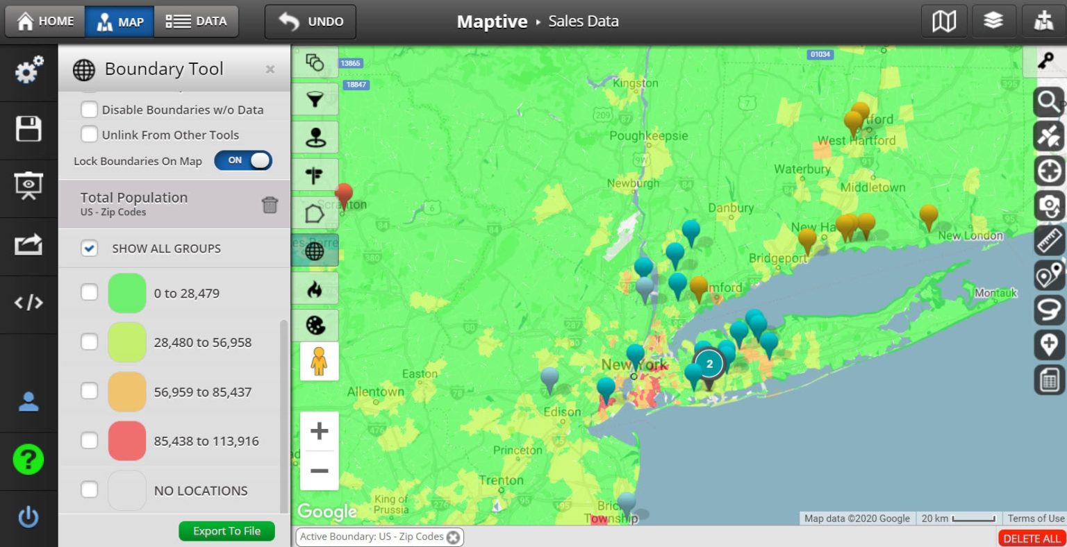
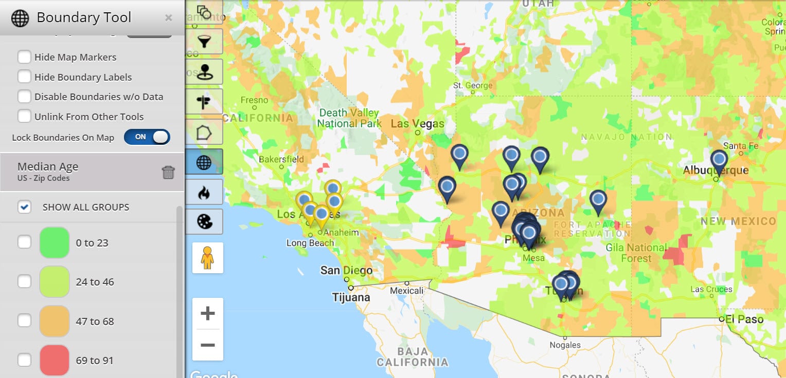
Choropleth maps are thematic maps that use different shading patterns and sequential color schemes for geographical areas, based on the statistical data within them.
Data is categorized into different classes, with light colors/shades representing lower numbers and darker colors/shades representing higher numbers.
For example, if you wanted to measure population levels for each state you could assign white to states under 10 million, light blue to states between 10 – 20 million, and dark blue to states over 20 million.
But keep in mind that for these maps to work properly, measure data with equal intervals.
Types of Data Used for Choropleth Maps
Use choropleth maps with a number of different types of data. To do so, just remember the three basic requirements when selecting data for this type of map:
Assuming your data set adheres to the above rules a choropleth map will accurately represent it.
What Are Choropleth Maps Used For?
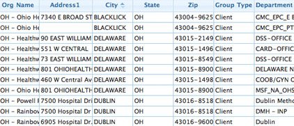
Map zip codes based on your data
Choropleth maps commonly measure socioeconomic and demographic information. However, they’re also used to track a number of business and sales metrics as well.
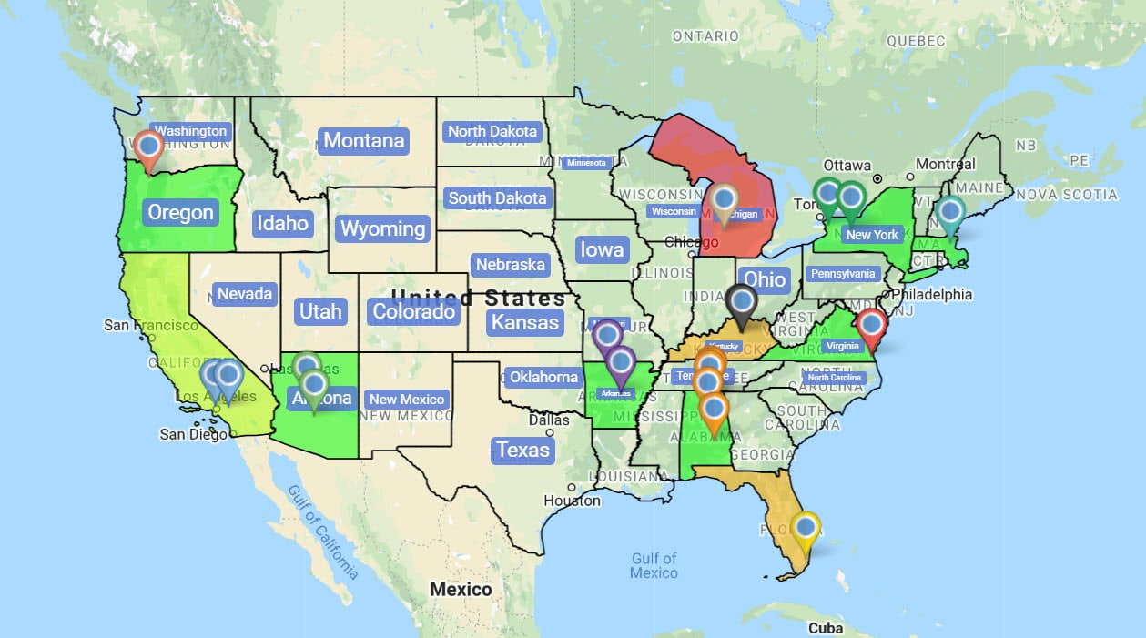
Use choropleth maps to represent the following types of data:
- Total population
- Population density
- Per capita income
- Housing
- Education
- Labor
- Sales
- Revenue
Advantages and Disadvantages of Choropleth Maps
While choropleth maps work perfectly for some projects, they aren’t suited for all. To get the most out of your data, experiment with a variety of maps to find the formats that work best for you.
Advantages
- Simple to Prepare: Compared to other types of maps, choropleth maps are quick to create and set up.
- Easy to Understand: Assuming you keep the number of classes low, someone can look at your map and quickly determine your findings without difficulty.
- Popularity: Choropleth maps are also very widely used, so most people are familiar with them. This means you don’t have to explain how they work in order for people to understand them.
- Measure Many Regions at Once: Their simplicity means you can place data for a large number of geographic areas on one map while still keeping everything comprehensible.
Disadvantages
- Not Ideal for Showing Total Values: Choropleth maps give you a generalization of your data, not exact amounts. So, if you want to know the total value for a specific piece of data, choose another type of map.
- Easily Manipulated: The results shown on the map largely depend on the data classes the creator chooses, so the map maker can manipulate the data to make a point.
Create Choropleth Maps in 6 Easy Steps
Step 1: Sign up for a Maptive free trial account. Try Maptive for free and explore the many mapping tools we have to offer.
Step 2: Upload or input your data. You can upload data directly from an existing Google or Excel spreadsheet, copy and paste your data into Maptive, or enter it manually.
Step 3: Select “Create Map” to view your map. Maptive will plot your data on an interactive map.
Step 4: Select the boundary tool. Click the tools icon in the upper lefthand corner, then select the Boundary / Geographic Territory Tool from the menu.
Step 5: Choose your boundary type.. Use the drop-down menu under “Select Boundary Type” to choose your boundaries. You have your choice of zip codes, counties, census tracts, cities, US states, and more.
Step 6: Select Your Data. Use the drop-down boxes available to you to select the type of data you’d like to measure. Choose your own data (sales, revenue, sales reps, etc.), measure the number of plotted locations, or take advantage of Maptive’s demographic insights such as population and income.
Start mapping now!
Just follow these simple steps:
Copy & Paste OR Drag & Drop Your Data Set Here.
OR you can Upload your file
 Important: Remember to include column headers in your data set. (like the example)
- Date Security: Your data is transferred using encrypted https