

Tim O’Brien once said, “Storytelling is the essential human activity. The harder the situation, the more essential it is.” This applies to everything in life, especially data.
Contently reinforced this point when it quoted Myles Harrison, saying, “Just like you wouldn’t expect an author to write a book without a plot, or an entrepreneur to launch a new venture without a business plan, you can’t expect to march blindly into creating a report or article using data without knowing what you want to say.”
With the average American being hit with around 34 gigabytes of content daily, the only way to make yours’ stick is by creating substance content backed up with objective data.
How are key stakeholders supposed to make data-driven decisions when they are only given a boatload of data and no story to easily connect the dots for them?
Don’t tell your audience all the data points you have. Show them. This is the key to telling a compelling story.
In this post, we will walk you through the eight steps it takes to tell a compelling story through data.
Six Steps to Telling a Story With Data
Brand storytelling would be much more fascinating if marketers thought more like journalists, who use publicly available data to provide new angles and insights to things that affect people’s lives.
Using data, which people deem trustworthy, makes your brand more credible to readers in your stories. Here is a six-step process for creating compelling stories with data.
1. Find an irresistible story.
All compelling data-driven stories begin by asking a good question – one with a quantifiable dimension.
In order to reach a good question, consider asking yourself one of the following two questions:
- What are my customers’ greatest questions?
- What are their biggest business challenges?
Content Marketing Institute (CMI) provides a good example of executing this.
Let’s say you’re in the healthcare space, and you know your audience is concerned with finding accurate, reliable health information online. One story you can consider creating would be a piece on how patients use online healthcare records in your city and how often they access this information. The specific question your content might address here would look like this: “Why consumer demand of health IT outstrips supply.”
2. Remember your audience.
Once you find your question, consider what your audience already knows about this topic. According to HBR, the data visualization needs to be framed around the level of information your readers already have, whether it’s correct or incorrect.
Here are the five different types of possible audience members, as outlined by HBR.
Beginner
The novice is new to the subject being discussed, but they do not want it overtly elementary.
Generalist
The generalist is aware of the content’s topic, and they’re looking for a general comprehension of it, broken down into major themes.
Manager
This audience member seeks an in-depth, actionable understanding of the specifics. They want details.
Expert
The expert wants less storytelling and more details.
Executive
Executives have little time, so they want to absorb the significant points of the data with conclusions of weighted probabilities.
3. Research to find data.
Now, it is time to find your data. This can be difficult for newbies who do not sprout from a journalism or research-heavy background, but not to worry, we will tell you how to find good data for your story.
Determine the data information you need.
In the healthcare example provided by CMI, to tell the story effectively, you would need data that shows:
- How many patients have asked for their health records online
- How many doctors or facilities have the technology to undertake such requests
- How many have actually done this
Search for the data.
Google makes it extremely easy to find credible data. You just need to know where to search. Here are a few places to begin:
- Public data websites
- Government databases
- State agency databases
- US Census Bureau (for demographics)
- Data.gov (government data)
- Google Public Data Explorer
- SocialMention (real-time social data)
- Facebook Graph Search
- GapMinder
- Google Trends
- Google Finance
- New York Times
- Million Song Database
- Topsy
- LikeButton
- DBPedia
- National Climatic Data Center
- Google Books Ngrams
- General lists
- Q&A sites
- Google Scholar (for academic studies)
4. Vet your data sources.
Remember, using data to tell a story is to increase your content’s credibility and validate your brand’s storytelling; therefore, it is vital that the data source be trustworthy to audience members.
Typically, academic journals, college websites (.edu addresses), and research reports from professional institutions are good places to source data. Unfortunately, most blogs, unless highly authoritative and recognized, are not good sources of data.
5. Filter your findings.
Filtering your data is like interviewing a source for your blog post or article. To tell the story or to reach the conclusion you want readers to take away, you need to ask the right questions in order to get the responses you want.
In step one, you already decided which question(s) you want to answer for readers, but you may have forgotten them by the time you conduct research. It is very easy to get carried away and find too much data, which will only overwhelm your audience.
So make sure you filter your data findings, asking yourself: Is this vital to telling a compelling story and convincing my audience of whatever I’m trying to convince them of.
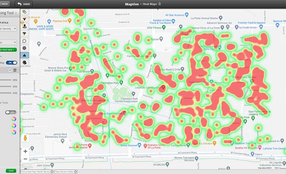
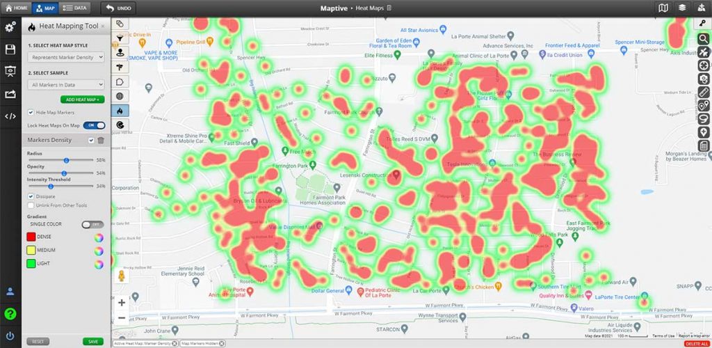
6. Decide on a data visualization.
How will you display your data story visually, making it easy to digest for your readers?
Bar charts, pie charts, infographics, and mappings are examples of ways to display your data visually. First, decide on which format will work best for the type of data you have.
Remember, the more interesting and interactive the visualization, the more time readers will spend on it.
Regardless of how you choose to display it, you must keep it simple. A good way to ensure your audience responds to your data visualizations is to test out different types and see which one gets the most engagement. Then you can keep utilizing that format in the future.
7. Craft the story.
Shaping your data-driven story requires a combination of creative and analytical staff members. The analytical people will collect and filter the data while the creatives will find the story that is dying to be told.
Make sure to be original, providing a new spin or unique point of view that has not been touched on before. A good technique to read about for this is the Skyscraper Technique content marketers use.
8. Gather feedback.
Before launching your story, ask a project outsider for feedback on the piece. What do they think about it?
You will find that you may have to distill the data down even further or use a good ole’ handy thesaurus to find words that would tell the story more effectively.
Conclusion
As Robert Harris once said, storytelling has a narcotic power. Entrance your audience and make them believe what you want by telling a killer, data-driven story.


