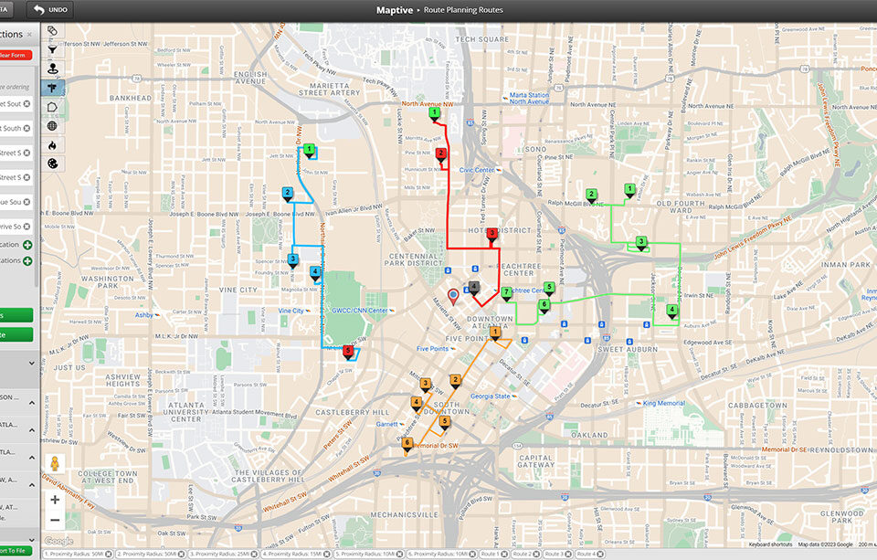
Heat Map Generator: Create a Heat Map
Turn a marker list into a density view that shows where your data piles up. Weight the heat by a number column, filter to a specific group, and tune radius, opacity, or color.
Heat Map Density You Can Spot
Marker Density style: Build a heat map that reads raw point concentration. Drop markers in, pick the Marker Density option, and the densest pockets glow the brightest.
Represents Numerical Data style: Weight the heat by a number column so the bloom matches value rather than row count. Pick a column with numbers only, then add the layer.
Sample selection: Apply the heat map to All Markers in Data, or pick the Specific Group option by choosing a column and a single value when you want to slice by category.
Per-layer controls: Tune radius, opacity, and intensity threshold by percentage, pick a custom color per category, and toggle Gradient On for blend or Off for solid color.
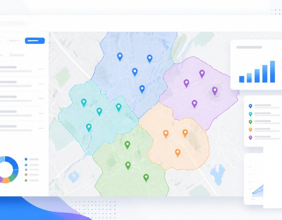
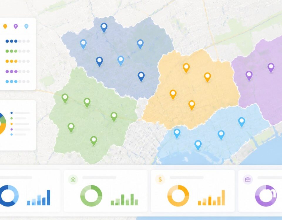
Stacked heat maps: Add another heat map onto the same view. Maptive auto-assigns a different color to each new layer, so the concentrations read alongside each other.
Hide and remove icons: Click the eye icon to hide a layer without deleting the work, or click the trash can icon when you want to remove a heat map permanently from view.
Heat Mapping in 3 Steps
1
Open
Open Map Tools, click the Heat Mapping Tool, and pick a heat map style of Marker Density or Represents Numerical Data.
2
Pick
Pick All Markers in Data, or choose the Specific Group option with a column and a single value when you want a slice.
3
Add
Click Add Heat Map to render the layer, then tune radius, opacity, intensity, and colors until the bloom fits the view.
Where Demand Concentrates
Spots With No Coverage
Density Versus Weighted Value
Volume Across an Area
Stacked Layers Compared
Patterns Inside a Group
Heat Mapping for Demand Reads
What Heat Maps Show
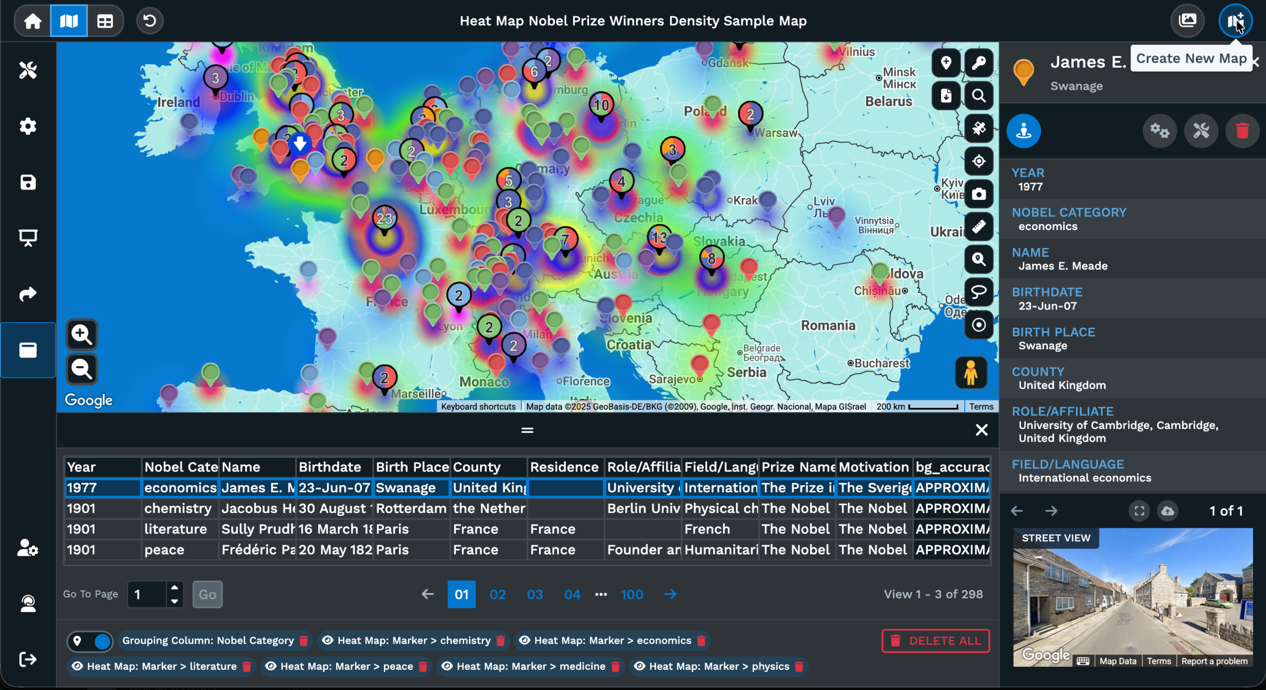
A heat map turns a list of points on a map into a colored bloom that gets brighter where the points sit closest together. The color is the read. Where the bloom is thick, the data is thick. Where the map stays cool, there is little or no data in that pocket. Reading the map by color is faster than scanning rows for location patterns, and the result holds up at any zoom level once the radius is set right.
The Heat Mapping Tool inside Maptive supports 2 heat map styles. Marker Density treats every point the same, so the bloom follows the count of markers in an area. Represents Numerical Data weights each point by a column with numbers only, so the bloom follows value instead of row count. The same data set can read very differently across the 2 styles, which is why both are available on the same map.
Sample selection narrows the input. All Markers in Data plots every row in the file, while Specific Group plots only the rows where a chosen column matches a chosen value. After the layer is added, the radius, opacity, and intensity threshold are each adjusted by percentage. Colors are picked per category, and the Gradient toggle switches between a multi-color blend and a single solid color.
Density Versus Heat Maps
A density map and a heat map are close cousins. Both use color to show where points concentrate on a map, and both rely on the same idea. More data in an area produces a brighter or warmer color. The line between the labels is mostly a wording habit. Most mapping tools, including Maptive, use the heat map name and treat density as the read the map produces from your data.
The split that matters in Maptive is between point count and weighted value. Marker Density is the count read. Each point counts the same, and the bloom grows where points sit close together. Represents Numerical Data is the weighted read. Each point carries the value in a chosen column, and the bloom grows where that value piles up. A pair of heat maps over the same set of pins can look very different.
Picking the right read depends on the question. Count answers where markers themselves group up, which fits foot traffic logs, address lists, and visit counts. Weighted value answers where a number column piles up, which fits sales totals, square footage, miles driven, or any other column with numbers only. Running both layers together in different colors makes the gap between count and value readable on a single map.
Building From a Spreadsheet
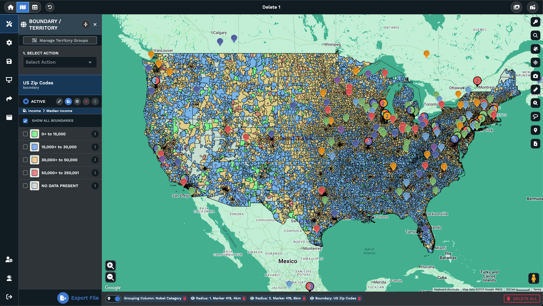
A heat map starts with a spreadsheet. Maptive accepts xlsx, tsv, or csv files with addresses or coordinates, and the rows become markers on the map after geocoding. From there, the Heat Mapping Tool runs on the marker set the map already holds. Any column in the source file can drive the heat. A category column powers Specific Group filtering, and a number column powers the weighted read.
Once the file is loaded, opening Map Tools and clicking the Heat Mapping Tool brings the controls onto the map. Picking Marker Density and clicking Add Heat Map produces a count-based bloom over every marker. For weighted heat, picking Represents Numerical Data and a column from the Numerical Data drop-down produces a bloom that follows the column. The column has to contain numerical values only.
Heat maps stay editable after they render. Radius, opacity, and intensity threshold are tuned by percentage so the bloom matches the scale of the question. Colors are picked per category, the Gradient toggle switches the layer between a blend and a single solid color, and the marker toggle hides the underlying pins. The Unlink From Other Tools. checkbox lets later marker filters run without changing the heat map.
FAQs About the Heat Mapping Tool
What is the Heat Mapping Tool?
The Heat Mapping Tool sits inside the Map Tools menu and turns your markers into a colored bloom that grows where the data sits closest together. Maptive offers 2 heat map styles. Marker Density treats every point the same, and Represents Numerical Data weights the bloom by a column with numbers only. After the layer is added with the Add Heat Map button, the radius, opacity, intensity threshold, colors, and Gradient toggle stay editable so the read fits the question.
How do I create a heat map from a spreadsheet?
Upload your xlsx, tsv, or csv file into Maptive and let the rows geocode into markers. Open Map Tools, click the Heat Mapping Tool, and pick Marker Density for a count read or Represents Numerical Data for a weighted read. Pick All Markers in Data, or pick the Specific Group option with a column and a single value when you want a slice. Click Add Heat Map. Tune radius, opacity, intensity, and colors until the bloom matches the scale of the map.
Can I weight a heat map by a number column?
Yes. Pick the Represents Numerical Data option as the heat map style, then pick the right column from the Numerical Data drop-down list. The column has to contain numerical values only. The article gives Sales, Price, Square Ft., Weeks, and Miles or Kilometers as examples of columns that work. Once you click Add Heat Map, the bloom grows where the value column piles up rather than where rows count up. The radius, opacity, and intensity threshold percentages are tuned the same way as a Marker Density layer.
Can I run more than a single heat map on the same map?
Yes. Click Add Heat Map again, picking a different style or sample on each pass. Maptive auto-assigns a different color to each new layer so the concentrations read separately. Each layer lists its own controls for radius, opacity, intensity threshold, colors, and the Gradient toggle, and you can edit any of them without touching the others. Stacking layers makes it easy to compare a count read against a weighted read, or a pair of Specific Group slices, on the same view.
How do I hide a heat map without deleting it?
Click the eye icon next to the heat map listing, either in the heat map controls or along the bottom bar of the map. The layer drops out of view and the rest of the map stays as it was, which helps when you want to read a layer that was sitting underneath. Click the eye icon again and the layer comes back. The trash can icon next to the same listing is the permanent removal action, so reach for the eye when you only want a temporary hide.
Does removing a heat map permanently delete it?
Yes. The trash can icon next to a heat map listing, or along the bottom bar of the map, removes the layer permanently. There is no undo step, and the layer is gone from the map after the click. If you only want the layer out of view for a moment, use the eye icon instead, which hides the heat map without deleting any of its values. Setting the controls again on a fresh layer takes more time than hiding and showing the original.
Can I adjust the radius after adding a heat map?
Yes. Radius is a percentage slider that stays available after you click Add Heat Map. Slide it up to spread the bloom across a wider area, or slide it down to keep the heat tight to the markers. The opacity and intensity threshold sliders work the same way and pair with the radius to control how strong the heat reads against the base map. All of the sliders update the layer live, so you can settle on the right look by watching the map as you move them.
How do I plot a heat map for a single category?
Open the Select Sample drop-down, pick the Specific Group option, then pick a column with category data and a single value from that column. The article gives State, Business Group, and Location Type as examples of columns, and AZ as an example value for a State column. Click Add Heat Map and the bloom plots only the rows that match. Add another Specific Group layer with a different value to compare a pair of categories on the same map without filtering out anything else.
Does filtering markers change the heat map?
By default, filtering markers with other map tools can affect the heat map, since both read from the same set of points. Check the Unlink From Other Tools. checkbox in the heat map controls and the link is broken. After that, marker filtering runs without touching the heat map, so the bloom stays as it was while the pin set behind it changes. The same heat map can also hide its own markers through the marker toggle if you want a cleaner background under the heat.
Is there a way to read patterns by group?
Yes. The Specific Group option inside the sample selector lets a heat map run on a slice of the data, picked by column and value. Stacking another heat map with a separate Specific Group value on the same map shows the slices side by side in different colors. Pair this with the Represents Numerical Data style and you can read where a chosen group concentrates by raw count, and where the same group concentrates by a number column, on a single map.