Map Data Visualization Tools
You depend on your data to help you make educated decisions. But oftentimes you’re bombarded with so much information that it can be overwhelming.
Maptive’s data visualization tools solve this by allowing you to display your location-based data on an interactive map. Once your information is plotted you can customize how it’s presented in a number of different ways to quickly identify significant trends and patterns that need to be acted on.
Make Sense of Your Data
With our data visualization tools you’ll be able to:
- Uncover New Insights: Seeing your data mapped out will allow you to quickly identify important trends that may not have been clear before.
- Help Others Understand Your Data: Plotting your data on a map makes it easy for everyone to understand and learn from your findings.
- Present Your Data in an Attractive Format: The attractive nature of our maps makes them ideal for presenting data to other team members.
- Customize Your Maps: < b>Customize your map using a number of tools to fit your unique needs and highlight the information that’s most important.
Google Maps and Maptive’s Interactive Data Visualization Tools
Maptive is powered by Google, the company that brought you the best data visualization software out there when it comes to geographical and spatial data. Google Maps revolutionized how we navigate the world around us, and now we’re using it to revolutionize how you analyze your data.
Our integration with this technology means that all of the navigational features of the platform you’ve come to rely on are available to you on our platform as well. Once you’ve understood your data using our interactive data visualization tools, you can easily use your map in the same way you use Google Maps in your everyday life.
How to Use Our Map Data Visualization Tools
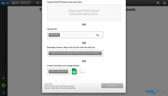
Step 1: Input or Import Your Data
Our map data visualization software has two views: DATA and MAP. To enter your data, click “Data” in the top left corner of the screen. Here you can either copy and paste your data into the field or import it from a spreadsheet.
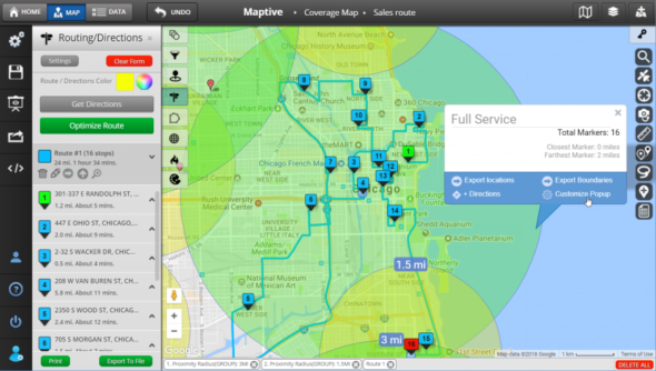
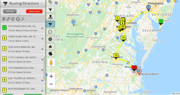
Step 2: View Your Data on Our Interactive Map
Once your data has been entered, click “Map” to view an interactive visual representation of the information. You can zoom in and out to find the exact view you’re looking for. For example, you can look at the entire United States, or zoom in to look at a specific state, county, or region.
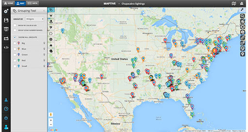
Step 3: Customize Your Map
Using the variety of interactive data visualization tools at your disposal you’ll be able to:
- Change a variety of aesthetic components, from the overall map type to the color of an indicated route.
- Make use of the data visualization features on Google Maps, such as switching to street view.
- Include geographical features such as street names, city or county names, and names of landmarks.
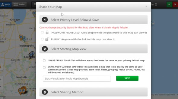
Step 4: Export or Share Your Map
Once you’re happy with your map you can export it or share it with other members of your team. When sharing maps you can use the privacy settings to only share certain views of your map and can control who is privy to what data.
Choose from a Range of Data Visualization Tools
Our interactive maps give you access to a number of different visualization tools that you can use to present your data exactly how you want.
Some of our favorite tools include:
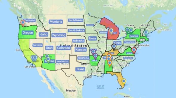
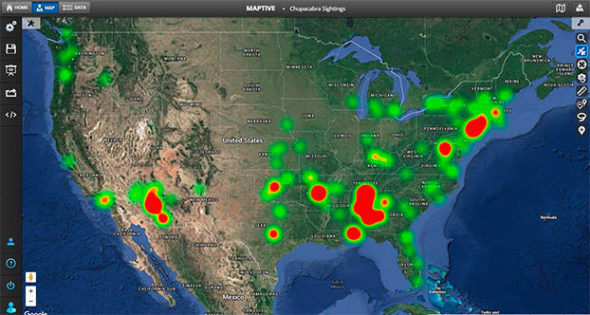
Heat Map Tool
The heat map data visualization tool identifies points of density on your map according to the location data you input, giving you immediate insights into the regions where your data is more heavily weighted.
Through this window, you’re able to see the degree and size of particular areas of density. You’re also able to identify areas that are lacking substantive data. It’s ideal for assessing market availability in a particular town or city and analyzing sales density in certain areas.
Boundary Tool
The boundary tool allows you to mark boundaries on your map so you can aggregate your numerical data according to the area types you have selected.
You’re able to draw regional boundaries according to categories such as countries, states, counties, and cities, or congressional districts. Once your boundaries are marked you’re able to observe what your data tells you about those regions.


