Mapping Software for the Nonprofit Sector
The Importance of Data
Data is important for the success of any nonprofit organization. You use it for presentations to potential donors, to monitor your strategic imperatives, and to collaborate with team members. Unfortunately, spreadsheets don’t always tell the whole story.
How are you supposed to properly convey the importance of causes you’re fighting for or the progress your organization is making with numbers and columns? This is where GIS technology and mapping software make a huge difference.
Mapping your Data
Uploading your data to an interactive map provides a visual experience far beyond what a spreadsheet can deliver. Plot your data to better illustrate various causes, such as poverty, environmental changes, and animal abuse. Or use your map to show the positive impact you and your team are having on the world.
Maps aren’t just for presenting data to external users. Use them internally to share important information with your team, track your results, and run your non-profit more efficiently.
What are You and Your Donors Looking to Achieve?
Your Goals
- Find an easy solution for organizing, analyzing, and presenting your data.
- Educate potential donors on important issues.
- Present your organization as data-savvy.
- Generate more donations for your nonprofit.
- Spread awareness about your cause.
Your Donors’ Goals
- Learn about the causes you support in a way that’s easy to understand.
- Learn about what your organization is doing to make an impact.
- Want to better understand what the writer is telling them.
How Does Mapping Software Help You and Your Donors Reach Your Goals?
Maptive takes your location data and turns it into a beautiful interactive map. Use it to uncover new insights, present your results, and share important information with your team.
Here are the ways Maptive helps both you and your donors achieve your goals:
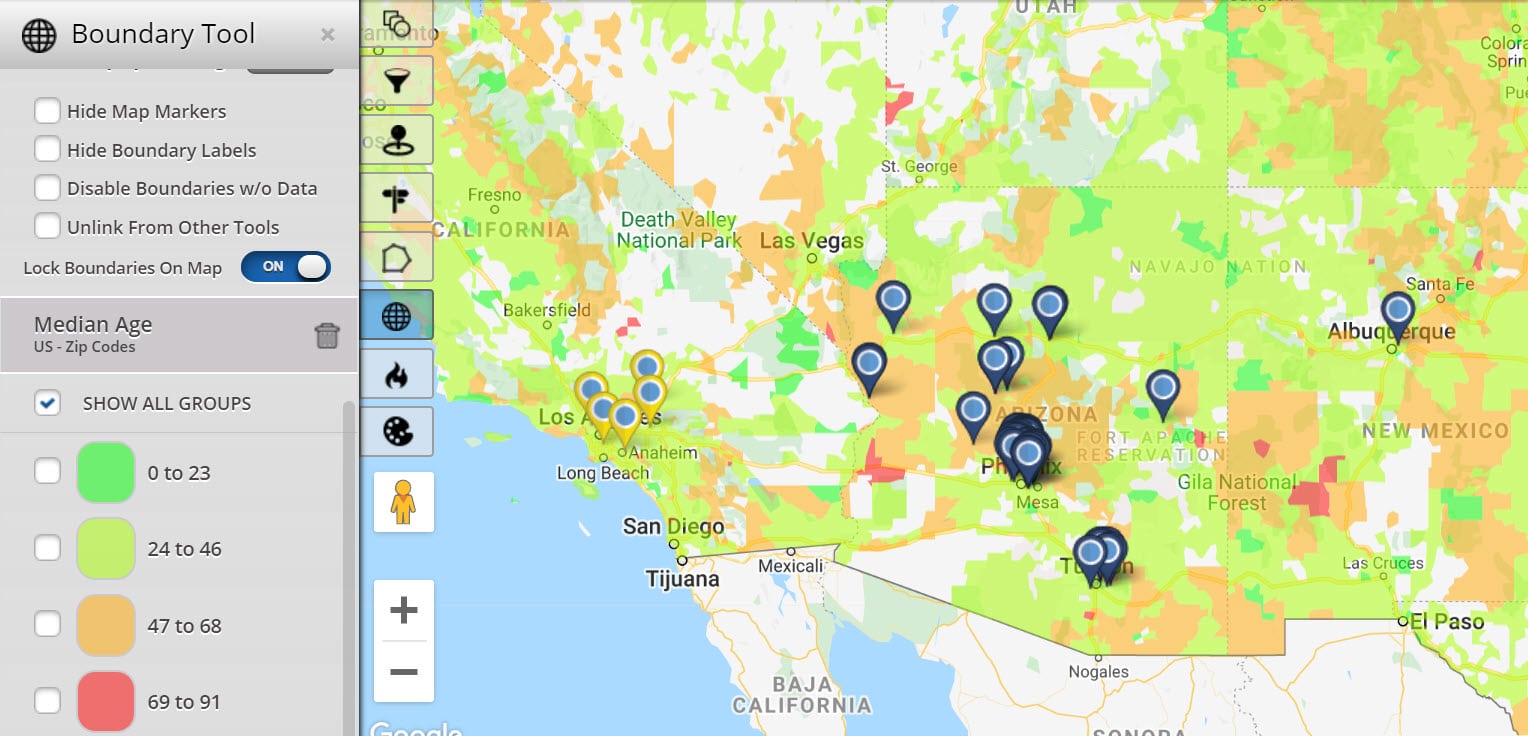
Heat Maps
Need to show how rampant a particular issue is in a given area? Use heat maps to display the level of density of certain data points, such as poverty levels, domestic abuse instances, overdose deaths, and more.
Displaying just how common a problem is in a community or region is a powerful way to convey your message and help people better understand the causes you’re fighting for. And as your efforts improve the situation compare new heat maps to older ones to demonstrate how much of a difference you’re making.
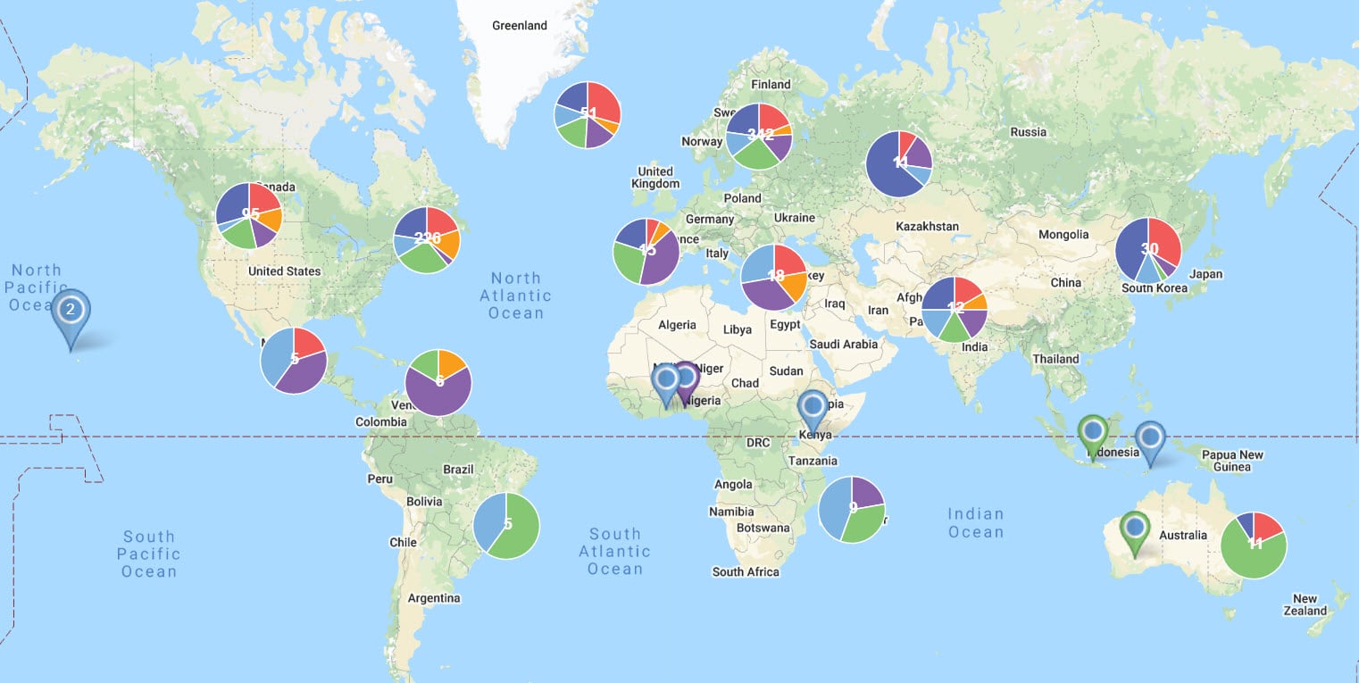
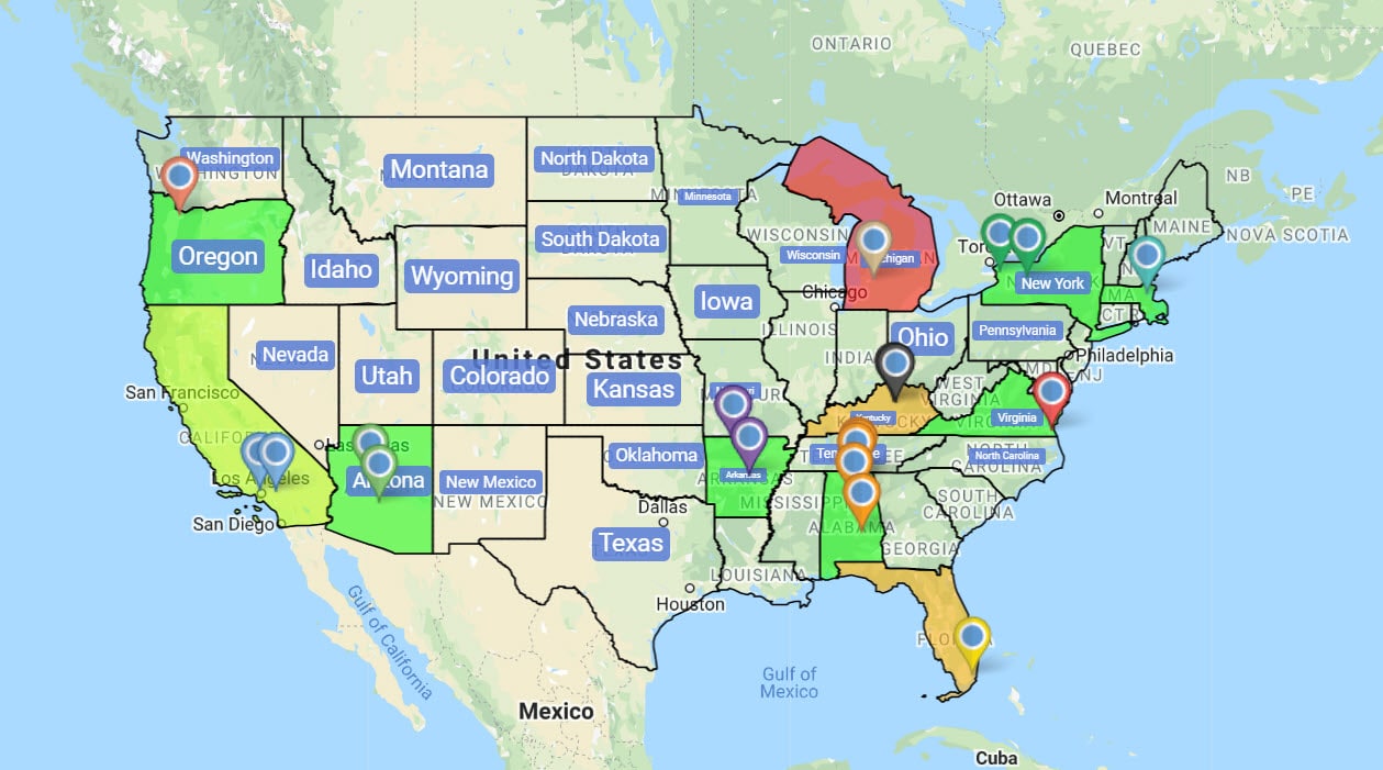
Pin Maps
Map markers can be used to plot locations, landmarks, people, events, and more. When clicked, they display a wide array of valuable data that can be shared with decision-makers, donors, or your team.
Use pin maps to plot the locations of your offices, projects, staff members, volunteers, donors, and areas of interest. Analyze your data more easily to develop organizational strategies and effectively reach out to previous and potential donors.
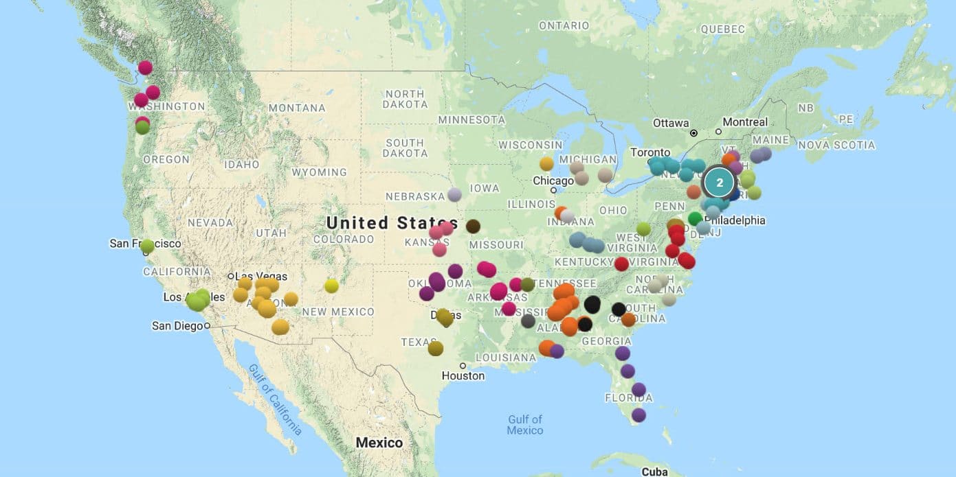
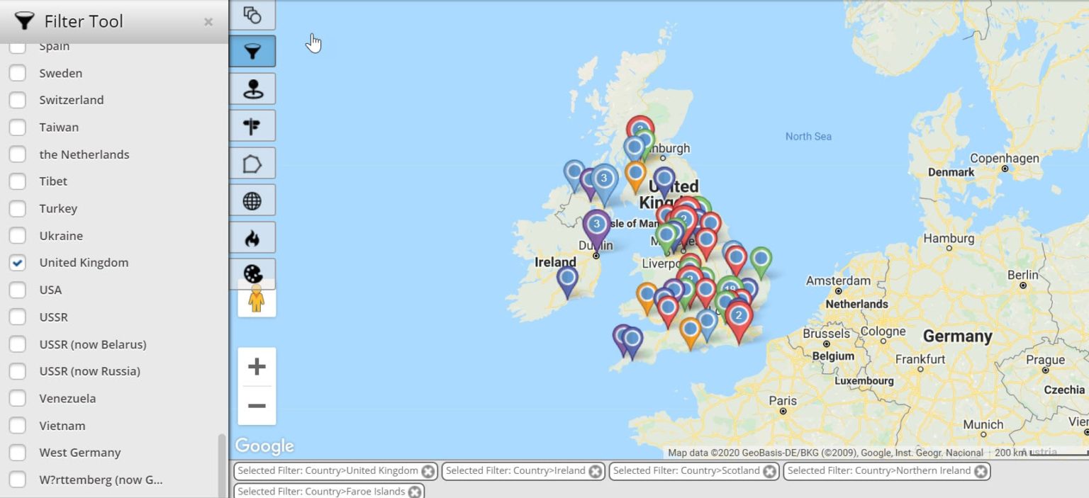
Filter Tool
Just like any organization, you likely keep a lot of data on your business, projects, and staff. Plotting all this data at once can be overwhelming and could cause you to miss important details and opportunities. Utilize the filter tool to decide what data you want to display and hide.
For example, for each of your donors you may choose to filter any of the following information:
- Name
- Age
- Address
- Phone number
- Amount donated
- Number of donations
For your projects, you may choose to create filters based on:
- Location
- Number of staff members
- Number of volunteers
- Budget
- Organizational targets
Use the filter tool to display data however you like in order to create a wide range of custom maps.
Cloud Technology
Interactive maps are great, but to get the most out of them they have to be available when and where you need them. Whether you’re collaborating in your offices, presenting data to potential donors, or working out in the field, you want your maps to be available to you.
Maptive uses cloud technology powered by the Google Maps platform. This means when you create a map with our software you can access it wherever you have an internet connection. Use your laptop or mobile device to easily share your maps and present important information.
Why Should Maptive Be Your Choice For Nonprofit Mapping Software?
The answer is, for all the reasons above and more:
- Illustrate the density of particular issues with heat maps.
- Plot important location data, such as projects, volunteers, and donors.
- Easily filter your data to zero in on the information you need.
- Access your maps virtually anywhere to analyze and share your data whenever you like.