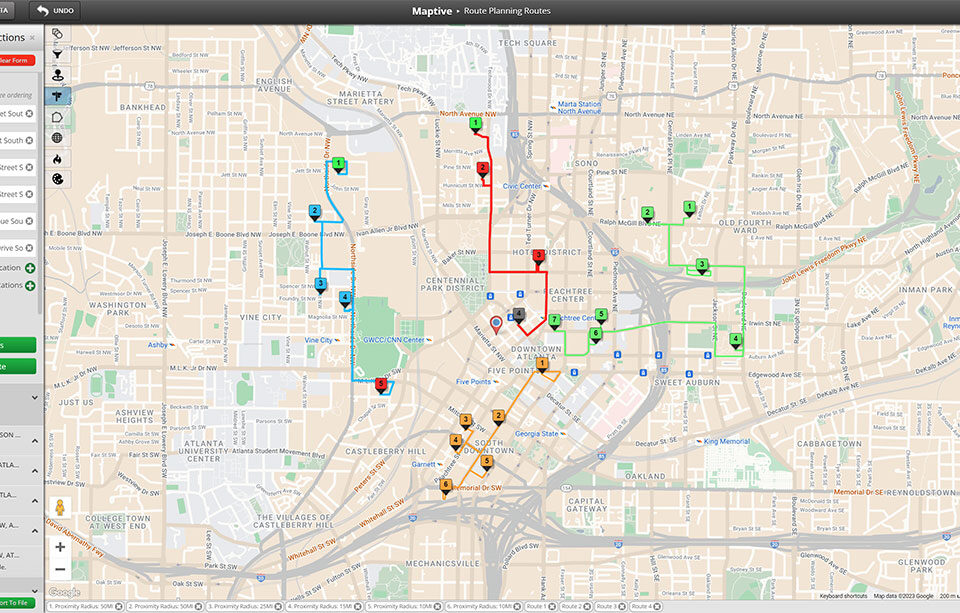
Geographic Boundary Tool
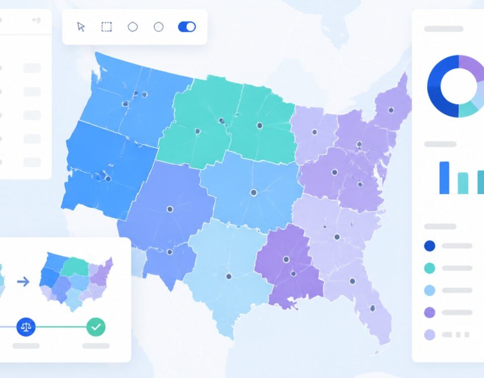
Color whole regions on your map by the data behind them. Pick a boundary set, choose a fill type, and Maptive paints every polygon to match the metric you want to track now.
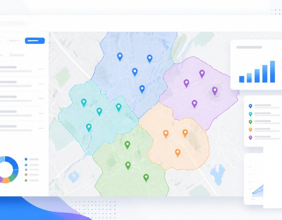
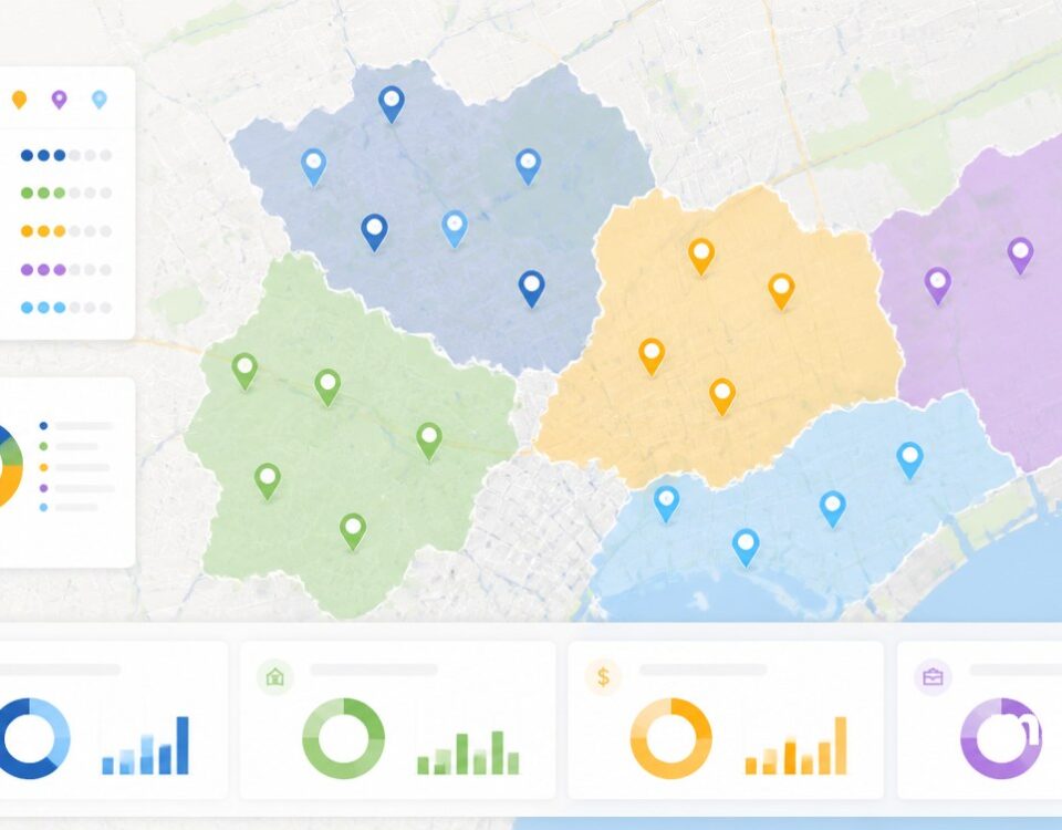
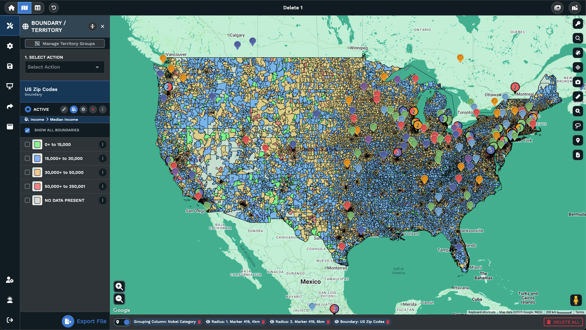
Boundary Patterns Across Your Map
Fill type menu: Pick from No Fill, My Numerical Data, My Group or Territory Data, Marker Count and Location Density, or Demographic Census Data on a chosen boundary set.
Function dropdown: Aggregate a numeric column across each polygon by Sum, Average, Max, or Min, then watch the color scale update so the busiest regions read the loudest.
Fill Settings: Adjust the color progression, set how many ranges show, switch between Value Ranges and Percentage Ranges, and tune Opacity from 0 to 100 across each range.
Boundary Formatting: Set Line Width, Line Color, and toggle Ignore Filters, Combine Groups, Hide Areas W/O data, or Disable Boundary Hover and Click for the active set.
Sync Data tab: Choose Geometry to match markers by point in polygon, or Data to match by a column value, which suits census track numbers and incomplete address fields.
Add More Fills: Stack multiple fill layers on 1 boundary set, swap the active fill from the panel, and remove any fill with the red garbage can icon when you are done.
Color Boundaries in 3 Steps
1
Pick
Open Map Tools, click the Boundary Tool, and choose a Boundary Set such as US States from the dropdown menu at the top.
2
Fill
Select a fill type, set the function or demographic metric you want, then click Load Boundaries to paint every polygon.
3
Read
Click any region to see aggregated totals in the right side panel, then tune Fill Settings until colors track your data.
Faster Decisions From Boundary Maps
Regional Totals at Sight
Density Without Pin Clutter
Demographic Context Built In
Categorical Maps Read Faster
Focused Coverage Snapshots
Stacked Views per Set
Boundary Mapping by Zip and County
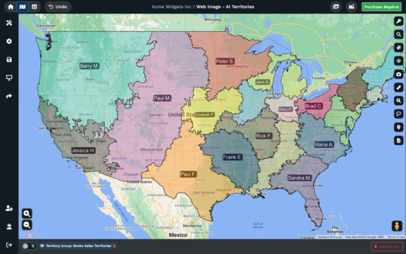
Building a Boundary Map
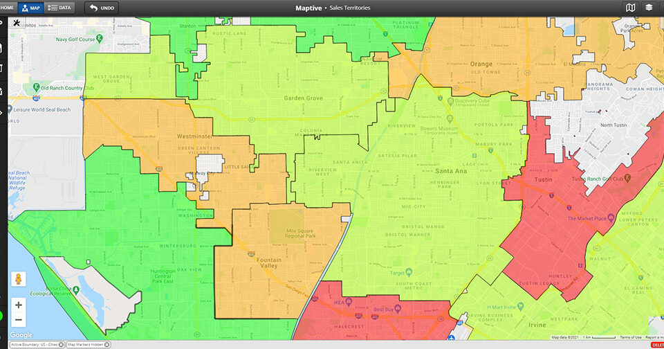
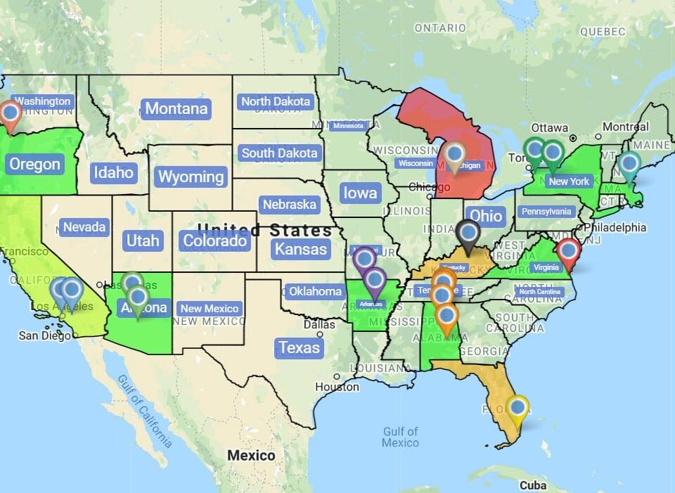
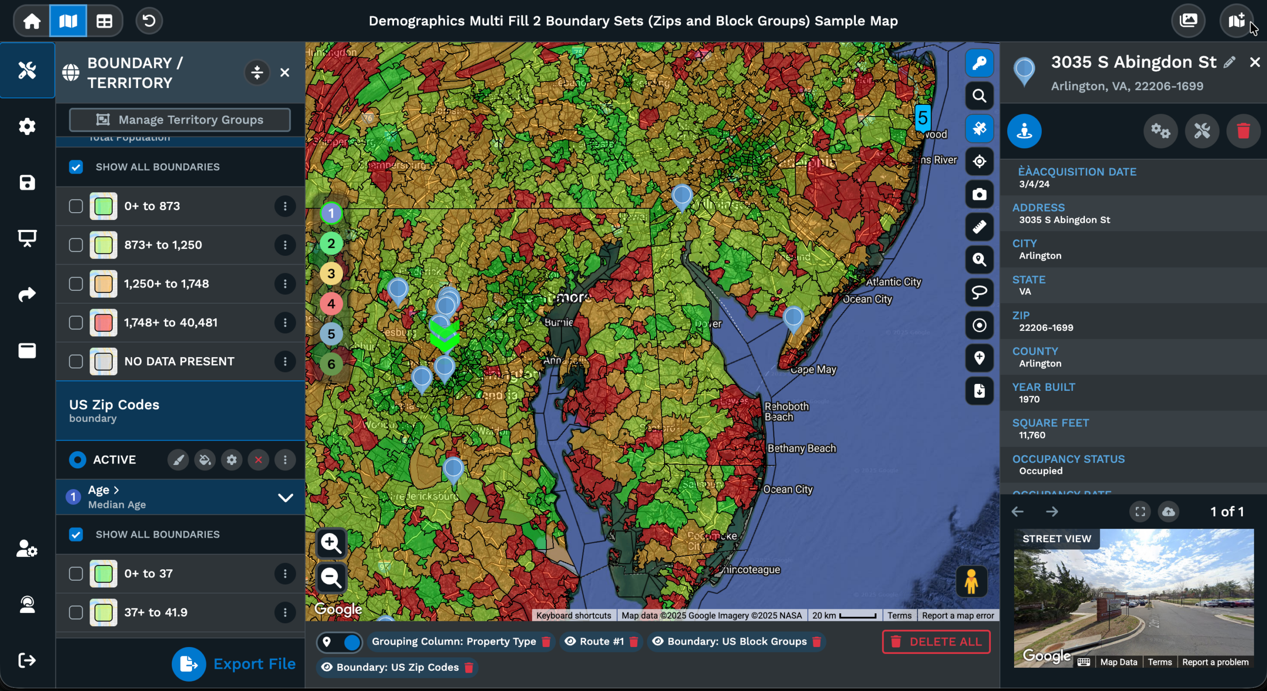
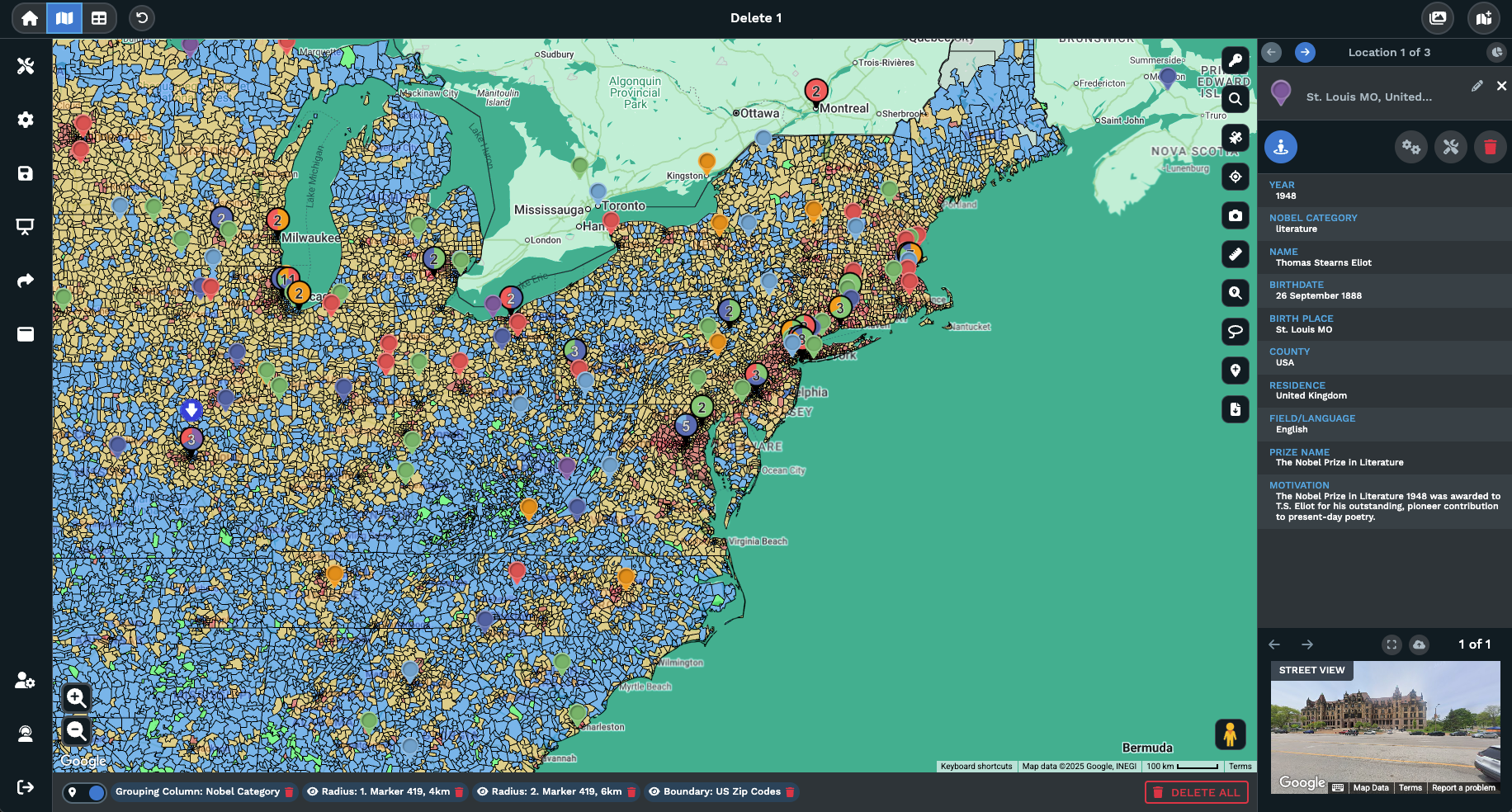
A boundary map starts with 2 picks. The first is the Boundary Set that covers your area, and the second is how each polygon gets colored. Open Map Tools, click the Boundary Tool, and open the Boundary Set dropdown. Pick US States or a set the panel offers. Maptive ships 5 fill types. No Fill or Manual Fill leaves outlines you color by hand. My Numerical Data colors by a column aggregated with Sum, Average, Max, or Min. My Group or Territory Data colors by a category column where the winning value drives the polygon. Marker Count and Location Density colors by row counts. Demographic Census Data covers population, income, and age across US and Canada.
Once a fill type is set, click Load Boundaries and the polygons paint across the map. Customize Fills opens the color progression, the number of ranges, and the range method. Value Ranges is recommended for a tidy spread, and Percentage Ranges suits fixed brackets. Opacity runs 0 to 100 per range, and the picker takes an HTML code for a brand palette.
Boundary Formatting sets Line Width and Line Color for polygon edges, with width at 0 to hide them. Toggles for Ignore Filters, Combine Groups, and Hide Areas W/O data round out the panel.
Connecting Markers to Polygons
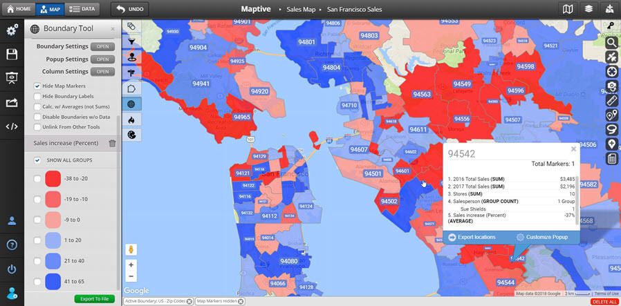
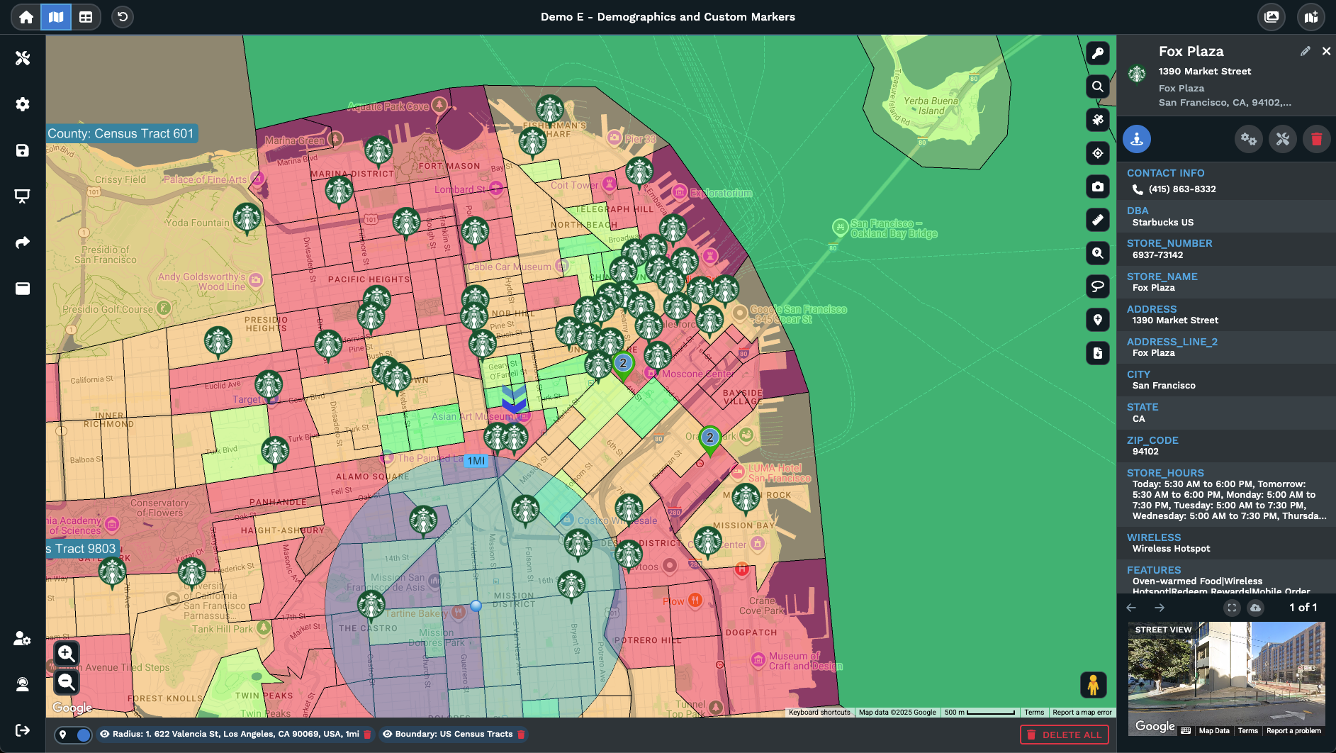
Boundary maps only sing when your markers attach to the right polygon. Maptive handles that link in the Sync Data tab. The default option is Geometry, a point in polygon match where every marker drops into whichever boundary holds its coordinates. That works for addresses that geocoded cleanly, since the latitude and longitude place the pin somewhere on Earth.
The second option is Data, a text match against a column in your spreadsheet. Pick the column, point Maptive at the boundary attribute, and the rows attach by name even if the address itself never geocoded. The docs call out census track numbers as a primary case here, since long ID strings need an exact match rather than a coordinate hit. Incomplete address fields also benefit, because a row missing a street will tie to a boundary if the state or zip column lines up.
Once markers and polygons are linked, every aggregation runs on that connection. Sum, Average, Max, and Min draw from rows inside each polygon. Marker Count rises and falls with the same row set. Click any polygon and the right side panel opens with totals, row count, and any custom metrics. Combine Groups can fold same-group polygons into a single unit so totals merge.
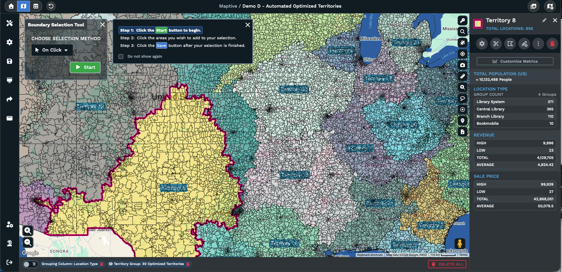
Isolating Polygons for Snapshots
The Boundary Isolation Tool, also called the cutting tool, narrows the map to a single boundary or territory. Click any polygon, then click the Isolate Boundary Button in the right side menu. The rest of the map drops away, leaving the polygon, its fill, and its labels in place. Pick a background color from the default list, or set a custom color with the picker, to control what sits behind the isolated region on screen.
The tool isolates 1 boundary at a time. To show several states or zips together, build a territory first, either through the Automated Territory Tool or the Territory Drawing Tool, and isolate that territory instead. The same workflow applies to any group of polygons inside a single territory.
Removing the isolation is a 3 way option. Click the isolated polygon and click the isolation tool again to restore the full view, delete the boundaries or territories from the map, or click the garbage can icon at the bottom where boundaries and territories are listed. The docs name screenshot work as the case for the cutting tool, useful when you are taking an image of a region. Aggregated totals stay visible while the polygon is isolated, so the snapshot keeps its data context.