Mapping Software for Journalists & Bloggers
Tell Stories With Data
If you want to be respected as a journalist or blogger you need data to back up your stories. Search engines have made it easier for writers to gather the information they need, but what’s the best way to present it?
Including statistics in your writing does have some value, but sometimes you need to utilize data visualization tools to further illustrate your point.
Upload your data sets to Maptive to create interactive and detailed maps in seconds. Plot important locations and data to further prove your arguments. Use our wide range of useful tools and different options to make your map your own, then share it with your readers to enhance your writing.
What Are Writers and Readers Looking to Achieve?
Writer Goals
- Inform readers.
- Provide added value.
- Use data to back up your writing.
- Provide a more immersive experience.
Reader Goals
- Learn new information.
- Be entertained.
- Want to better understand what the writer is telling them.
Take Your Articles to the Next Level with Maptive
Using the power of Google Maps, Maptive takes the data and statistics you collect and turns them into interesting maps for your readers to enjoy.
Here are a few ways Maptive can help you and your readers achieve your goals:
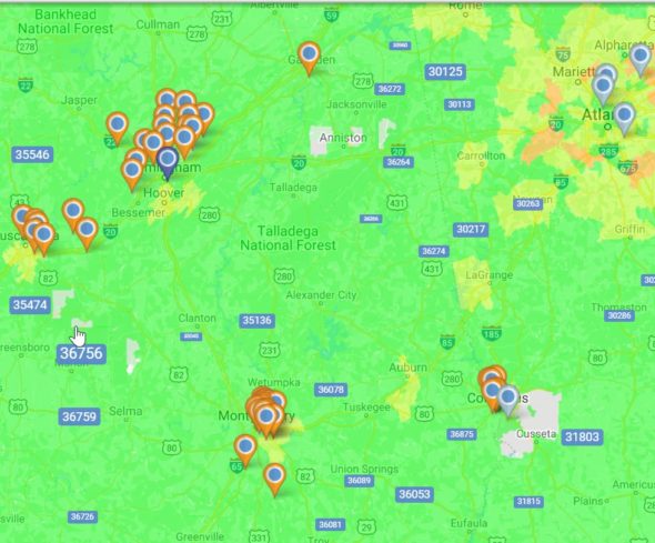
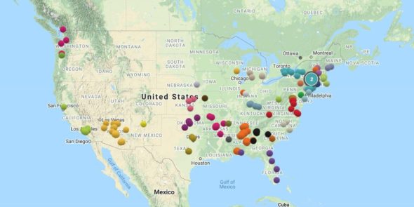
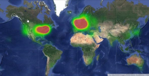
Pin Maps and Heat Maps
Are you using geographic data to tell your story? Easily plot the locations of businesses, events, incidents, and more with map markers to add another dimension to your articles. Or use heat maps to show the density of data points like population, crime rates, and infections to further prove your point.
Filter Tool
If you’re like most researchers you gather a lot more data than you need. There’s nothing wrong with being thorough, but when it comes time to write your story you have to filter your research down to only what you need.
Use the filter tool to decide what information to display and what to leave out. Set up several filters at once to swap data in and out as you need it to create the perfect maps for your projects.
Customize Your Map
Personalize your map by taking advantage of Maptive’s wide range of customization options. Change the size, color scheme, and shape of your map markers, insert photos, draw on your map, use our text editor, select your view, and utilize dozens of mapping tools to create a unique look that your readers will love.
Share and Embed
Sharing your maps is quick and easy with Maptive. Grab your sharable link to post your map to Facebook, Twitter, forums, and other platforms. Or embed your maps directly into your news stories, articles, and blog posts using the embed code provided. Get your readers the information they need where they want it so you can share your findings.
View Maptive’s full suite of mapping tools and features here.
Why is Maptive the Best Mapping Software for Journalists and Bloggers?
The answer is, for all the reasons above and more:
- Tell your story more effectively with informative maps.
- Filter your data to display the information you want.
- Customize your map however you like with a variety of powerful tools.
- Easily share your maps on your website or social media.
Sign up for a free trial of Maptive today, or take advantage of our free account, and discover how our mapping software can help you tell the important stories.


