Create Custom Maps for Presentations
Build a map your slide deck deserves. Drop in your spreadsheet, style the view to match your template, then export a sharp image that pastes into PowerPoint or Google Slides.
Presentation Maps Ready for a Deck
Export Map Image icon: Sits on the right-hand side of your map and opens the dialogue box where every export choice lives, so the styled view becomes a slide-ready image.
File type picker: Lets you pick PNG, PDF, or JPG inside the dialogue box, so the file you walk out with already matches what PowerPoint, Keynote, or Google Slides expects.
Export Styles options: Cover Screenshot, Map, Legend, and Map + Legend, so you can pull the menus-and-map view, the map alone, the legend, or a map-with-legend image.
Size selector: Offers Normal or Large output for the same styled view, so a small inset on a stacked slide and a full-bleed cover map come out of the same dialogue box.
Map Key toggle: Sits inside Shared Maps/Presentational Maps and turns the legend for Grouping or Geographic Boundary on or off, so the legend matches the slide story.
Theme Style switch: Flips the map to a dark or light theme inside Shared Maps/Presentational Maps, so the exported image lines up with the slide template colors easily.
Slide-Ready Maps in 3 Steps
1
Style
Open Map Settings, set Theme Style on dark or light, toggle the Map Key, and frame the styled view on the cover slide.
2
Export
Click the Export Map Image icon, pick PNG, PDF, or JPG, pick Screenshot, Map, Legend, or Map + Legend, then pick a size.
3
Paste
The finished image downloads to your desktop sized for the deck and ready to drop onto a PowerPoint or Keynote layout.
Sharper Coverage Story
Faster Slide Builds
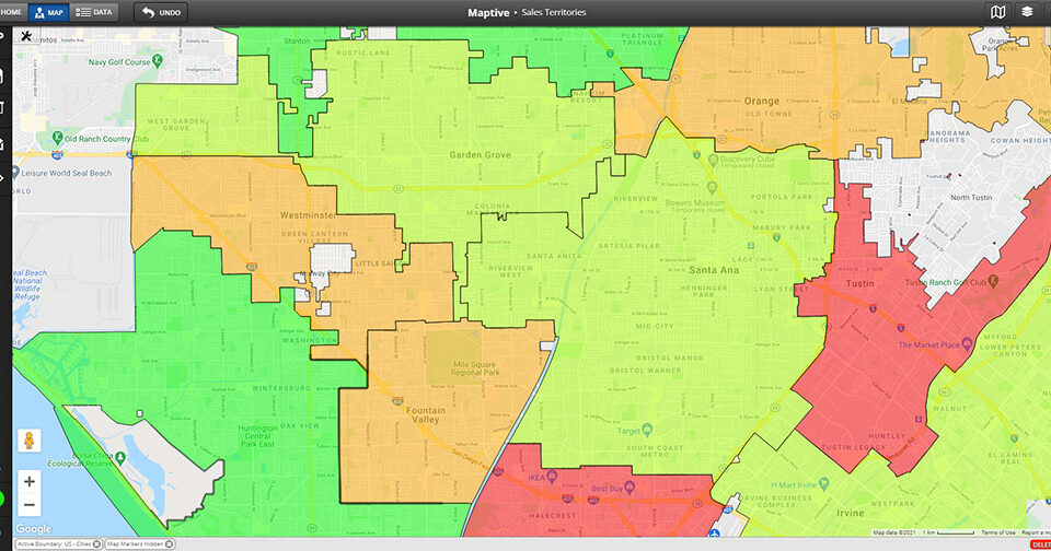
Cleaner Heat Maps
Stronger Rollout Pitches
Easier Before and After
Repeatable Weekly Slides
Building Maps for a Slide Deck
Picking An Export Style
The Export Map Image icon on the right-hand side of your map opens a dialogue box that lets you pick what portion of the screen becomes the slide image. Screenshot keeps the menus and the map together in the export, which is useful when the spoken story relies on the tool labels and panels staying visible on the slide during the walkthrough itself in front of a live audience watching the styled deck.
Map crops the export down to the map portion only, which gives a clean rectangle that fits a slide layout without surrounding panels or app chrome cluttering the edges of the image at all. Legend exports only the legend of the grouping or boundary tool, which works for an inset on a slide that already carries the map elsewhere in the deck on a separate page or in a slide section header up top.
Map + Legend pairs the styled map view with a simplified legend of the grouping or boundary tool, which produces a traditional map-with-legend image that any slide layout can hold cleanly without a layout fight on the page. Pick the style that lines up with the slide, click Continue, and the image file downloads to your desktop ready to paste in cleanly on the slide layout already sized for it.
Choosing PNG, PDF, JPG
The export dialogue inside Maptive offers PNG, PDF, and JPG, so the file format you walk away with already matches what your slide tool expects to drop straight onto a layout in the deck without conversion. PNG keeps crisp edges on markers, labels, and boundary outlines, which is the format to pick for a slide that gets projected at presentation size in a meeting room or printed at any handout scale also.
PDF works when the map needs to travel as a handout alongside the deck itself, since the file opens in any reader without a layout app and keeps the same look on every screen the audience views it on during the meeting. JPG keeps the file size smaller for decks that need to email cleanly to a wide list or load fast on a webinar platform that throttles big files heavily on a slow connection call.
Pick Normal size for a slide thumbnail or a corner inset on a busy layout where the map plays a supporting role beside the text and the charts on the page itself. Pick Large size for a full-bleed cover slide or a printed handout where the map carries all the visual weight of the slide on its own. Both sizes use the exact same styled view inside Maptive every time you click Export Map Image.
Styling The Shared View
Map Settings holds a Shared Maps/Presentational Maps menu that controls what the presentation copy of your map actually shows the audience on the slide during the talk. Theme Style flips the map to a dark or a light look so the colors line up with the slide template colors instead of clashing with them on the page. That keeps the embedded copy and the exported image both consistent with the rest of the deck design.
The Map Key toggle controls if the legend for Grouping or Geographic Boundary travels with the embedded copy of the map on the slide layout itself. Pair that toggle with the Display Title/Description option, and the map name plus any notes you wrote into the file carry over to the slide without retyping them by hand on the slide inside the deck app itself in the meeting room or webinar.
For a live embed instead of a static image, the same Shared Maps/Presentational Maps menu carries an iFrame snippet plus toggles for Restrict zoom level and Restrict Map Panning on the embed itself in the deck. The embedded copy only moves where you let it move, so a live map inside a web deck stays on the area the audience needs to see at that moment in the talk on the stage in front of them.
FAQs About Custom Maps for Presentations
How do I make a map for a PowerPoint presentation?
Upload your spreadsheet into Maptive, style the markers and the base map inside Map Settings, then click the Export Map Image icon on the right-hand side of your map. Pick PNG, PDF, or JPG in the dialogue box, pick the Export Style that matches your slide layout, pick Normal or Large size, then click Continue. The file downloads to your desktop ready to drop onto a PowerPoint slide. Pick PNG for projected slides and PDF for a handout copy of the deck.
Can I export a map as a high-resolution image?
Yes. The Export Map Image dialogue offers a Normal and a Large size option for the same styled view of your map. Pick Large when the map needs to fill the slide or appear on a printed handout copy of the deck, and pick Normal for a smaller inset on a stacked layout with text beside it. The export comes out at the size you pick, so a cover slide and an agenda inset share the same styled view without rebuilding the map a second time inside Maptive.
What file types does the export support?
The Export Map Image dialogue offers PNG, PDF, and JPG as file type options. PNG keeps the sharp edges of markers, labels, and boundary outlines for a slide that projects at presentation size in a meeting room. PDF works for sending the map as a handout that opens in any reader without a deck app. JPG keeps the file size smaller for decks that need to email cleanly to a wide list or load fast inside a webinar platform. Pick the type the deck expects, then click Continue.
How do I add a custom map to Google Slides?
Click the Export Map Image icon, pick JPG or PNG in the dialogue box, pick the Export Style that matches the slide layout, then click Continue on the dialogue. The image file downloads to your desktop on its own. Open the slide inside Google Slides, drop the file onto the slide canvas, and resize it to fit the layout box. The map you styled inside Maptive carries the colors, markers, and legend you set, so no extra design work is needed inside Google Slides on the deck itself afterwards.
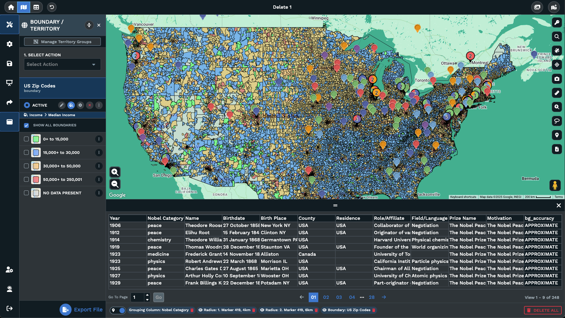
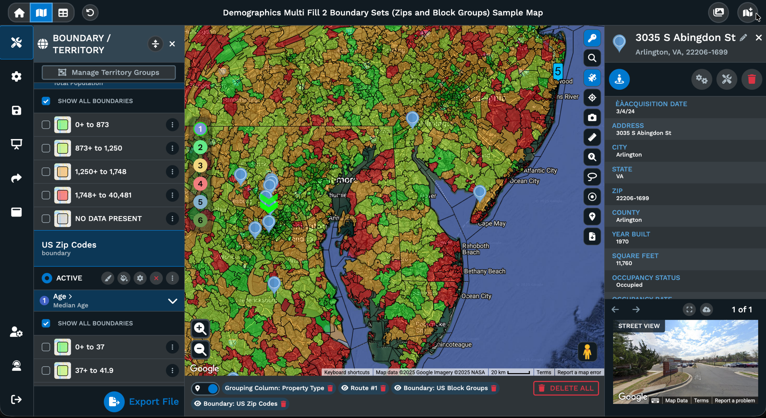
Can the legend appear on the exported image?
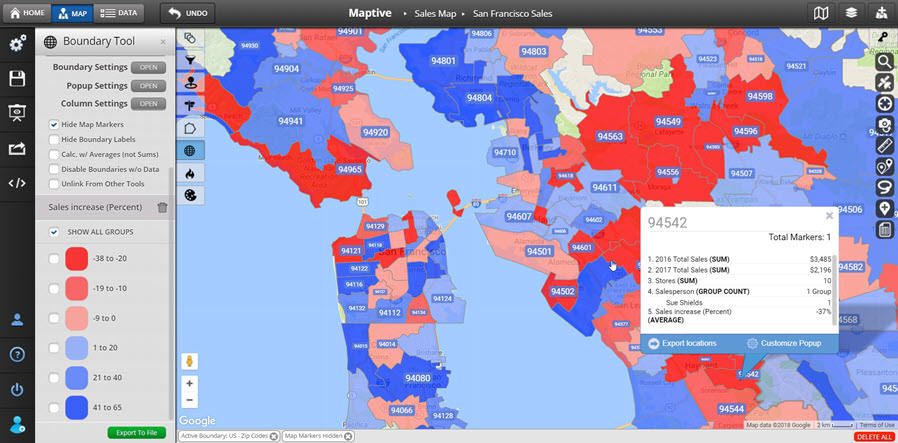
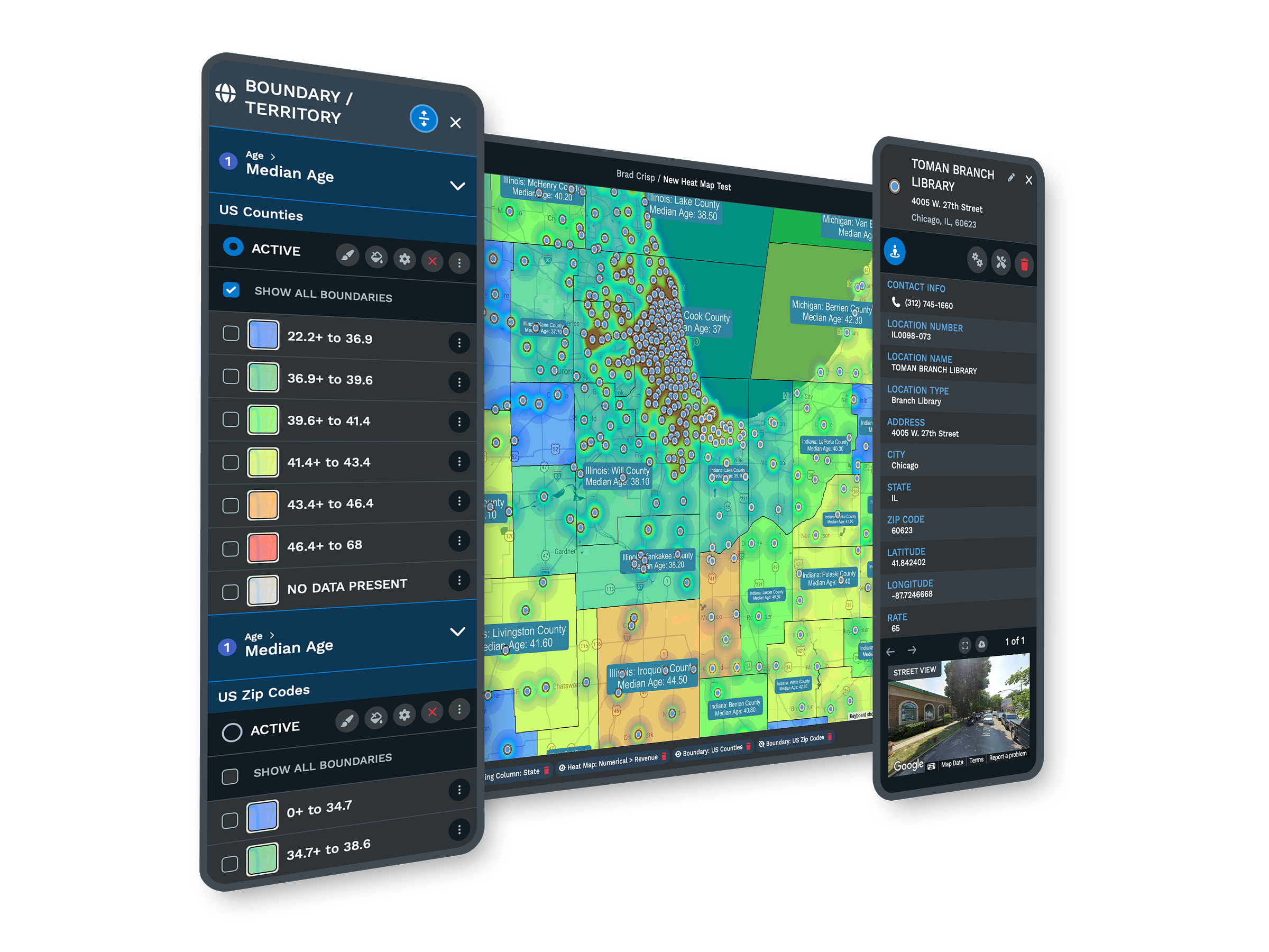
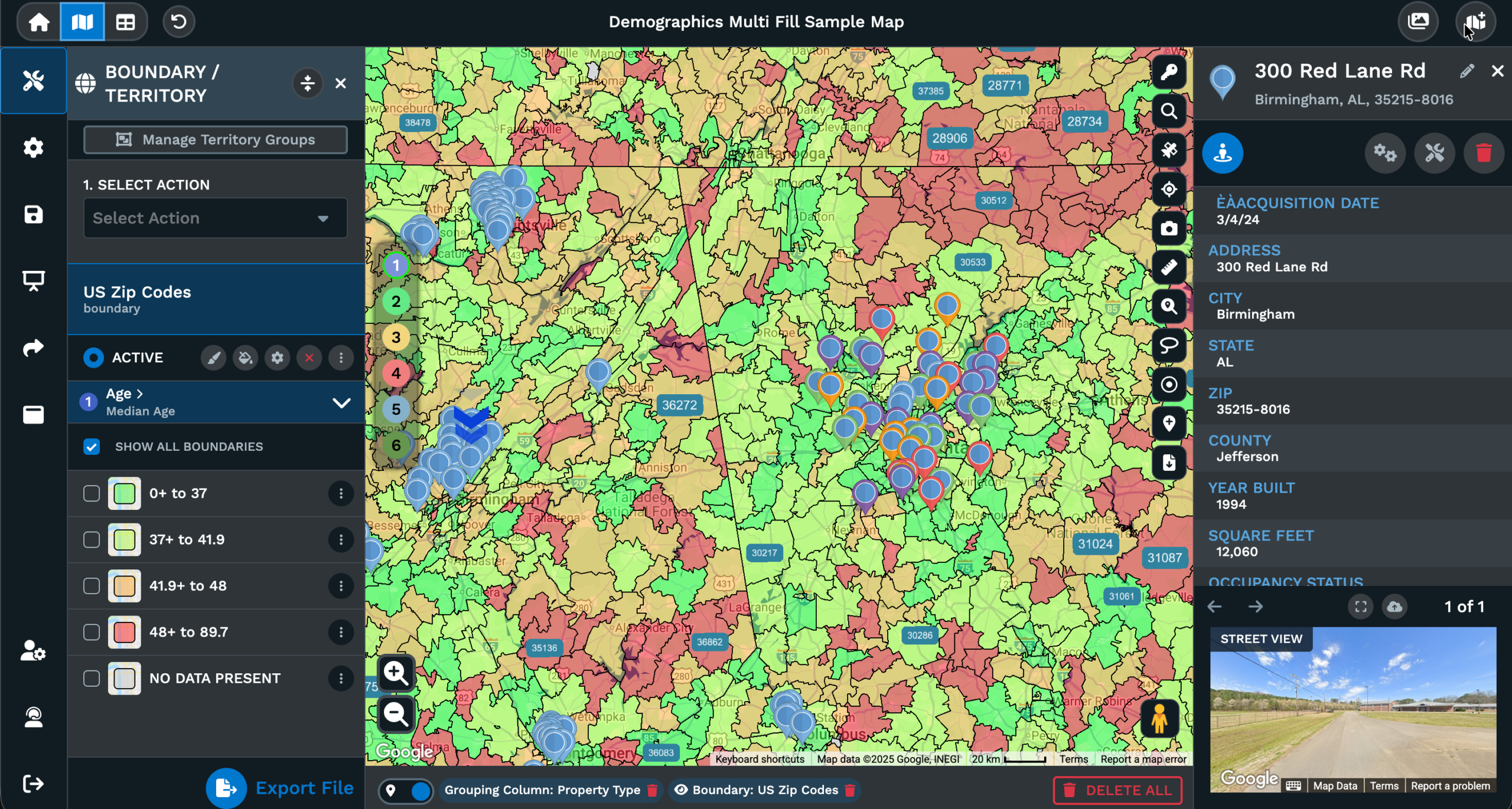
Yes. The Export Styles list inside the Export Map Image dialogue includes a Legend option and a Map + Legend option for the export. Legend exports only the legend of the grouping or boundary tool, which works as an inset image on a slide that already carries the map elsewhere in the deck. Map + Legend pairs the styled map with a simplified legend of the grouping or boundary tool together, producing a traditional map-with-legend image for the slide. The Map Key toggle inside Shared Maps/Presentational Maps controls what the legend covers.
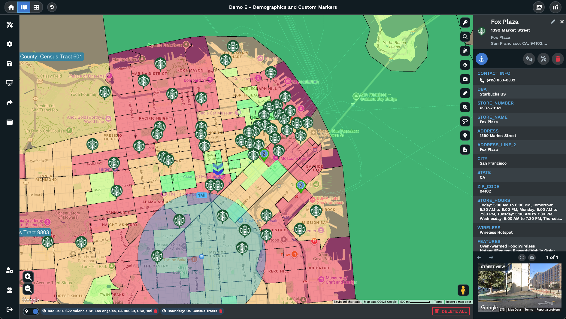
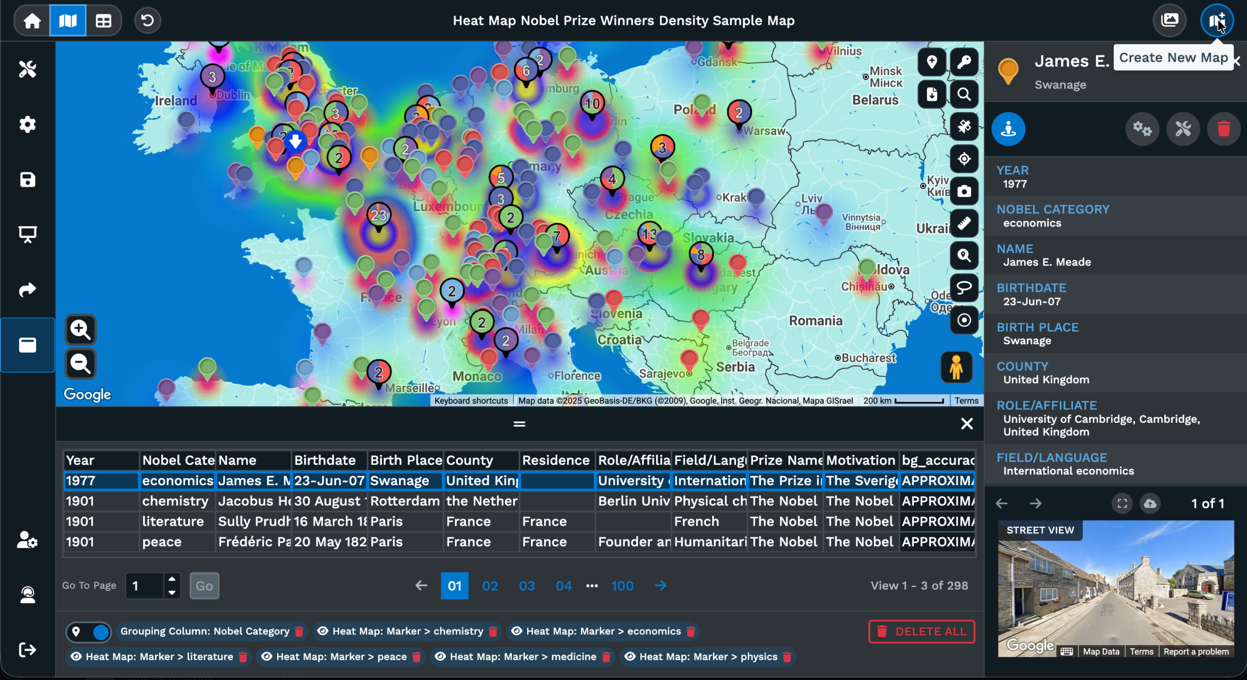
How do I make a heat map for a presentation?
Plot your data inside Maptive, switch on the heat mapping tool, and tune the layer until the hot zones read sharply on your screen during setup. Click the Export Map Image icon, pick PNG or JPG, pick Map or Map + Legend under Export Styles, pick Normal or Large size, then click Continue on the dialogue. The styled heat map downloads as an image file that pastes into a PowerPoint, Keynote, or Google Slides layout without anyone in the audience asking what they are looking at on the slide.
Can I match my company branding on the map?
Yes. Map Settings carries a Shared Maps/Presentational Maps menu with a Theme Style switch that flips the map to a dark or a light look to line up with the slide template colors. The base map and the marker styling can be tuned before the export so the image that downloads to your desktop carries the colors you picked for the brand. Display Title/Description also lets you carry over a map name and notes that line up with the deck headline on the slide itself easily.
What size should a map image be for a slide deck?
Pick Normal size for a thumbnail inset on a busy layout where the map plays a supporting role beside the text and the charts on the slide. Pick Large size for a full-bleed cover slide or a printed handout copy of the deck where the map carries the visual weight on its own. Both size options share the same styled view in Maptive, so the map on the cover slide and the map on the agenda slide stay visually aligned. The size you pick in the Export Map Image dialogue applies to the downloaded file.
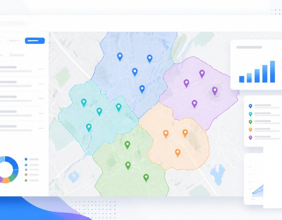
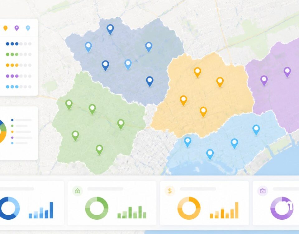
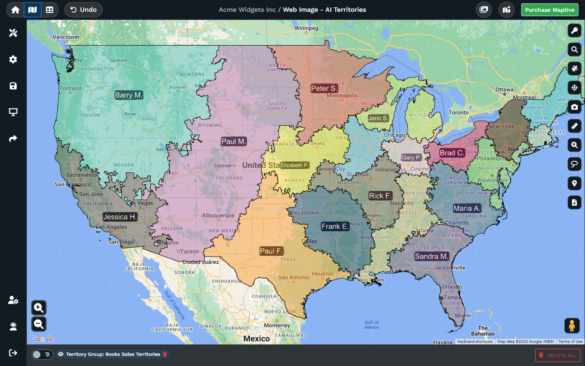
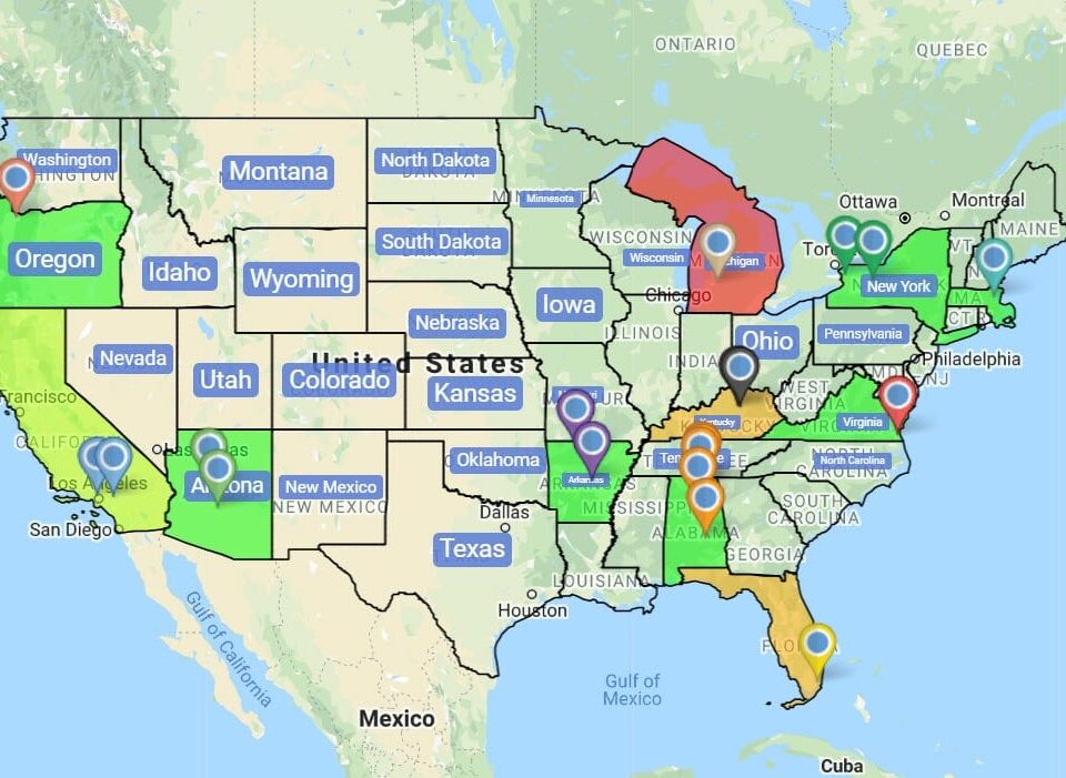
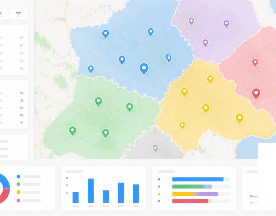
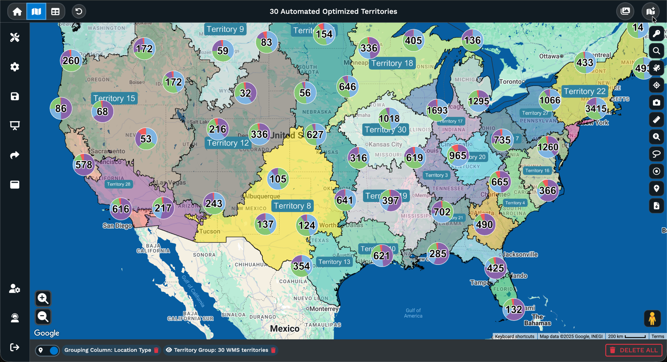
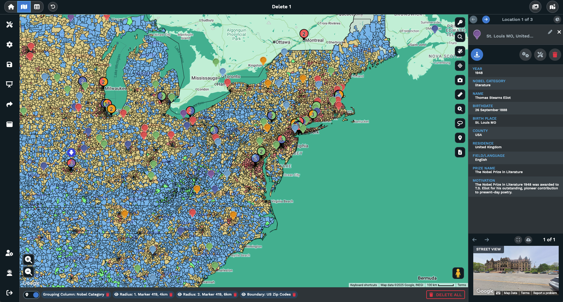
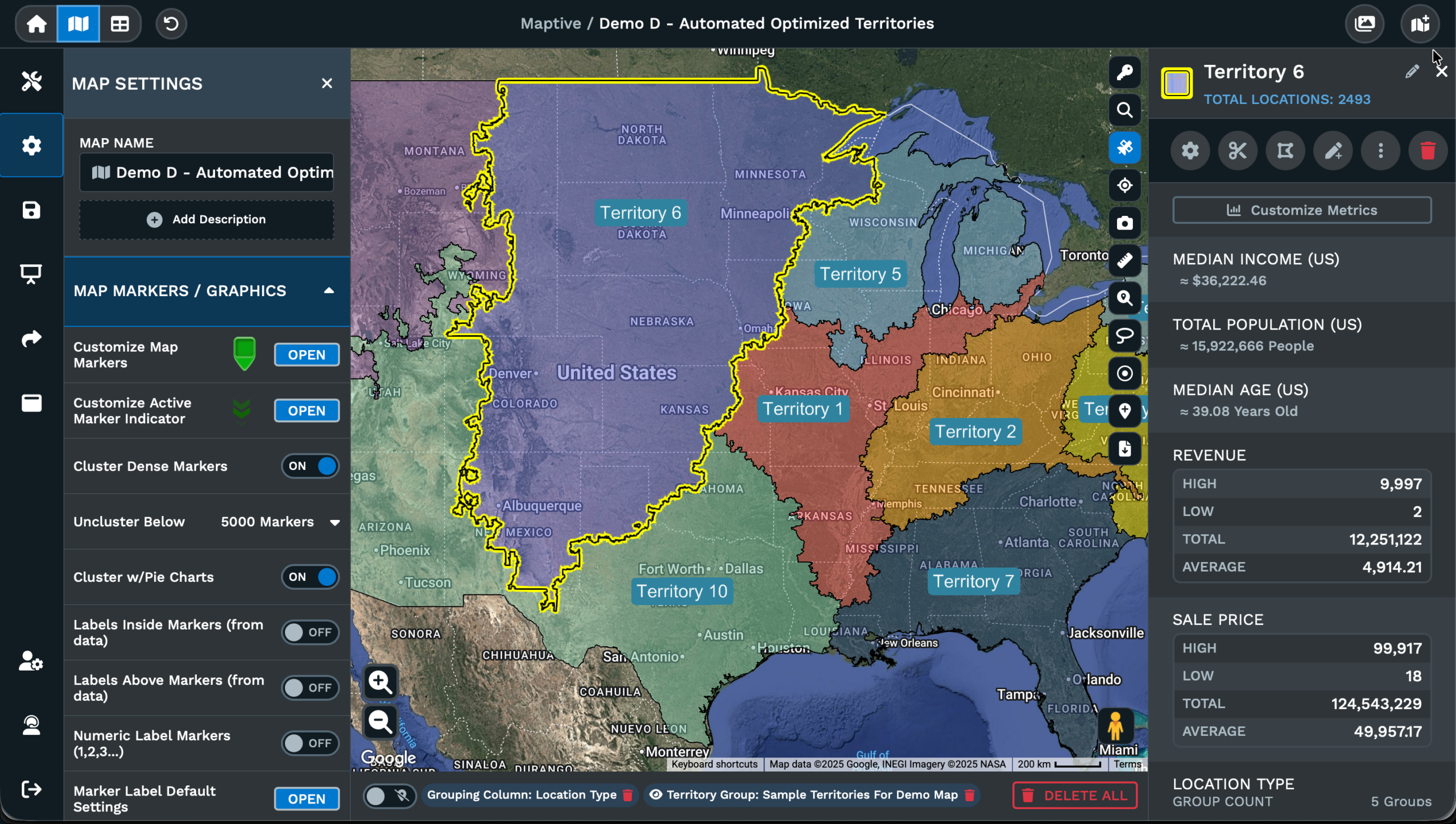
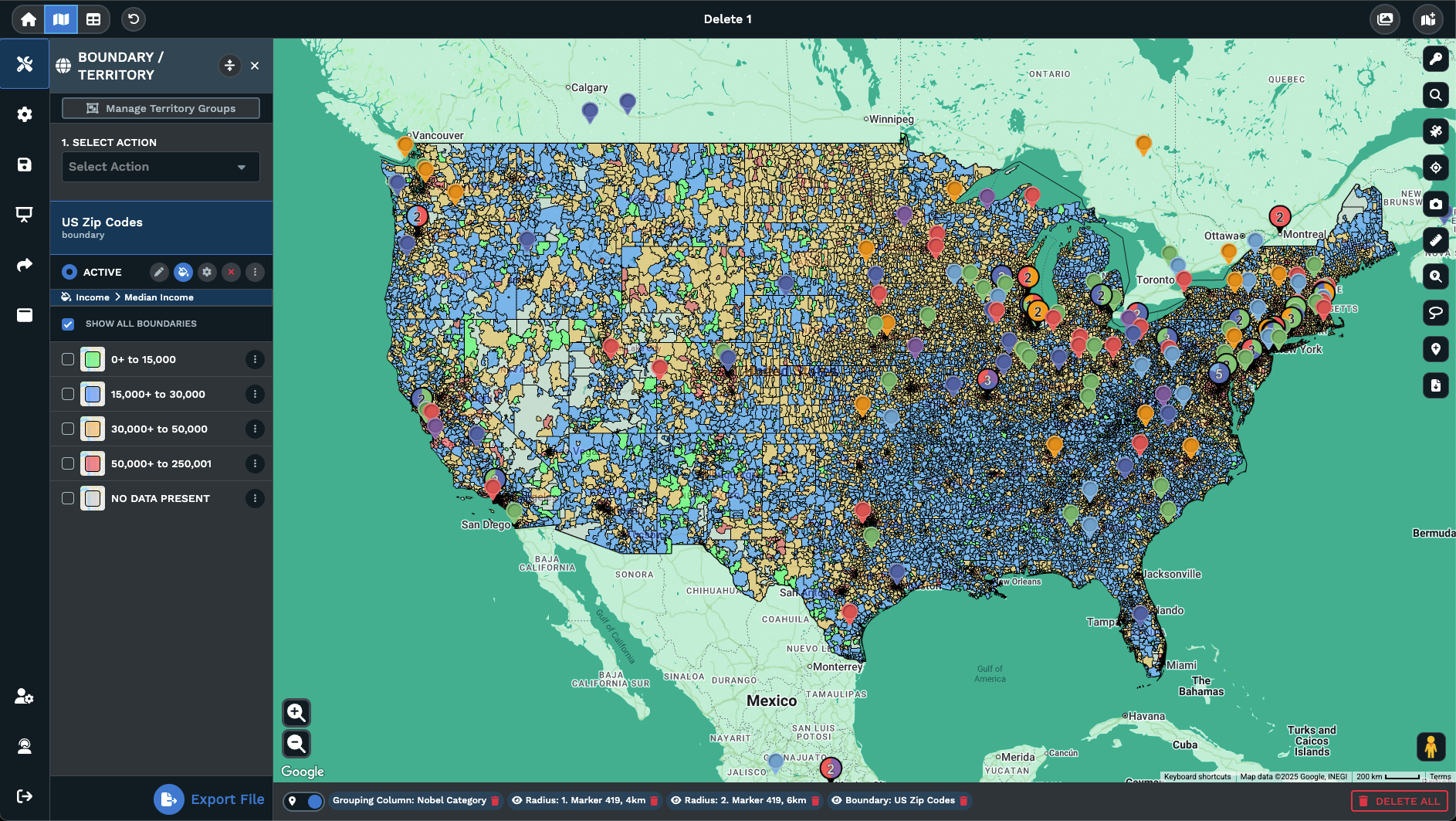
Can I show sales territories on a map for a slide?
Yes. Build the territory layer inside Maptive using the grouping tool or the Geographic Boundary tool together, then pick Map + Legend inside the Export Map Image dialogue. The exported image carries the territory shading and the simplified legend together, which works for a slide that has to explain coverage at a glance to a leadership audience. Pick PNG for projected slides or PDF for a handout copy of the deck, pick Normal or Large size, and click Continue to download the file to your desktop quickly.
Can I embed a live map in a web slide deck?
Yes. Open Map Settings and find the Shared Maps/Presentational Maps menu inside it. The bottom of that menu carries an iFrame snippet for embedding the map on a web page. The same menu carries toggles for Restrict zoom level and Restrict Map Panning, so the embedded copy of the map only moves where you let it move during the talk. Pair the embed with the Map Key toggle and the Theme Style switch to keep the live version aligned with the deck styling on screen.