



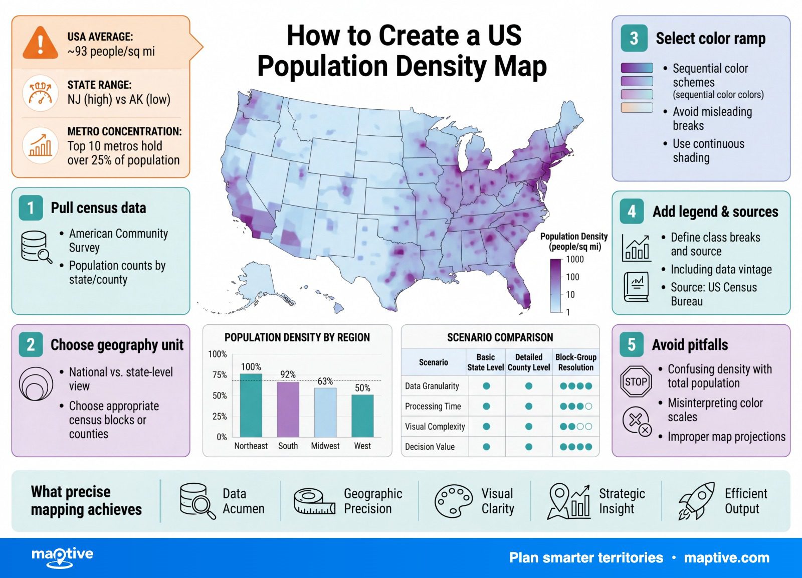
You create a US population density map by gathering a population count for a census geography, dividing each area’s population by its land area to get a density in people per square mile, and shading every area on a color ramp so darker means more crowded.
Pick which census geography you build on before you touch a color, because that one choice fixes what the finished map can say. A county map, a tract map, and a ZIP-area map of the same population tell three different stories, so the geography you pick decides which of the three you get.
People per Square Mile, and Why the Unit Decides the Density Map
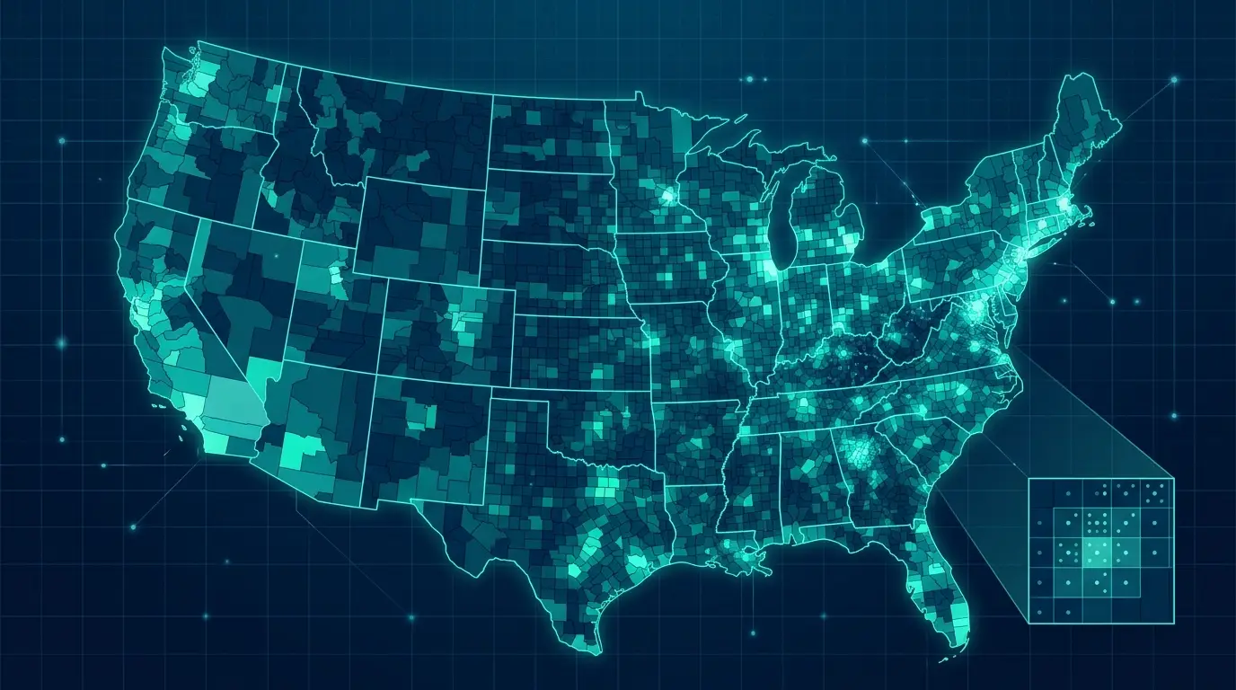
Population density is the number of people per square mile of land, and it answers how many people would live in one square mile if everyone were spread evenly across the area. The national figure is 94.83 people per square mile from the 2023 American Community Survey, with roughly 90 to 95 as the durable round number. For scale, the resident population reached 341.8 million as of July 1, 2025, up about 0.5% over the prior year, the slowest growth in several years.
That national average is the least interesting number on the map, because it hides an enormous spread. Washington, D.C. was 11,130 people per square mile in 2023, while Alaska was 1.29, a range of more than 8,000 to 1 between the densest and the sparsest jurisdiction. A density value, a rate per unit of land, is what makes those places comparable in the first place, where a raw headcount would only tell you that more people live in California than in Wyoming.
A national density map is mostly empty by design, and that surprises people the first time they build one. About 80% of Americans live in urban areas that cover under 3% of the land, so the honest map is a few intense corridors against a vast pale background, which is the real shape of the country. A useful way to hold the shape in your head is that the country splits into thirds by density, a small dense third, a middle third, and a vast sparse third, each holding roughly the same number of people. Once you expect that lopsidedness, the mostly empty map looks less like a mistake and more like an accurate picture of where the population is concentrated.
How to Choose the Census Geography to Map
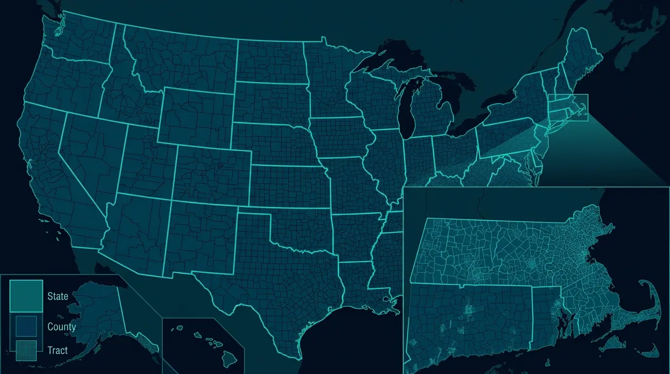
More than any later choice, the census geography you build on sets how much detail you see, how reliable the data is, and how fast the map renders. Census geographies form a ladder from coarse to fine, and where you build on that ladder shapes all three of those at once.
The Nesting Ladder From State to Block Group
The geographies nest cleanly inside one another, running from the nation down through regions, states, counties, census tracts, block groups, and finally census blocks, with each smaller unit fitting fully inside the larger one. A census tract is built to hold about 4,000 people, ranging roughly 1,200 to 8,000, and it is the standard unit for neighborhood-level work. A block group, the subdivision below it, targets about 1,500 people in a range of 600 to 3,000, and it is the smallest geography for which the American Community Survey publishes its detailed sample data, so it is the practical floor for most demographic maps. The census block underneath that is roughly a city block and has only the once-a-decade headcount, not the survey detail.
Matching the Unit to the Decision
The tradeoff is the same at every rung. A smaller unit shows a finer pattern but carries noisier data and renders more slowly, while a larger unit is smoother, more statistically reliable, and faster to draw, at the cost of blurring the local concentration you may be trying to find. There are about 3,100 counties but roughly 85,000 census tracts, and the jump from a county map to a tract map is where a browser starts to chug. The workable habit is to prototype at county level for speed and drop down to tract or block group only once a question genuinely needs neighborhood resolution. A national market overview rarely needs anything finer than counties, and forcing it to tract level mostly buys slow renders and a cluttered picture, while a decision about where to place a single store depends entirely on the neighborhood scale, where a county average would average away the very block that matters. Choosing the unit is itself part of the analysis, which is why it is worth deciding deliberately rather than accepting whatever the tool defaults to.
The ZCTA Exception
ZIP codes tempt everyone, because they match how businesses already think about regions, but they sit off the clean census ladder, and the reason matters here for one specific failure. Every other census unit nests, so block groups roll up into tracts and tracts into counties without a seam. The Census tabulation areas built to stand in for ZIPs nest inside nothing but the nation, so a single one can straddle two or three counties or a state line, some come in disconnected pieces, and uninhabited land or water can be left unassigned entirely. The practical consequence shows up as blank pockets on the map, and those holes are easy to misread. A blank patch does not mean zero people. It means no unit was assigned there, so treating the gap as a finding will mislead any market read built on top of it. When the analysis ties back to counties or states, tracts and block groups are the cleaner choice.
How to Build the Map Once You Have Picked the Unit
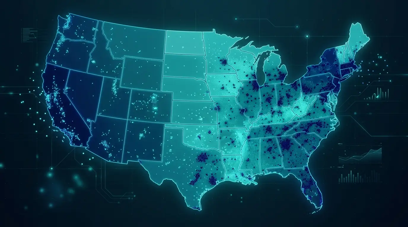
With the unit chosen, the build is a short, repeatable sequence, and most of the failures happen at the join rather than the shading.
Pull the Right Data From the Census
A density map needs two files, a population table for your geography and a matching boundary file that carries the land area. The population can come from the 2020 decennial count, which gives exact figures down to the block, from the American Community Survey, which adds the demographic detail between censuses, or from the annual Population Estimates, the source of the 341.8 million national total. The survey data comes in two release windows, and the difference matters for the map. One-year estimates are the freshest but exist only for places of 65,000 or more people and carry wider margins of error, while five-year estimates cover every geography down to tract and block group and are far more reliable, which makes them the default for any fine-grained density map. Do not mix the two windows on a single map. One more detail saves a lot of confusion later. Use land area, not total area, as the denominator, or large lakes and bays will pad the bottom of the fraction and make coastal and Great Lakes units read as far emptier than they are.
Join the Table to the Boundaries Without Breaking It
The population table and the boundary file connect through the GEOID, the FIPS code that names each geography. This join is where analysts lose an afternoon, because it can fail without any error at all. When a FIPS code is stored as a number rather than text, the leading zero drops off, so Alabama’s “01” becomes “1” and no longer matches the boundary file’s “01”. The map still renders, with half the geographies coming back blank or unmatched and no warning to point you at the cause. A text-versus-number mismatch on the join key is the usual culprit, and checking that the codes line up as text before you shade anything is worth the minute it takes.
Normalize, Classify, and Shade
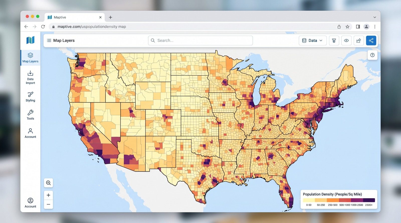
With the data joined, divide each area’s population by its land area to get the density value, and resist re-dividing anything that is already a rate, since a median or a percentage is an intensity and normalizing it twice produces nonsense. Then sort the density values into bands, usually four to eight of them, and know that where you set the breaks changes which regions read as dense, because density is always skewed and the same values can be cut to flatter the cities or the countryside. The practical move for density is to put the cuts where the distribution itself thins out, so the bands track real clusters rather than even arithmetic slices. Shade the bands on a single-hue ramp with darker for higher, add a legend and labels, and the map is done. Because the breaks decide which regions read as dense before you have argued for any of them, choose them deliberately instead of leaving the default in place. In Maptive, the heat-mapping tool separates marker density, where each point counts equally, from numeric weighting, where each point carries a column value, and territory boundaries can be drawn from states, counties, ZIP areas, or tracts, with more than 50 Census variables available down to the block group.
How to Read a Density Map for Market Sizing and Site Selection
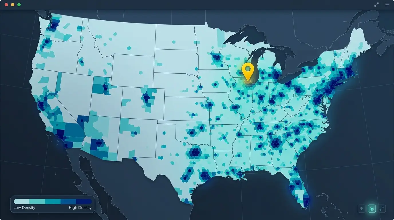
A finished density map pays off when it informs a location decision, and reading it well starts with separating two questions it can answer at once. Where the country is dense now and where it is growing fastest are not the same map. Density still concentrates on the coasts and in the big metros, with New York the densest major city and the Northeast Corridor, coastal California, Chicago, and Dallas as the recurring clusters. Growth, meanwhile, is largely a Southern and mountain-West story at the moment, with nine of the ten fastest-growing metros from 2023 to 2024 sitting in the South. A site decision that confuses the two ends up chasing yesterday’s density or tomorrow’s growth without meaning to.
For trade-area work, the density map becomes the input to the next step rather than the finished product. Draw distance rings or drive-time zones around a candidate location, then read the population density inside the primary, secondary, and tertiary zones to estimate how many people you can reach. Different formats need different density floors, since a convenience store works on far less surrounding population than a specialty boutique or a destination retailer. From there the saturation math is simple. Divide the population in a zone by the number of competitors in it to get residents available per location, and compare that against a benchmark you trust. The reason density makes this trustworthy is that it normalizes for the physical size of each zone, so a small dense trade area and a large sparse one can be compared on equal terms instead of by how big they look on the map. The same land-area-versus-total-area check from the data step still applies before you trust any zone read, because a county that is half water reads far emptier against its full extent than against its dry land, and a single mislabeled column can tilt every comparison you draw from the map.








