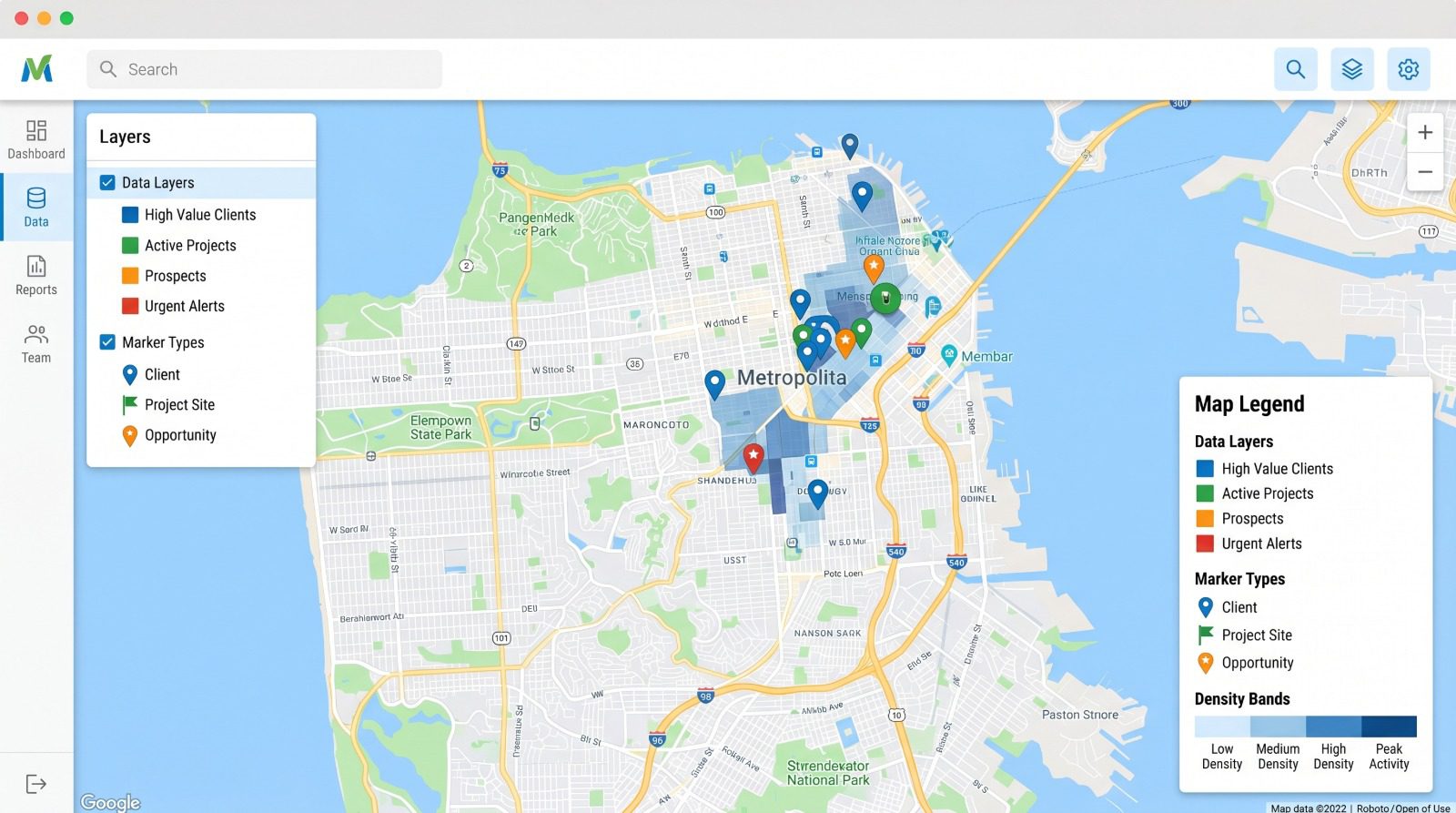
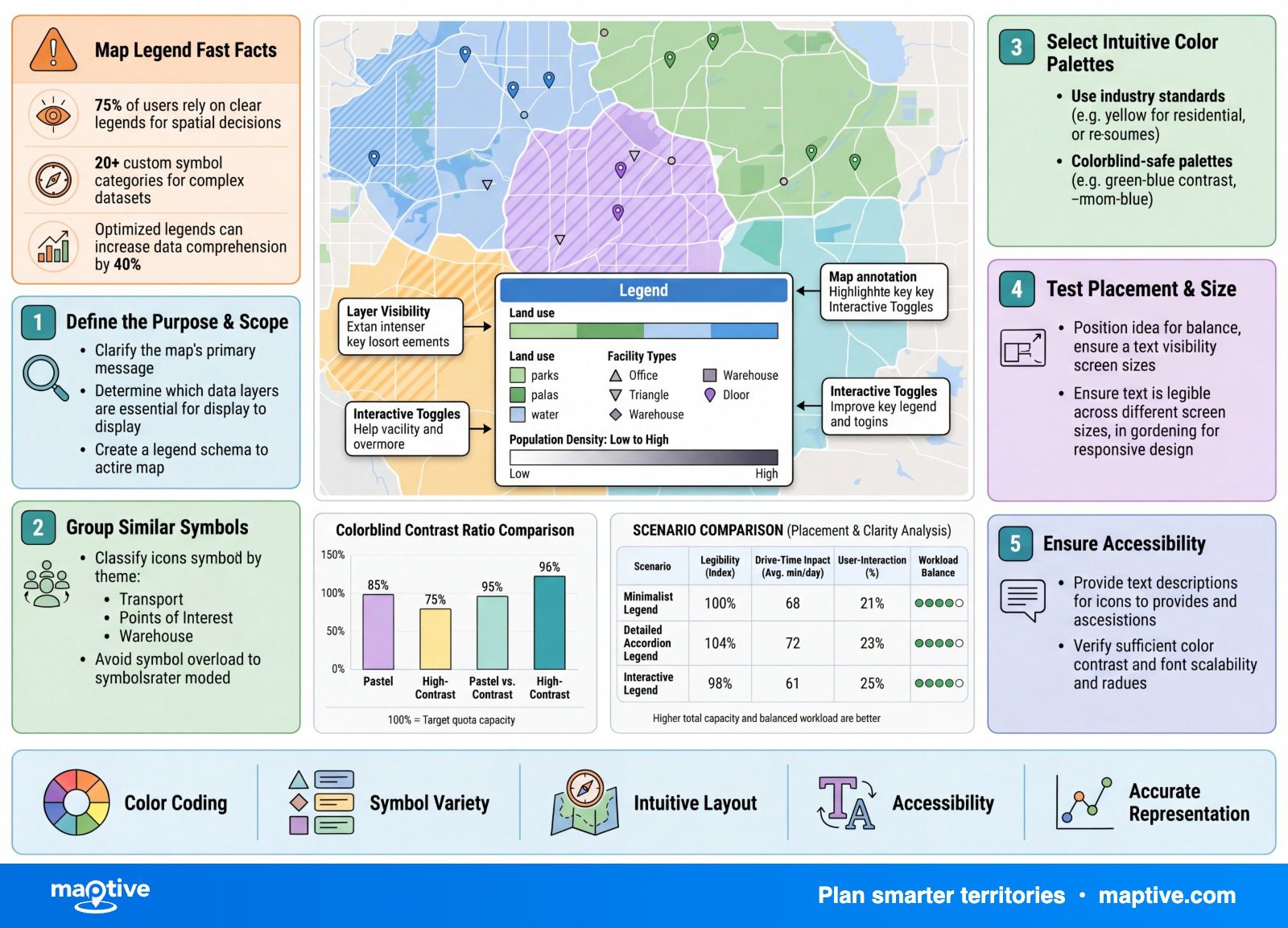
You create a map legend by grouping your markers by a data column and letting the mapping tool assign a color, and sometimes a size, to each group. The legend is the panel that lists those color-to-value and size-to-value pairings so a reader can translate the markers back into the data.
The legend is a byproduct of how you grouped the markers rather than something you build at the end. That is also why a color-coded map shared without a legend leaves its colors meaningless.
What the Legend Has to Do

A legend, also called a key, is the graphic that explains what the colors, symbols, and marker sizes on a map stand for. The two words mean the same thing in current use. There is a historical distinction worth one line, that a key was once a plain list of symbols while a legend implied a fuller explanation, but you do not need to honor it on a working data map.
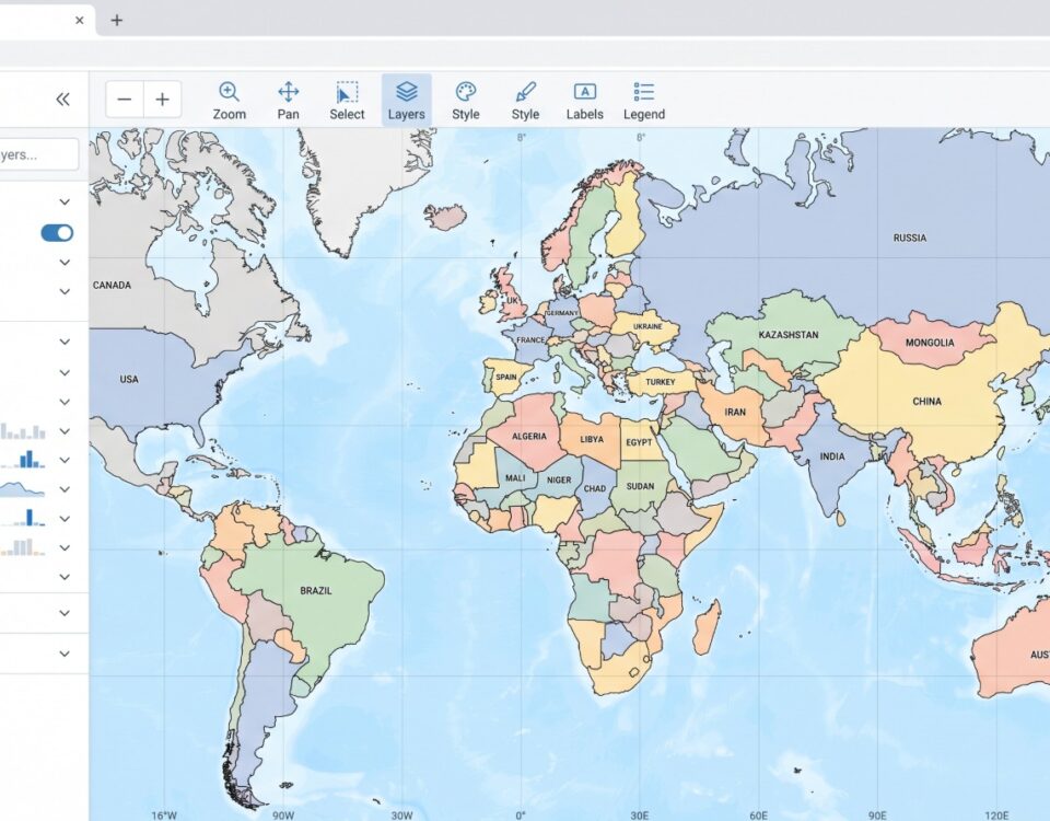
What the legend has to deliver is simple to state. It pairs each swatch or marker size with a short label naming the group or value range it represents, so a reader can match a color on the map to a meaning. Without it, a reader cannot reliably interpret a thematic map and can draw the wrong conclusion from the colors, which is why a finished data map is not handed over without one.
The useful way to think about it on a data map is that the legend describes the grouping you already chose. You pick a column, the tool colors the markers by it, and the legend lists the result. That makes the grouping decision the real legend design, which is where the work starts. For a map with only a handful of directly labeled points, you can skip the legend and label the points in place, but once a map has many groups, a legend reads more cleanly than labeling everything in place.
Group Your Markers to Build the Legend

The first decision is what you want the map to show, because the column you group by produces the legend you get. You open the grouping controls, pick the column, and the tool assigns a color or a size to each value in it. In Maptive this is Map Tools, then the Grouping Tool, then selecting the column to group by. The shape of that column, text or number, sends you down one of two paths.
Grouping by Category for Identity
When the column holds identity data, a rep name, a territory, an account status, or a product line, you group by category. Each distinct value gets its own hue, and the legend becomes a list of named groups paired with their colors. Hue here stands for identity rather than order or magnitude, so the colors do not need to mean more or less of anything, only different from one another. This is the version leadership reads fastest, since the question it answers, who owns what or what sits where, is a matter of telling groups apart at a glance.
Grouping by Numeric Range for Magnitude
When the column holds numbers, sales, deal size, or population, you group by numeric range. The values are sorted into bands, often shown darker for higher values, and the legend lists each band with its shade. The point to hold in mind for the legend is that where you set the cutoffs between bands is an editorial choice the data does not make for you, so the same column can produce two legends that rank the regions differently depending on where the lines fall. For the legend that means the band labels have to read as deliberate intervals a viewer can trust, with no awkward overlap or gap between one band’s top number and the next band’s bottom.
In Maptive you check “group using number ranges” and use “Set Number Ranges” to set the cutoffs and the number of bands, and the tool switches to ranges automatically once a column has more than 500 distinct values. Magnitude can also be shown through marker size instead of color, and range-grading the values into three to five sizes makes a cleaner size legend than scaling every marker continuously.
Color Choices for a Readable Legend
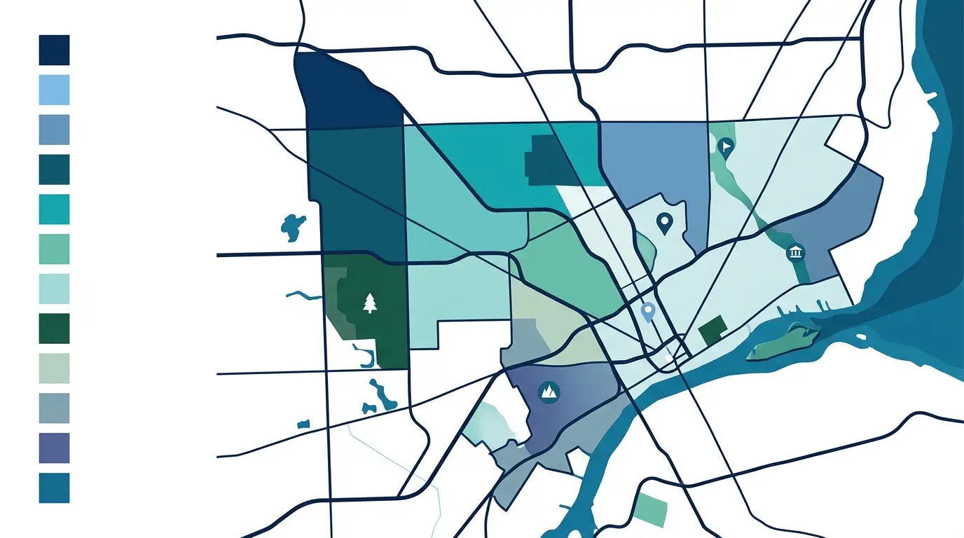
Color is the single biggest lever on how readable the finished legend is, and it is where most data maps fail without the maker noticing. Three choices do most of the work, and the first one matters more than the rest.
Match the Color Scheme to the Data Type
The scheme should match the kind of data it encodes, and there are three families to choose from:
Sequential (one hue running light to dark) for ordered numbers that go low to high, such as sales or population.
Diverging (two hues with a neutral middle) for data with a meaningful center, such as performance above or below an average.
Qualitative (a set of distinct hues) for unordered categories, such as rep or product line.
Matching the scheme to the data type is the largest legibility gain available to you.
A rainbow scale is the wrong choice for ordered data, even though tools still offer it. Its lightness rises and then falls from one end to the other, so a reader cannot tell which color means more without checking the key every time, and it fails for colorblind readers. A sequential light-to-dark scale fixes both problems, because the eye reads darker as more on its own and the pattern comes through without bouncing back to the legend. When the legend lists numeric bands, order them with the highest value at the top and work down, never the other way around.
Practical Limit on Colors and Bands
There is a stable ceiling on how many groups a reader can take in, and it is lower than most first drafts assume. About seven hues is the practical maximum for a categorical map, and three to seven classes is the working range for a numeric one, with sequential schemes reading cleanest at three to five steps and diverging ones at four to six. The published palettes most mappers reach for stop near twelve swatches, which is the same limit drawn from the other side, since past that the legend asks the eye to separate shades it no longer can.
Adding more bands past that point does not sharpen the map. The shades of adjacent bands grow too close for the eye to separate, so the extra granularity stops adding information and becomes clutter. Beyond roughly eight categories the trouble is less that colors cannot be told apart and more that a reader cannot hold that many groups in mind at once. The lesson usually arrives the first time someone renders a sixteen-row legend and finds a wall of near-identical shades nobody can read. When that happens, the fix is to collapse the bands rather than keep them.
Keep the Legend Colorblind-Safe
Color vision deficiency affects about 8% of men and 0.5% of women, so a sizable share of any audience may not see your palette the way you do. Red-green pairings are the classic failure, and a blue-orange contrast is the safer pair. A palette filtered to be colorblind-safe usually holds around six colors before two of them start to converge, which is one more reason the legend stays short. Pair color with a second channel, a shape, a label, or position, so the map survives both color blindness and a grayscale print. One practical habit saves a lot of rework. Judge the swatches at the small size they appear in the legend, around 12 pixels, rather than in a large preview block, because colors that look distinct when big can blur together once shrunk. Run the map through a color-blindness simulator before you share it.
Title, Place, and Label the Legend

Once the encoding is set, a few layout choices make the legend self-explanatory on the page. Title it after the data and its units, “Sales (USD, 2025)” or “Population per Square Mile,” and never with the word “Legend.” The reader already knows it is a legend, so that title only wastes the most prominent line on the panel.
Placement follows where the eye lands and where the data is not. Bottom-right is the default scan target, top-right works better when the lower portion of the map is dense, and either way the legend should sit over empty map space so it does not cover markers. A semi-transparent background, around 70 to 85% opacity, keeps the labels readable while letting the base map show through.
Labels reward consistency. Start each one with a capital, keep them parallel in structure, put units in parentheses, and use the same terminology the map uses. Name the groups so there is no judgment call left to the reader, because an ambiguous entry, where someone cannot tell if “trails” belong under transportation or stand on their own, stalls them. When the legend runs long, group related entries with white space or short subheads, and a grid layout reads tidier than a single tall column.
Share the Legend So Viewers Can Read It

The last step is handing the map to someone else. A static key at the bottom of an exported image works, but an interactive legend does more, letting viewers toggle which groups display and switch between grouped columns without touching the underlying map. In Maptive the working grouping panel becomes a clean viewer legend through two share settings. Turning on “Legend Replaces Grouping” gives viewers the key in place of the editing panel, and turning on “Display Legend Only” hands them the legend without the rest of the customization tools.
Shared with view-only permission, a colleague opens the legend, sees which color maps to which value, and switches groups on and off to focus the view, all without being able to change anything. The legend is the part of the map that does the explaining when you are not in the room, so it deserves as much attention as the data it describes.