


Build a Density Heat Map of Your Customers & Members
Staring at thousands of customer pins and wanting the general trend instead of exact points? Maptive puts a density heat layer over your addresses so hot and cold areas read at a glance.
No credit card required
- Drop a smooth density gradient over your customer, member, or ticket-buyer points to read concentration instead of exact locations.
- Heat every marker at once, or heat one group on its own, like a single membership tier or one state.
- Adjust radius, opacity, intensity threshold, and colors until the hot and cold areas are easy to read.
- Turn the gradient on or off, and hide the underlying markers so the heat layer reads by itself.
- Run more than one heat map on the same view, each in its own color, to compare two groups side by side.
- Build it from a plain address list with no GIS skills, then export the map image or share a link.
Trusted by teams at









Read the Concentration Behind Your Points
I love the heat map, and the sharing capability is very efficient. The initial data upload is easy and the settings are intuitive.
Building Your Heat Map in Maptive
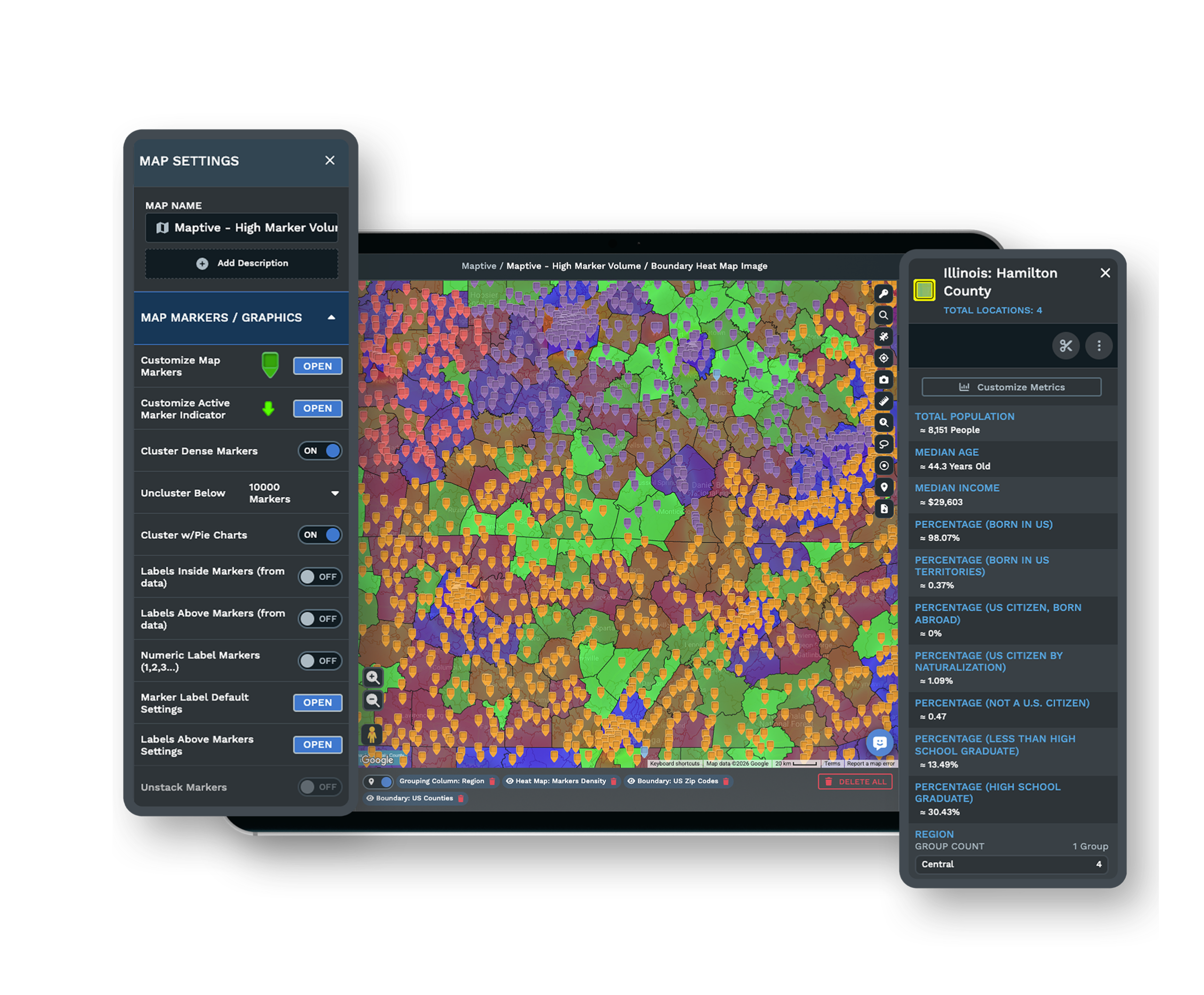
-
1
Open the Heat Mapping Tool
Upload and plot your customer or member list, then open the Heat Mapping Tool in Map Tools. The default Marker Density style heats every point on the map, so you see where all your buyers sit without touching a single pin.
-
2
Add the Heat Map, or Pick One Group
Click Add Heat Map to lay the density gradient over your points. To heat one segment on its own, choose Marker Density for a Specific Group, use Select Sample, pick the column such as membership tier or state, and set the value like AZ. The layer then reads only those addresses.
-
3
Tune Radius, Colors, and Gradient
Move the radius to grow or tighten each hot spot, set opacity so the base map still reads underneath, and adjust the intensity threshold to control how many nearby points count as hot. Change the colors, or turn Gradient On for a single-color fade from light to strong.
-
4
Hide the Pins, Compare, and Share
Turn on Hide Map Markers so the gradient reads on its own, and add a second heat map for another group, each color set apart automatically. Use Unlink From Other Tools to filter your markers without moving the heat, then export the map image as a PNG or PDF, or share a link.
See Where Your Customers Concentrate
Start the 10-day free trial with no credit card. Upload your customer or member list, open the Heat Mapping Tool, and watch the hot spots form on your own data. Prefer a hand? A Maptive specialist will build the first heat map with you and set the radius and colors.
No credit card required
Frequently Asked Questions
How do I build a heat map of my customers?
Upload your customer list as an Excel file, CSV, or Google Sheet, and Maptive geocodes the addresses onto the map, correcting messy entries and missing ZIPs. Open the Heat Mapping Tool in Map Tools, keep the Marker Density style, and click Add Heat Map. A smooth density gradient forms over your points, warm where addresses pack together and cool where they thin out. From there you set the radius, opacity, and colors. Most people have a working customer heat map in their first session, with no GIS skills and no code.
Where are my members most concentrated?
The heat map answers that directly. Plot your member addresses, open the Heat Mapping Tool, and add a Marker Density layer, and the hottest colors mark the pockets where members pack in tightest. Widen the radius for a regional read or tighten it to pick out single neighborhoods. To compare one tier against another, use Select Sample and heat a specific group, then add a second heat map for the next group in its own color. You read concentration as a gradient, so you catch general trends without hunting through exact pins.
What is the difference between a heat map and clustered pins?
Clustered pins group nearby markers into a numbered bubble that breaks apart as you zoom, so you still read individual points. A heat map instead puts a smooth density gradient over your data, so a region glows warmer where more addresses fall and cooler where fewer do. That makes the heat map the better read when you want the general pattern rather than exact locations, like spotting where buyers cluster across a metro. You can hide the underlying markers so only the gradient shows, which keeps the concentration easy to follow.
Can I heat map only one group of customers?
Yes. In the Heat Mapping Tool, choose Marker Density for a Specific Group, use Select Sample, and pick the column you want to filter on, such as membership tier, plan, or state. Set the value, like AZ or Gold, and the heat layer reads only the addresses that match. You can add another heat map for a second group, and Maptive sets the colors apart automatically, so two segments sit on the same map without blending. This makes it easy to see how one group concentrates against another.
Can I hide the individual pins and show only the gradient?
Yes. The Heat Mapping Tool has a Hide Map Markers control that removes the points from view and leaves the density gradient on its own. Buyers who want the general trend, not exact addresses, get a cleaner read this way, and a shared map keeps individual customer locations off the screen. Turn the markers back on any time you want to check a single point. You can also use Unlink From Other Tools so filtering your markers does not change the heat layer underneath.
How do I adjust the radius and intensity of the heat map?
Open the heat map controls and move the radius slider to grow or tighten each hot spot, which changes how far a single point spreads its heat. The intensity threshold sets how many nearby points count before an area reads as hot, so you can play down thin scatter or bring out dense cores. Opacity lets the base map show through, and the color controls set the gradient. Turn Gradient On for a single-color fade from light to strong, which suits a simple hot-and-cold read.
Can I put two heat maps on the same map?
Yes. Add as many heat maps as you need on one view, and Maptive gives each a different color so the layers stay apart. A common setup heats one group, like current members, then adds a second layer for another, like lapsed members or ticket buyers, so you compare where each concentrates. Each layer has its own trash icon to remove it and an eye icon to hide it without deleting, so you toggle between reads. This gives you a side-by-side view of two audiences on one map.
Do I need GIS skills to make a customer density map?
No. The heat map is a menu choice in the Heat Mapping Tool, so you build it from dropdowns and sliders with no GIS training or code. Upload a plain address list, plot it, click Add Heat Map, and set the radius and colors. Geocoding handles messy addresses and missing ZIPs for you, so a raw customer export becomes a mapped density read in minutes. The US and Canada support team answers in under 15 minutes if you want help setting the radius or picking colors for a first map.
How many customer points can the heat map handle?
Maptive plots up to 200,000 markers on a single map using WebGL and the Google Maps Platform, so a large customer or member file heats without thinning your data first. Because the gradient reads density rather than each point, a heavy file often reads better as heat than as a wall of pins. If you want to focus, use Select Sample to heat one group, or apply the Filter Tool to the markers underneath while Unlink From Other Tools holds the heat layer steady.
Can I share or export the heat map?
Yes. Export the map image as a PNG or PDF, including a poster size up to 2048 by 2048 pixels, so the heat map drops straight into a deck or a printout. You can also share a live version through a password-protected link, a public link, or a one-line HTML embed, and presentation mode gives you a full-screen view for a meeting. A shared heat map keeps the same gradient a colleague sees when they open the link, so the read stays consistent across a team.








