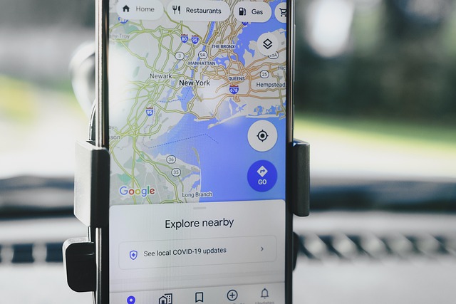
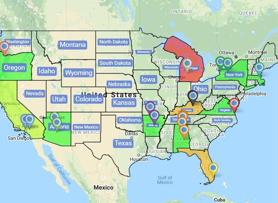
Driving Radius Maps
Want to draw a 10-mile circle around your warehouse and pull every customer inside? Open Distance Radius Circles, pick a center, set miles, and the circle paints to scale.
Driving Radius Around Any Hub
Distance Radius Circles: Pick a center, set the miles in Proximity Within, click Add Proximity Radius, and Maptive renders a circle to the distance you typed on your map.
Starting Location: Type a full address, drop the map pin, use the mobile device option, or click a marker and pick Add Radius from the tools icon on the right side menu.
Customize Metrics: Click inside the circle to open the right side popup, then pick the spreadsheet columns or US and Canada demographics you want rolled up for the area.
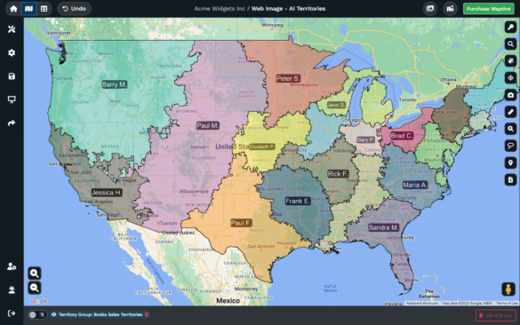
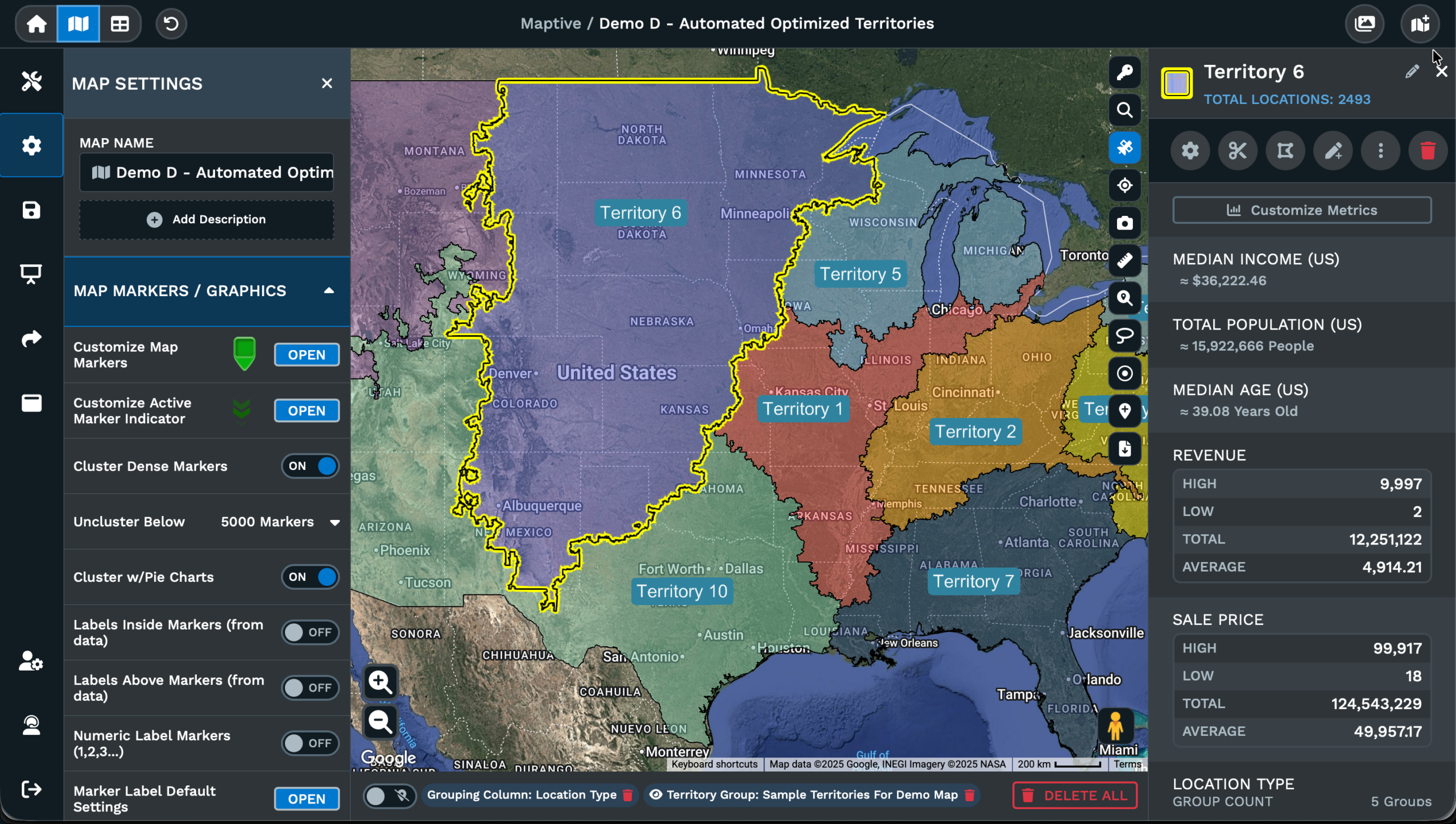
Apply To Group: Switch Apply To from Individual Location to Group, then pick a column like State or Industry, and Maptive draws a circle around each marker in the group.
Edit Proximity: Open the kebab menu on a radius, pick Edit Proximity, and the dialog opens name, miles, fill color, border color, fill opacity, border opacity, and stroke.
Export Locations: Open the kebab menu on a radius, pick Export Locations, and Maptive returns the rows inside as xlsx, tsv, or csv with straight line or driving distance.
Driving Radius Maps in 3 Steps
1
Open
Open Map Tools on your Maptive map, pick the Distance Radius Circles tool, and the entry form opens on screen for you.
2
Configure
Type a Starting Location or click a marker, enter miles in Proximity Within, then click Add Proximity Radius to draw.
3
View
The circle paints to the set distance, rows inside count up, and the popup returns demographics with your column totals.
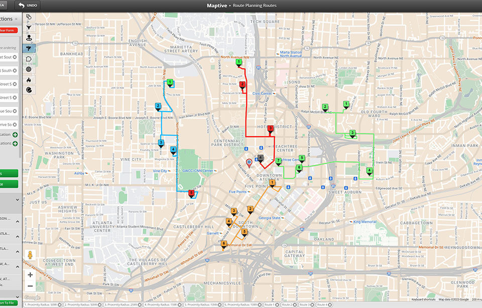
Compare Circle vs Polygon
Filter List by Distance
Rank Site Candidates
Set Delivery Mile Zones
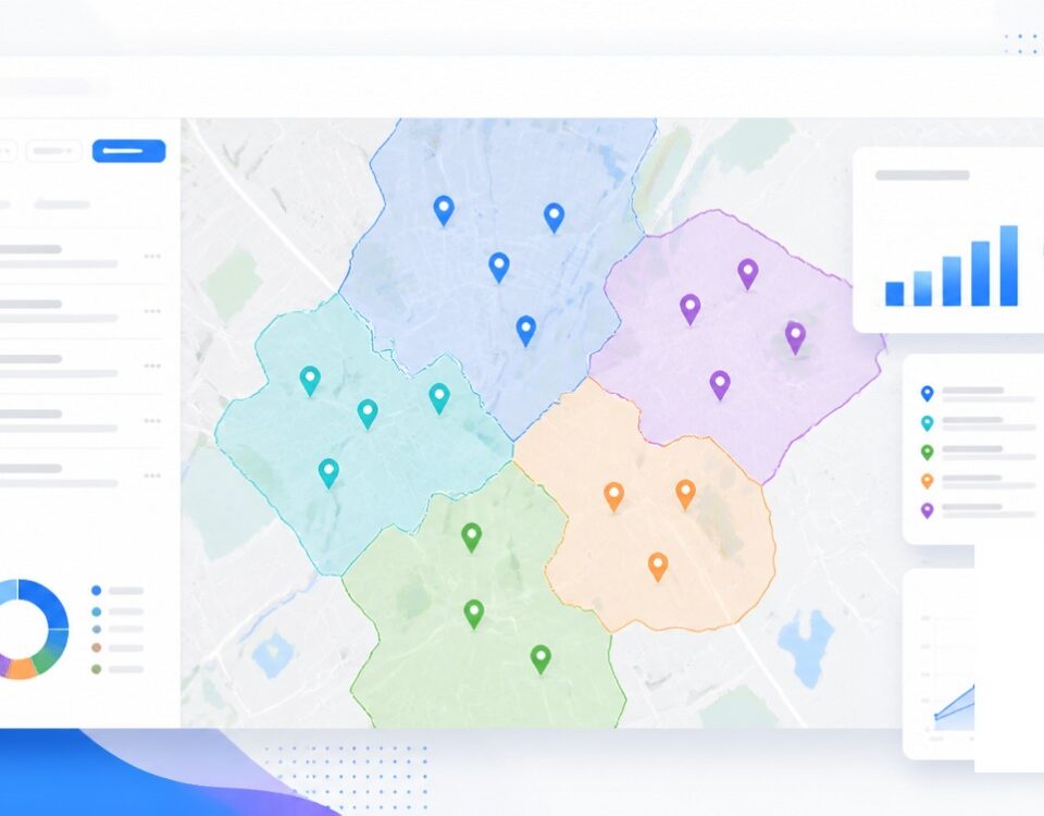
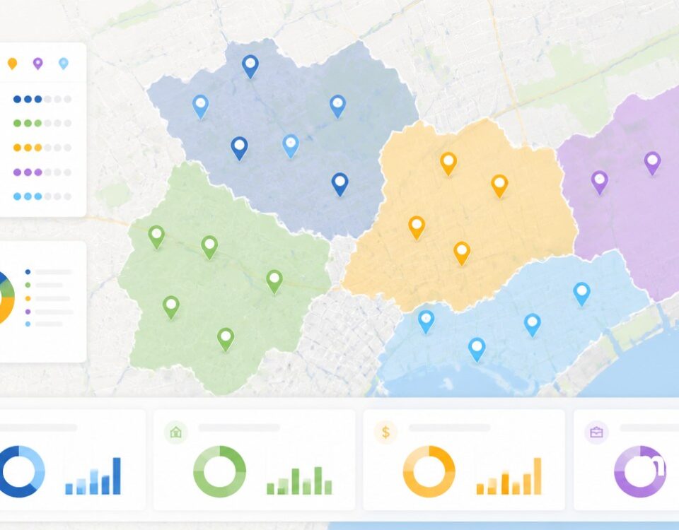
Build Balanced Territories
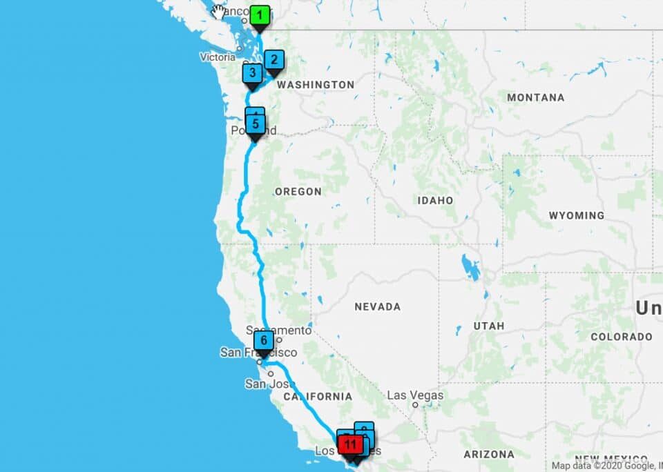
Stack Layered Radii
Coverage Mapping by Driving Distance
How the Radius Works
A driving radius map is a circle of set miles or kilometers drawn around a center point on a map. The center is a hub, a store, a warehouse, a customer address, or any point a person picks on the map. The circle paints to the distance the person types, equal in every direction around the hub, so a 10 mile circle reaches the same distance north as south or east as west.
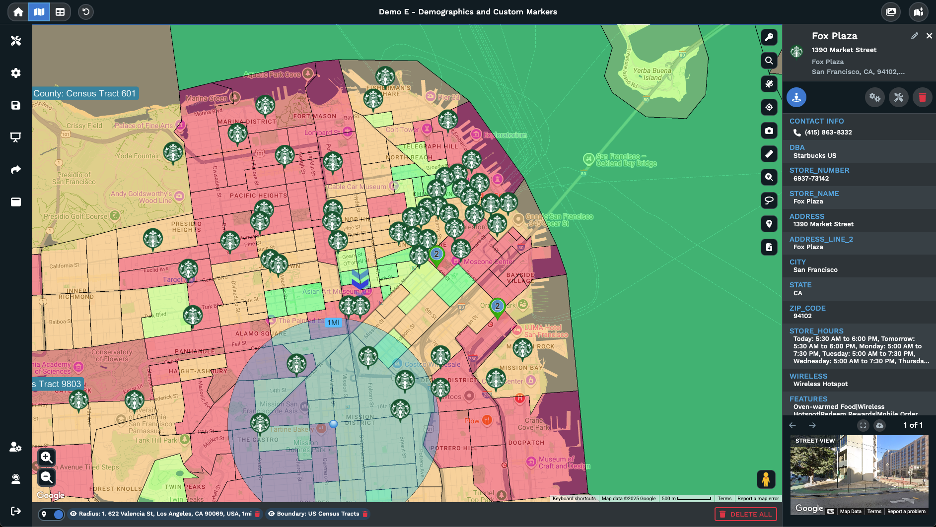
The data inside the circle is what makes the radius a planning tool instead of a graphic. In Maptive, a click inside the circle opens a right side popup that returns the count of rows from your spreadsheet within the radius. Customize Metrics on the popup adds spreadsheet columns and US or Canada demographic stats to the popup, so the area returns a real number for revenue, households, or any other column.
Driving radius maps work best when the question is distance from a hub, not travel time across a road grid. A 5 mile delivery boundary, a 25 mile rep range, or a 100 mile service area all ask the same question, which is every row inside a set distance of a single point. The Distance Radius Circles tool on Maptive returns that area on the map, with rows inside, totals on the popup, and an export ready for the team.
Drawing the Mile Circle
The Distance Radius Circles tool sits in Map Tools on a Maptive map. Open it from the menu, and a form opens for the center point of the circle. Type a full address into Starting Location, drop the map pin to click any spot on the map, use the mobile device location button for your current spot, or click a marker on the map and pick Add Radius from the tools icon on the right hand side menu.
Enter a number into Proximity Within, and the dropdown next to it switches the units between miles and kilometers for the circle. Pick a fill color, a border color, and a border thickness in the form, then click Add Proximity Radius to render the circle on the map. The radius arrives in the Selected Proximity Section with its own entry on the list, plus a kebab menu for the actions on that radius.
Apply To Group on the form switches the tool from a single center to a group of markers. Pick a category column on Select Group Column, like State or Industry, then pick the value on Select Group, and Add Proximity Radius draws a circle around every marker that matches the group. Filtering the data also filters the circles on the map, so a smaller set of markers leaves a smaller set of rings on screen.
Circle vs Drive Time
Maptive supports both a distance radius and a drive time polygon because each answers a different question on the map. The Distance Radius Circles tool draws a circle at set miles or kilometers around a point, the right pick when the question is pure distance from a hub. A 5 mile delivery boundary, a 25 mile rep range, or a 100 mile service area each treats every direction the same around the center.
The Drive Time Polygon tool paints a different area for the same hub. The polygon follows the road network, so a city with a river running through it produces a polygon with a notch where the river sits, and a sparse rural grid pinches the polygon in the directions roads do not run. A 5 mile circle and a 15 minute polygon for the same point can return very different coverage areas on the map.
Both tools sit in Map Tools on a Maptive map, and both work the same way for the rest of the workflow. A click inside the area opens the right side popup, Customize Metrics picks the columns that roll up across markers inside, and Export File ships the data for every radius and polygon on the map together. The choice between a circle and a polygon depends on the question, distance or driving time.
FAQs
What is a driving radius map?
A driving radius map is a circle of set miles or kilometers drawn around a center point on a map. The Distance Radius Circles tool in Maptive paints the circle for you. Pick a center by typing the address into Starting Location, dropping the map pin, using the mobile device option, or clicking a marker on the map. Enter the distance in Proximity Within, pick miles or kilometers from the dropdown, then click Add Proximity Radius. The output is a circle on your map with the rows inside, ready for the team.
How do I make a driving distance map?
Open Map Tools on your Maptive map, pick the Distance Radius Circles tool, and the form opens on screen. Type a full address into Starting Location or click a marker on the map. Enter the miles or kilometers you want for the circle in Proximity Within, pick a fill color and a border color if you want, and click Add Proximity Radius. The circle paints to the distance you typed, and a click inside opens the right side popup with the count of rows and any rolled up demographics for the area.
Can I switch between miles and kilometers?
Yes. The Proximity Within field on the Distance Radius Circles form sits next to a dropdown for the units. Pick miles or kilometers from the dropdown, and the circle resizes to match. The same dropdown is on Edit Proximity, so a radius already on the map can switch units after it was drawn. Open the kebab menu on the radius in the Selected Proximity Section, pick Edit Proximity, change the units, and click Save. The circle redraws to the new unit setting on the map for the team.
How do I export the rows inside a circle?
Open the kebab menu on the radius in the Selected Proximity Section and pick Export Locations. Maptive returns the rows from your data that fall inside the circle as an xlsx, tsv, or csv file, or a copy to clipboard option. The export form has options for all rows, the N closest rows to the center, or the rows outside the circle. A toggle picks straight line distance or driving time and distance for each row. Click Export Now to start the download, and the file arrives ready for use.
Can I add more than 1 circle to a map?
Yes. The Distance Radius Circles tool adds circles 1 at a time from the form, and the map holds every circle in the Selected Proximity Section. Add a 5 mile circle, a 10 mile circle, and a 25 mile circle on the same point, each through Add Proximity Radius, for a layered coverage view. Each circle has its own entry on the list with an eye icon to hide it and a kebab menu for actions. Export File from any kebab menu ships data for every radius on the map together.
What is the difference between a driving radius and drive time?
A driving radius circle measures pure distance from a center point in miles or kilometers, equal in every direction around the hub. A drive time polygon measures the area a driver can reach from a point inside a set time, drawn to the road network. A 5 mile circle and a 15 minute polygon for the same hub can return very different areas on the map. Maptive offers both tools. The Distance Radius Circles tool draws the circle, the Drive Time Polygon Tool draws the polygon, and both can sit on the same map.
How do I customize the data inside the popup?
Click anywhere inside the circle on the map, and the right side popup opens with the count of rows from your data within the radius. Pick Customize Metrics on the popup, or open Customize Metrics from the tool window on the left side. The metrics dialog lets you pick which spreadsheet columns to roll up, plus US and Canada demographic stats for the area inside the circle. Save the picks, and the popup returns a real per-circle number for revenue, households, or any column on the data.
Can I add radius circles to a group of markers?
Yes. Switch the Apply To dropdown on the form from Individual Location to Group. Pick a category column on Select Group Column, like State, Industry, or any column with a value per marker. Pick the value you want on Select Group, then click Add Proximity Radius. Maptive draws a circle around every marker that matches the group on the map. Filtering the data also filters the rings on the map, so a smaller set of matched markers leaves a smaller set of rings for the team to read.
How do I edit a circle after I draw it?
Open the kebab menu on the radius in the Selected Proximity Section and pick Edit Proximity. A dialog opens with fields for Proximity Name, Proximity Within, Proximity Fill Color, Border line color, Proximity Fill Opacity, Border Line Opacity, and Border line stroke. Change any of the fields, and click Save to write the change back to the circle on the map. To move a circle, double click the center point, hold and drag the circle to the new spot, and click the green check to save the move.
Can I export distance for every row inside?
Yes. Open the kebab menu on the radius and pick Export Locations. The export form has a distance option that toggles between straight line distance and driving time and distance per row. Pick the option you want, and the file returns the rows inside the circle with that distance column appended. For multiple circles on the map, an option returns each row once for the radius it sits closest to. The output is an xlsx, tsv, or csv file with rows and distance per row for the next pass.