


Mapping Software for Journalists & Bloggers
Does your next story have a map in it? If the dataset behind it includes places, Maptive can turn those places into the graphic your readers explore. Upload a dataset and have a map before deadline.
No credit card required
Trusted by teams at
















How Do Journalists Map Data?
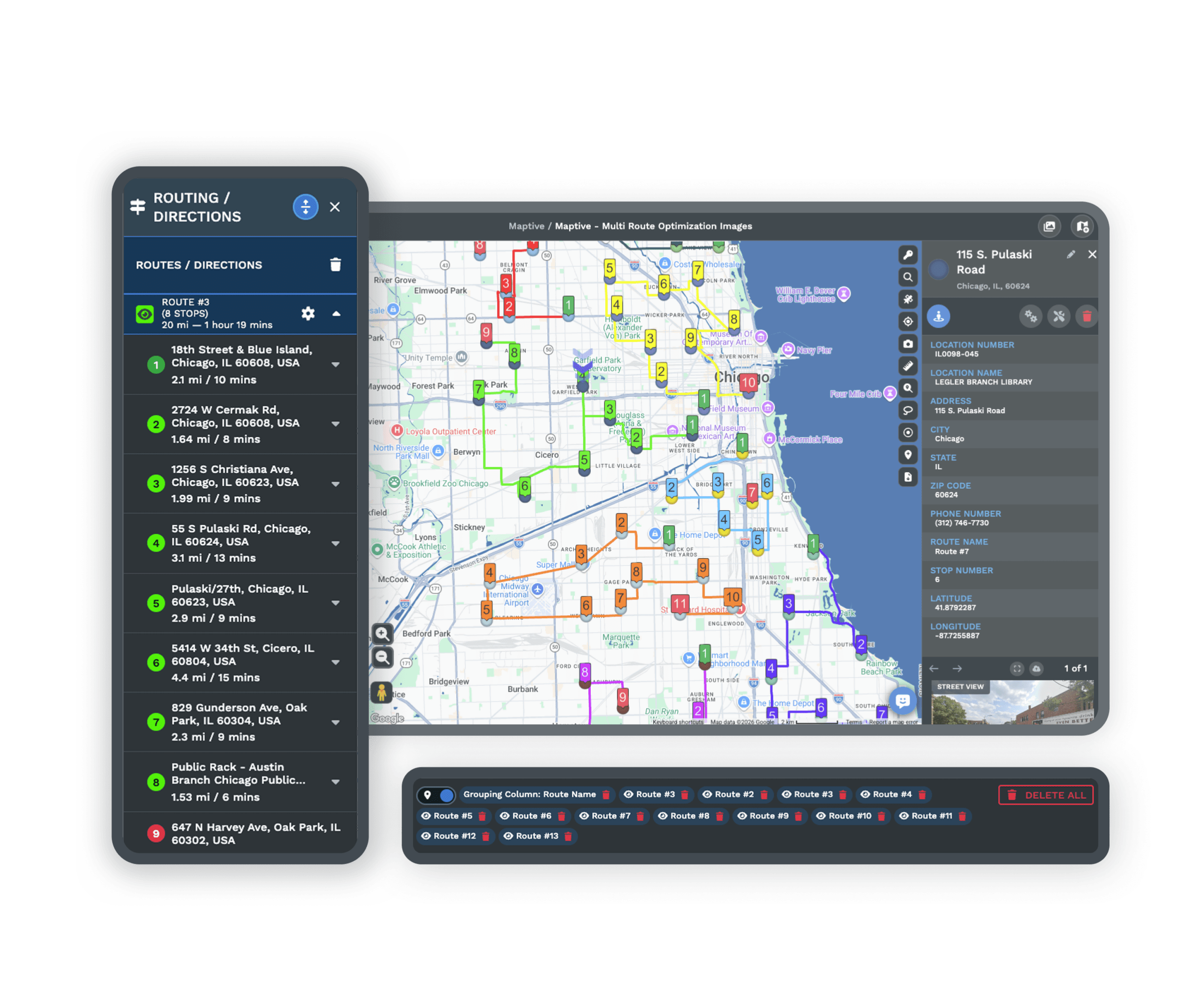
The data behind a story can become a map readers explore. A spreadsheet of places is enough to build it in minutes. Filter down to the angle you are writing about, then embed the finished map in the article. Every tool is unlocked from the first login, including export.
Plot the Data Behind the Story
The dataset uploads as a spreadsheet, and geocoding fixes incomplete addresses on upload. Every column stays attached to its marker, so the details behind each point stay readable.
Filter Down to the Angle
A dataset usually contains more than the story needs. The filter tool shows one category at once, and saved filters swap between views, so the graphic shows what the piece claims.
Add Demographic Context
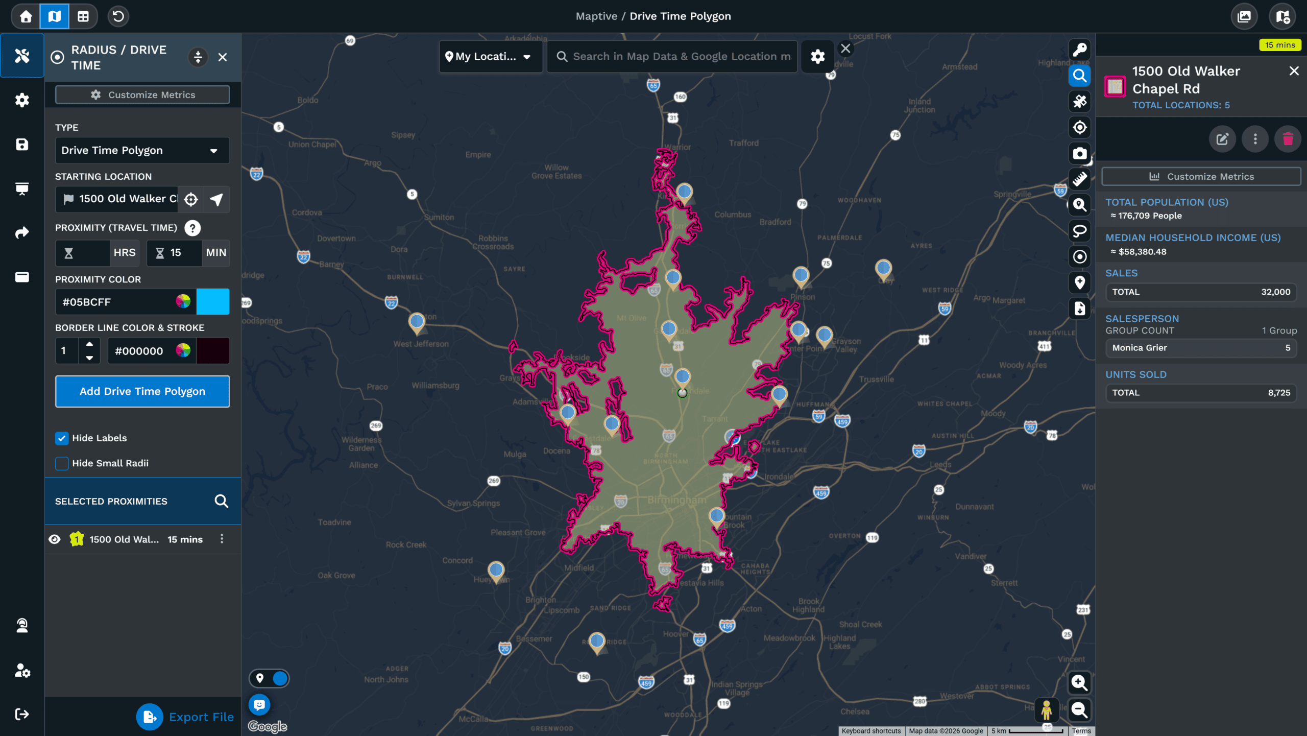
Over 50 Census variables, down to tract and block-group level, layer under your data. The places in a story can be described in population and income terms with no second dataset.
Embed the Map in the Article
A finished map embeds in the article as an interactive graphic, or exports at presentation resolution for print and social slots. Shared links open without accounts for any reader.
Other Ways to Map a Story
One dataset can support more than one graphic. Heat views, boundary fills and annotations work from the same upload, so a follow-up does not mean re-uploading.
Heat Maps That Show the Pattern
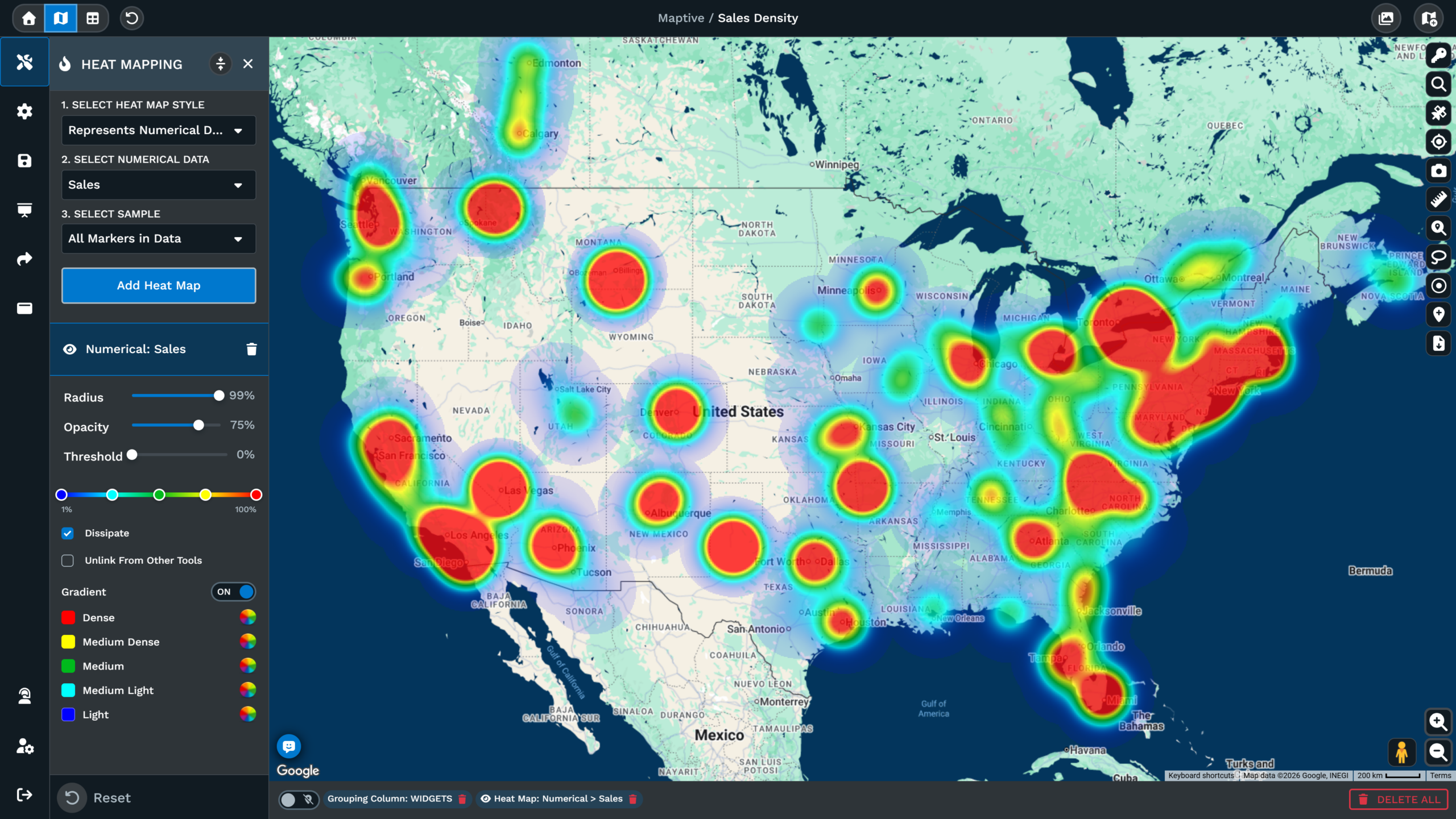
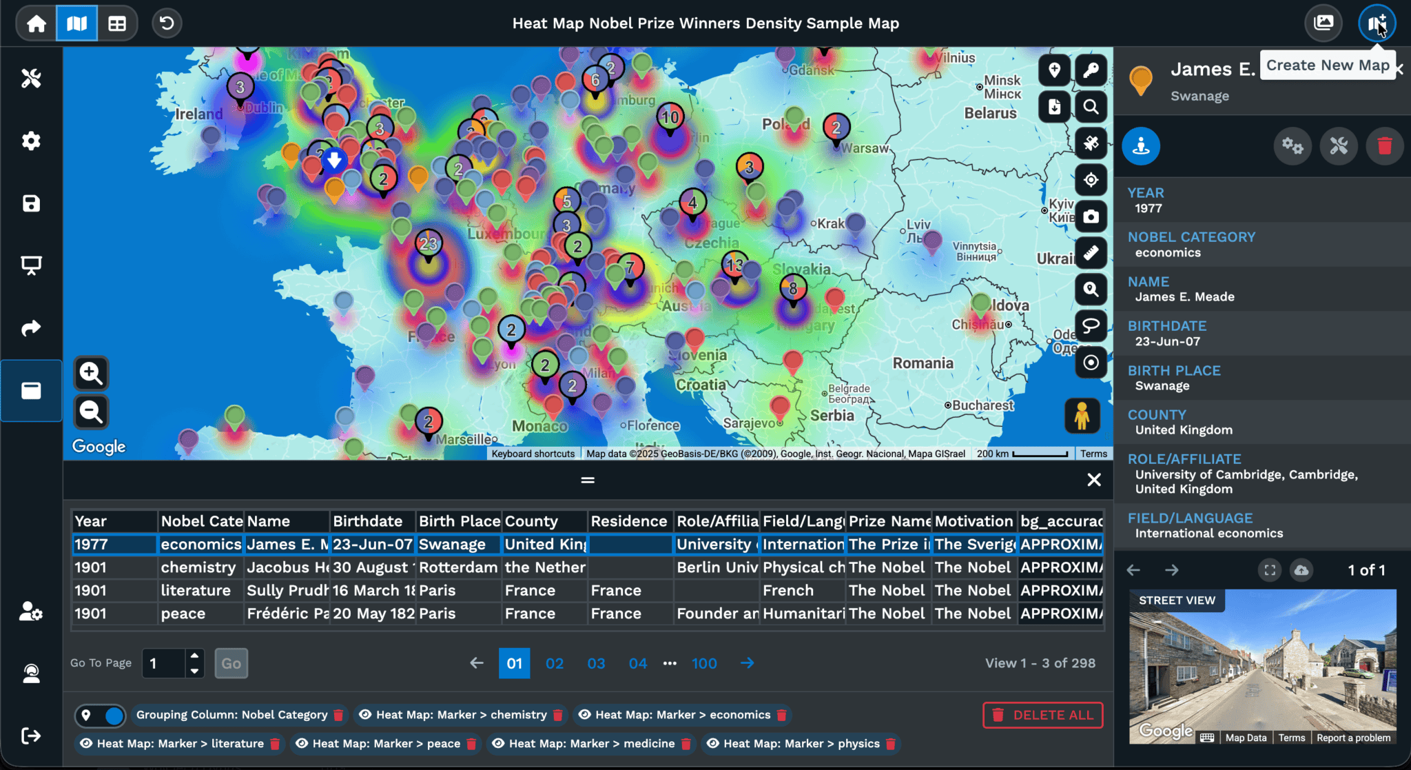
Weight a heat map by record count to show where events concentrate, or by a value column to show where the impact is the largest, and either view exports as an image for the piece.
Boundary Maps for Ongoing Coverage
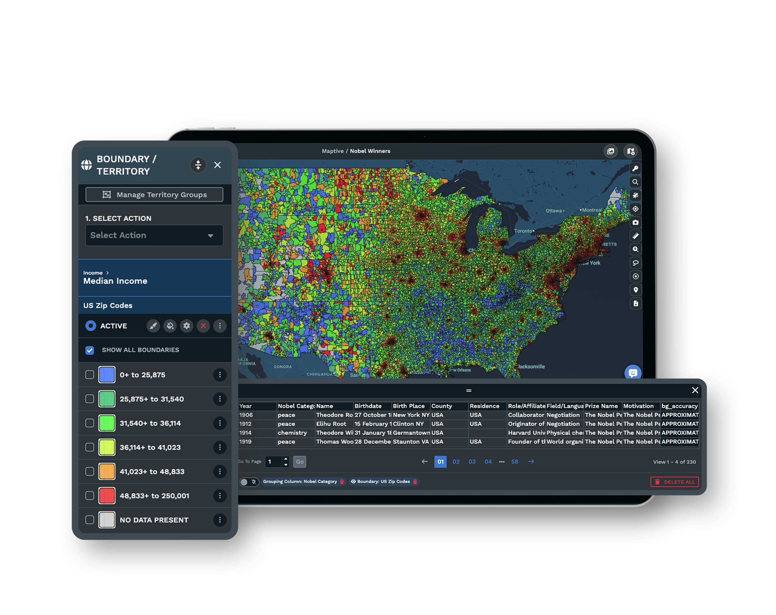
Fill county, ZIP or tract boundaries by one of your columns, and each region shows a dominant category. The map updates when the sheet does, which suits a story running for weeks.
A Drawing Tool for Annotations
The drawing tool adds text, callouts and labels on the map, so the graphic can point at the finding rather than rely on a caption, and the annotations export with the image file.
Maps Readers Can Explore
An embedded map lets readers zoom, filter and click through the data. You control which tools and columns readers get, and the interactive version shows more than a static image.
A Working Map Inside Thirty Minutes
Deadline is the argument. Most people have a first working map within about thirty minutes. The trial asks for no credit card, and support answers in under 15 minutes from the US and Canada team when a story cannot wait.
A Map for Every Story You File
Maptive builds the map from ordinary spreadsheet columns, and geocoding handles inconsistent addresses during the upload. The analysis tools work through the map interface, so the newsroom's graphic does not wait on a developer.
See Your Journalists & Bloggers Data on a Map
Upload a spreadsheet and get a working map in minutes, with every tool unlocked from the first login.
Frequently Asked Questions
What is mapping software for journalists and bloggers?
It is software that turns the places inside a dataset into a map readers can see and explore. Maptive runs in the browser and builds the map from spreadsheet columns, so no code and no GIS background are involved. More than 60 mapping and analysis tools come on every plan, from heat maps and boundary fills to an embed code for the published article. Nothing is reserved for a higher tier, and a first map usually takes about thirty minutes.
How much does mapping software for journalists cost?
Maptive's 45 Day Pass is $250 for one user, which fits a single investigation or a project with a publication date. The Pro plan is $1,250 a year or $110 a month billed monthly. The Team plan is $2,500 a year or $220 a month, and it covers five users with collaboration and a dedicated success manager. Enterprise pricing is volume-based. All 60+ tools and the census data come with every tier, so the choice is about users and data capacity rather than features.
Is there a free trial of Maptive for writers?
Yes. The trial lasts 10 days and asks for no credit card, with every tool unlocked from the first login. You evaluate the platform on a real dataset rather than demo data, so anything built during the trial can go straight into a draft. Upload a spreadsheet or paste from the clipboard, and a working map is ready in minutes. When the trial ends, the account expires unless you choose a plan, and no billing information is collected at signup, and support is available during the trial.
Do I need coding or GIS skills to make maps for my stories?
No. Maptive was built for people who have data with places in it and no background in mapping or development. The tools work through the map interface, and every change shows its effect as you click. Most users have a first working map within about thirty minutes. When a question comes up close to deadline, the US and Canada support team answers by phone and email in under 15 minutes, and onboarding can walk a newsroom through its first maps.
How do I turn a dataset into a map for an article?
An Excel or CSV file uploads directly, and rows can also be pasted from the clipboard or connected from a Google Sheet. Geocoding happens during the upload and reconciles what the file contains, including missing ZIP codes and inconsistent address fields. Every other column stays attached to its marker, so the details behind each point remain readable. For a dataset that updates as reporting continues, a connected Google Sheet refreshes the map when the sheet does. No reformatting is needed first.
How do I embed an interactive map in my article?
Every map has an embed option that produces the code for your article template, and the embedded version stays interactive for readers. The owner controls which tools and data columns readers can use, so the published graphic shows only what the story needs. Shared links open without an account, which also suits newsletters and social posts. For print or image slots, the same map exports at presentation resolution or poster size. The embed code can be reused across articles, and nothing needs to be installed by readers.
What demographic data can I add to a story map?
Every plan includes more than 50 US Census variables at no extra cost, published at state, county, ZIP code, census-tract and block-group level, with Canadian data included as well. The variables cover population density, household income and age, among other measures, and they appear underneath your own points. That lets a story describe the places it covers in demographic terms without sourcing a second dataset or cleaning one. It is included on every plan, with nothing extra to buy, which saves a separate data purchase.
Is my unpublished data secure in Maptive?
Maptive encrypts data with 256-bit SSL in transit and at rest, and access controls include two-factor authentication and single sign-on, with role-based permissions set per user, so a collaborator can be given one map and nothing else. Sensitive columns can be hidden from everyone you share with, and passwords can be required on shared links before publication. Audit logging records what was accessed and by whom, and uptime across 2025 was 99.9%, with the Salesforce AppExchange security review already passed.
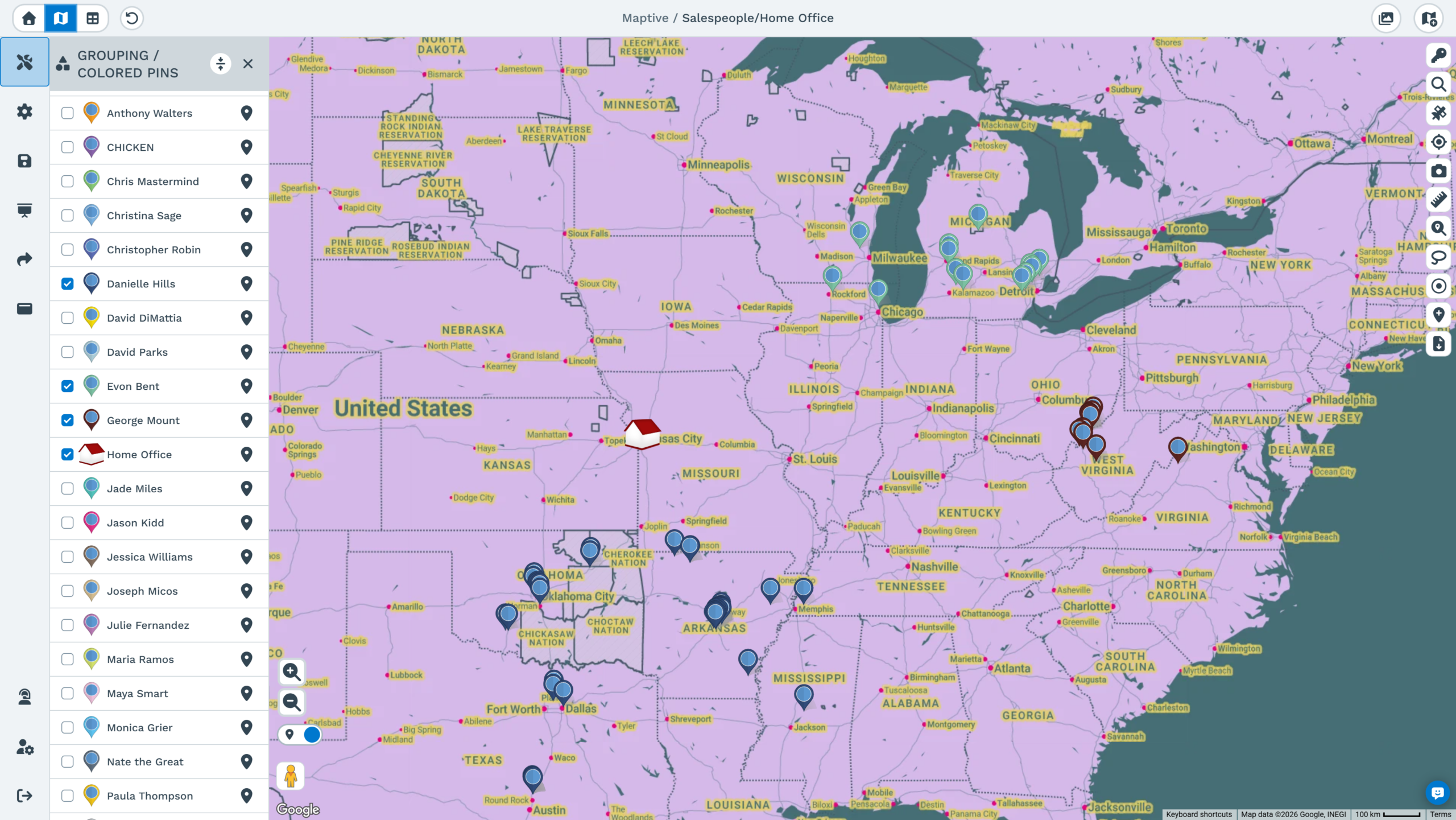
Can I filter my data to match the story's angle?
Yes. Filtering shows one category or value range at a time, and several filters can be saved on the same map, so you can swap views while deciding what the graphic should claim. Markers can also be grouped and colored by any column, which separates categories visually before filtering. The export reproduces what is displayed, so the published image always matches the filtered view you settled on. Filters can be combined for narrower views, and each saved view exports on its own.
How many records can one story map handle?
One map can show over 200,000 markers, and a data set can include up to 100,000 locations on the Pro and Team plans, or 50,000 on the 45 Day Pass. Enterprise capacity is volume-based for larger datasets. Every marker has the columns that came with it, so filtering and heat weighting work at full volume rather than on a sample. For very large datasets, the filter tool is the practical way to work, since one segment can be isolated and published on its own.








