


Build a Sales-Weighted Heat Map of Revenue, Not Points
Have a heat map that lights up where you hold the most customers, when what you care about is where the money lands? Maptive can weight the heat by a sales or revenue column, so the hot spots follow value instead of raw point count.
No credit card required
- Weight the heat by a numeric column like Sales, Revenue, or Price, so the intense areas mark high value, not high headcount.
- Read revenue intensity across a region from your individual customer points, without rolling the numbers up into boundaries first.
- Keep a plain density heat map beside it to compare where many customers sit against where the revenue lands.
- Adjust radius, opacity, intensity threshold, and colors until the high-value pockets read at a glance.
- Turn the gradient on or off and hide the underlying markers so the weighted heat layer reads on its own.
- Build it from an address list with a value column and no GIS skills, then export the image or share a link.
Trusted by teams at









See Where the Revenue Concentrates
As our data visualization partners, Maptive has become an integral part of our operations, from logistics to project tracking.
Building the Weighted Heat Map in Maptive
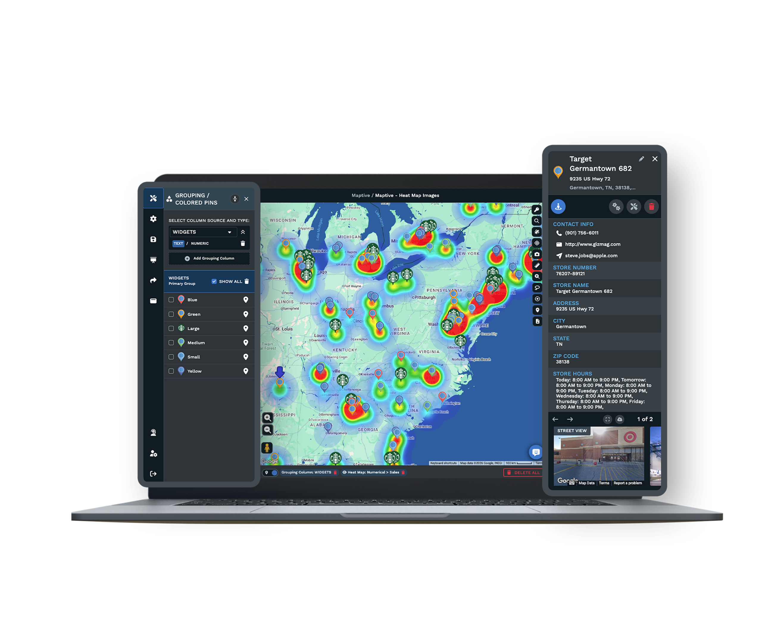
-
1
Plot Your Points with a Value Column
Upload your customer or order list, making sure one column holds the number you want to weight by, like Sales or Revenue. Geocoding places every address and fixes missing ZIP codes, so each individual point keeps its own value onto the map.
-
2
Choose Represents Numerical Data
Open the Heat Mapping Tool in Map Tools and set the style to Represents Numerical Data. Pick the numeric column, such as Sales or Revenue, then click Add Heat Map. This style needs a numeric column, so the heat weights by that value rather than counting points the way Marker Density does.
-
3
Tune Radius, Intensity, and Colors
Move the radius to grow or tighten each hot spot, set opacity so the base map reads underneath, and adjust the intensity threshold to control how much value registers as hot. Change the colors, or turn Gradient On for a single-color fade from light to strong across your value range.
-
4
Add a Density Map to Compare, Then Share
Add a second heat map set to Marker Density to see where many customers sit next to where the revenue lands. Turn on Hide Map Markers so each gradient reads on its own, use Unlink From Other Tools to filter markers without moving the heat, then export the image or share a link.
Map Your Revenue, Not Your Headcount
Start the 10-day free trial with no credit card. Upload a list with a sales or revenue column, open the Heat Mapping Tool, set the style to Represents Numerical Data, and watch the high-value areas form on your own data. Want a hand? A Maptive specialist will build the first weighted heat map with you and set the radius and colors.
No credit card required
Frequently Asked Questions
Can my heat map be weighted by sales dollars instead of number of customers?
Yes. In the Heat Mapping Tool, set the style to Represents Numerical Data and point it at your sales or revenue column. Instead of counting how many customers fall in an area, the heat scales by the dollars in each row, so a handful of large accounts can outweigh a dense pocket of small ones. Click Add Heat Map and the gradient redraws by value. Your points keep their own figures, so two areas with the same customer count can read very differently once sales drive the color.
How do I show revenue intensity geographically?
Plot your customers or orders with a revenue column, open the Heat Mapping Tool, and choose Represents Numerical Data as the style. Select the revenue column and click Add Heat Map, and the warm areas mark where revenue concentrates rather than where points pile up. From there you set the radius, opacity, and intensity threshold so the high-revenue pockets are easy to pick out. Because the heat reads from individual points, you see revenue intensity across a whole region without first rolling the numbers up into ZIP codes or counties.
What is the difference between a density heat map and a weighted one?
A Marker Density heat map counts points, so it heats the places with the most customer addresses. A weighted heat map, built with the Represents Numerical Data style, scales by a number in each row instead, like sales or revenue. The first answers where many customers sit, and the second answers where the value lands. They can disagree, since a busy area of small accounts and a thin area of large ones look different once dollars drive the color. Running both on the same view lets you read count against value side by side.
Does the weighted heat map need a numeric column?
Yes. The Represents Numerical Data style weights the heat by a number, so your file needs a column of values such as Sales, Revenue, Price, or Premium in each row. If a row has no number in that column, it has nothing to contribute to the weighted heat. A plain address list with no value field still runs with the Marker Density style, which counts points, but to weight by dollars you add the figures to your data before or after upload and point the tool at that column.
Which columns can I weight the heat by?
Any numeric column in your data can drive the weighted heat, from total Sales and Revenue to Price, deal size, order value, or Premium. You choose the column when you pick the Represents Numerical Data style, and you can build more than one heat map, each pointed at a different number, then switch between them. Text columns like segment or status will not weight the heat, since the style needs a number to scale by. To split a value by category instead, the Grouping Tool colors your pins by number ranges rather than blending them into a gradient.
Can I compare where my customers are with where the revenue is?
Yes. Add one heat map set to Represents Numerical Data on your sales column, then add a second set to Marker Density on the same points. Each gets its own color automatically, and you can hide one while you read the other. The density layer shows where many customers sit, and the weighted layer shows where the revenue lands, so a region that looks busy on one can look thin on the other. That gap is where the useful decisions hide.
How do I adjust the look of the heat map?
After you add the heat map, controls let you set the radius, opacity, intensity threshold, and colors. The radius grows or tightens each hot spot, opacity lets the base map read underneath, and the intensity threshold controls how much value registers as hot. You can turn Gradient On for a single-color fade from light to strong, or keep the multi-color gradient. Colors are set apart automatically when you run more than one heat map.
Can I hide the pins and keep only the heat?
Yes. Turn on Hide Map Markers and the underlying pins drop away, so only the weighted gradient shows. That keeps the read uncluttered when you present or export, since a dense field of pins can compete with the heat. If you need to filter your points without moving the heat, use Unlink From Other Tools, which holds the weighted layer steady while you narrow the markers underneath.
Can I share or export the weighted heat map?
Yes. Once the weighted heat map reads the way you want, export the map image as a PNG or PDF, up to poster size, for a report or a deck. You can also share a live version through a password-protected link, a public link, or a one-line embed, and presentation mode gives you a full-screen view for a meeting. Everyone who opens the map reads the same weighted heat from the same data.
Do I need GIS skills to build a sales-weighted heat map?
No. Building a sales-weighted heat map is a matter of menu choices, not GIS training or code. You upload a list with a value column, open the Heat Mapping Tool, choose Represents Numerical Data, and pick the column to weight by. Geocoding handles messy addresses and missing ZIP codes, so you do not prepare the file in a separate system first. Most people have a weighted heat map on screen in their first session, and the US and Canada support team will help if you get stuck.








