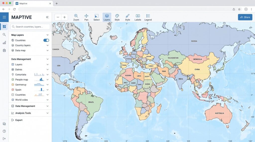
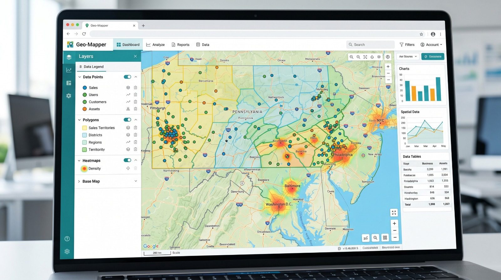
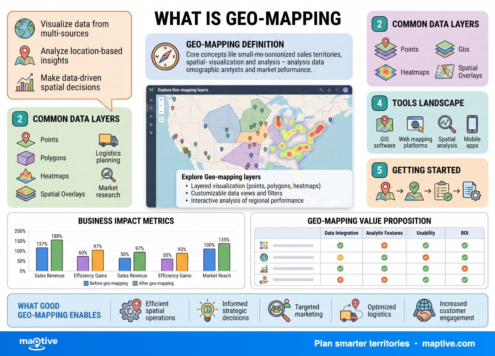
Geo-mapping is the process of turning location data, addresses, ZIP codes, coordinates, or sales figures tied to a place, into a map so the geographic patterns hidden in a spreadsheet become readable.
In 1854, a London physician plotted cholera deaths onto a street map of Soho, and the deaths gathered tightly around a single water pump on Broad Street. The addresses had been in the records all along. Only the map made the cluster visible. The same move, run on a modern list of accounts, is what geo-mapping does.
Geo-Mapping vs Geocoding, Two Different Steps

Geo-mapping is plotting and visualizing location data so you can see geographic patterns instead of scanning rows of numbers, working from the data you already have. The map is the part that makes that data legible at a glance.
One step often gets confused with the whole thing. Geocoding is the step that runs right before the map appears. It takes a text description of a place, a street address or a place name, and returns the geographic coordinates that software can position on a map. A plain address has no coordinates attached, so on its own it cannot be drawn. Geocoding supplies the coordinates, and geo-mapping is the visualization of those coordinates once they exist. Most web-based mapping tools recognize the addresses in an uploaded spreadsheet and geocode them for you, so you rarely have to produce coordinates by hand.
It is also worth settling the relationship between a few terms that get used loosely. “Geospatial” is the broad umbrella for anything to do with how things are distributed across space. A full geographic information system is a heavier, analytical database-and-spatial setup built to answer complex spatial questions, the kind that tracks every valve in a utility network or every repair on a line over a decade. Geo-mapping belongs to the plotting-and-seeing side of that. It is dynamic and driven by your data, but its job is to make patterns visible, not to run deep spatial analysis.
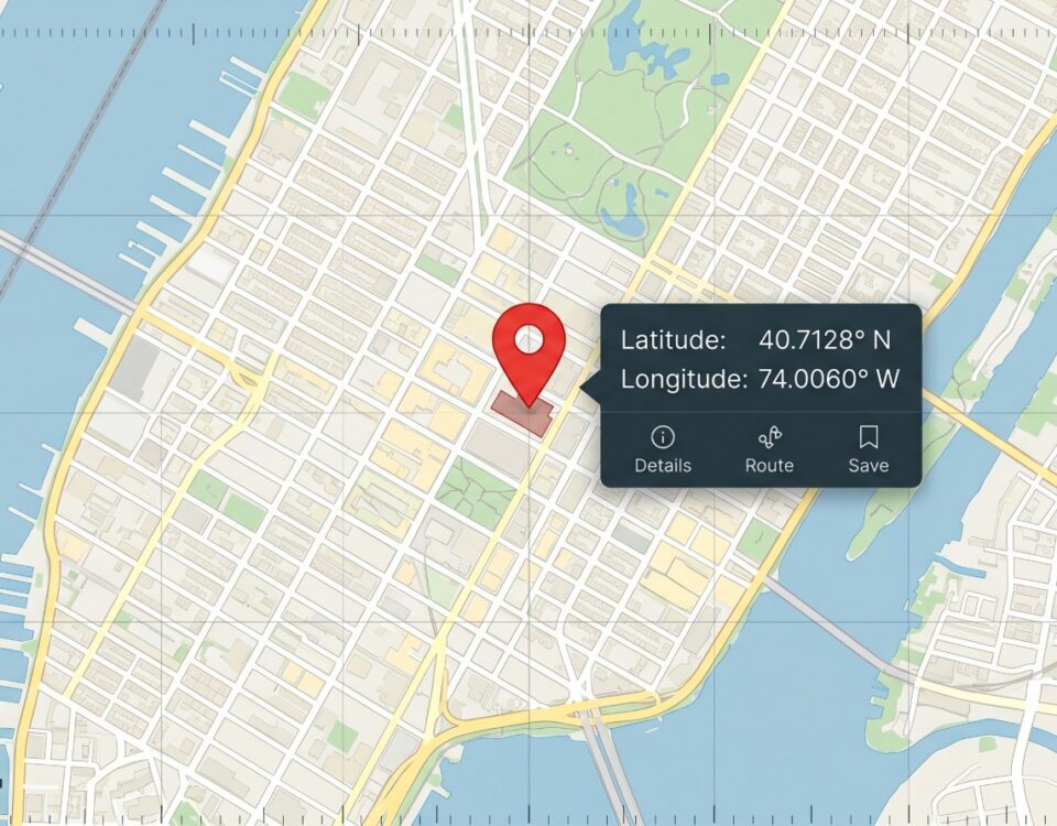
That is also what separates a geo-map from the consumer map on your phone. A consumer map answers a question about one place, where it is and how to get there. A geo-map starts from your entire dataset, your accounts, your sales, your territories, and shows the shape of all of it at once, which is the difference between finding a single place and seeing how everything you have is arranged.
The Data Behind a Geo-Map
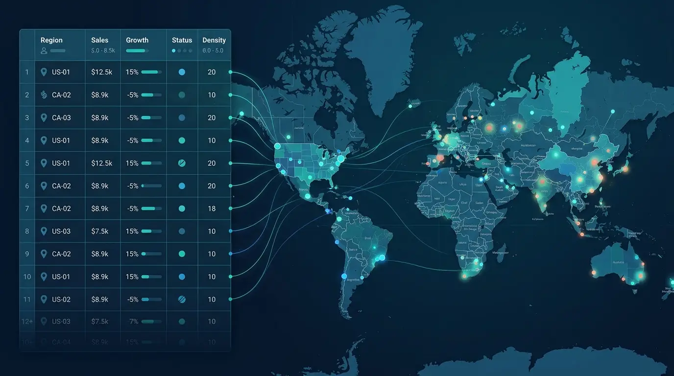
The inputs are ordinary, and most teams already hold them. The data is usually held in a CRM or a spreadsheet as a flat list, which is exactly the form that hides its own geography.
The Three Forms of Location Data
Three kinds of location data can anchor a record to a place. A street address is one. A latitude and longitude coordinate pair is another. The third is a named region, a ZIP code, county, state, or country. Any of the three is enough to put a record on a map, though a full street address geocodes more accurately than a ZIP code alone, and separate columns for street, city, state, and ZIP give the cleanest result. A header row helps, since it lets the tool detect which columns hold the location and which hold the data you want to group by.
For mapping a book of business accounts, the practical minimum is a short list of columns. You want the account or company name, a full address or ZIP code, a value field such as revenue or deal size, the account status, and the assigned rep or territory. With those five, the map can show not only where each account is but how it is doing and who owns it.
Data Cleanup Before Mapping
The part nobody warns you about is that your own data fights you a little. Reps enter addresses inconsistently, one types “St.” and another types “Street,” one writes “NY” and another “New York.” Duplicates pile up. Some records have only a city and state. A record with no usable address simply never appears on the map, so it is missing from the analysis even though the upload reported success. A short cleanup before mapping, removing duplicates, standardizing the address format, and filling in missing location fields, takes about ten minutes and noticeably improves how many records land where they should. It is unglamorous, and it stands between the export and the picture you came for.
The Main Types of Geo-Maps

Once the data is on the map, there are four common views, and each answers a different question. Reaching for the view that matches the question in front of you, instead of defaulting to one style, is the part that takes judgment.
Point Maps
A point map is the most basic view, one marker per record at its location. It answers the question of where everything is. Markers can be color-coded by a category, such as account status, or sized by a numeric field, and a point map is usually the first thing a dataset produces the moment it is uploaded.
Heat Maps
When the question is where things bunch up rather than how a defined region performs, a heat map is the view that answers it. It shows density, using a color gradient to light up the places where points concentrate, so the hot spots stand for clusters of customers, sales, or competitors, and the cool areas stand for gaps. A heat map colors across continuous space, not within any fixed border, which is what makes it the right view for spotting clusters.
Choropleth and Territory Maps
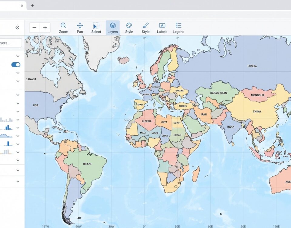
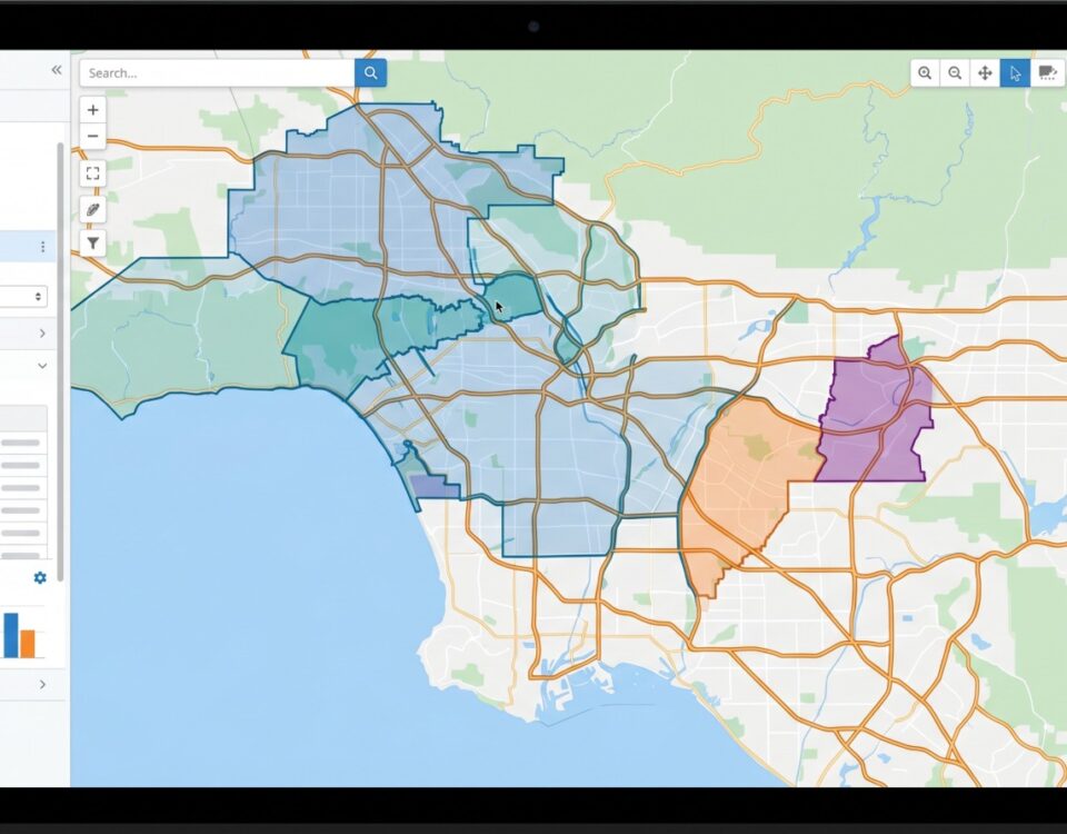
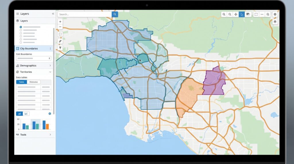
A choropleth shades predefined regions, ZIP codes, counties, states, or countries, by a value, so you can compare regions at a glance. The regions are fixed boundaries rather than shapes drawn by the data, and the color changes abruptly at each border, which is the visible difference from a heat map’s smooth gradient. A value shaded across regions is usually more meaningful as a rate than as a raw count. The territory map is the sales and service version of this idea, built on established boundaries or on boundaries you draw by hand to divide a market among reps and compare one region against another.
Radius and Distance Maps
A radius map draws concentric distance rings, or drive-time polygons, around a point to study its trade area. It answers who falls within a set distance or drive time of a location, which is the question behind targeting nearby customers, spacing out store locations so they do not cannibalize each other, and assigning accounts to the closest rep.
Turning the Map into Decisions
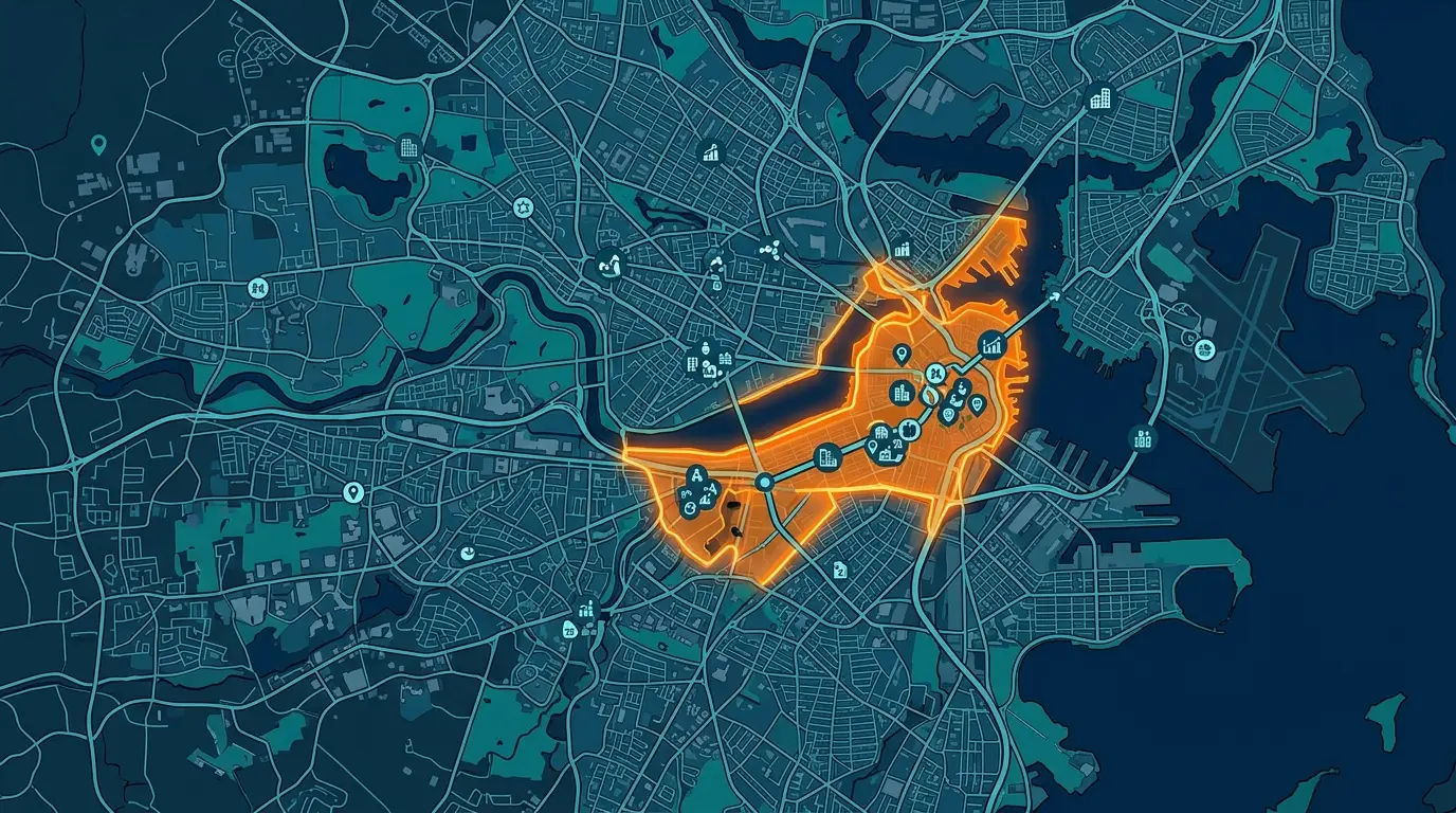
This is where the 1854 move pays off in a modern setting, because once the data is visible, the decision is only beginning. Plot a book of accounts and the patterns surface immediately. Dense clusters of active accounts are your strongholds. Prospects clustered near those active accounts are the reachable opportunities. Isolated prospects in otherwise empty territory point either to an expansion pocket or to a coverage model that does not fit. None of that is visible in a CRM dashboard, where the same accounts are a sortable list.
Territory balance is where the map is least comfortable to look at. A set of territories can look perfectly even by account count in a spreadsheet, with each rep holding roughly the same number of accounts, and still be wildly uneven on the ground. Mapping accounts by rep exposes one rep covering three states while another covers a single metro, revenue piled into one corner, coverage deserts, and reps overlapping on the same streets while whole ZIP codes go untouched. The account math can balance while the travel burden and the real opportunity do not, and the map is what shows that imbalance.
From the same mapped data, several other decisions open up. Radius and drive-time bands let you score candidate locations for a new site and check that they are spaced sensibly before any site is chosen. Once territories are balanced, the data feeds multi-stop route planning that cuts windshield time and service-coverage checks that catch both thin areas and wasteful overlap. Mapping sales by region surfaces which areas over- and under-perform in a way a numeric report flattens. Overlaying demographic data under your accounts shows which segments a product reaches and where similar untapped markets remain.
The work is quick enough to repeat, which is why teams re-map at least quarterly or whenever something changes, a new rep is hired, a rep leaves, a major account is won or lost, or a new market opens. In a tool such as Maptive, the cycle is essentially export, clean, and map, and the refreshed view is on screen in minutes. The pattern shows up in the numbers too. In a 2026 field-sales survey, the lowest-performing teams were twice as likely to run their territories on spreadsheets and paper maps as the highest performers, 34% versus 17%. A spreadsheet stores where the accounts are. The map shows how they sit together, and that picture is what lets you decide what to do about it.