
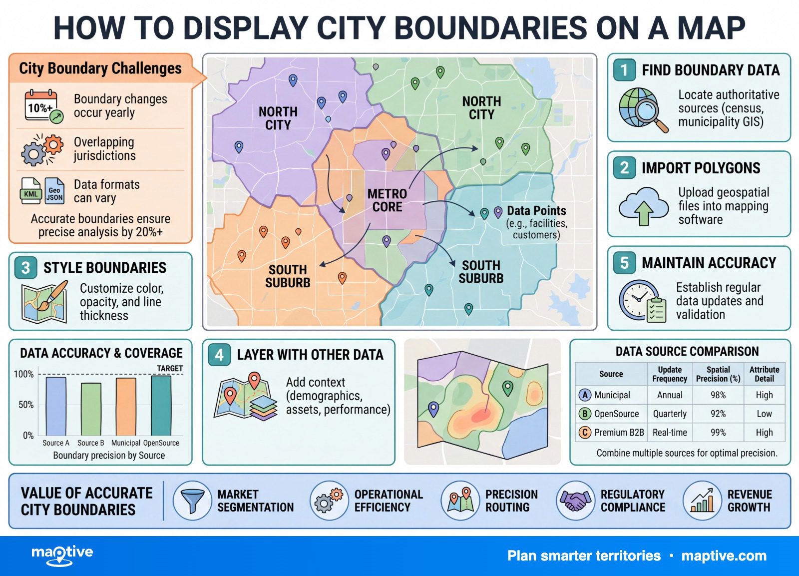
To show city boundaries on a map, add a city-boundaries layer drawn from Census places, turn the outlines on, and shade each city by your own data if you want more than the lines.
What turns this from a styling task into real work is the city written on a mailing address, which is a postal routing label rather than a legal boundary. Roll your data up on that field and you file unincorporated county addresses under a city they do not belong to, and the shaded map looks every bit as finished as a correct one.
Census Places: Incorporated and Census-Designated
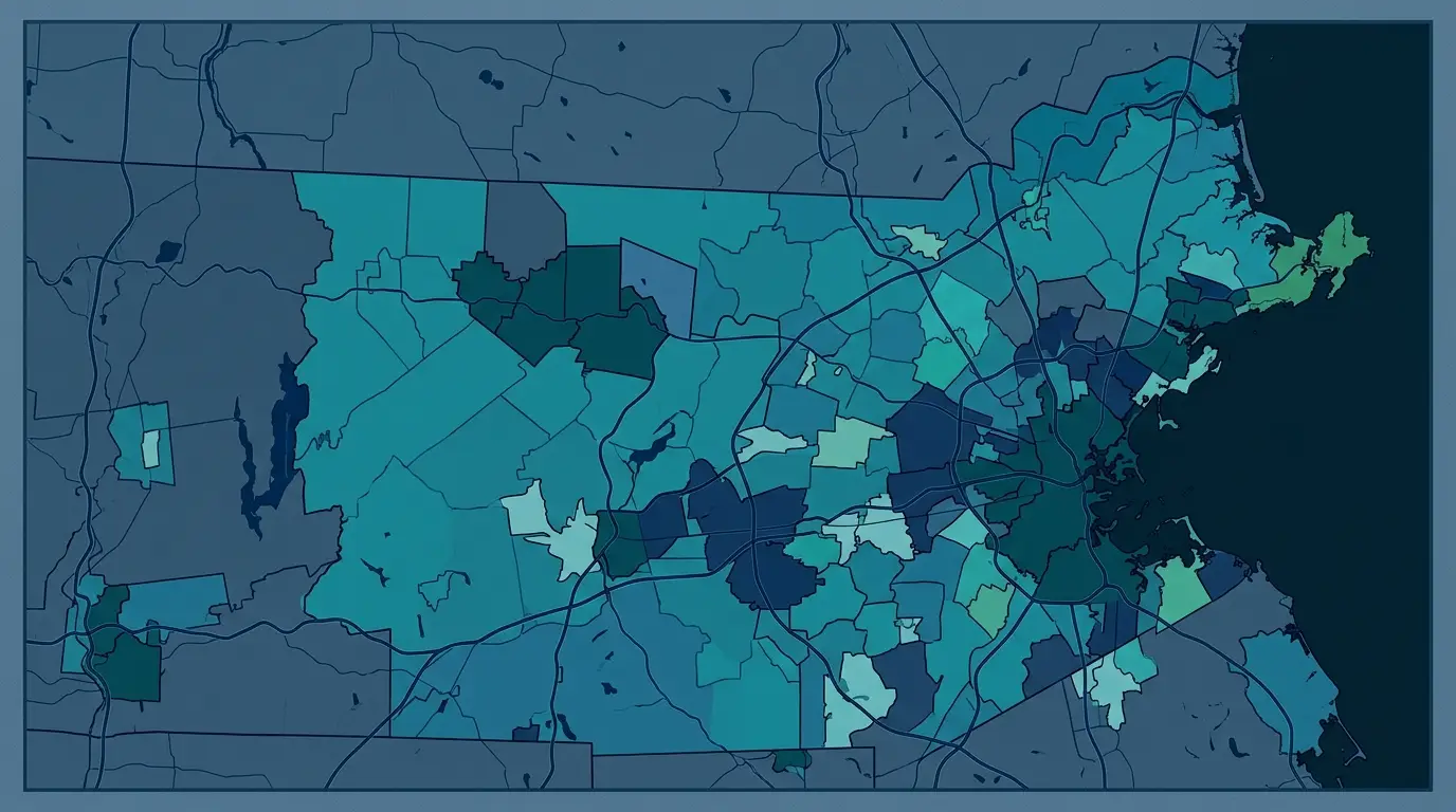
A city boundary on a US map is almost always a Census “place” polygon. A place is a named, locally recognized concentration of population that is not part of another place, and it comes in two kinds. An incorporated place is a self-governing city, town, village, or borough with legal limits and powers set by the state it is in. A census-designated place is a statistical stand-in for a settled community that has no municipal government, drawn so unincorporated areas can appear in census tables, with boundaries that carry no legal status.
That distinction is the frame for everything below. The polygon you are about to put on a map is a legal artifact of state law, and the rules for incorporation vary so much from state to state that the result is anything but uniform. There are roughly 19,500 incorporated places in the country, and about three-quarters of them hold fewer than 5,000 people, so most American “cities” are small towns, with metros the exception. A national city layer also mixes legal cities with statistical stand-ins depending on the state, which is worth holding in mind before you trust any single number the map gives you.
The Mailing-Address City Is Not the City Limit
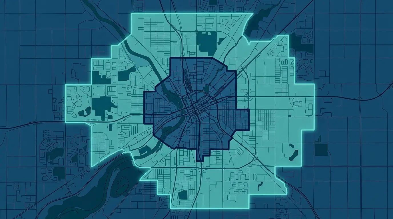
This is the pitfall that corrupts more by-city reports than any other, and it is worth slowing down for. The Postal Service assigns a city name to a ZIP code so it can route mail efficiently, based on which post office facility delivers the area and on physical features like highways and rivers. None of that follows the legal city limits. So a property can carry the name of a city in its address while sitting, in law, on unincorporated county land outside that city’s borders.
The clean example is Fayetteville, Georgia. Residents inside the city limits and many residents of the surrounding unincorporated parts of Fayette and Clayton counties all carry a Fayetteville 30214 or 30215 mailing address, because their mail comes from post office facilities inside the city. Their addresses match even though their jurisdictions do not, which is exactly the kind of overlap a rollup cannot see.
For data work, the consequence is direct and easy to miss. If you aggregate records by the “City” column in your address data, you are aggregating by the postal mailing city, which sweeps unincorporated county records into the wrong city bucket and reports a clean total over the error. A territory that looks like it belongs to one city can be padded with county addresses that city never served. The correction is to assign each record by the boundary that legally contains it, testing each record’s coordinates against the city polygons so it inherits the city it falls inside. The two methods can hand you materially different city totals, and the boundary method is the one that shows where a record sits in law, not where its mail happens to come from.
City Names as Unreliable Keys

Even after you trust the boundary over the mailing label, the name string carries its own trap. Springfield, Franklin, and Clinton repeat across dozens of states, so a rollup keyed on the city name alone collides every one of them into a single row. A sales figure that looks like one busy Springfield can be a dozen scattered towns stacked on top of each other. Carry the state with the city at a minimum, and assign records by the boundary polygon where you can, so each record is counted in the city whose boundary contains it, instead of every town that shares the spelling.
How to Put City Boundaries on the Map and Roll Records Up

With the assignment understood, the build is short, and the mechanic underneath it is the point-in-polygon roll-up already described. Each record is matched to the city whose boundary contains it, and then the values are totaled per city. The work below is done knowingly rather than mechanically, which is the whole reason for clearing the misconceptions first.
Add the City Boundary Layer
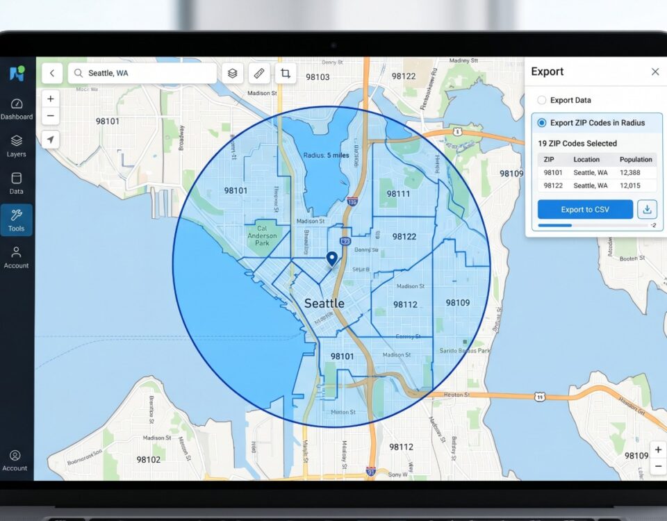
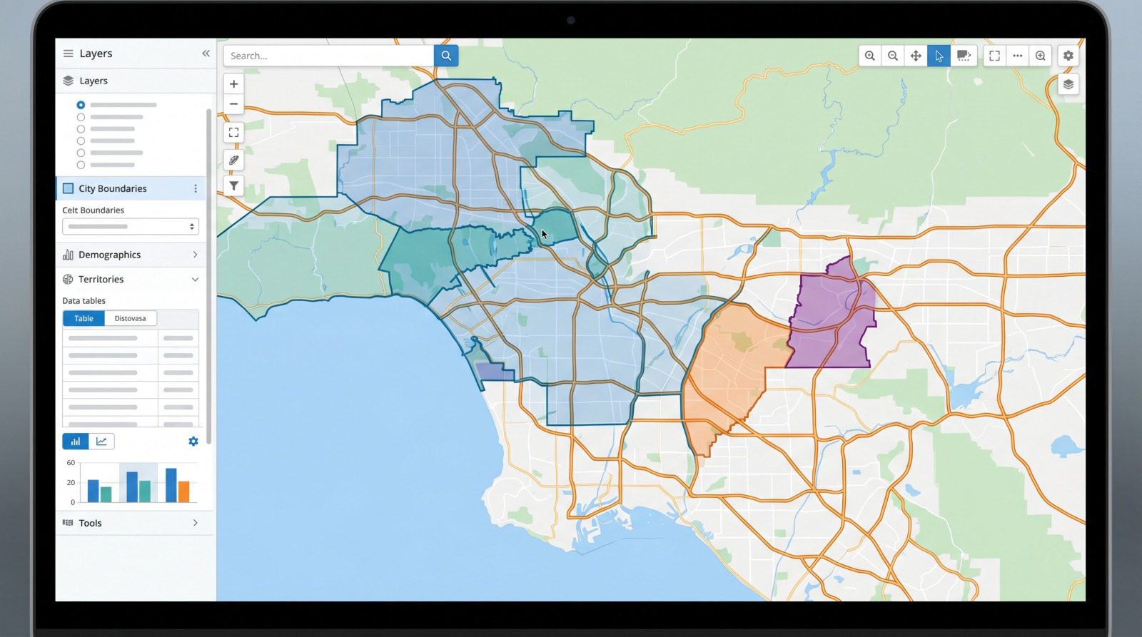
Create a map and upload your spreadsheet, or start with a blank map if you only want the lines. Open the boundary tool, select US Cities, and add the boundary. From there you can show the city borders on their own or fill them in based on your data. In Maptive, the US City Boundaries layer covers roughly 30,000 cities and towns drawn from the Census Places database, a count that runs well above the 19,500 legal municipalities because it also includes towns and statistical places. The platform is candid that the data has some holes, and invites you to flag a missing city so it can be sourced elsewhere, which fits the known gaps in Census places. Every boundary layer also carries a vintage year, so note which year’s lines you are looking at.
Link Your Data to the Cities
To move from outlines to a data map, point your spreadsheet at the boundaries through the Boundary Fill Type setting. Choose My Group Data when the column is categorical, such as a region or a status, and My Numerical Data when it holds a number, such as sales or headcount. The tool then maps your data to the cities, picks fill colors for the cities where you have records, and aggregates the rows for each city automatically. Click any city and you see its rolled-up values, most often the total sales in that city or the number of locations inside it.
Choose the Aggregation Rule
The rollup needs to know how the per-record values combine, and that choice decides what the map ends up saying. The right rule depends on what each city’s number is supposed to mean.
A sum suits quantities like total sales, units, or headcount, where the city’s total is the point of the map.
A mean suits rates like average order value, where adding the records together would produce a meaningless figure.
A count suits record volume, when the number of locations or accounts in a city is the question.
The same cities can look strong on a total-sales map and ordinary on an average-deal-size map, so the rule has to be chosen before the colors are read.
Why City Limits Look Jagged

The moment the layer renders, the outlines surprise most people. They come out jagged, and many are pierced by interior holes where most people expect smooth shapes. There is a reason for it, and it has nothing to do with bad data. A city boundary is the cumulative record of decades of separate annexation decisions, where the city absorbed adjacent unincorporated land piece by piece, so the line traces history rather than geometry.
The interior holes have a name. They are county islands, unincorporated pockets the city annexed around but never absorbed, usually because residents of the pocket declined to join. They appear most often in the western states where cities annexed aggressively, and on the map they show up as gaps inside the city outline. Some state laws also allow non-contiguous annexation, where a city takes in land that does not touch its existing boundary, so a single “city” can be several disconnected polygons, a main body plus outliers. An aggregation has to treat all of those pieces as one city.
Boundaries also move. Cities annex new land year to year, and the Census Bureau re-collects the legal boundaries annually through its Boundary and Annexation Survey, gathering updates straight from local officials. A city layer that was right last year can be slightly off after a single annexation cycle, which is the practical reason to keep the vintage year attached to any boundary map you share.
Cities Larger Than Their Counties
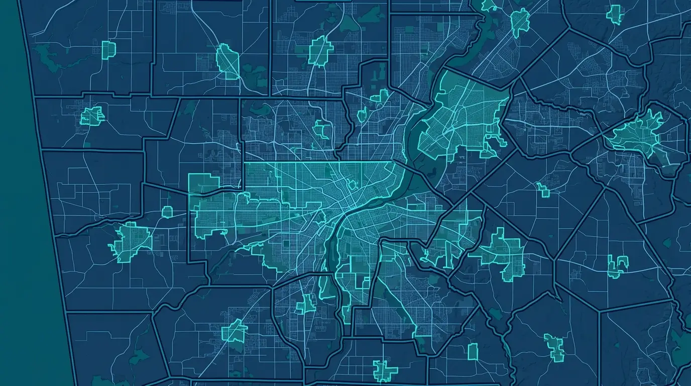
The last assumption to drop is that a city is a small thing tucked inside a larger county. Consolidated city-counties break it. Jacksonville merged with Duval County in 1968, and its city boundary now covers 747 square miles, the largest city by land area in the contiguous United States, taking in forest, wetland, and beach. Four small municipalities, including Jacksonville Beach and Atlantic Beach, keep their own governments inside it, so the map shows cities sitting within a city. A reader scanning by-city totals has to know that one “city” on the map can be the size of a county and carry a county’s worth of mixed terrain.
The same legal lines also explain why a city total often comes in smaller than expected. City limits cover only the incorporated area, so a city-proper count leaves out the suburbs that leadership pictures as the market. Miami is around 40th among US cities by city-proper population, below Tucson and Fresno, even though its metro is one of the largest in the country, because its legal limits are small against its built-up region. A by-city map answers where your records physically sit inside municipal lines. If the question is the commuting trade area around a core instead, that is a metro question, built on whole counties, and it will give you a much larger footprint than the city polygon ever will. Decide which one the report needs before you shade it.
There is a smaller cousin to this, for anyone tempted to plot each city as a single dot instead of a boundary. A city is an area, and the point a dataset uses to stand for it can mislead. The Census place coordinate is the geometric center of the boundary polygon, which can fall outside the area residents think of as the community, while the USGS points instead to the original nucleus like the old city hall. Two authoritative sources put the city in two different spots, so a single pin per city lands in the wrong place more often than not. The polygon is the honest object.
Put together, the corrections point one way. Assign each record by the polygon that legally contains it, not by the city in its mailing address, carry the state so two Springfields never merge, and note the vintage year on boundaries that move with every annexation cycle. Do that and the shaded totals are something a leader can act on, because each one reflects the records that legally sit inside the line.