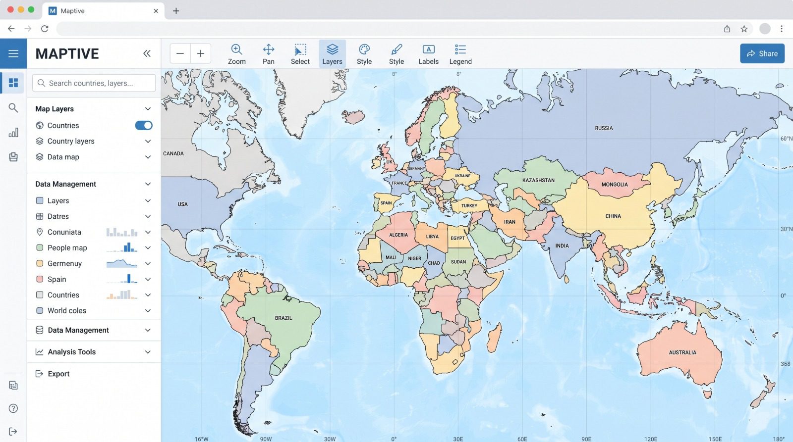
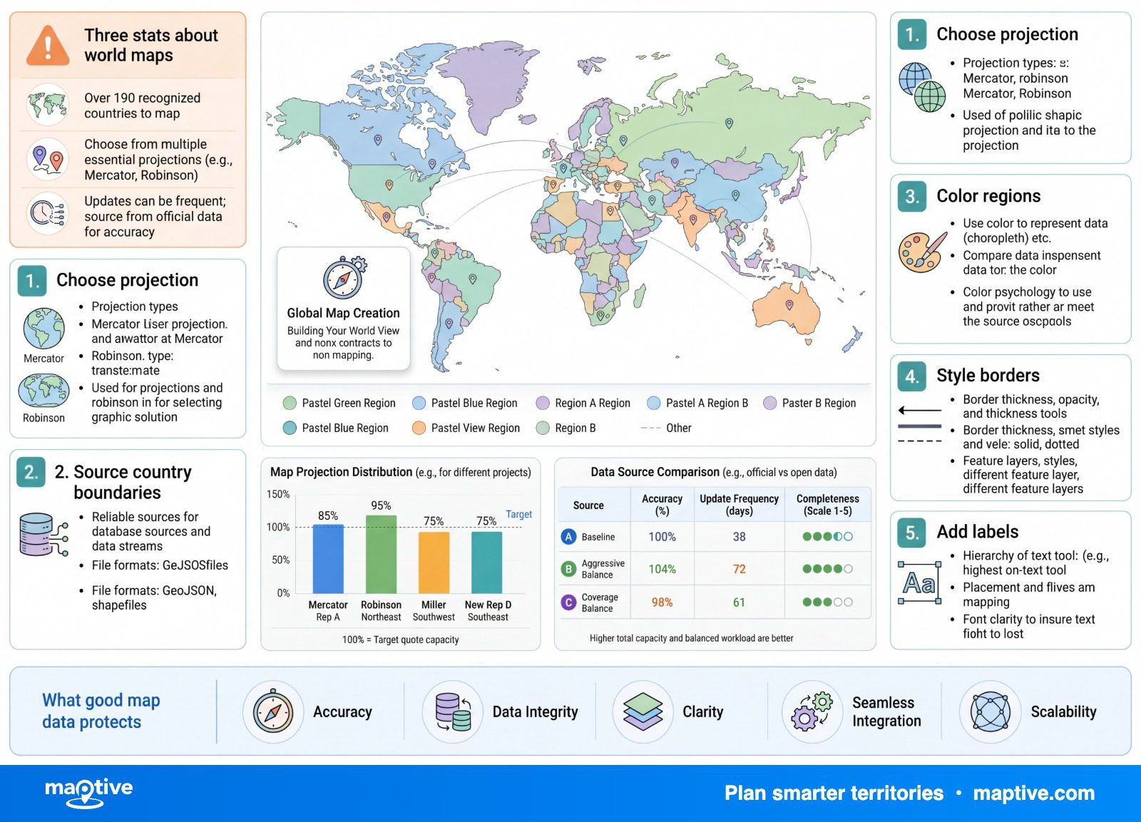
Building a labeled world map is a chain of decisions that look objective and are not, from how many countries you show to how you draw them.
On the familiar web map most people picture, Greenland looks about the size of Africa, though Africa is roughly 14 times larger. The map is already making choices for you before you add a single data point.
You upload your location data into a tool that draws the country names and borders, then you settle the choices that decide what the map says, and two of them matter more than the rest.
The Two Jobs of a World Map
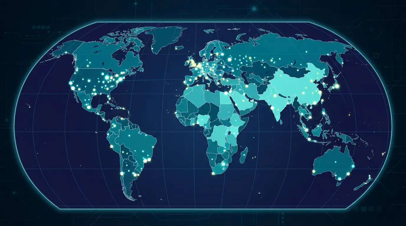
A world map does one of two jobs, and they need different data. Plotting puts a marker at each international address or coordinate, which suits offices, customers, and shipments you want to see as individual points. Shading colors each whole country by a single aggregate value, which suits a question like sales by country or customers by country, where the pattern across the map is the answer. Most international maps end up doing both, so it helps to know from the start which job each part of your data is for, since the plotting side needs coordinates and the shading side needs one clean value per country.
The count of countries is the first hidden choice. There are 193 United Nations member states, plus 2 observer states in the Holy See and Palestine, which gives the usual figure of 195, and the number rises toward 202 once you add the states with partial recognition. A map that claims to show all the countries is taking a position on a contested question, not stating a fact. The list also changes as recognition shifts, so a world map built a year ago can already be out of date on which borders and which names it shows.
Plotting International Addresses
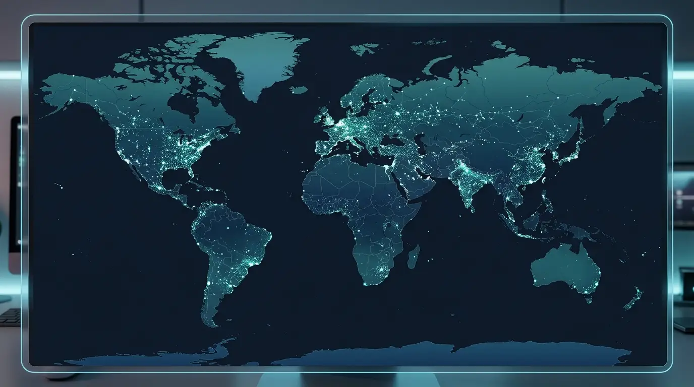
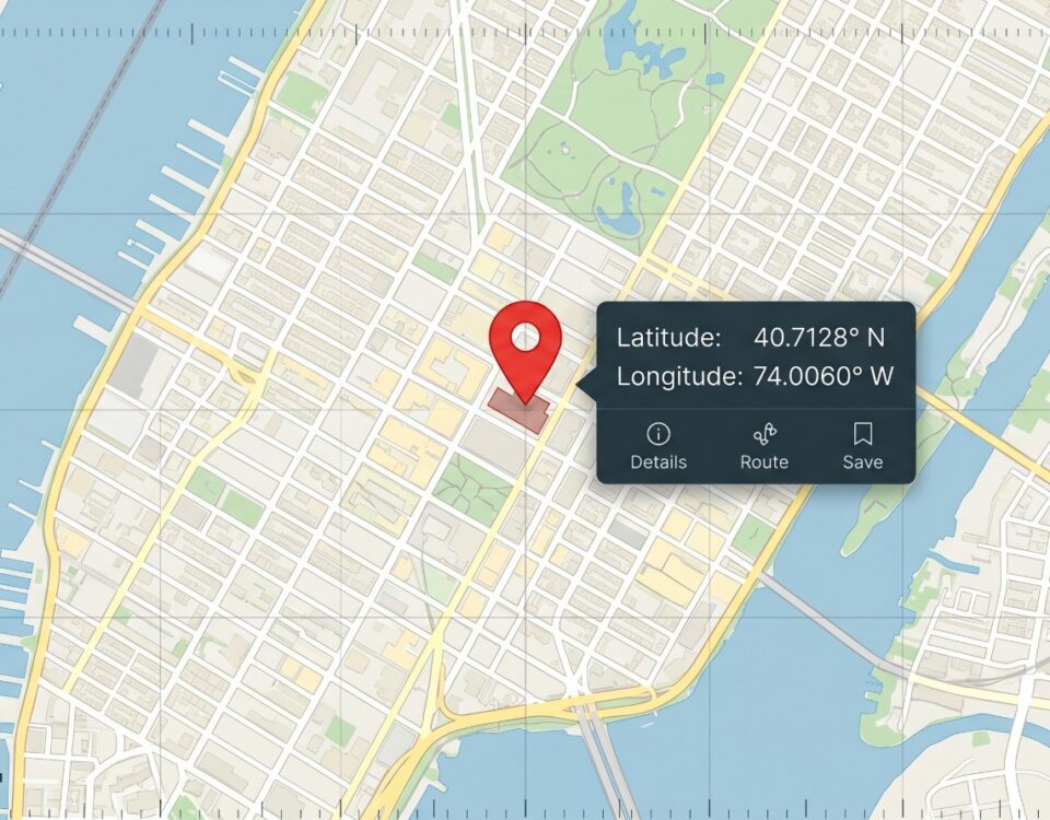
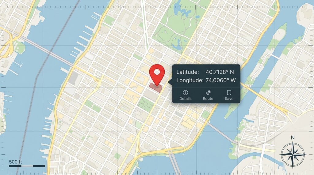
International addresses turn into coordinates far more unevenly than people expect. Geocoding converts an address into a latitude and longitude so it can appear on the map, and its accuracy tracks how mature each country’s postal data is. A country with an established address system can resolve to the doorstep, while a less-established one may only reach a city or a region, so the precision ceiling is set country by country rather than by your tool. The geocodes are only as good as the address data underneath them, and that data quality changes the moment you cross a border.
The assumptions hidden in a data pipeline are easy to miss until a foreign address breaks them. One geocoding team ran 1.23 million British flats through a pipeline shaped around North American addresses, and the system labeled each one “Fl” for floor, confidently reporting that Flat 2 was on the second story. Nothing in the import looked broken, even though it was wrong at scale. 2.4% of British addresses have a building name and a postcode and no street at all, which is complete and deliverable in Britain and unreadable to a parser that expects a number on a street. Postal codes do not even mean the same thing from one country to the next. The United States has nearly 42,000 US ZIP codes for 340 million people, so a single ZIP can cover a whole town, while Britain has around 1.8 million postcodes for 68 million people, where one postcode narrows down to roughly 15 letterboxes. A column labeled postal code means a different geographic resolution depending on the country it describes.
Always Pass an Explicit Country
Attaching the country to every address before you geocode is the single most effective fix when plotting global data. Handed an address with no country, many geocoders default to the United States, which returns the wrong location for the many city names that repeat around the world. There is a London in more than one country, Springfields scattered widely, and a Georgia that is both a country and a state, and the geocoder cannot tell which one you meant without being told. Adding a country field removes that guesswork and is the difference between a marker on the right continent and one dropped on the wrong one.
Address Format as Local Convention
The deeper lesson is that an address format is a piece of a country’s culture. A parser trained on one country bakes in rules its author never names, such as the idea that every address has a street, and those rules surface only when a real foreign address violates them. Even the column headers make assumptions, since words like state and ZIP are American and describe nothing in much of the world. Teams that build global address support describe it less as a feature you finish and more as a debt you keep paying, because each new country reveals the next assumption you did not know you held.
Joining Your Data to Country Borders

When you shade countries by a value, each row of your data has to match a country on the map, and the match fails far more often on the name than on the geography. Country names diverge from the codes that systems use to identify them, so a boundary layer may know a country by a formal name like “Viet Nam” or “the Islamic Republic of Iran” while your spreadsheet says Vietnam or Iran. The United Kingdom is a sharp example, since its two-letter code is GB, named for the island of Great Britain rather than the country, so data keyed to “UK” can miss a layer keyed to “GB.” The same Georgia that confuses a geocoder also breaks a country join, returning an empty result because the tool cannot read free text the way you intend it.
Matching on a code rather than a name is the reliable fix. The ISO standard assigns every country a two-letter, three-letter, and numeric code, and keying your join to one of those codes sidesteps the whole family of name mismatches at once. When a code is not available, adding an explicit country or region field gives the tool the disambiguation it needs. Either way, a pile of unmatched rows is the signal to stop and fix the key before you trust the colors on the map.
Choosing a Map Projection
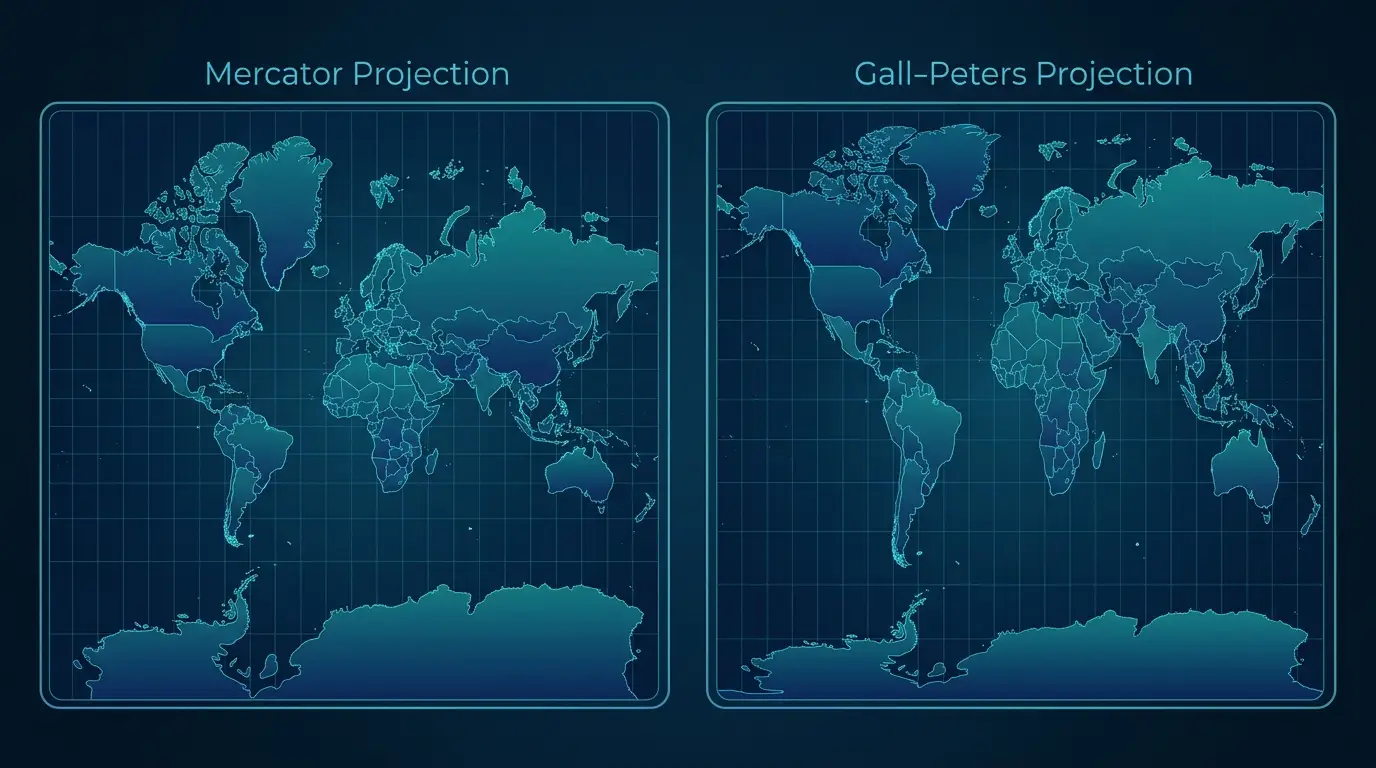
The second choice that matters most is the projection, the method for flattening a round world onto a rectangle, and no single projection preserves area, shape, distance, and direction all at once. The one you pick changes what the reader sees, and the right answer depends on what the map is for.
Mercator and Far-North Inflation
The standard web map uses the Mercator projection, which holds angles and direction true locally, the property that made it useful for steering a course and the reason zoomable maps adopted it. The cost is in size, because Mercator inflates landmasses the farther they lie from the equator and shrinks those near it, so Greenland appears to rival Africa despite covering a fraction of its area, and Russia looks close to twice its true relative size. Alaska gets the same treatment, seeming to match the contiguous United States while it covers about a fifth of it. This is a current debate rather than a textbook footnote. In August 2025 the African Union formally moved to push world maps away from Mercator and toward the Equal Earth projection, on the grounds that the distortion understates the size of Africa.
Match the Projection to the Job
For plotting located points and offering a familiar, zoomable map, Mercator is a sound choice, since the marker stays at its true coordinate no matter how the surrounding land is stretched. The trouble comes with a shaded map, where the reader compares countries by eye and the projection hands high-latitude countries more visual weight than their data deserves. The value is in the color, but the eye also takes in area, so a country can look more important than its number simply for lying far from the equator. When the map’s purpose is to compare countries by a value, a projection like Equal Earth or Robinson keeps relative area honest and serves the comparison better. One more habit protects a shaded world map no matter the projection. Shade a rate or a share rather than a raw count, because raw totals only redraw the largest markets in the darkest color and hide the intensity you were trying to show.
Blank Countries and Disputed Borders
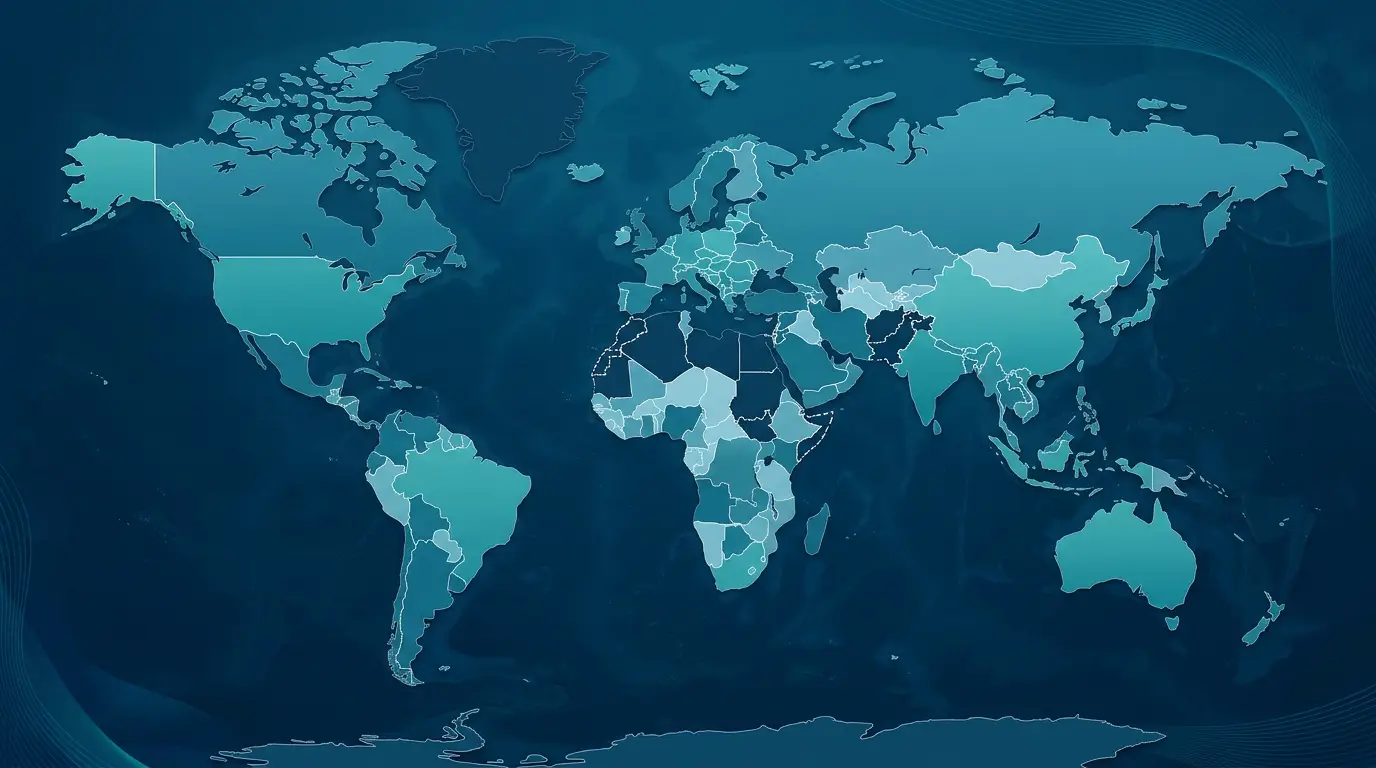
Two decisions lie at the edges of the map, and both reward making them on purpose. Blank countries on a world choropleth are usually a sign that data is missing, which a styling slip would never explain. Some countries report no independent statistics because their data rolls up to a parent, as Greenland’s does within Denmark, others are disputed and keep no official figures, and a few have their statistics set aside by the organizations that would otherwise publish them. Small island and micro-states are dropped from many maps outright, and average country coverage across a large sample of world maps came to under two-thirds. The fix is to decide deliberately how a country with no data should render, so an absence shows as absence rather than as a zero.
Disputed borders are the other edge, and drawing them is an editorial and political act more than a technical one. The cartographic convention is a solid line for a recognized border and a dotted or dashed line for a contested one, held to consistent weights so a reader can tell them apart. The same border is drawn differently for different audiences, and major providers maintain more than 30 country versions of their maps, so a viewer in one country sees a line that a viewer in another does not. There is no single neutral world map, and even the name you attach to a place can signal a claim, which is why careful maps use neutral language such as administered by. For an internationally shared business map, the convention plus an awareness that the map may reach audiences with different official views is the safe default. This is what the whole exercise comes down to, because a world map looks like a neutral background while the honest one is the map where you chose the country count, the join key, the projection, and the treatment of missing data on purpose rather than by default.