
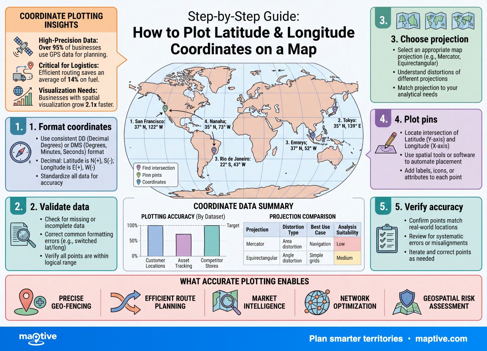
To plot a column of latitude and longitude coordinates, put them in two separate spreadsheet columns, latitude first and longitude second, format each as a decimal-degree number, and upload the file to a mapping tool that places every row as its own point.
Because you already hold the coordinates, there is no address lookup to wait on, which makes this one of the most reliable things you can hand a map.
Most of the trouble that does happen announces itself by where the dots end up, so the real skill is reading the wrong-place pattern.
Plotting Coordinates and Geocoding Addresses

It helps to know which of two jobs you are doing, because they run in opposite directions. Geocoding takes location text, a street address or a place name, and works out the coordinates for it. Plotting points starts a step later, when you already have the latitude and longitude in hand and only need each pair placed on the map. There is no matching to resolve and no ambiguity to settle, so a clean coordinate file maps faster and more dependably than the same locations supplied as addresses.
If your records arrived as addresses rather than coordinates, geocode them first and save the latitude and longitude that come back. Once those numbers are in the spreadsheet, you are doing the plotting job described here, and the steps below apply unchanged.
How to Format Coordinates in a Spreadsheet
Almost every plotting problem is decided here, before the map renders anything. Get the columns right and the upload is the easy part of your afternoon. The format that mapping tools expect is plain and worth following exactly.
Two Separate Columns in Decimal Degrees
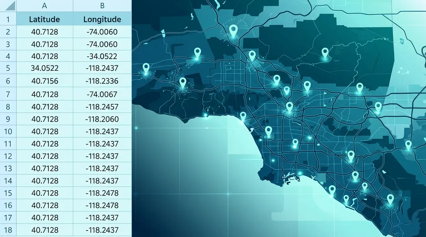
Keep latitude in one column and longitude in another, and format both as numbers rather than text. Use decimal degrees, the format where New York City is 40.7128 and -74.0060. Label the two columns so the tool knows which value is which, and make sure a delimited file includes a header row naming the latitude and longitude fields, since the map cannot infer them from position alone when the labels are missing.
A common starting point is a single cell that holds both values together as “40.7128, -74.0060.” That will not plot as it stands. Highlight the column, open Text to Columns under the Data menu, choose the delimited option, and split on the comma. You come out with latitude and longitude in their own columns, ready to map.
Decimal degrees earns its place because a spreadsheet can sort, filter, and calculate on it. The older degrees-minutes-seconds notation, the kind written as 40 42′ 46.08″ N, reads well to a person but a spreadsheet stores it as a text string. None of the work you might want to do on the column, no sorting and no range checks, will run on text shaped like that.
The Sign Convention for South and West
In decimal degrees, latitudes south of the equator and longitudes west of the prime meridian are written as negative numbers, while north and east stay positive. That one rule does a lot of work, because almost the entire Western Hemisphere has a negative longitude. New York’s is -74.0060, not 74.0060. The minus sign is the detail people drop most often, and dropping it is easy to overlook rather than obvious, which is exactly why it causes the kind of error you only catch later.
Adding a Range Check Column
Latitude only ever runs from -90 to 90, and longitude only from -180 to 180. A quick formula column that flags any value outside its range will catch the two most common mistakes before a single point is drawn. A “latitude” reading above 90 is almost always a longitude sitting in the wrong column. A value that breaks its range is the swap or the missing sign showing itself early, while it is still a number in a cell and not a pin on the wrong continent.
The Wrong-Place Pattern and Its Signatures

When a plotted map looks wrong, the location of the bad points is the most useful clue you have. Each kind of mistake has a signature place it sends the dots, and once you learn the four common ones you can usually name the cause in a few seconds and go straight to the column that needs fixing. The map is reporting honestly, putting the numbers exactly where you told it to.
Points in the Open Ocean
Points that should sit over North America but appear in the middle of the ocean almost always mean the latitude and longitude columns are reversed. The geographic standard pairs them as latitude then longitude, and feeding them in the other order flips each point to a different part of the globe. The fix is the two-second kind once you recognize it, since you only need to swap the first two values back into the right columns. One thing is worth noting for anyone moving data between tools. Some formats and programs expect longitude first, so confirm what your specific tool wants rather than assuming the order is universal.
A Pin on the Far Side of the World
A single point that turns up thousands of miles from where it should be usually means a negative sign went missing. Take the Statue of Liberty, which sits at 40.6892 north and 74.0445 west, written correctly as 40.6892, -74.0445. Drop the minus and enter 40.6892, 74.0445, and the pin lands in a lake in Kyrgyzstan, more than 6,000 miles away. The point does not drift a little. It jumps to the wrong continent, which is at least the kind of mistake that is easy to spot once you know to look for it.
A Cluster Off the Coast of West Africa
A small raft of points floating in the Atlantic off West Africa, with no land beneath them, is the tell for blank or zeroed rows. When a coordinate cell is empty, broken, or defaulted to zero, the row plots at 0 latitude and 0 longitude, a spot in the Gulf of Guinea about 600 kilometers south of the coast. The geospatial community named that spot Null Island around 2010 and 2011 precisely so a clump of pins there would read as a flag for missing or zeroed data. Those pins are not real locations but the cells you forgot to fill, gathered in one place where you can find and remove them.
Scientific Notation in Coordinate Columns
If your numbers arrive looking like 1.23E+08, the spreadsheet rewrote them before the map ever saw them. Opening a CSV by double-clicking lets the program scan the first couple of hundred rows, guess a type for each column, and rewrite the stored values, which can turn long coordinate strings into scientific notation and strip leading characters. The data was fine until the app changed it on the way in. The way around it is to import rather than open, using Data and then Get Data and then From Text or CSV, and to set the coordinate columns to a number or text type as they load. Degrees-minutes-seconds pasted straight into a cell hits the same wall, since it stays text until you convert it to decimal degrees, as covered above.
Choosing the Right Number of Decimal Places
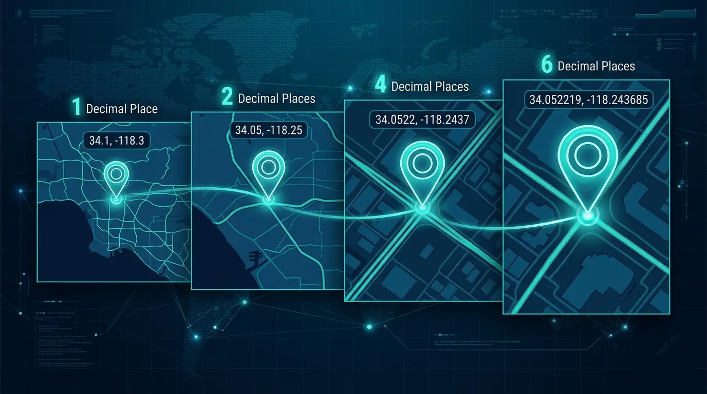
Precision is a choice, and more digits past a certain point buys you nothing real. Each decimal place tightens the fix by a factor of ten. Two places puts you within about 800 meters, the size of a town or neighborhood. Three is within about 80 meters, a city block. Four narrows to around 11 meters, the footprint of a building. Five is close to a meter, about a doorway. Six places gets you to roughly 11 centimeters, which is survey-grade.
For business mapping, four to five places covers almost everything you would want to do. Six or more places only has real meaning when the source data came from land surveying, and otherwise the extra digits are false precision you typed for no one, since a typical phone GPS fix can itself be off by several meters. The opposite problem shows up too. When a point snaps to a coarse, general location instead of the exact spot, precision was usually lost on the way in, with the coordinates typed as text, rounded, or cut to too few decimals. It looks plausible until you zoom in, which is what makes it easy to miss. One detail is worth filing away. A degree of longitude narrows as you move toward the poles, so the same number of decimal places buys slightly more real-world precision in longitude the farther you are from the equator.
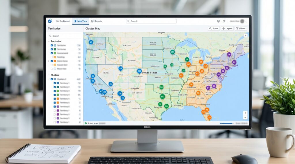
Working With a Plotted Coordinate Set

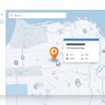
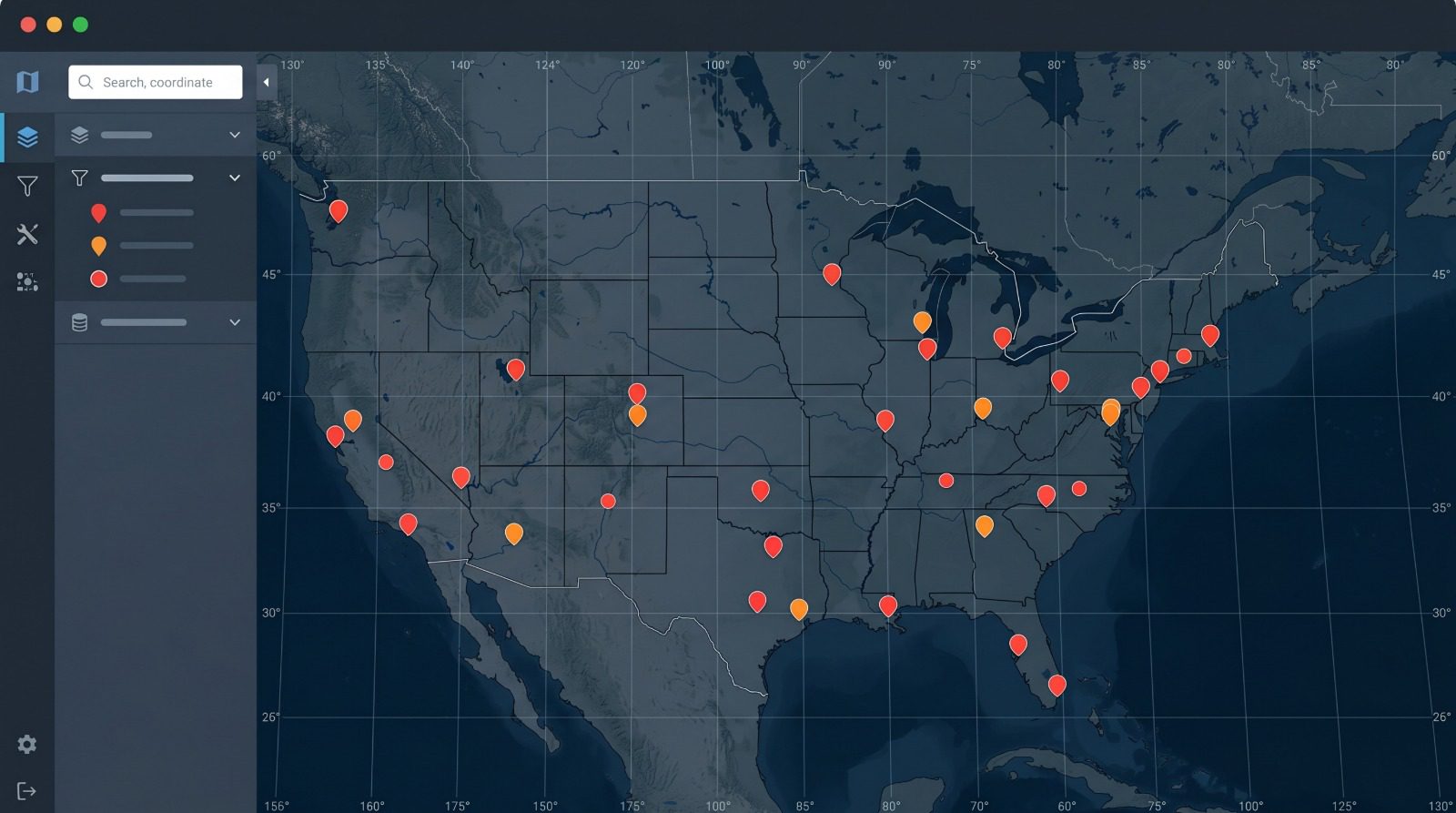
The plotting step is where the work starts to pay off, since a plotted row carries more than a dot on a basemap. It brings the other columns from its row, a name, an account, a rep, a sales figure, into a popup you can open by clicking the marker. From there the set is yours to work with. You can group and color-code the points by any column, filter down to a subset, build the shortest route across a list of stops, turn density into a heat layer, or draw territories around clusters by ZIP code, county, or a hand-drawn boundary.
Size is rarely the constraint. A coordinate set can run from a handful of points to tens of thousands in a single pass, and a platform such as Maptive maps data sets of any size in one upload, so the same workflow holds for ten field sites or ten thousand accounts. And when a point does land somewhere strange, read it as a message before you retype anything. A dot stranded in the open ocean usually points straight to the column you swapped or the sign you dropped.


