Among donor-advised fund accounts, 44% of grant dollars stayed inside the donor’s own metro area in 2024 and 54% inside the home state. Giving that concentrated turns a national donor file into a stack of local files.
Total US charitable giving passed $600 billion for the first time in 2025 while donor counts kept falling, extending a decline that started in 2021. Fewer donors giving more each turns the question of where those donors are into a planning question instead of a reporting one.
What Donor Mapping Shows That a Donor Report Does Not
Mapping software for nonprofits answers the prior question of which places the file is in. The awareness-to-advocacy diagram that also goes by the name donor mapping picks up later, once those places are known. Among the donor-advised fund accounts tracked across the top 30 metros, the share of grant dollars staying local reaches 80% in St. Louis and stays in the mid-50s in Chicago and Dallas-Fort Worth. Two organizations with files of the same size may be working in completely different geographies.
The smallest gift band fell more than 10% year over year inside that decline. Losing the bottom of a file while holding the top changes which neighborhoods a development office can still work. A map answers that before any capacity screening does.
Absence shows up on a map in a way it never shows up in a giving report, because a report has no empty space in it. A fundraiser at a Tennessee organization ran a campaign built around a live state map where each state lit up as it hit a $1,000 goal, raised close to $24,000 in five days, and led the write-up with the 12 states still under 20%. Most of those states were in the Northeast and Mountain West.
How far the map can be trusted still depends on the export it was built from. Most projects underestimate how much repair that file needs.
Donor Data Requirements Before You Map
A donor map can only argue what the export lets it argue. That limit is fixed before anyone opens a mapping tool. The columns present, the age of the addresses in the file and the number of times one household appears under different records each set a different part of it.
Which Columns a Donor Map Needs
The minimum is a street address, a city and a ZIP code, plus a name so a marker means something when it is clicked. Anything beyond that minimum buys a specific capability.
- A lifetime giving or last-gift-amount column, so donors can be colored by value.
- A last-gift-date column, so lapsed donors can be isolated with a filter.
- A campaign or fund column, so the annual fund and the capital campaign can be separated on one base map.
- A donor-type or channel column, so monthly givers can be split from one-time givers.
How Often Donor Addresses Go Out of Date
A donor file decays faster than the plan built on it. Between 11% and 17% of a file moves in a year, and 10% to 20% of addresses in a typical database are invalid at any moment once keying errors are counted. The National Change of Address file has 160 million records covering 48 months. Only about 60% of moves are ever reported to it, so a clean run against that database still leaves a large minority of movers where they were.
The presentation of the map should name that limit. Rows with incomplete or malformed addresses have to be repaired in the spreadsheet before upload. A further share of the file will place correctly at an address the donor has already left. Returned mail still arrives at an advancement team that reviews every address by hand each morning.
Duplicates and Multi-System Exports
The donor file is usually assembled rather than exported. Gifts arrive through the CRM, an events platform, a peer-to-peer tool, a payment processor and whatever a campaign added last year. Somebody reconciles them by hand into one spreadsheet. A database manager working across 17 systems rewrites the headers every time.
Duplicates survive that process and then behave differently on a map than in a list. Two records for the same household stack as two markers on one rooftop. A shop migrating off a 25-year-old system found its duplicate tool returning more than 18,000 possible matches. Deduplication ahead of the upload removes most of that. On a file that never got one, a dense cluster is as likely to be repeated records as households.
How to Put a Donor List Into Mapping Software for Nonprofits
With a file you trust, the build is a sequence of choices. What the map is made from comes first, what the colors mean second, and the unit the counting happens in last.
How to Upload a Donor Export
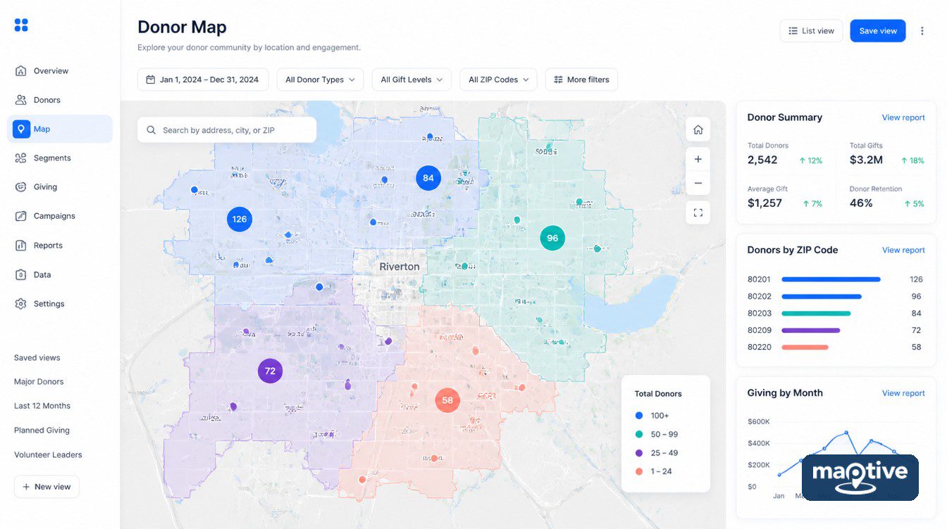
Create New Map appears on the Home, Map and Data tabs and disturbs nothing already built. Give the new map a name, a description if other people will open it, then bring the donor export in by drag-and-drop, through Add File, as a paste that includes the header row, or straight from a Google Sheet. The upload reads Excel, CSV and TSV.
Header columns such as Address, City, Zip code, Name and Phone Number give the automatic matcher something to work with. Click Map Now. A dialog may then appear for matching the address-specific columns, with the automatic match already applied and anything it missed left for correction. Work through that dialog rather than clicking past it. A ZIP column matched to the wrong field will put a Boston donor in a Kansas county, and it is usually a gift officer, already booked on the trip, who finds out.
Color-Coding Donors by Giving Level
The choice of grouping column is the argument the map makes. Everything after it is styling, and styling changes only how fast the argument arrives. Open Map Tools, select the Grouping Tool and choose the column. It becomes the Primary Group and each value gets its own colored marker. That pulls monthly donors apart from one-time donors, or one fund from another, without touching the underlying file.
For a gift amount or lifetime giving column, select Numeric. The popup then lets you set how many groups the values split into and group them by percentages or by number ranges. Marker style runs from standard blue bubbles to multi-color bubbles or growing pins, and a column with more than 500 distinct values can be switched to number ranges. A Secondary Group from a second column displays alongside the primary colors, so one map can show donor type and gift size together. Grouping by giving level shows who is worth a visit, while grouping by fund shows the reach of one appeal.
Donor Counts by ZIP Code and County
In the Boundary Tool, select the boundary set and choose the fill. Counting donors per boundary and totaling dollars per boundary are one dropdown apart, under Marker Count / Location Density and under My Numeric Data with Sum.
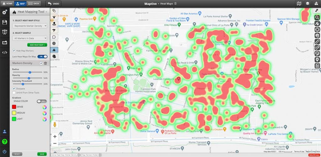
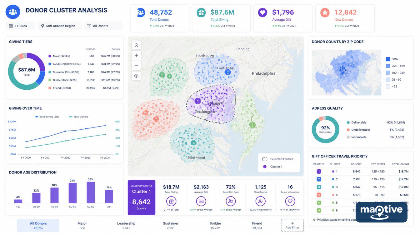
On a donor file the two fills rank the same boundaries differently. Neither is a summary of the other. A boundary with a high count and a low sum is a mailing list, and one with a low count and a high sum is two or three long-standing households. A Marker Density heat map over the same markers gives the smooth picture for a slide. Only the boundary fill produces a number a plan can use.
Is Donor Count the Same as Giving Capacity
No. A count reports how many households in a boundary have already given, and nothing in that number describes what those households are able to give, or what share of their income they part with.
Why Wealthy ZIP Codes Are Not the Best Targets by Default
The standard rate measure in philanthropy research is a locality’s total contributions as a share of its adjusted gross income. The resulting map of American generosity does not follow the map of American wealth. By that measure the long-standing finding, drawn from IRS itemizer data and repeated across editions of the same study since the mid-2010s, is that typical households in Utah and Mississippi gave more than 7% of income while typical households across several New England states gave under 3%. Households in the $50,000 to $75,000 band gave a larger share of discretionary income than households above $100,000 in the same analysis.
The sector has worked this out on its own terms. Most affluent households are not strong giving prospects, which is why capacity scores now blend in county-level home prices, having moved off raw property values as a capacity proxy. Fundraisers have argued since at least 2015 over whether purchased screening data is worth its fee, without reaching an answer. A screening file measures wealth. Giving history already records giving, at no cost beyond the export.
Adding Census Data to a Donor Map
Capacity questions need population context, which can be added without importing anything. The Demographic Census Data fill colors boundaries directly from United States or Canada census metrics once you select the demographic group and the specific metric. Customize Metrics puts the same census values inside a drawn area, so a boundary, territory, radius or drive time polygon displays them next to your own columns.
A thin area on the donor map is thin either because nobody there gives or because almost nobody lives there. The census fill tells the two apart. Counties with similar median incomes also differ sharply in how many filers give at all, which is another reason census context belongs on the map before anyone concludes anything about capacity.
Cluster Selection and Filtered Donor Exports
Acting on one part of the map means getting that cluster off the screen and into somebody’s calendar without handing over the entire file.
Selecting a Cluster With the Lasso Tool
- Click the lasso icon at the right of the map. It turns blue when it is active. Click near the outside edge of the cluster and click again to add each line, then close the selection by clicking the starting point or double-clicking.
- The popup then lists what can be done with the selection.
- Export the rows inside the selection to a file or the clipboard.
- Edit one column’s value across every selected marker at once, which writes through to the Data tab.
- Build an optimized driving route to the locations you enclosed.
- Export the boundaries the lasso covers, including boundaries never imported into the map.
- Delete every selected location, permanently, including from the Data tab.
Two of those actions rewrite the underlying file. Point the batch editor at a column that happens to be empty and the emptiness is written through to every marker inside the selection.
Filters to Apply Before an Export
The Filter Tool assigns each column a filter type, so which filter matters depends on which donor column it is pointed at. Group separates the annual fund from the capital campaign, or monthly givers from one-time givers. A lapsed list comes out of the Date filter, bracketed between the earliest and latest gift dates present. Number gives a slider between the giving column’s lowest and highest values, which is how a file gets cut into gift-size bands. Single names and account numbers are found with Text, inside whichever column holds them, and Attribute splits semicolon-separated values in a cell into separate groups.
Export then offers a choice of scope. Export Entire Dataset takes everything, Export Filtered Data takes everything that would show under the current filters, and Export Data Visible on Map takes only what is on screen. Files come out as .xlsx, .tsv or .csv, or straight to the clipboard. Export Filtered Data is what a gift officer should receive. It hands over one region and leaves the rest of the database in place.
Planning Gift Officer Travel Around Clusters
Major gift officers spend around half their time traveling and carry portfolios of roughly 100 donors. A single itinerary covers 15 to 20 personal visits and is planned around a region, with discovery visits stacked onto trips already scheduled for that area.
That is why a cluster does operational work. The lasso around a metro, exported to a spreadsheet, becomes the itinerary list, and the same polygon re-run in six months shows what the visits changed. It also puts a file of names and gift amounts in somebody’s inbox.
Is It Safe to Put Donor Data on a Map
A donor map is a document about named people. The controls that matter are the ones deciding who sees which columns. Map Settings has a Shared Maps and Presentational Maps menu with switches for every tool a viewer can see and use, including the legend, the filter tool, routing, boundaries, the heat map, the search bar and the lasso. Individual columns can be disabled so they never display at all, and gift amount is usually the first column to switch off.
The habits that follow from those switches sort viewers by what each one needs to see.
- Keep the marker-level map inside the development team, since that is the only group with a working reason to see names against gift amounts.
- Send a board member or an event host the boundary or heat view, with named markers, gift amount and contact columns switched off.
- Give a gift officer their region as a filtered export or a lasso export. The whole file does not need to leave the office.
The professional standard fundraisers already work to is a statement of ethics that applies a relevance test, under which information being findable does not make it appropriate to circulate. A map circulates faster than a printed list, so the viewer settings belong on a checklist that gets run every time a link is created.
The switches are a set of controls and nothing more. The discipline is the one a development office already runs on a printed prospect list, applied now to a document that forwards itself in one click. Names on the map are what makes it useful to a gift officer, and the same names are what should come off it before the link goes anywhere else.
Frequently Asked Questions
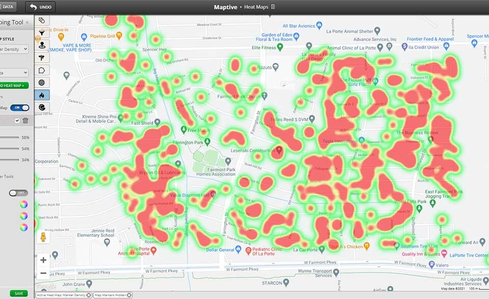
Yes, and no second file is needed. Upload the spreadsheet with its address columns, then generate the density surface from the markers already plotted. What comes back ranks areas against each other. For an actual number of households in a named ZIP code, use a boundary fill instead.
A dot density map places points so a reader can see presence and relative concentration, and the points are not meant to be counted. A heat map summarizes the same records as a single density surface instead of as individual marks. On a donor file the density surface only ranks areas against each other. Any count of households in a small area has to come from the dots.
The two fills are one dropdown apart. My Numeric Data with Sum aimed at the giving column colors each ZIP by dollars raised, and Marker Count colors the same boundaries by how many households gave. A ZIP that ranks high on one and low on the other is either a mailing list or a pair of long-standing households, and those two need different treatment.
Click the Export Data icon on the right of the map, choose Export Entire Dataset, Export Filtered Data or Export Data Visible on Map, pick .xlsx, .tsv or .csv or the clipboard, then click Export Now.
Mostly. Among donor-advised fund accounts in 2024, 54% of grant dollars went to charities inside the recommending donor’s home state and 44% stayed inside their own metro area, up 5 points from 2022. Across the top 30 metros, four out of five accounts made at least one grant to a nonprofit in the donor’s own city.
Among donor-advised fund accounts in 2024, ranked by the share of grant dollars staying local, St. Louis led at 80%, followed by Cincinnati-Middletown at 66% and Salt Lake City at 64%. Cleveland, Atlanta, Indianapolis, Dallas-Fort Worth and Chicago were all in the mid-50s against a national average of 44%.
Community asset mapping documents the resources present in a community, including institutions, associations, physical spaces and individual skills. It comes out of asset-based community development, published in 1993, which frames a community as assets to mobilize rather than deficits to fix. Plotting donors and assets on one base map shows how far a support base overlaps a service footprint.
Faster than most plans assume. Somewhere between 11% and 17% of a file moves in a year, and 10% to 20% of addresses are invalid at any given moment once keying errors are counted in. Running the file against the National Change of Address database, which holds 160 million records across 48 months, repairs the movers who reported themselves. That is roughly 60% of them, so a clean run still leaves a large minority mapped where they used to be.
Yes, since the mapping tool reads an exported file, which puts Raiser’s Edge, Bloomerang, DonorPerfect, Salesforce NPSP, Little Green Light and Neon One on the same footing once a constituent list with address columns is exported to Excel or CSV.
Portfolios run at roughly 100 donors, with some shops carrying 125 to 150. Travel is around half the job. A single itinerary usually covers 15 to 20 personal visits planned around a region. Discovery visits are added to trips already on the calendar.
Business mapping software, pointed at a donor or constituent export rather than at a sales file. Nothing in it is built specifically for fundraising. What makes it a nonprofit tool is the questions it gets asked, which are where the base is dense, which giving levels sit where, how the base compares with the census population around it, and which slice of the file a particular gift officer should receive.