

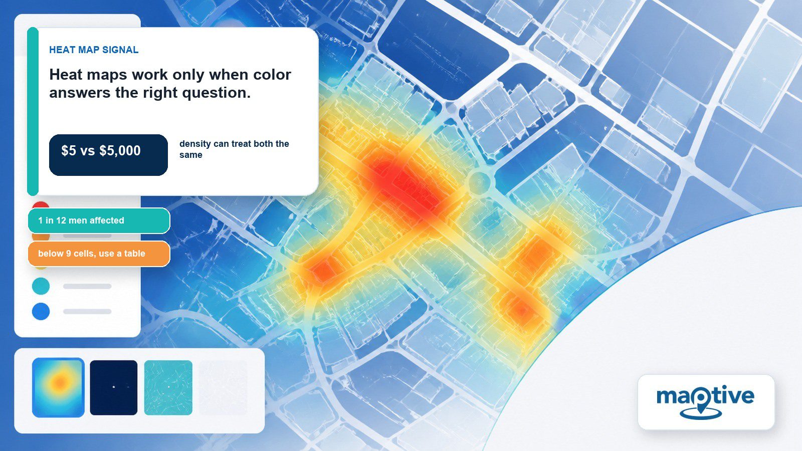
One dropdown at setup sets what a heat map measures. Left on Marker Density, a per-capita income map weights every address equally. Cities hold more addresses than farmland does. The map lights up the same familiar cluster of cities every time while the rural county with the highest figure in the state stays dark. Anyone ranking counties on that map picks the wrong winner. The color is reporting address counts under an income label.
Which Question Is Your Heat Map Answering?
A heat map is a colored surface built from individual data points, and it answers one of two questions, either how many things gather in a place or how much of something exists there. The style picked at setup decides which one. Reading the wrong question into the map is where most of the confusion starts.
Marker Density Maps Where Every Marker Counts the Same
Marker Density counts markers, and a spot glows hotter where more of them gather. That is a how-many answer. Scoping narrows the count further, cutting a national upload down to Arizona alone without touching the rest of the data.
Running Marker Density across a full customer list gives a retailer an accurate picture of where customers physically are, useful for staffing a pop-up or scheduling a delivery route.
But spending never enters the calculation. A $5 purchase and a $5,000 one add the same amount of heat. The customer who spent the most sits in the same color band as every neighbor.
What Column Does a Value-Weighted Heat Map Need?
The second style is value-weighted and answers a how-much question. It requires a column that contains only numbers, such as sales or price. Square footage and distance work too. Weighting the bloom by that number lets a handful of high-value markers outweigh a much larger cluster of small ones. A column mixing text with numbers will not work.
Both styles can appear on one map at once, layered so an analyst can compare them side by side. Each layer renders in its own automatically assigned color, keeping the two visually distinct. Either layer can be hidden or removed on its own.
The Neighbors a Statistically Meaningful Hot Spot Needs
Sitting alone, far from any neighbor, a single high-value point stays the same cool color as the ground around it even when its number is the largest on the entire map. The per-capita income map fails on exactly that count. Its bright areas are the places holding the most addresses. The color concentrates on address counts alone.
To count as a statistically meaningful hot spot, a location needs a high value and neighbors with high values too.
Reading a density map as an answer to “where is our strongest customer” produces the wrong conclusion. The map is answering “where are our most customers,” and the strongest customer can sit well outside the brightest area.
How Does a Heat Map Differ From a Choropleth Map?
Cartographers have argued for years over the accuracy of the label “heat map.” A choropleth shades predefined regions, a state or a county, by an aggregate value for the whole area. Having no regions to shade, a geographic heat map draws a continuous surface straight across the individual coordinates in the file, recognizing no borders.
Both come out as colored regions that look hot or cool, which is where the mix-up starts. It repeats the density-versus-value confusion, a map asked to answer a question its underlying data was never built to answer. For a business the practical cost arrives at the data-preparation stage. A choropleth needs a value already aggregated to a region, a county’s average income for instance, while a point-based heat map needs individual rows with coordinates. Feeding one format the other’s data fills the screen with color and puts a label on it that the underlying rows cannot support.
The Color Choices That Limit a Heat Map’s Audience
Borrowed originally from thermal-camera imagery, a full rainbow scale implies a smooth linear gradient in the data underneath it. Real numbers rarely move that way.
The sharp visual boundary between one color band and the next looks like a jump in value, so more color on the map buys no more precision about what changed and where.
Color choice also limits the audience. Some form of color vision deficiency affects 1 in 12 men, and a red-green scale hides the pattern for that share of any audience.
A 2026 review of more than 6,000 scientific papers found the same colormap mistakes in peer-reviewed research. Rainbow palettes and missing legends turned up again and again.
How Many Cells Does a Grid Need to Justify a Heat Map?
A heat map earns its place when a grid has enough cells that a human eye would struggle to scan every number, and when the goal is spotting an outlier fast. Monthly sales for 15 products across 8 regions is one such grid, 120 numbers deep. One unusually strong product performing in two otherwise weak regions shows up as a single bright cell that a table of that size would have buried.
Below roughly 9 cells, a plain table communicates faster than any color gradient. This applies whenever a decision depends on an exact difference. If a plan hinges on Region A running 12% higher than Region B, the heat map will not give that number, and someone ends up pulling the underlying figures anyway.
When the reader needs to identify specific individual locations, a pin map remains the better choice. It also fits when the number of distinct locations stays small enough to avoid a field of pins turning into visual clutter.
The Setup That Decides What a Heat Map Shows
In Maptive, building either style begins with one shared setup.
Open Map Tools and select the Heat Mapping Tool.
Choose Marker Density or Represents Numerical Data from the dropdown.
Click Add Heat Map to generate the layer.
Radius and opacity can both be adjusted after the map generates. The color gradient can also switch to a single flat color when a gradient adds more distraction than information for a given audience.
One checkbox, Unlink From Other Tools, keeps the heat map fixed while filtering markers elsewhere on the map, which matters for a team that wants to explore other filters without watching the heat map move underneath them mid-analysis.
The same segment scoping that narrows Marker Density to one state works for Represents Numerical Data too, letting a retailer isolate one region or one product line before reading the result. A narrower view like that turns a busy national map into an answer to one specific question.
Frequently Asked Questions
What is a heat map?
A two-dimensional visualization that represents the magnitude of values in a dataset using color, with warmer colors generally indicating higher values or greater concentration and cooler colors indicating less.
What is a heat map used for in business?
Spotting patterns across many location or category combinations at a glance, such as customer concentration or regional sales performance, without reading every underlying number one at a time.
How do you read a heat map?
Darker or hotter colors indicate higher values or greater concentration, and lighter or cooler colors indicate the opposite. The legend defines what each color band represents, and without it, the colors are a guess.
What does marker density mean on a heat map?
It counts how many data points fall within an area and treats every point as equal weight, so the resulting map answers a how-many question.
Can a heat map weight its color by a numeric value?
Yes, a value-weighted style uses a numeric column such as sales or price to weight the intensity of each point.
When should a business choose a table over a heat map?
Once the grid drops below roughly 9 cells, the numbers are quicker to read directly. The other case is any decision that turns on an exact numeric difference between two values, which a color gradient cannot deliver.
Are heat maps accurate?
Color reports the direction of a value accurately and its exact size only approximately. Two similarly colored areas can differ by an amount that changes the decision at hand.
Is a heat map identical to a hot spot map?
Not exactly. Hot spot analysis is a specific statistical technique that flags spatial clusters as statistically meaningful using a formal test, while heat map in everyday use more often describes a density surface with no such test applied.
What color scheme works best on a heat map?
A single-hue scale running from light to dark suits values that stay positive, while a two-color scale meeting at a midpoint such as zero suits values that run above or below it. Rainbow scales are generally discouraged for implying gradient changes the data does not contain.
Can a heat map be built in Excel?
Excel has no dedicated heat map chart type, but conditional formatting applied to a numeric grid with a two- or three-color scale approximates one for grids up to a few hundred cells.