You map multiple locations on Google Maps by using Google My Maps, not the standard Google Maps app, since My Maps is the free custom-map builder that imports a whole spreadsheet at once. Create a map, click Add layer, click Import, upload a CSV or Excel file with a column of addresses, and Google geocodes the list and drops a pin for every row. It is the right free way to plot a small list, and it stops being the right tool the moment the list grows, because the first wall you hit arrives with no error message.
Google Maps Versus Google My Maps
The two products do different jobs, and reaching for the wrong one is the most common reason people get stuck. The standard Google Maps you use on your phone is built to search for a place and route to it, and it will let you build a single trip with a handful of stops. Google My Maps, at mymaps.google.com, is a separate free tool for building custom maps with layers, drawn shapes, imported spreadsheets, and a shareable link. Plotting an entire address list at once is a My Maps job.
The limit that pushes people toward My Maps in the first place is the directions cap. Standard Google Maps allows 10 stops in a route, counting the start and end, and after the tenth the Add destination option grays out. There is a URL trick that can stretch a route toward 25 stops, but it is an unsupported hack rather than a workflow, which is why adding destinations one at a time never scales to a list of any real size.
How to Import a Spreadsheet of Addresses Into Google My Maps

The import itself is quick once the file is right, and almost all of the trouble comes from skipping the preparation.
Prepare the Spreadsheet First
Clean the file before you import it, because dirty rows do not announce themselves when they fail. Put your column headers in the first row so My Maps can read them. Split the address across separate Street, City, State, and ZIP columns rather than packing it into one long string, since the split version plots more correctly and leaves less room for the geocoder to guess. Standardize the formatting, strip out special characters, and remove duplicate rows. Blank address fields and inconsistent formatting cause rows to fail the match and drop on import, and My Maps gives you no list of which ones vanished, so the cleanup is what protects you from losing records you will not know are missing.
Add a Layer and Import the File
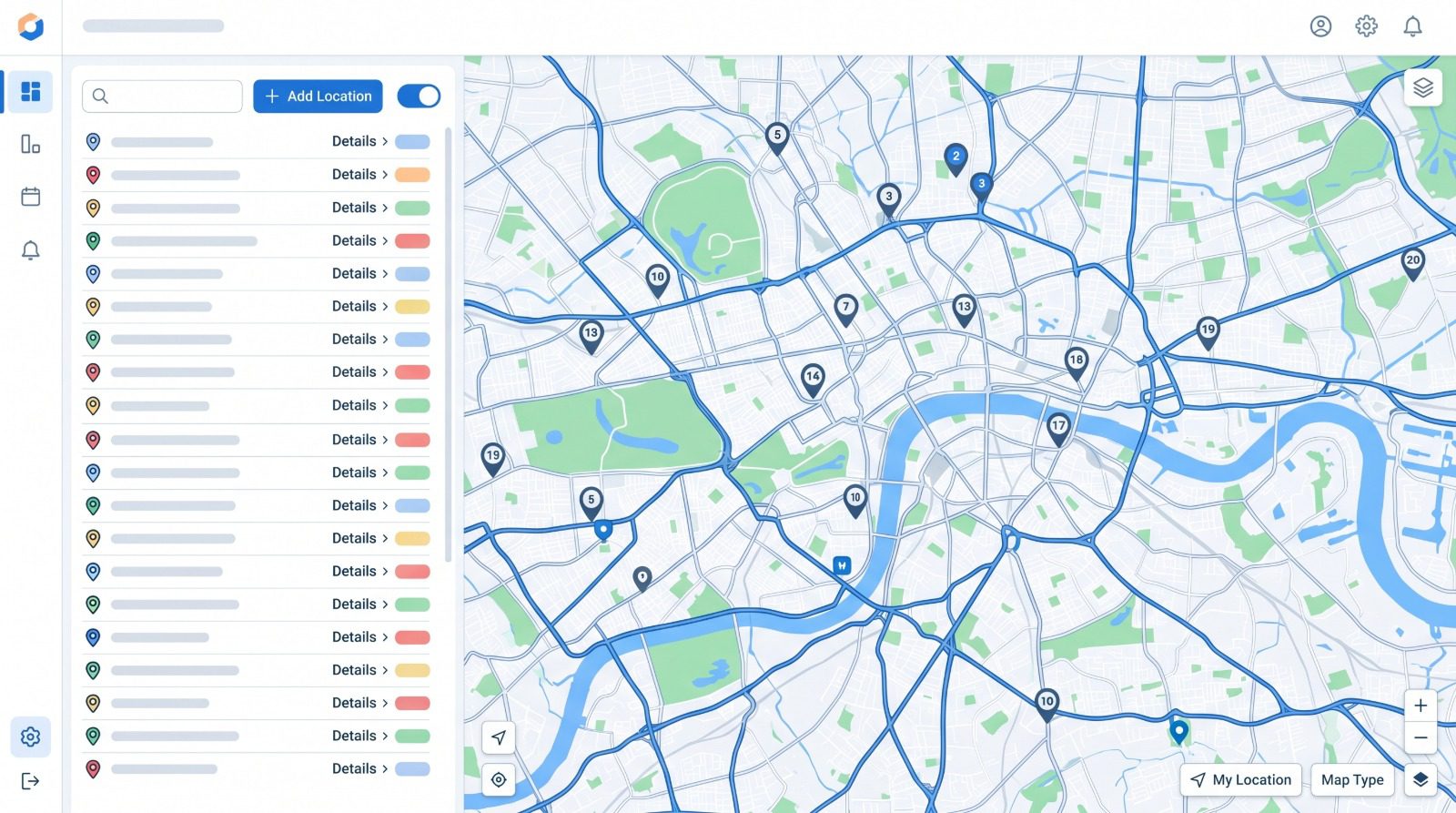
Sign in at mymaps.google.com and create or open a map. In the legend on the left, click Add layer, give the layer a name, then click Import beneath it. Upload your file, which can be a CSV, TSV, XLSX, Google Sheet, KML, KMZ, or GPX, and click Select. My Maps then asks which column contains the location data, where you choose the address column, a latitude-longitude pair, or a place-name column, and which column should title each marker. Google geocodes the addresses for you on import and plots the layer. When the underlying sheet changes later, the layer’s Reimport and merge option lets you replace all items, update the ones that match, add new ones, or merge on a shared column, and any styling you set on a data column is kept through the refresh.
Verify the Plotted Count
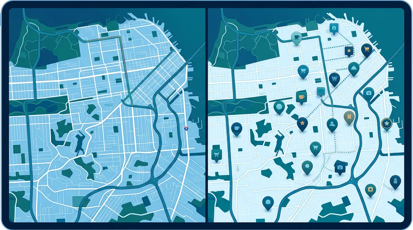
Before you do anything else with the map, compare the number of pins to the number of rows in your file. This one habit catches the wall described below, where an oversized import looks like it worked while leaving rows out without a word. A pin sitting on the map is also no guarantee that the pin is in the right place. When the geocoder cannot find an exact match it downgrades without telling you, falling back from a rooftop point to a guessed point along a street, or to the center of a ZIP code, and those fallbacks can land hundreds of feet from the real address, with the gap widening on rural roads and large lots. The dot looks equally confident either way, so a quick scan for pins that have landed somewhere implausible is part of trusting the map.
The Scaling Limits of Google My Maps

My Maps holds up well for a small list and then meets a series of ceilings as the data scales. They arrive in a particular order, and knowing that order is what keeps each one from coming as a surprise.
The Silent 2,000-Row Import Wall
Google’s own help docs draw the line at 2,000 rows and tell you not to import a file larger than that. The reason this catches so many people is that My Maps does not stop you or warn you when you cross it. An import of 5,000 rows appears to succeed, the map zooms to fit, the pins appear, and only the first 2,000 rows end up on the map. Nothing on the import flags the shortfall, so the missing locations stay invisible until someone goes hunting for one that should be there and cannot find it. This is the single most common complaint about the tool, and it is also the easiest to miss because the import reports success either way and leaves the shortfall for you to find.
The Performance Slowdown Near 500 Points
The performance wall shows up long before the documented one. My Maps draws every marker in the browser at once, without the clustering or lazy-loading that purpose-built tools use to stay quick, so the map starts to drag much earlier than the 2,000-pin cap suggests. In practice the slowdown can start near 500 points, a quarter of the limit, with the lag worse on phones than on a desktop. So the responsive ceiling sits far below the official one, and a map that felt fine at a few hundred addresses can become sluggish to pan and click well before you reach the row limit.
The 10-Layer, 10,000-Place Ceiling
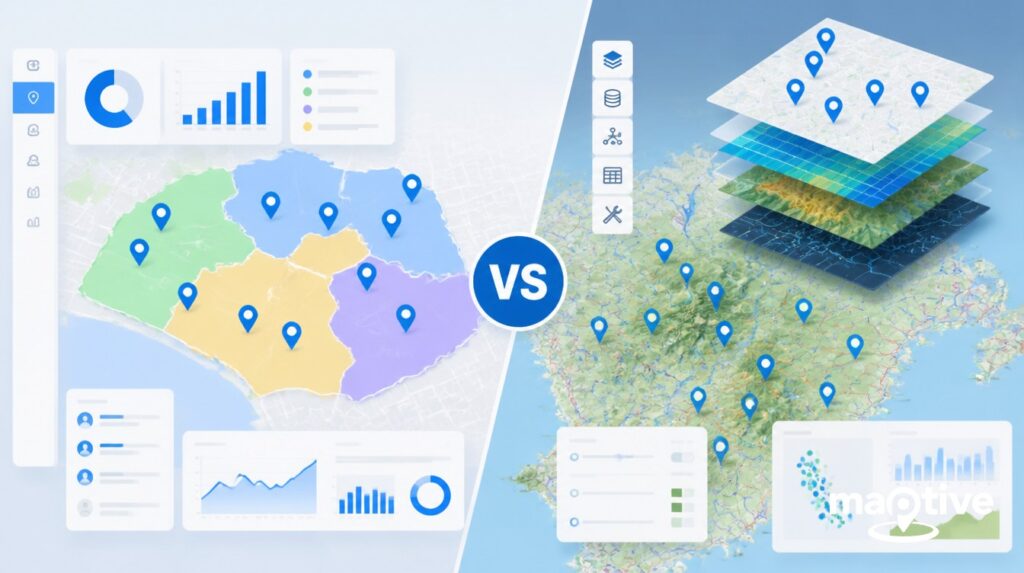
Beyond the row limit, the structural caps bound the whole map. A single layer takes up to 2,000 features, a map allows up to 10 layers, and the map as a whole caps at 10,000 places. A list of more than 10,000 addresses cannot fit on one My Maps map at all. The documented way around the per-layer limit is to split your data across several layers or across separate linked maps, and it works in the narrow sense that the pins all plot somewhere, while defeating the point in the process. Fragmenting 5,000 locations across layers or maps makes it impossible to search or read across the full dataset at once, which is the very thing you opened a map to do, so the split is a workaround rather than a real fix.
The Analysis Gap in Google My Maps

The harder limit has nothing to do with how many pins fit, and everything to do with the fact that the reader’s real job is rarely to see dots on a map. The questions behind a list of locations are which clusters matter, how to split coverage fairly across a team, what route to drive, and which areas are underserved, and answering any of them takes counting, banding, or overlaying that My Maps does not do.
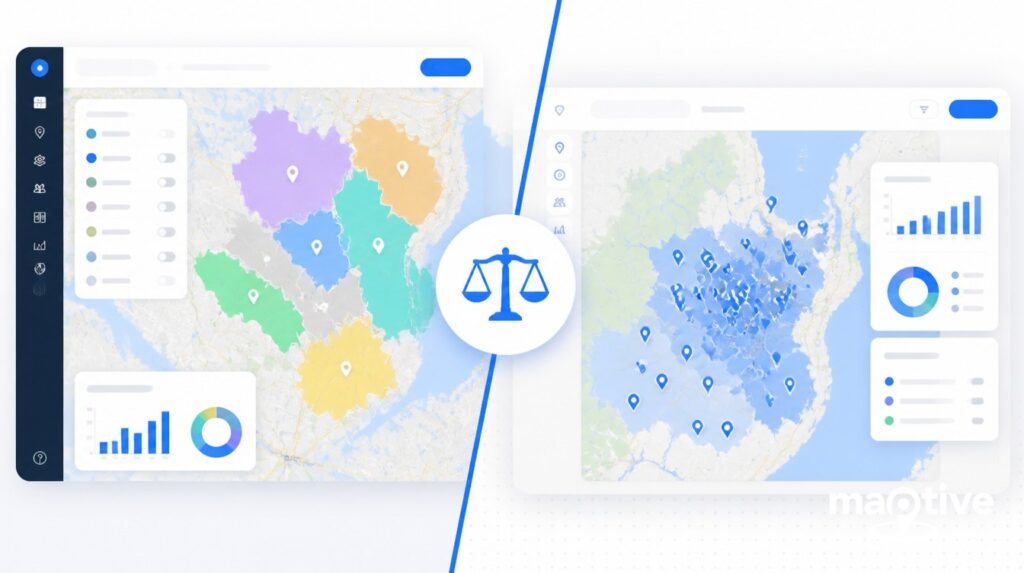
The clearest gap is that My Maps cannot count what falls inside a shape. Draw a polygon around a neighborhood and you get an outline, not a number, and it will not tell you how many of your plotted addresses or how many households fall within it. Two territories that look identical on the map can have very different loads, so one rep ends up with 80 houses and another with 400, and nothing on the map warns you. You find out when the lighter-loaded rep’s commissions tank and they start asking why.
The rest of the gaps follow the same pattern, where the data is on the map but the tool cannot do anything with the numbers behind it:
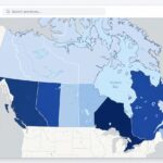
No demographic overlay, so household income, population density, age, and consumer spending stay off the map and you see geography without market signal.
No weighted heat map. A numeric column such as sales volume or account count cannot be turned into a view of where value concentrates.
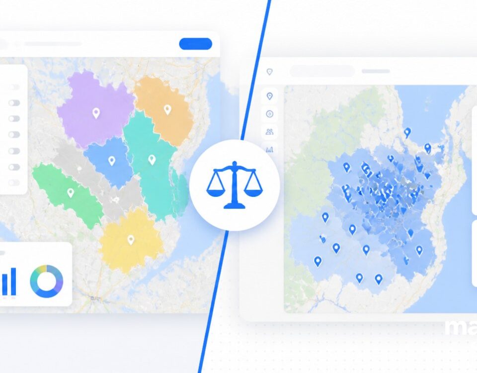
Territories are drawn by hand, point by point, with no ZIP-to-territory build and no balancing.
Version history is missing too, so a pin dragged into the wrong layer or an edited boundary cannot be rolled back, so experienced users keep a separate spreadsheet of their boundaries as a backup.
None of these caps is a flaw in the tool, since My Maps was built as a lightweight consumer product, and the missing analysis exists by design. Google’s paid Maps Platform and its mapping API can lift the row ceiling, but only by building and paying for a custom application, which is a different undertaking than opening a map.
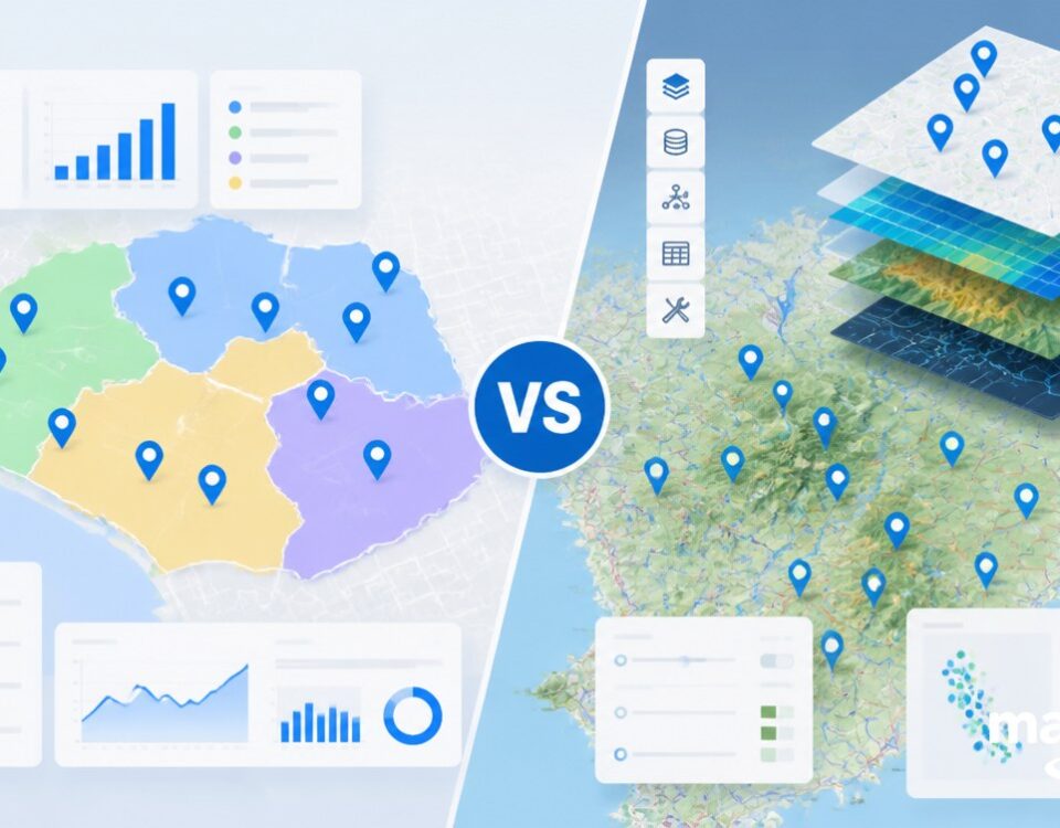
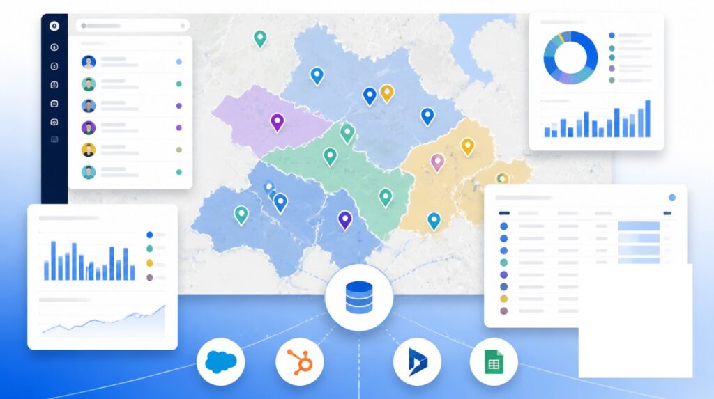
Bulk Plotting and Analysis in Dedicated Mapping Software
Once the list or the questions outgrow the free tool, business mapping software is the honest next step, and the difference starts with scale. A platform such as Maptive plots tens of thousands of records on a single map, with one customer running up to 10,000 accounts and instant recalculation for groups of more than 5,000, so the size of the list stops being the thing you plan around.
The more useful difference is everything that becomes possible once the pins are down, where each capability answers one of the questions My Maps leaves hanging:
Group and color the markers by any column, region, priority, rep, or status, with a legend you toggle to isolate one segment at a time.
Draw concentric radius or mileage bands around a candidate location to see which addresses fall inside each ring for trade-area work.
Draw or import a territory, including by ZIP code, and watch the count of records inside it update in real time as you adjust the boundary, so coverage is balanced before anyone is assigned to it.
Optimize the order of a long list of stops and export turn-by-turn directions for the field, far past the 10-stop ceiling of standard directions, with route optimization handling up to 70 stops.
Weight a heat map by an uploaded field, push the in-map data back out to a spreadsheet, and share a view-only link that controls which menus and tools a viewer sees.
These are the moves that turn a plotted list into answers about coverage, value, and routes.
The framing is staged rather than absolute. My Maps is adequate for a solo rep with a handful of clean stops, and it makes sense as the free starting point. Most teams outgrow it somewhere between three and ten reps, usually when they start assigning territories and trying to understand what the team covered last week, and that is a visibility and accountability problem rather than a routing one. What pushes a team off the free map is almost never the pin count, but the first week someone has to answer who covers which ZIP, what ground last week’s routes really touched, and which territories carry twice their share, and finds the tool can show the dots but not weigh them.


