


Map Where Your Employees Live to Site Your Next Office
Where do most of our employees live, and which office site would give the whole team the shortest commute? Maptive plots your staff home addresses as a heat map, then counts how many people fall inside the drive-time around each candidate location.
No credit card required
- Upload employee home addresses from a spreadsheet, and geocoding fixes messy rows and missing ZIP codes.
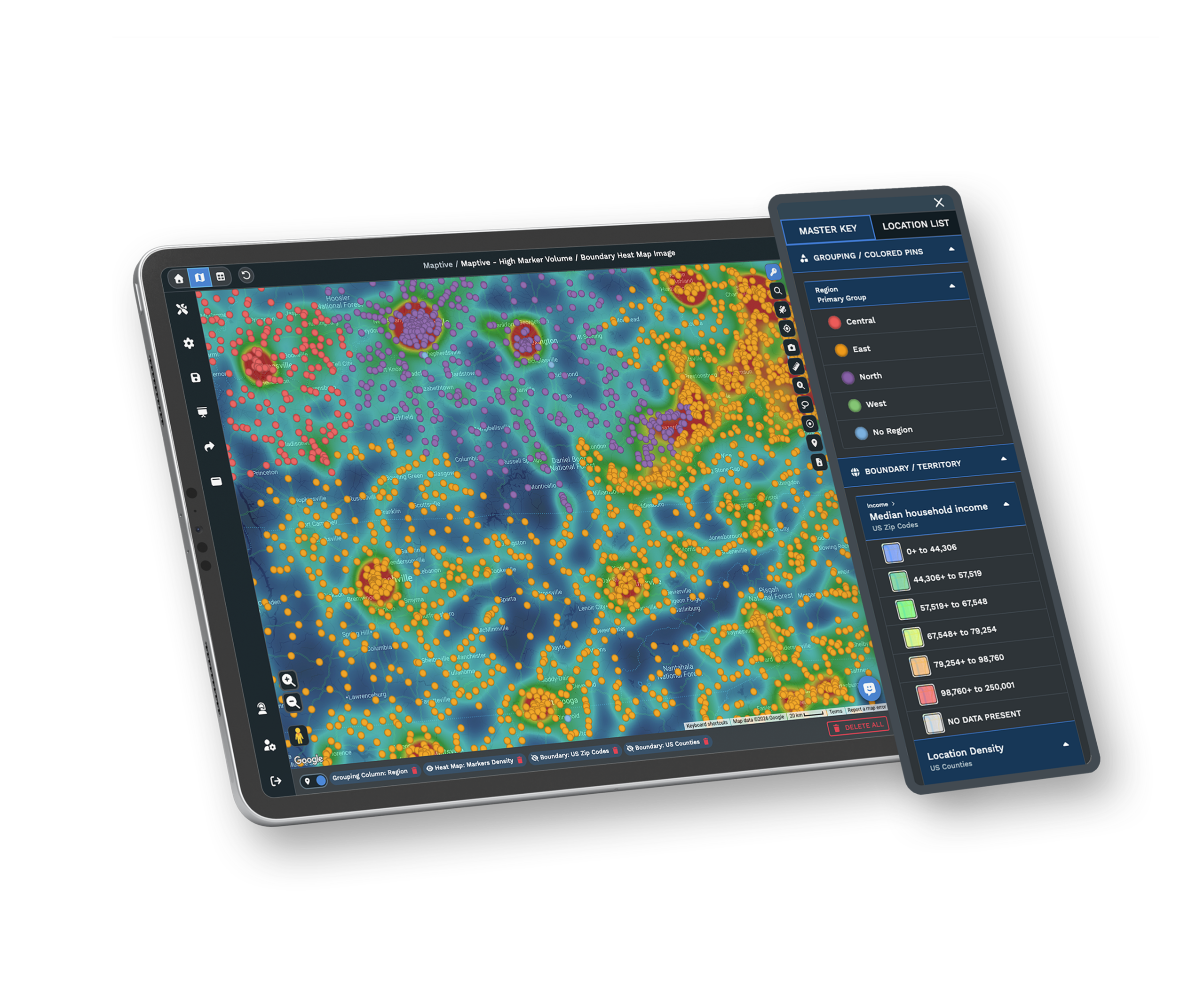
- Drop a marker-density heat map to see where staff concentrate as a gradient, not a wall of pins.
- Draw a drive-time polygon around a candidate office and count the employees inside that commute.
- Set a distance radius in miles for a straight mileage commute and read who falls inside.
- Lasso any cluster of employees on the map and read the selected head count.
- Compare two candidate sites by the employee count inside each drive-time, side by side.
Trusted by teams at









Turn Home Addresses Into a Siting Case
Maptive helped us go beyond geography. The flexible analysis tools help us manage in ways beyond getting from point to point.
Building the Workforce Map in Maptive
-
1
Upload Home Addresses and Drop a Heat Map
Upload your employee list from Excel, CSV, or a Google Sheet, and Maptive geocodes the home addresses, correcting messy rows and missing ZIP codes. In Map Tools, open the Heat Mapping Tool, pick Marker Density, and click Add Heat Map. The gradient runs hot where staff concentrate and cool where they thin out. Adjust the radius and intensity, or turn on Hide Map Markers to show the density on its own.
-
2
Draw a Drive-Time Around Each Candidate Office
Open the Drive Time Polygon Tool, enter a candidate office address, set the commute you care about, such as 30 minutes, and click Add Drive Time Polygon. Repeat for each proposed site so every address keeps its own commute shape on the same map. Drive-time polygons are based on perfect driving conditions rather than live or historical traffic, so treat each one as a fair, repeatable footprint rather than a rush-hour forecast.
-
3
Count the Employees Inside Each Commute
Click a drive-time polygon and the right panel reports how many employee locations fall inside it. Open Customize Metrics, choose Spreadsheet Data, and add a Group Count of your staff column for the exact number within that commute. Do the same for the other polygons, and the site with the highest count is closest to where your people already live. That figure turns a relocation opinion into a defensible siting case.
-
4
Check a Mileage Radius or Lasso a Cluster
For a straight mileage commute, open the Distance Radius Circles tool, center a ring on a candidate address, set Proximity Within to a figure like 15 miles, and add the radius, then run Customize Metrics for the count inside. To size a single neighborhood, use the Lasso Tool to draw around a cluster of homes and read the selected count. Together these answer where your workforce lives and which address serves the most people.
Start Your Workforce Map Free
Begin the 10-day free trial with no credit card and every tool unlocked. Upload your employee roster, drop a heat map, and draw a drive-time around each candidate office on your own data to see the counts for yourself. Want a hand? A Maptive specialist will sit down with you and build the first commute comparison so your siting deck is ready to present.
No credit card required
Frequently Asked Questions
How do I map where my employees live?
Upload your employee list from Excel, CSV, or a Google Sheet with a home address column, and Maptive geocodes each row, correcting messy addresses and filling in missing ZIP codes. Open the Heat Mapping Tool in Map Tools, pick Marker Density, and click Add Heat Map. The map paints a smooth gradient over the home addresses, so the areas where staff concentrate read as hot spots. You can adjust the radius and intensity, or turn on Hide Map Markers to show the density on its own. No GIS skills or code are needed.
How do I find the office site with the lowest employee commute?
Draw a Drive Time Polygon around each candidate office address, set the commute you care about, and click each polygon to read how many employees fall inside. Open Customize Metrics and add a Group Count of your staff column for the exact figure. The candidate with the most employees inside its drive-time gives the whole team the shortest average commute. Comparing those counts side by side turns a relocation debate into a number you can defend to the lease committee and to leadership.
Can I count how many employees are within a 30-minute drive of a site?
Yes. Open the Drive Time Polygon Tool, enter the site address, set the time to 30 minutes, and add the polygon. Click it and the right panel reports the number of employee locations inside, and Customize Metrics adds a Group Count for a precise total. You can set any commute length, from 15 minutes to an hour, and draw a fresh polygon for each candidate address. Because every polygon reads from the same roster, the counts stay comparable across the sites you are weighing.
Does the drive-time use live traffic?
No. Drive Time Polygons are based on perfect driving conditions, not live or historical traffic data. That makes each commute footprint a fair, repeatable comparison between candidate sites rather than a rush-hour prediction that changes by the hour. When you draw a 30-minute polygon around two addresses, both are measured the same way, so the difference in employee counts comes from distance and the road network alone. Use the drive-time as an even baseline, and pair it with a mileage radius when you want a simpler distance cut.
How do I compare two candidate office locations?
Draw a Drive Time Polygon around each address using the same commute length, then click each one and read the employee count from the panel or from a Group Count in Customize Metrics. Both polygons are on the same map over the same heat map of home addresses, so you can see which site is closer to the dense clusters and which count comes out higher. Add a third or fourth candidate the same way. The site with the most employees inside its commute is your lowest-commute option in plain numbers.
Can I select employees in one area and get a count?
Yes. The Lasso Tool lets you draw a free-form shape around any cluster of employee homes, and Maptive reads back the count of markers you selected. This is handy when you want to size one neighborhood or corridor rather than a full commute ring, or to check how many people live near a specific site before you draw a formal drive-time. You can lasso a downtown core, a suburb, or a stretch along one highway, and the selected total updates as you adjust the shape.
What if my employee addresses are messy or missing ZIP codes?
Maptive geocodes your list on upload, correcting inconsistent formatting and filling in missing ZIP codes so more of your roster lands on the map. You can paste addresses or bring them from Excel, CSV, or a Google Sheet, and you do not need to clean the file by hand first. Rows that need attention are flagged for review. Once the homes are placed, the heat map, drive-time counts, and radius all read from the same corrected set of locations, which keeps every siting number consistent.
Can I measure commute by miles instead of drive time?
Yes. Open the Distance Radius Circles tool, center a ring on a candidate office, and set Proximity Within to a mileage figure such as 15 miles, then add the radius. Click the ring and run Customize Metrics to read how many employees fall inside it. A radius measures straight-line distance from the site, which gives a simpler cut than a road-based drive-time. Many teams draw both, using the mileage ring for a quick screen and the drive-time polygon for the commute number that goes in the siting case.
How many employee locations can I map at once?
Maptive plots up to 200,000 markers on a single map, so even a large workforce spread across a metro or several regions fits on one view. The heat map summarizes all of those homes as a density gradient, and each drive-time or radius counts the employees inside for you. Panning and zooming stay responsive at that scale, so you can map every employee rather than a sample when the siting decision has to hold up.
Is my employee address data secure?
Maptive protects data with 256-bit SSL encryption, two-factor authentication, single sign-on, and role-based access, so you control who on the team can open the workforce map. Home addresses stay inside your account, and you decide when to share a map through a password-protected link, a public link, or a one-line embed. For a siting review, you can share a read-only view of the commute comparison without handing over the underlying roster. The US and Canada support team can help you set up access controls if you need them.








