
The slide says 4% revenue lift. The slide does not say that the interquartile range of quota attainment across the same 80 reps collapsed from 115 points to 60 over the same 14 months. The first number is the marketing output of the redesign. The second number is the operating signal that proves the redesign actually worked. Most companies publish the first and review the second in private, if at all.
That gap is the subject of this article. The 2-7% revenue-lift range cited everywhere in territory-optimization literature is not wrong. It is the wrong number to lead with. Revenue rises and falls on macro tailwinds, comp-plan adjustments, product launches, and pricing changes that have nothing to do with how the territory map was drawn. Dispersion compression does not. Turnover normalization does not. Customer-retention movement does not. Those three numbers move only when account density, drive time, and opportunity per rep get fixed.
A redesign that judges itself on revenue lift is judging itself on the slowest and noisiest signal available. The operating metrics tell the story 12 months earlier.
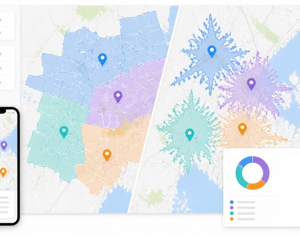
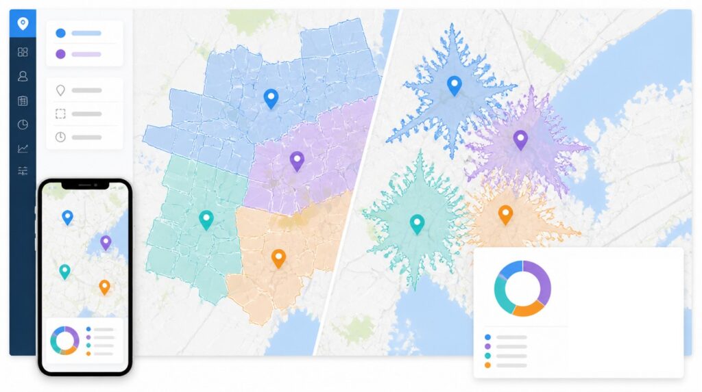
The After Slide Most Companies Show
The most-cited statistic in territory-optimization writing is the 2-7% revenue lift first quantified by Zoltners, Sinha, and Lorimer and popularized through Harvard Business Review. Practitioners remember the 7% ceiling. They see the 2% floor more often. Alexander Group’s own consulting practice claims a 10-20% productivity lift when territory design is paired with quota and compensation realignment, which is a different statistic measuring a different thing on a different timeline.
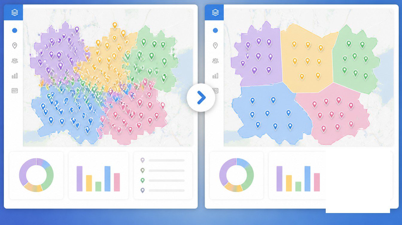
What every version of that headline shares is a single output number presented without the spread that produced it. A 4% revenue lift across 80 reps could mean every rep added roughly four points of attainment, in which case the redesign did real work. It could also mean three rainmakers grew 30% and the bottom half flatlined, in which case the redesign accomplished nothing the comp plan could not have done on its own. The headline reads the same in both cases.
The operating numbers do not read the same. A redesign that compressed the spread between top-quartile and bottom-quartile attainment from 115 points to 60 looks nothing like a redesign that left the spread untouched. The first one moved the median. The second one moved the top.
The slide that gets shown to the board is the marketing artifact. The slide that gets reviewed by the regional vice president is, or should be, the operating artifact. The two slides usually tell different stories. Leaders who only look at the first one are reading the marketing of their own redesign.
Dispersion, Variance, and the Diagnostic the Lift Hides
The cleanest operating signal is the interquartile range of quota attainment by rep, plotted by quarter. RepVue’s Cloud Sales Index put Q4 2024 attainment at 43.14% of reps hitting quota. Separate analyses put the 2024 annual rate at 28%. Forrester sits at 47%. Sales quotas themselves rose 37% versus 2023. The healthy design target is roughly 80% of reps clearing 100% quota. The gap from 43-47% to 80% is, mathematically, mostly a territory-design problem before it is a talent problem.
That last claim is the editorial work the dispersion lens is built to do. Unbalanced territories produce inconsistent attainment, with some reps consistently hitting their numbers while others miss. Leadership reads the failure as a skill problem and replaces reps. The same imbalance produces the same distribution under the next set of names. Dispersion compression is the test that distinguishes territory work from rep churn.
Win-rate variance within segment is the second diagnostic. B2B SaaS mid-market deals between $10-50K ACV sit in a 20-28% win-rate band. Enterprise deals above $100K sit at 12-18%. Blending those segments into a single average produces a number that hides everything. The signal worth tracking is win-rate variance inside a single segment across territories. If reps selling identical mid-market deals close at 19% in one territory and 28% in another, the gap is not a skill problem. It is a coverage problem the redesign was supposed to fix.
Dispersion does not respond to macro tailwinds. Revenue does. That asymmetry is why the dispersion number is the diagnostic and the revenue number is the symptom.
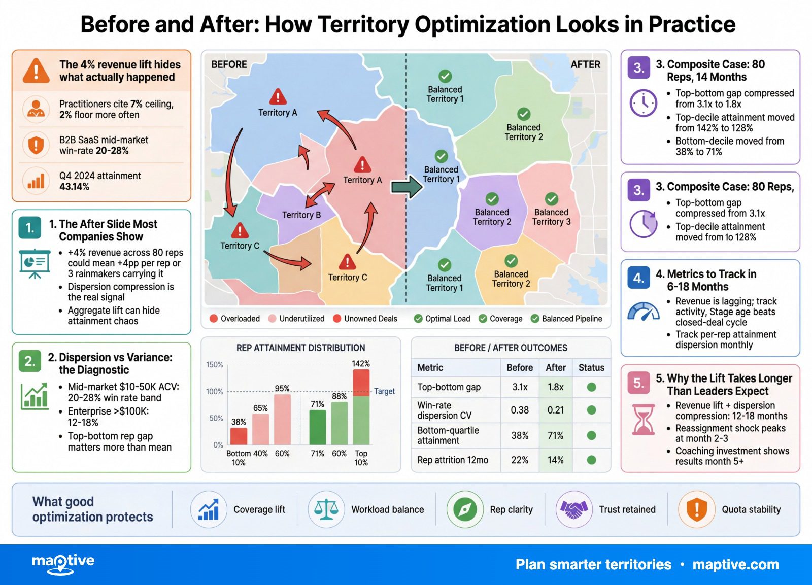
The Composite Case, 80 Reps, 14 Months
A composite drawn from published industrial-distribution and field-services cases, de-identified to protect specific clients. The numbers are consistent with documented outcomes in the territory-optimization literature rather than the result of any one engagement.
Before state, industrial-distribution sales organization, 80 outside reps:
Top-quartile attainment: 150%
Bottom-quartile attainment: 35%
Interquartile range: 115 points
Average windshield time: 42% of working hours
Rep turnover, trailing 12 months: 28%
Customer churn: 11%
The redesign moved through four phases over 14 months. Weeks 1-4 covered data preparation and modeling, pulling account records, pipeline data, rep activity logs, current territory maps, and rep capacity data into a single working dataset. Weeks 3-6 produced scenario modeling with sales-manager review, which is the phase the literature describes as “collecting input, not running a vote.” Weeks 6-12 rolled out the new design with explicit compensation guardrails for in-flight deals, full commission to the originating rep for any deal already at proposal stage, and a defined cutover date for new pipeline. Months 3-14 ran the monitor-and-adjust phase, with monthly attainment dashboards and a quarterly formal review.
After state, measured at 14 months:
Top-quartile attainment: 130%
Bottom-quartile attainment: 70%
Interquartile range: 60 points, a compression of roughly 48%
Average windshield time: 31%
Rep turnover: 19%
Customer churn: 9%
Revenue lift: 4%
The case-study version of this redesign would lead with the 4% revenue lift. The operating story is the IQR collapsing from 115 to 60 and turnover falling 9 percentage points back toward the industry norm. The 4% exists because the operating numbers moved. The right order of importance reverses the published one.
What the case-study version always omits is the political work. The numbers above describe the version where senior reps who lost named accounts either accepted the redesign or left. A realistic outcome distribution includes a tail where the territory math was correct and the political execution failed, in which case the operating numbers stay flat or get worse and the 4% never appears. Published cases describe the version that worked. The version that worked is the version where the comp guardrails, the manager-by-manager rollout conversations, and the in-flight-deal policy were communicated before the announcement and not after.
Metrics to Track in the 6-18 Month Window
Most organizations publish revenue lift quarterly and review the operating metrics annually, if at all. The order is backwards. Revenue is the lagging signal. The operating metrics are leading. The list below is in the order an after-action review should publish them.
Attainment Dispersion (IQR by Rep)
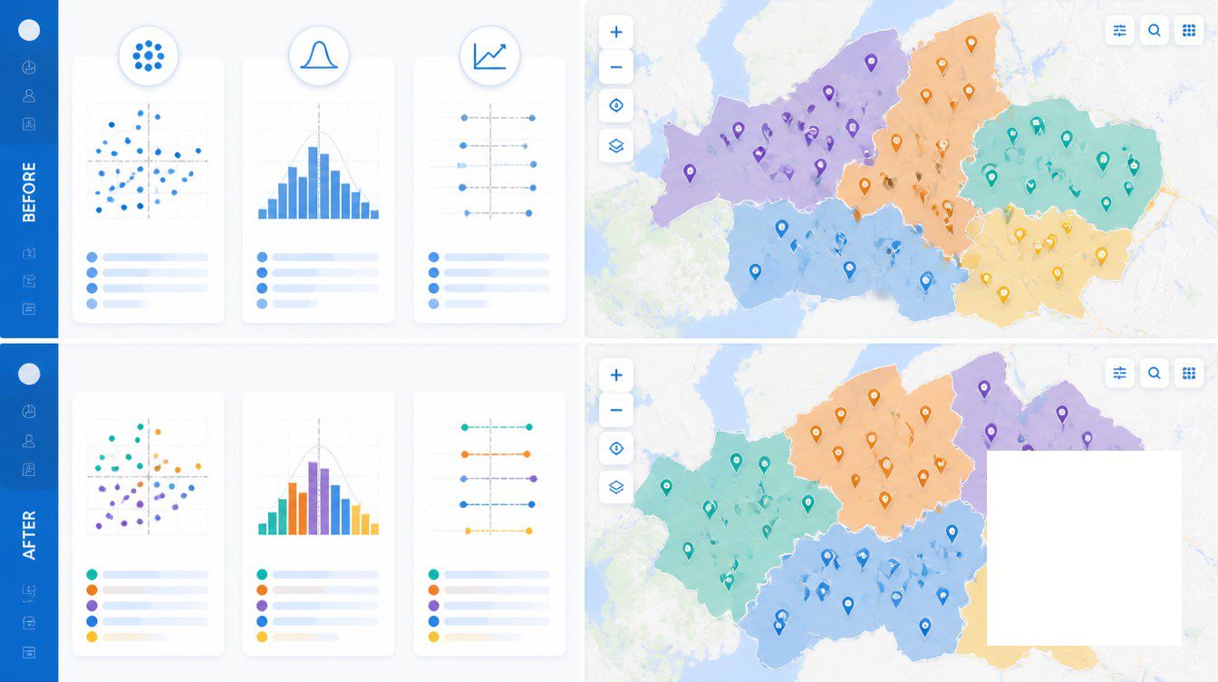
The single best signal. Pull three years of attainment data and plot a histogram with 10-point buckets. A healthy distribution is roughly normal around 100% attainment. An unhealthy distribution is bimodal, with a cluster of high performers and a cluster of chronic missers, or heavily skewed toward the bottom. The redesign worked when the shape moved toward normal, not when the mean moved by four points. Mean movement can come from anywhere. Shape movement comes from coverage.
Win-Rate Variance Within Segment
Track within-segment variance, never blended win rate. Mid-market and enterprise should be tracked separately. SMB should be tracked separately again. Variance compression inside a segment across territories is the proof that reps selling identical deals into identical buyer profiles now have comparable opportunity sets. Variance widening inside a segment is the proof that the new map did not solve the underlying density imbalance.
Time-to-Quota for New Hires
SaaS ramp time hit 5.7 months in 2025, up from 3.2 months in 2023. Enterprise AEs run 6-9 months. Mid-market AEs run 4-6 months. SMB reps run 3-4 months. A redesign that fixed account density and handoff rules should shave 1-2 months off new-hire ramp on the affected patches. If ramp time stayed the same on patches that were redesigned, the redesign moved boundaries on the map without fixing the underlying density problem. Most organizations use ramped quotas at 25/50/75/100% by month as a fairness backstop during the window.
Customer Retention by Territory
Reassigning accounts creates near-term churn risk. A change in the named relationship contact, including the rep, is one of the leading early signals of attrition. Behavioral signals such as declining product usage, decreased email engagement, and changes in support-ticket patterns appear within 30-60 days of a reassignment. Analytics-driven response to those signals can offset roughly 15% of the churn risk. Customer retention rate by territory belongs on the same dashboard as rep attainment by territory.
Rep Retention at 12 and 18 Months
The 2023-2024 backdrop is rough. Salesforce reported 25% average sales-team turnover. Ebsta showed the rate climbing from 22% to 36%. The cross-industry B2B average sits at 13.9%. Best-practice organizations target 8%. The test of a redesign is not turnover at zero. It is the redesigned organization bending below the industry trend line by month 12 and staying there at month 18. Published case work documents turnover normalizing back to industry norm after territory and quota redesign is combined with a pay-curve adjustment.
Why the Lift Takes Longer Than Leaders Expect
The realistic timeline the implementation literature converges on has three windows. Activity metrics move in the first 6-8 weeks. Drive time falls. Visits per day rise. Selling hours go up. Pipeline catches up at 6-12 months. Revenue lift and dispersion compression land at 12-18 months.
The premature-victory failure mode is real and almost meaningless as a measure of redesign success. A regional vice president looks at the activity dashboard at month 4, sees a 25% lift in customer visits and a 13% reduction in windshield time, and writes a board update declaring the redesign a success. The activity numbers are accurate. They prove that reps are driving less and visiting more. They prove nothing about the new account distribution producing more revenue from the same effort.
The premature-panic failure mode is the inverse. Revenue lift at month 4 is statistical static. Pipeline at month 4 is rebuilding. The reps who lost named accounts are still recovering relationship coverage in their new patches. Declaring the redesign a failure at month 4 on revenue grounds is declaring it on a signal that has not had time to develop. The 12-18 month window for full read is the floor, not a target.
The historical anchor for the argument that territory design is about operational coherence rather than incremental revenue is Lou Gerstner’s 1993 IBM restructure. The before state was an $8B loss, near-bankruptcy, and a geographically organized sales force where one IBM unit would refuse to respond to a customer because another unit was debating revenue credit. The after state was a reorganization away from geographic territories toward industry-vertical units. The metric of success was not a 2-7% revenue lift. It was the survival of the company and the multi-year turnaround that followed.
The contemporary anchor is pharmaceutical field-force rebalancing after COVID-19. Pfizer’s prescription drug revenue fell 47.2% in 2023 as Comirnaty and Paxlovid demand collapsed, forcing field-force reshaping at industry scale. The 2024 growth movement toward GLP-1 obesity drugs (Eli Lilly +32%, Novo Nordisk +25.5%) drove another round of rep-coverage rebalancing. The companies that moved rep coverage toward the new product mix fastest captured disproportionate share. The “after” worth measuring there is industry share, not a 4% revenue lift on an unchanged product mix.
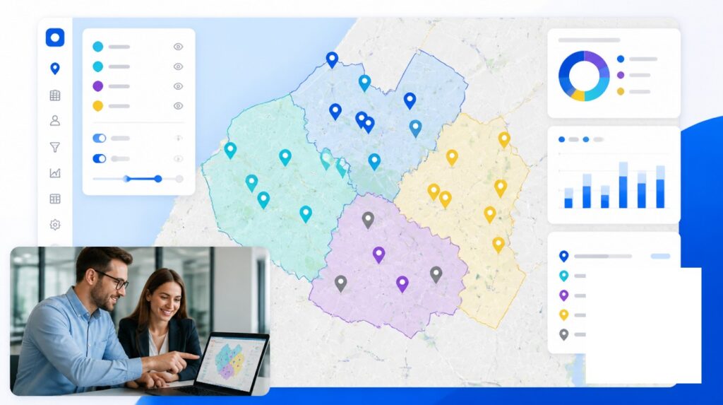
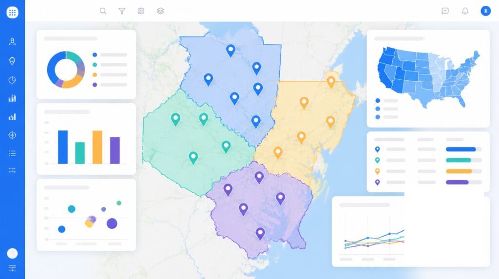
Mapping and analytics tools, including Maptive, exist to make the operating numbers visible on the same dashboard as the revenue numbers. A redesign that judges itself on revenue lift alone is judging itself on the slowest signal in the system. The dispersion number reads first. The lift reads last. Most organizations have the order reversed, which is why most case studies describe the wrong “after.”
Frequently Asked Questions
How much revenue lift can you expect from sales territory optimization?
The most-cited published range is 2-7%, originating with Zoltners, Sinha, and Lorimer’s work and republished through Harvard Business Review. Practitioners should plan for the lower end, 2-4%, in year one. The higher end usually requires the redesign to also change coverage model or compensation structure. Productivity-focused lifts of 10-20% appear in the literature when territory design is paired with quota and pay-curve adjustment.
What is the real ROI timeline for sales territory optimization?
Activity metrics such as drive time, visits per day, and selling hours move in the first 6-8 weeks. Pipeline metrics catch up at 6-12 months. Full revenue lift and dispersion compression typically take 12-18 months to read cleanly. Cases of quadrupled volume in eight months exist in the literature but are exceptional rather than typical.
What metrics should you track before and after a territory redesign?
The leading indicators are attainment dispersion (interquartile range of quota attainment by rep), win-rate variance within segment, drive time, and visits per day. The lagging indicators are revenue lift, time-to-quota for new hires, rep retention at 12 and 18 months, and customer churn by territory. Tracking revenue alone misses the operating story.
How long does a sales territory realignment take?
A formal data-prep-through-rollout cycle runs 4-12 weeks in published implementation guides. The full transition where the operating numbers stabilize is typically 12-18 months. Most consulting guidance is explicit that the process runs over a series of years, not a single quarter.
What percentage of sales reps hit quota in 2024?
Roughly 28% of reps hit annual quota by some benchmarks. RepVue’s Q4 2024 Cloud Sales Index reported an overall average of 43.14% attainment. Forrester sits at 47%. Sales quotas themselves rose 37% versus 2023, which compressed attainment further. The healthy design target is approximately 80% of reps clearing 100% quota.
Why does revenue lift alone fail to prove the redesign worked?
Revenue can rise on macro tailwinds, comp-plan changes, or a strong product launch. The signal that the territory work specifically did the work is dispersion compression. The gap between top-quartile and bottom-quartile attainment narrows when account density and opportunity per rep get fixed. Macro tailwinds do not narrow that gap. Coverage redesign does.
How much can drive time fall after territory optimization?
Published cases cluster around 20-40%. Route planning cuts rep travel time by up to 30%, and field organizations report 20-40% increases in daily calls per rep after route optimization. A specific industrial-distribution case documented a 13.7% travel-time reduction worth roughly $1M in annual travel expenses, alongside a 2.7% increase in selling time.
What happens to customer churn after territory realignment?
Reassigning accounts creates near-term churn risk. Behavioral signals such as usage decline, email engagement drop, and changes in support-ticket patterns typically appear within 30-60 days of a rep change. Analytics-driven response to those signals can offset roughly 15% of the churn risk. Customer retention rate by territory should be tracked alongside attainment by territory.
Does territory optimization reduce sales rep turnover?
Yes, when the redesign actually fixes underlying imbalance. Published case work shows turnover normalizing back to industry average after territory and quota redesign combined with pay-curve adjustment. The 2023-2024 backdrop is rough, with Salesforce reporting 25% average team turnover and Ebsta showing the rate rising from 22% to 36%. The test is the redesigned organization bending below the industry trend line.
What are the phases of a territory optimization project?
Four phases appear consistently in published implementation guides. Phase 1 is data preparation and modeling, weeks 1-4. Phase 2 is scenario modeling with stakeholder review, weeks 3-6. Phase 3 is rollout with compensation guardrails, weeks 6-12. Phase 4 is monitor and adjust, months 3-18. Skipping the compensation guardrails in Phase 3 is the most common failure mode.
How do you handle in-flight deals during territory transition?
The standard policy is full commission to the originating rep for any deal already at proposal stage, with a defined cutover date for new pipeline. Some organizations use a temporary stewardship approach for open territories until new reps ramp, which requires an explicit incentive structure so the steward does not underweight either patch.
What does attainment dispersion mean in territory analysis?
It is the spread between the top and bottom of the quota-attainment distribution across reps, most cleanly measured as the interquartile range or the standard deviation. A healthy distribution is roughly normal around 100% attainment. An unhealthy distribution is bimodal or heavily skewed. Compression of the interquartile range after redesign is the single best signal that the territory work actually fixed the imbalance.


