


Bubble Maps
Bubble Map Maker: Size Map Markers by Any Number Column
Size every marker on the map by a number column so the biggest value becomes the biggest circle. Pick a range count, edit the buckets, and Maptive draws a value-coded view.
No credit card required
Trusted by teams at
















What Controls a Bubble Map: Primary Group, Numeric Ranges, and Marker Styles
Open Map Tools, pick the Grouping Tool / Colored Pins Tool, then point Primary Group at a number column and set the column type to Numeric. A popup loads the range options for the map.
Primary Group Dropdown: Choose the Column Bubbles Scale By
Pick the column you want bubbles to scale by. Sales, headcount, or any number column on the file maps to a set of size ranges drawn at each pin.
Numeric Column Type: Switch Categories to Value Ranges
Switch the chosen column from text to Numeric so range buckets replace category sets. This option works once a column holds over 500 distinct values.
Range and Bucket Controls: Set How Many Bands the Map Shows
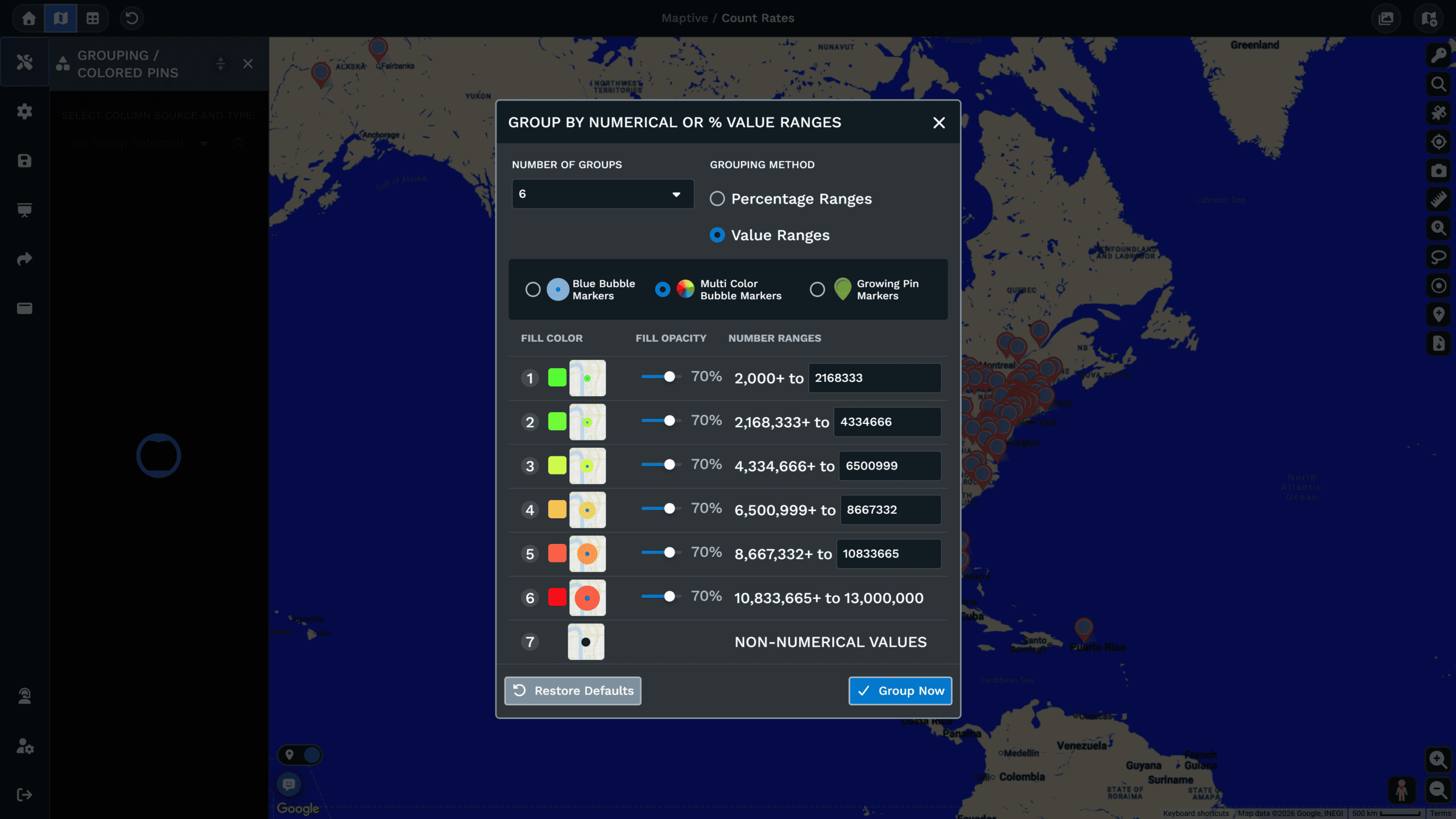
Set how many groups you want, then pick between percentages or number ranges. Edit the lower and upper bounds for each bucket so the breaks fit.
Blue Bubble Markers: One Color, Size Carries the Value
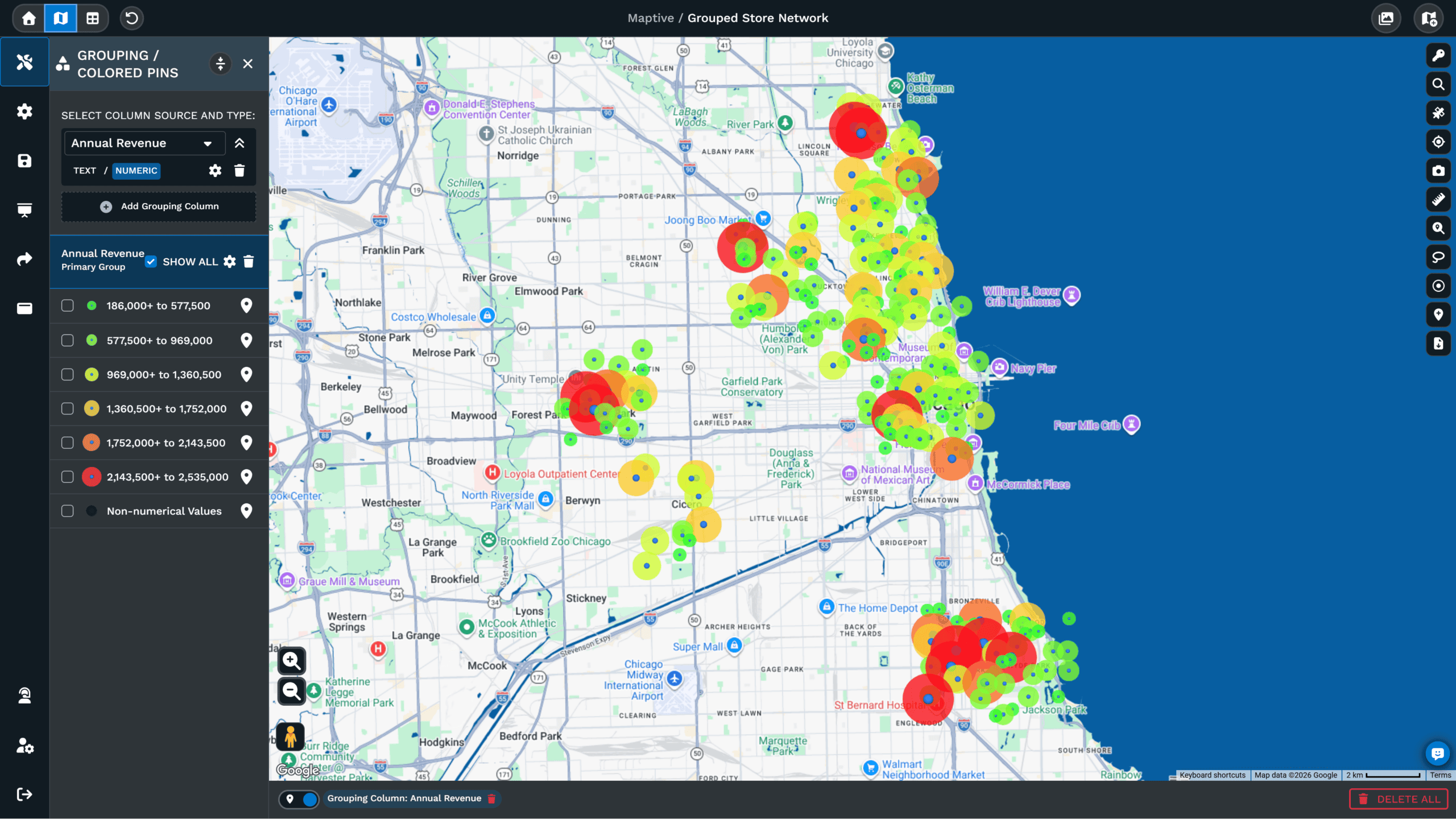
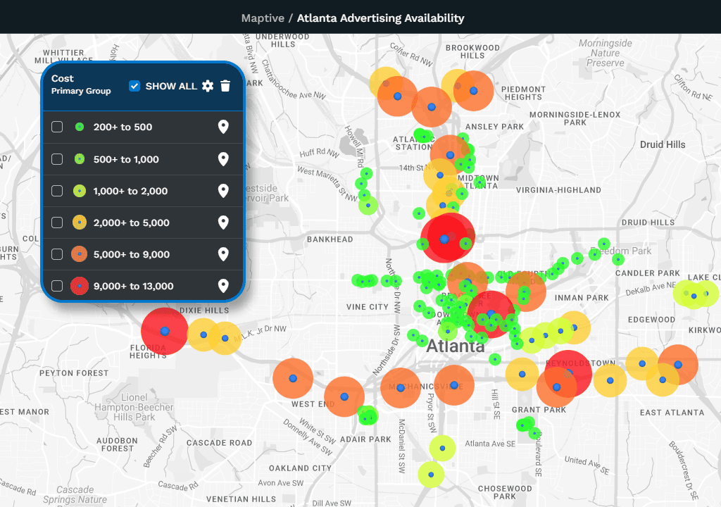
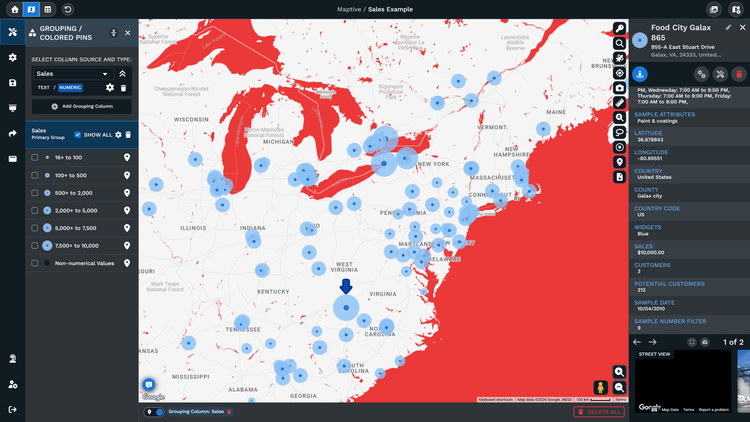
Use the standard option for a single color on the map, with size carrying the value. The bubbles grow with the bucket so the biggest values pull the eye.
Multi Color Bubbles: Size and Color on the Same Circle
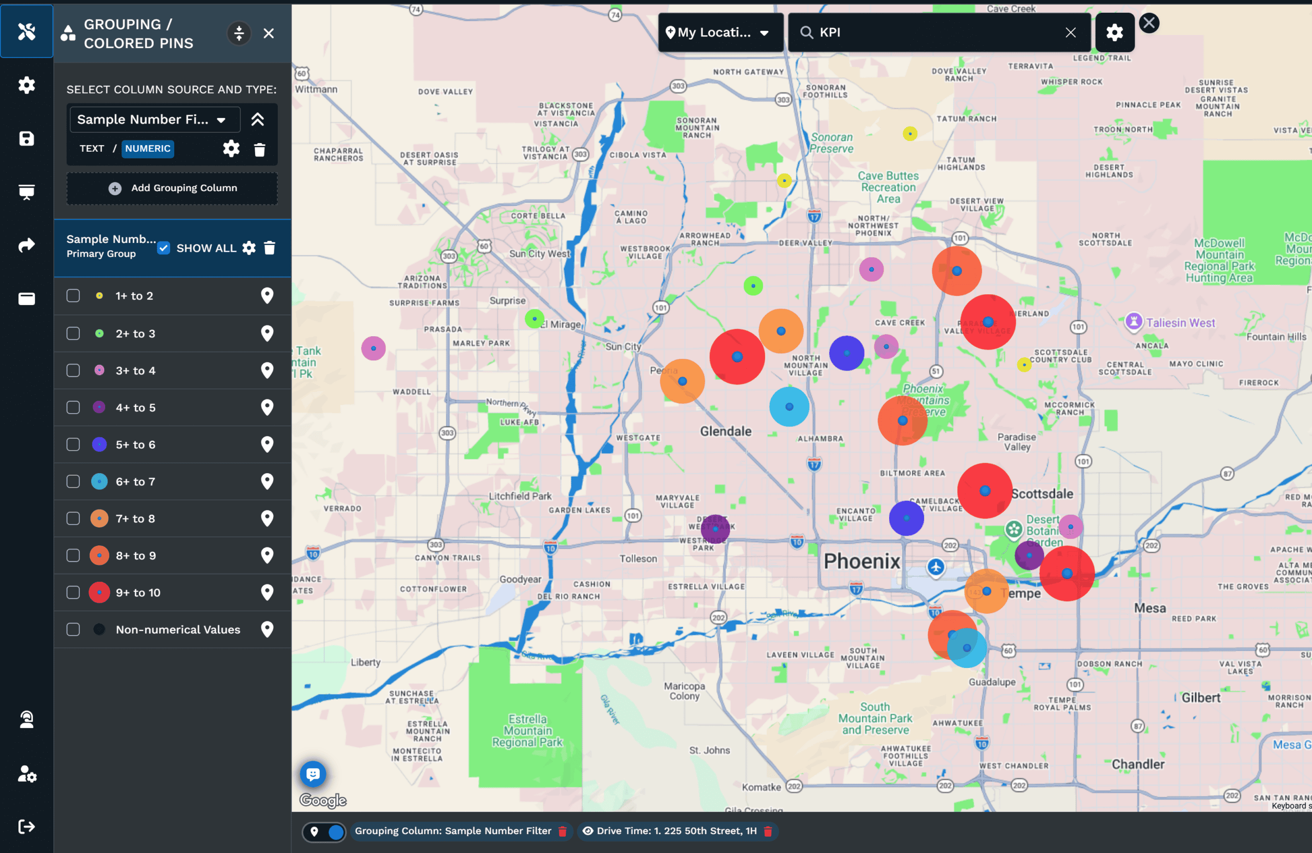
Pick this option when you want bubble size paired with a per-range fill color. Each range gets its own fill, so the map shows size and category at the same time.
Growing Pin Markers: Pins That Scale With the Bucket
Pick a pin marker that scales by range when a pin suits the map better than a circle. The marker grows with the bucket and stays anchored at the row location.
How to Make a Bubble Map in 3 Steps
The process takes one file and three decisions. Each step below corresponds to one screen in Maptive.
01
Open the Grouping Tool
Open Map Tools and click the Grouping Tool / Colored Pins Tool, which brings the Primary Group dropdown onto the map.
02
Pick a Number Column and a Marker Style
Pick a number column, switch the column type to Numeric, set the bucket count, then pick a Blue or Multi color bubble.
03
Click Group Now to Draw the Bubbles
Click Group Now and the map redraws with sized bubbles per range, and the legend labels each band.
Bubble Map Use Cases by Team
A bubble map answers one question: which rows carry the biggest number. The ten examples below name the column that drives the bubbles and the decision the map supports.
Sales
See Which Accounts Are Worth the Drive
Every account looks the same on a pin map, so route planning defaults to whatever is closest. Group the account list by annual value, set the column to Numeric, and pick Multi color bubbles. The largest circles sit on top, which turns a flat patch of pins into a ranked call list before any filtering happens.
Map Customer Locations →Sales Ops
Balance Territories on Revenue Instead of Account Count
Two territories with the same number of accounts rarely carry the same revenue. Set Primary Group to the territory column and Secondary Group to revenue with Blue bubble markers. Each territory keeps its color while the bubbles show where the dollars actually sit, which is what a boundary redraw depends on.
Territory Management →Retail Site Selection
Rank Candidate Sites by Score on the Map
A scored shortlist in a spreadsheet loses the geography that produced the score. Group the candidate list by the score column across five or six ranges and the strongest sites appear as the largest bubbles. Deselecting the bottom bands leaves only the sites worth a site visit on screen.
Retail Store Planning →Franchising
Compare Unit Performance Across the Network
Franchise reviews stall when unit results arrive as a ranked table with no geography attached. Group the unit list by same-store sales with Multi color bubbles and the underperformers show up as small circles inside otherwise strong regions. That contrast points at which markets to look at first.
Franchise & Multi-Location →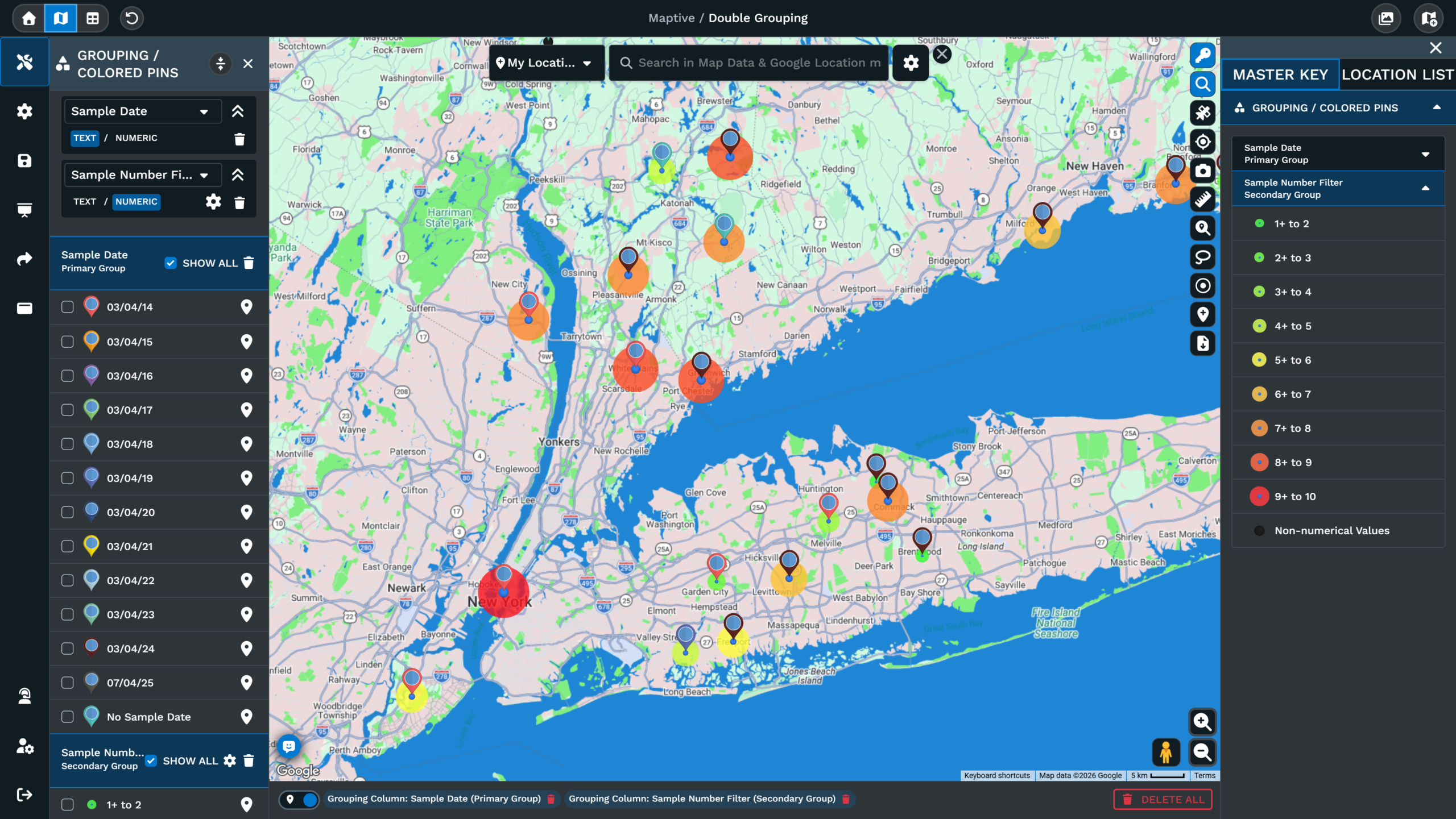
Field Service
Find the Sites That Consume the Most Technician Hours
A ticket log tells you how many visits happened, not which addresses drain the schedule. Group the site list by hours logged or ticket count with Growing pin markers. The pin grows with the bucket and stays anchored at the address, so heavy sites stand out against their neighbors without leaving the map.
Field Service →Insurance
Show Insured Value per Location, Not Policy Count
A dense cluster of small policies and a single large one look identical when every risk is one pin. Group the book by total insured value and the map sizes each risk by the number that matters to exposure. Producer reviews and accumulation conversations both start from that view.
Insurance →Commercial Real Estate
Put Rent or Square Footage on Every Property Pin
Clients rarely read a rent comparables table. Group a portfolio or comp set by asking rent, square footage, or price per foot and each property carries its number as circle size. The legend labels each band, so the map explains the spread without a walkthrough of the underlying rows.
Commercial Real Estate →Logistics & Distribution
Spot the Hub Carrying the Heaviest Throughput
Hubs with weekly throughput need a view that points at the bottleneck before the next planning round opens. Group the hub list by the throughput column across five ranges with Growing pin markers. The biggest pin marks the biggest load, and the legend keeps the bands legible as you zoom.
Supply Chain & Logistics →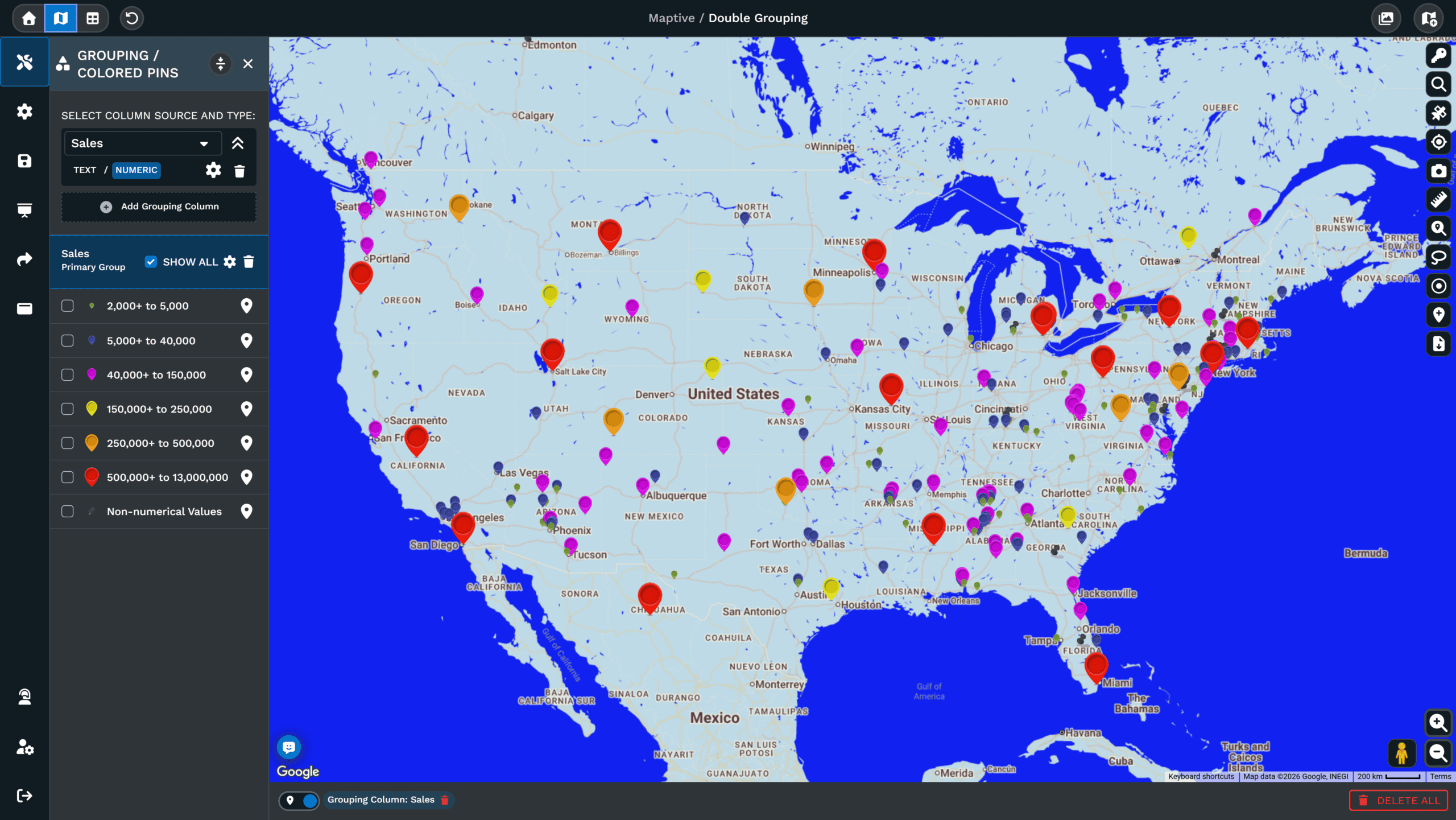
Marketing
Show Spend and Segment on the Same Map
Showing size and category together normally forces two separate map views. Set Primary Group to the segment or campaign column and Secondary Group to spend or response volume with Blue bubble markers. The Answer Center notes the secondary slot suits numeric data because the bubbles carry the magnitude of the row.
Teams →Nonprofits & Fundraising
Size Donors by Gift Instead of Counting Records
A donor file sorted by gift size drops the geography that event and chapter planning depends on. Group the file by lifetime giving with percentage breaks and major donors appear as the largest bubbles in each city. One university mapped 200,000 alumni records to plan exactly this kind of outreach.
Read the ODU Story →Free Trial
Make Your First Bubble Map in Minutes
Upload your spreadsheet, point the Grouping Tool at a number column, and the map redraws with sized bubbles. The trial is free and a credit card is not required.
How to Read a Bubble Map by Value
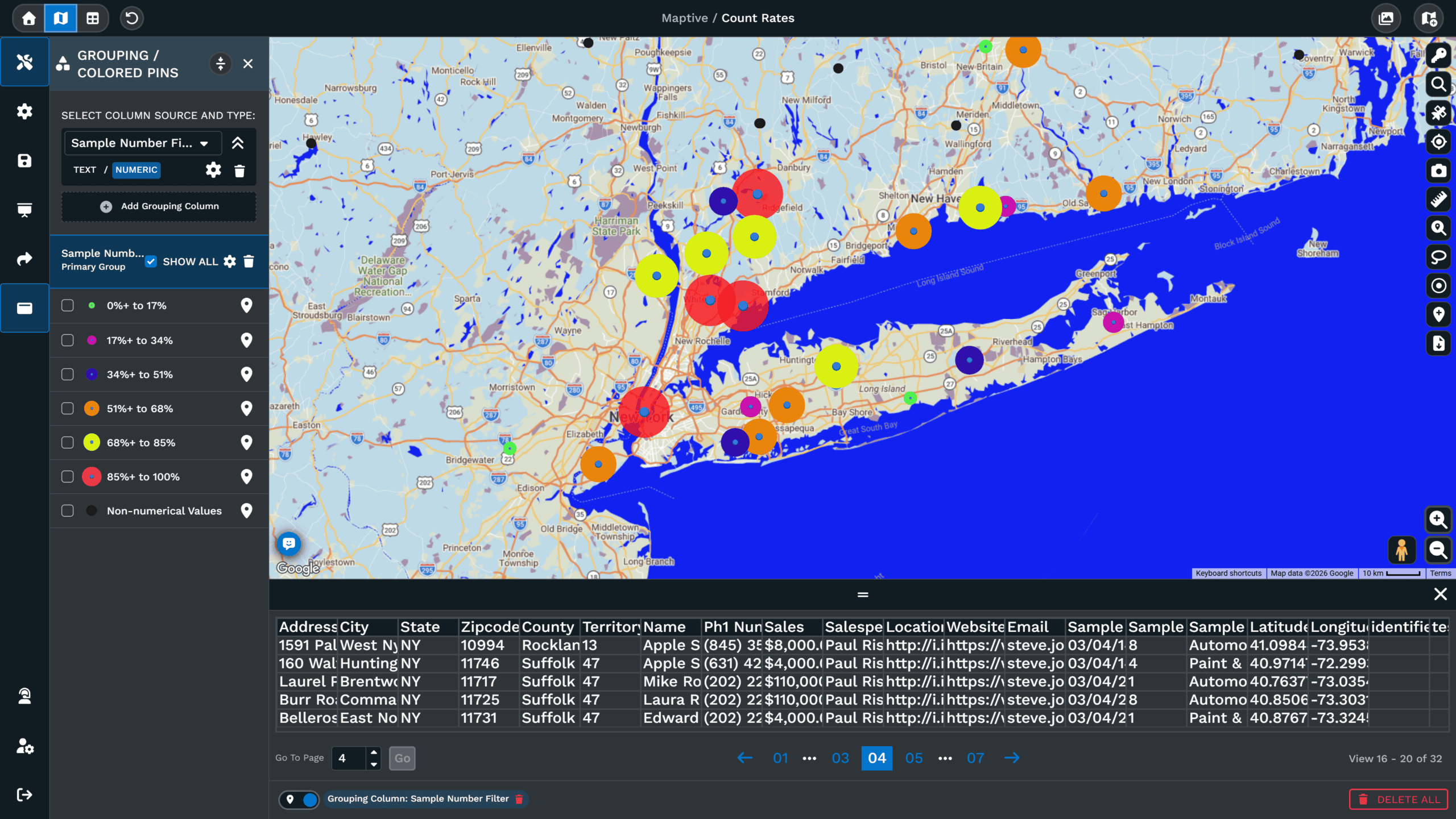
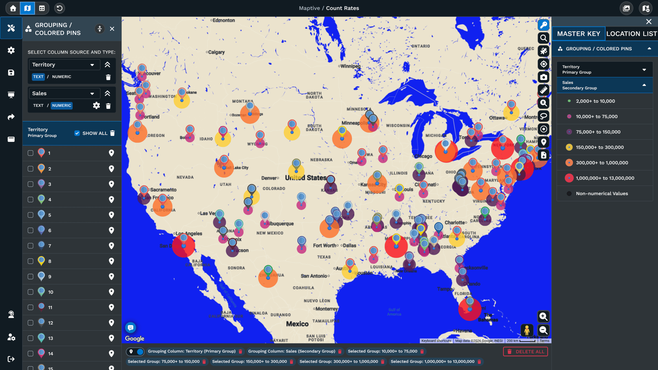
A sized marker map turns a column of numbers into circles where size carries the value. The pin still sits at the exact row location, but the circle drawn around or beneath the pin scales with the range bucket the row falls into.
What a Sized Marker Actually Shows
Reading the map by circle size is faster than scanning rows for the biggest values, and the legend shows the range bands so any viewer can match a bubble to a number band. The Grouping Tool inside Maptive supports three marker options when the chosen column is set to Numeric. Blue bubble markers use a single color across the map, with size carrying the value. Multi color bubbles add a per-range fill color so size and category sit on the same circle. Growing pin markers swap the circle for a pin marker that grows with the bucket.
Where the Range Buckets Get Set
The bucket setup runs inside the same popup. The number of groups, the breaks between buckets, and the choice between percentages or number ranges all live in the popup. Each range gets its own fill color, so the map can work as a single-color size scale or as a multi-color size scale. The Group Now button writes the choices to the map, and the legend updates with the new ranges.
From Spreadsheet to Bubble Map
A bubble map starts with a data file already loaded into Maptive. Once rows are geocoded into markers, the Grouping Tool runs on any column the file holds. A number column drives the bucket sizes the bubbles are drawn from, and the Answer Center lists Sales as the worked example for a numeric grouping. Any column with over 500 distinct values can be switched to number ranges so the buckets cover a meaningful spread. Bubble maps stay editable after Group Now is clicked, and Primary and Secondary groups can be selected or deselected to show one band at a time.
Bubble Map vs. Heat Map: Which Answers Your Question?
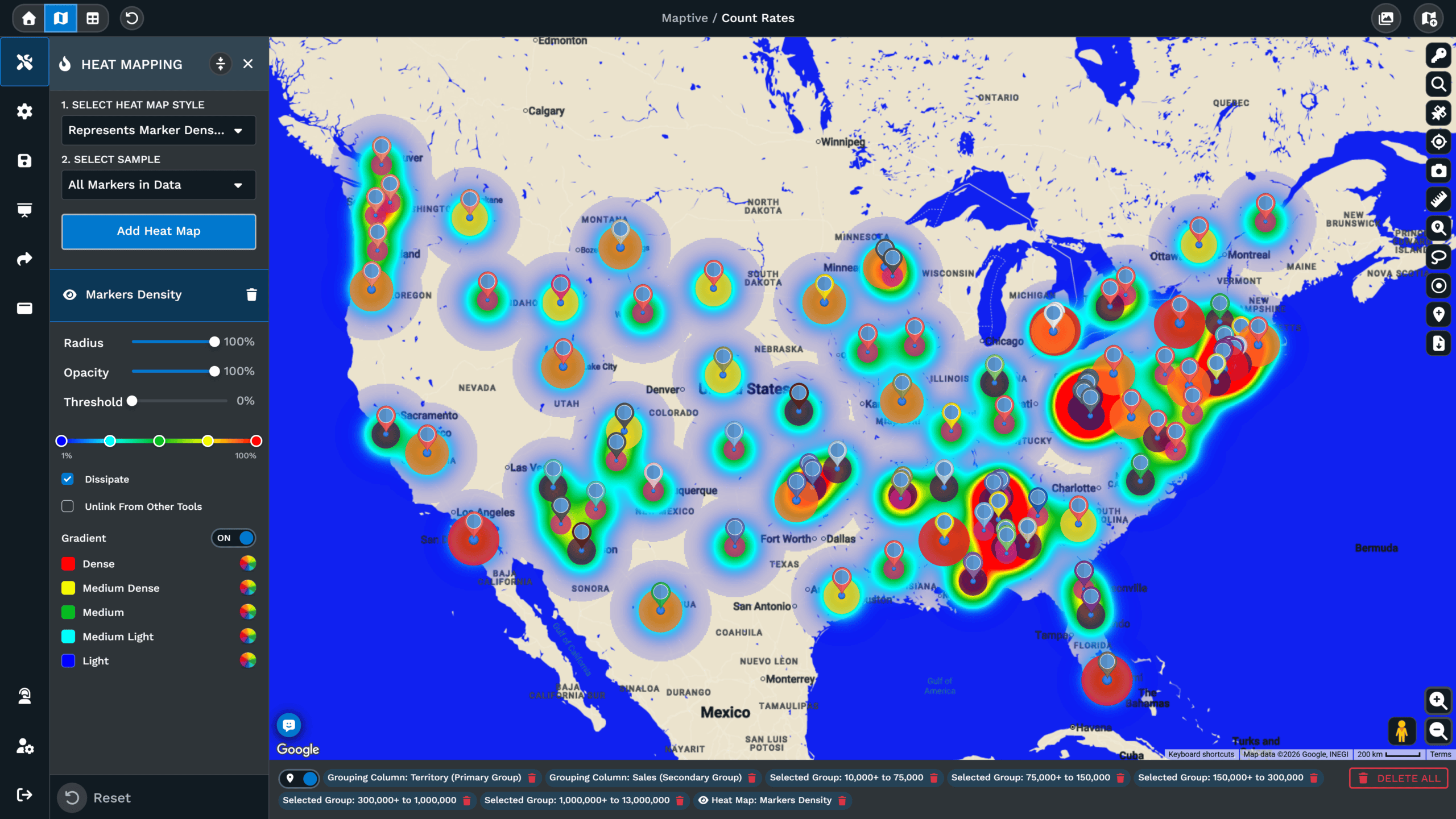
A bubble map and a heat map answer two different questions about the same data set. A bubble map keeps every row as a marker and scales the circle by a value in that row, so a single location stands on its own by size. A heat map blends rows into a colored bloom that shows concentration across an area. Both rely on color or size to surface where the data sits, and both work from the same uploaded file.
- What gets plotted. A bubble map plots a circle per row, with size and color tied to a bucket the row falls into. A heat map plots a bloom across the map that grows where points sit closest together.
- A single high value. One high-value row stands on its own on a bubble map. The same row blends into the bloom on a heat map.
- Row-level comparison. Use bubbles when the audience needs to compare one location against another.
- Region-level questions. Use heat when the question is about pockets rather than points, and the goal is to see where a region as a whole runs hot or cool.
- Both at once. Running both views on the same data set across saved map views answers the row-level and region-level questions in turn.
| Bubble Map | Heat Map | |
|---|---|---|
| Plots | One circle per row | A blended bloom across an area |
| Shows | Value in a single row | Concentration across a region |
| Best for | Comparing 1 location against another | Finding pockets rather than points |
| Tool | Grouping Tool / Colored Pins Tool | Heat Mapping Tool |
How Bubble Maps Handle Overlapping Data
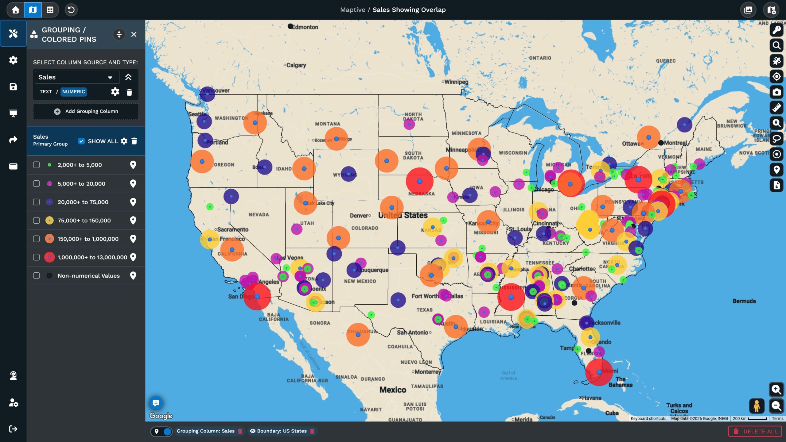
Each range bucket in the Primary Group or Secondary Group list can be selected or deselected from the Grouping Tool panel on the right of the map. Deselecting hides the markers in that bucket without resetting the map or losing the range setup behind it, which is how you show one band at a time when the map carries a lot of pins.
Bubble Map Maker FAQs
What is a bubble map in Maptive?
How do I size markers by a number column?
What marker options can a bubble map use?
Can a bubble map show two columns at once?
Can I edit the range buckets after the map is drawn?
Does the Grouping Tool work on text columns too?
Can I add a second bubble layer to compare ranges?
How do I hide a bubble band without removing it?
Does the bubble map handle a column with hundreds of distinct values?
Should I edit a single marker or the whole group?
More Ways to Visualize Your Data
Marker Grouping Tool
Sort and group markers by any data column.
Learn more →Heat Mapping Tool
Show marker density and value concentration.
Learn more →Color-Coded Map
Color pins, boundaries, and heat by any data column.
Learn more →Demographic Overlays
Add Census income and age data under your records.
Learn more →Bubble Maps
Start Mapping Your Data Today
Maptive includes over 60 mapping tools in one subscription, and the Grouping Tool that builds bubble maps is one of them. The trial is free and a credit card is not required.








