


Turn Survey Responses into a Sentiment Gradient Map
Handed a stack of poll numbers and want to show leadership how an area is leaning rather than where each respondent falls on the map? Maptive turns scaled survey scores into a smooth gradient, so a region reads warmer where a measure is favored and cooler where it is opposed.
No credit card required
- Weight a heat gradient by each response score with the Heat Mapping Tool, so strong opinions read warmer than mild ones.
- Turn Gradient On for one color scale, then hide the pins so the gradient reads without individual respondents on screen.
- Shade counties or ZIP codes by the average response score with the Boundary Tool, for one figure per region.
- Set a diverging palette, cool for opposed through neutral to warm for in favor, so both sides read on one key.
- Split the ranges with Value Ranges or Percentage Ranges, and print the number on each region.
- Build it from a plain response file with no GIS skills, then share a link or export the image.
Trusted by teams at









See How an Area Is Leaning
I can finally visualize my business geographically and make sense of my data in different ways. There is a variety of tools and it is easy to use.
Building the Gradient in Maptive
-
1
Weight a Heat Map by the Response Score
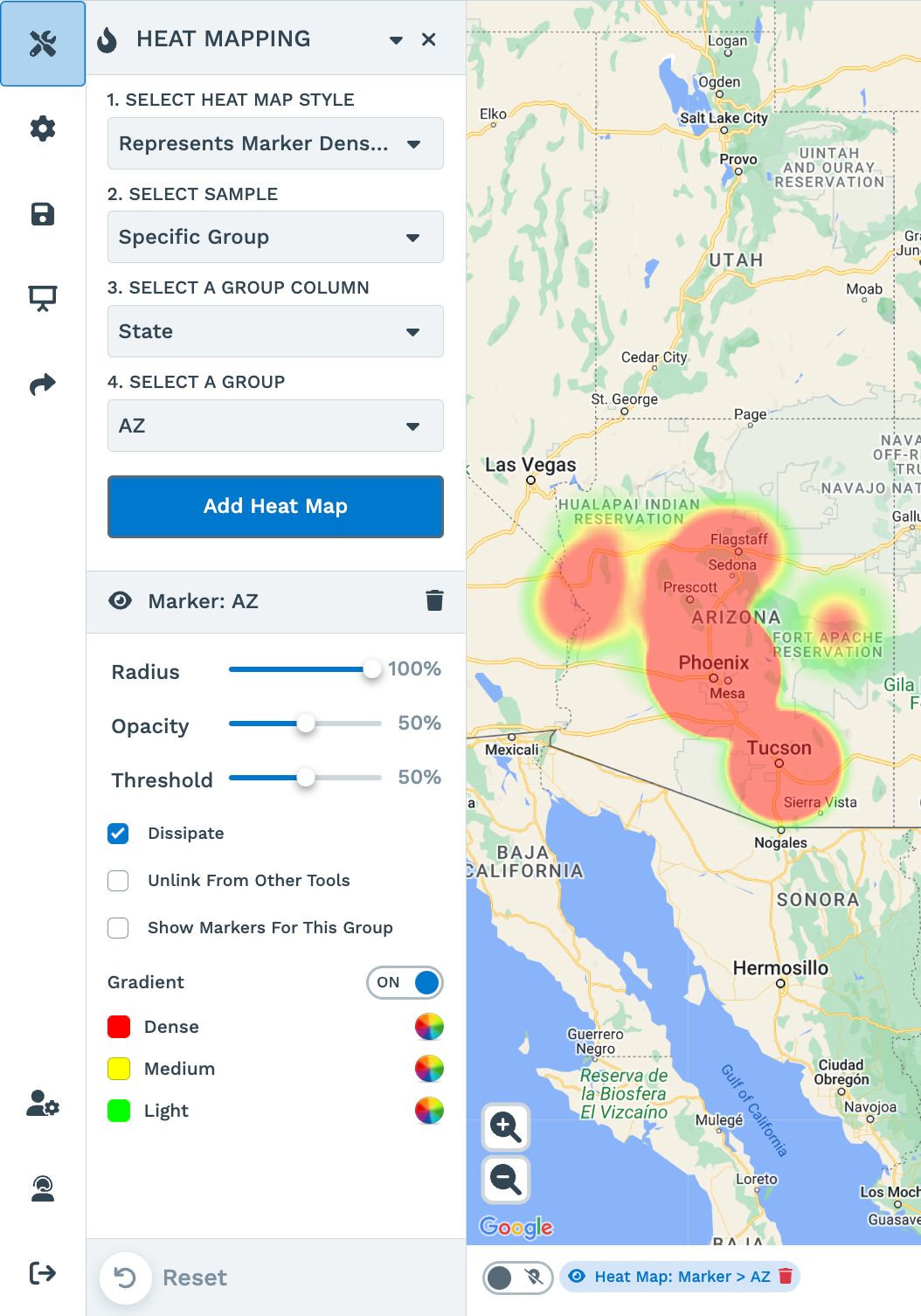
In Map Tools, open the Heat Mapping Tool and choose the Represents Numerical Data style. Point it at the column that holds each response score, then click Add Heat Map. The heat is weighted by that number rather than by how many rows land in one spot, so a +90 response reads warmer than a +10 response in the same place.
-
2
Set One Color Scale and Hide the Pins
Turn Gradient On for a single color scale, then adjust the radius, opacity, and intensity threshold until the gradient matches how dense your sample is. Hide Map Markers so only the gradient remains, which keeps individual respondents off a view you plan to present.
-
3
Shade Counties or ZIPs by Average Score
For a firm figure per region, open the Boundary Tool, pick US Counties or ZIP Codes, and set the fill to My Numerical Data. Choose Average as the function and the response-score column as the number, then click Load Boundaries. Each region colors by the mean score of the responses inside it, with a key of ranges and the total on every area.
-
4
Tune the Ranges and Diverging Colors
In Fill Settings, open Customize Fills to set the number of ranges, choose Value Ranges or Percentage Ranges, and pick a color per range. Assign a cool color to the opposed ranges, a pale tone to the middle, and a warm color to the ranges in favor, so support and opposition read on one key. The map redraws as you change each setting.
Show the Lean on Your Own Numbers
Start the 10-day free trial with no credit card and load your own response file. Open the Heat Mapping Tool for a soft gradient, or the Boundary Tool for a score per county, and watch each area take shape. Want a hand? A Maptive specialist will build the first sentiment map with you.
No credit card required
Frequently Asked Questions
How do I map survey responses as a gradient?
Upload your response file, open the Heat Mapping Tool in Map Tools, and choose the Represents Numerical Data style. Point it at the column that holds each response score and click Add Heat Map. The heat is weighted by that score rather than by how many rows fall in one spot, so a strongly favorable area reads warmer than a lukewarm one. Turn Gradient On for a single color scale, adjust the radius and intensity to match your sample, and Hide Map Markers to leave only the gradient on screen.
Can I show which areas lean which way?
Yes, and two paths do this. A heat map weighted by a favor-to-oppose score gives a smooth read of the lean across a region. For a firmer answer, the Boundary Tool fills counties or ZIP codes by the average score inside each one, so every region takes one color for its position. Pair the fill with a diverging palette, cool for opposed through neutral to warm for in favor, and leadership sees which side of the line each area falls on.
Should I use a heat map or shaded boundaries for sentiment?
Both fit, and the choice depends on the read you want. A heat map gives a soft gradient that ignores hard borders, which suits a first look at where support concentrates. Shaded boundaries give a firm number per region, so a county or ZIP takes a single average score and a color to match. Use the heat gradient for the mood of a wider area, and the Boundary Tool when leadership wants the figure for a named county or precinct. You can build both on one upload and switch between them.
What is a diverging color scale and when do I need one?
A diverging scale runs from one color through a neutral middle to a second color, so a two-sided score reads in both directions from the center. Sentiment data usually runs from opposed to in favor, which is where a diverging palette fits. In the Boundary Tool, Customize Fills lets you give a cool color to the opposed ranges, a pale tone to the middle, and a warm color to the ranges in favor, so support and opposition map on one key.
Can I map a favor-to-oppose score from -100 to +100?
Yes. Score each response on your own scale, such as -100 for fully opposed up to +100 for fully in favor, and load that column as the value. In the Heat Mapping Tool, the Represents Numerical Data style weights the gradient by that number. In the Boundary Tool, My Numerical Data with the Average function rolls the scores up per region so each county or ZIP takes its mean. Either way the map reads from your scale rather than a fixed preset.
How does Maptive weight a heat map by response value?
The Represents Numerical Data style asks for a numeric column and weights the heat by that number instead of counting points. A row scored +90 reads warmer than a row scored +10 in the same spot, so the color tracks strength of opinion, not head count. You control the radius, opacity, and intensity threshold, and you can add a second heat map in another color to compare two questions on one view.
Can I shade counties or ZIP codes by average sentiment?
Yes. Open the Boundary Tool, pick a boundary set such as US Counties or ZIP Codes, and set the fill to My Numerical Data. Choose Average as the function and the response-score column as the number, then click Load Boundaries. Each region colors by the mean score of the responses inside it, and a key of ranges appears with the total on every area. This turns scattered responses into one figure per county or precinct, the view most leadership teams want when they ask how a district is leaning.
What classification options does Maptive offer for the ranges?
Maptive splits a fill into ranges two ways. Value Ranges place an equal number of regions in each range, and Percentage Ranges split the regions by an equal share of the high-to-low spread. You set the number of ranges and the color for each one in Customize Fills. For a sentiment map, a few ranges with a diverging palette keep the read simple, while more ranges show finer movement between areas.
Can I hide the individual respondent pins?
Yes, and both tools let the gradient stand on its own. In the Heat Mapping Tool, Hide Map Markers removes the underlying points so only the gradient remains, which keeps individual respondents off a screen you plan to share. The Boundary Tool colors whole regions, so the fill already reads without pins on top. Leaving the raw points off matters when the data is sensitive, because leadership sees the pattern by area rather than a dot per respondent.
How do I share a sentiment map with leadership?
Once the gradient reads the way you want, share it as a password-protected link, a public link, or a one-line embed for an internal page. Presentation mode walks a room through the map full screen, and Export Map Image saves a PNG or PDF for a slide. The shared view reads from the map you built, so a leader who opens the link sees the current gradient, not a stale screenshot in a deck.








