


Map Crime & Incident Hotspots Around Your Locations
Which of your sites sit closest to recent incidents, and how many fall within a mile of each one? Maptive plots your incident data, heats the hotspots into a density gradient, and counts what lands inside a radius or drive-time area around any location.
No credit card required
- Upload crime or incident records by street address or lat/long, and geocoding places each one on the map.
- Heat the incidents into a density gradient, or weight the heat by a severity column so heavier events read hotter.
- Color incidents by type with the Grouping Tool, so assault, theft, and vandalism read apart on the same map.
- Ring any site with a radius and count how many incidents fall inside through a Group Count metric.
- Draw a drive-time area to see the ground a response team can cover from a site under perfect conditions.
- Export every incident inside a radius or drive-time area to a spreadsheet for a report, with no GIS skills.
Trusted by teams at









Turn an Incident Feed into a Threat Picture
I love the heat map, and the sharing capability is very efficient. The initial data upload is easy and the settings are intuitive.
Building the Threat Map in Maptive
-
1
Upload and Plot the Incident Data
Bring in your incident records as an Excel file, CSV, or Google Sheet, exported from an open-source crime portal or a records system. Maptive geocodes street addresses and reads lat/long coordinates straight from the columns, correcting messy entries and missing ZIPs, so each incident lands as a marker with no GIS work.
-
2
Heat the Hotspots
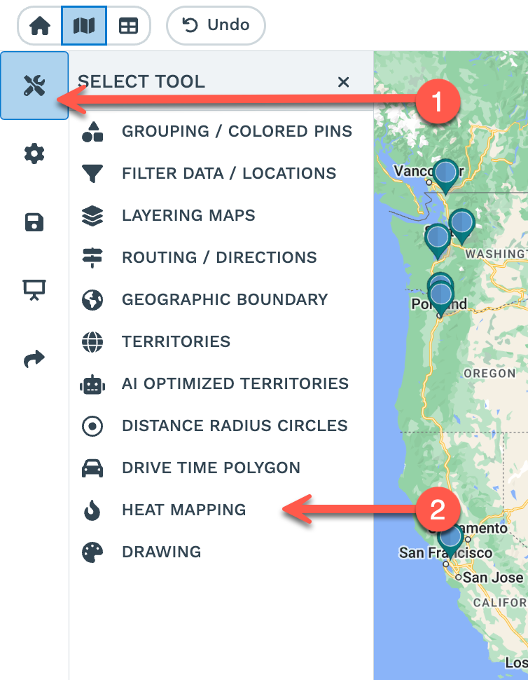
Open the Heat Mapping Tool in Map Tools and keep the Marker Density style to heat every incident, then click Add Heat Map. The warmest colors mark the pockets where records pack in tightest. To rank the map by severity instead of raw count, choose Represents Numerical Data and point it at a severity or weight column, and the gradient runs hotter where the heavier events sit rather than where the most reports fall.
-
3
Color Incidents by Type
Open the Grouping Tool and pick the category column, such as offense type or priority, and each incident takes a color for its group. Assault, theft, and vandalism read apart on the same view, and the tool builds a legend so an analyst reads the mix without opening each pin. You can layer the colored markers on top of the heat map to see both concentration and category at once.
-
4
Ring a Site and Count What Is Inside
Open Distance Radius Circles, center a ring on a site by address or marker, and set Proximity Within in miles or kilometers. Click the ring, open Customize Metrics, and add a Group Count of your incidents under Spreadsheet Data to tally how many fall inside. For a reachable area, draw a Drive Time Polygon around the site under perfect driving conditions, then export the incidents inside either shape to a spreadsheet.
Assess Your Sites on a Free Trial
Start the 10-day free trial with no credit card and run it on your own incident export. Plot the records, heat the hotspots, and ring a site to count what is nearby in a single session. Want a hand? A Maptive specialist will build the first hotspot map with you.
No credit card required
Frequently Asked Questions
How do I hotspot crime data near my locations?
Upload your incident records as an Excel file, CSV, or Google Sheet, and Maptive geocodes the addresses or reads lat/long columns to plot each one. Open the Heat Mapping Tool in Map Tools, keep the Marker Density style, and click Add Heat Map. A smooth density gradient forms over the incidents, warm where records pack together and cool where they thin out. Plot your own sites on top so the hot pockets read against each location, and adjust the radius and colors until the concentration is easy to follow.
What incidents are within a radius of this site?
Drop a ring on the site through Distance Radius Circles and set Proximity Within to the distance you want, such as one mile. Click the ring and open Customize Metrics, then add a Group Count of your incident rows under Spreadsheet Data, and the pop-out returns how many fall inside. You can also sum a severity column for a weighted total in the same read, then export the incidents inside the ring to a spreadsheet so a report lists each event by name.
Can I map open-source crime or incident data?
Yes. Public crime and incident portals usually let you download records as a CSV with a street address or lat/long coordinates, and that file uploads to Maptive as is. Geocoding corrects messy addresses and fills missing ZIPs, and lat/long columns plot straight to the marker. From there the same tools apply, so you heat the download into hotspots, color it by offense type, and count what falls near a site, turning a raw public export into a mapped read in a first session.
How do I weight a hotspot map by severity?
In the Heat Mapping Tool, choose the Represents Numerical Data style rather than Marker Density and point it at a numeric column, such as a severity score or an incident weight. The gradient then runs by that value instead of raw point count, so an area with a few heavy events reads hotter than an area with many minor ones. This separates volume from seriousness on the same map, and you can lay the plain density heat beside the weighted one to compare the two reads.
Can I color incidents by type?
Yes. Open the Grouping Tool, pick the category column such as offense type, priority, or source, and each incident takes a color for its group. The tool builds a legend, so assault, theft, and vandalism read apart without opening a single pin. Layer these colored markers over the heat map and you read concentration and category together, which helps an analyst tell a cluster of minor reports from a pocket of serious events.
How do I measure proximity from a site to nearby incidents?
Ring the site with Distance Radius Circles, then click the ring and open Customize Metrics to count the incidents inside with a Group Count. To ring several sites at once, set Apply To Group and Maptive draws the same-size ring around every marker in that group, so you size proximity across a portfolio on one basis. Each ring reads its own count, and you can export the incidents inside every ring for a combined list.
Does the drive-time area use live traffic?
No. The Drive Time Polygon is based on perfect driving conditions, not live or historical traffic. It maps a steady reach around a site, so the same address returns the same area every time rather than moving with the hour of the day. That makes it a dependable base for a response-area view, where you want a consistent read of the ground a team covers. Set the time in hours and minutes, and test a 5-minute reach against a 10-minute reach around the same site.
Can I export the incidents inside a radius?
Yes. A radius and a drive-time polygon both export the incident rows that fall inside them to xlsx, tsv, csv, or the clipboard. For one circle, use the kebab menu and Export Locations. For every circle at once, use Export File. You choose straight-line or driving distance, records inside or outside the shape, and a closest-circle option when rings overlap. A drive-time polygon can also export the ZIP codes or counties inside it, so a briefing hands off both the incident list and the boundaries.
How many incident records can Maptive map?
Maptive plots up to 200,000 markers on a single map using WebGL and the Google Maps Platform, so a long incident history maps without thinning the file first. Because a heat map reads density rather than each point, a heavy file often reads more plainly as a gradient than as a wall of markers. To focus a dense map, heat one category on its own with Marker Density for a Specific Group, or apply the Filter Tool while the heat layer holds steady.
Do I need GIS skills to build a risk hotspot map?
No. Every step is a menu choice, so an analyst builds the map from dropdowns and sliders without GIS training or code. Upload a plain incident export, plot it, click Add Heat Map, and set the radius and colors. Geocoding handles messy addresses and lat/long columns for you, and Customize Metrics builds the proximity count from dropdowns. Most people have a working hotspot map and a first site count in their opening session, and the US and Canada support team answers in under 15 minutes.








