


Map Disease Prevalence & Positivity Rates by Area
Standing at a trade show, how do you show a vet how common a disease really is in their own county? Maptive plots de-identified case data as colored dots, a density heat map, and shaded ZIP codes or counties, so local positivity reads at a glance on a tablet.
No credit card required
- Upload de-identified case or incidence data by ZIP code or address.
- Plot each result as a colored dot, split by positive, negative, or test type.
- Add a heat map that turns individual cases into a smooth prevalence gradient.
- Shade ZIP codes or counties by positivity rate with a numeric range key.
- Read case counts and rates back from inside any region you click.
- Share a password link or presentation view for a tablet on the show floor.
Trusted by teams at









Show Local Positivity, Not a National Average
Excellent geo-data front end tool for presentations and business visualization.
Building a Prevalence Map in Maptive
-
1
Upload De-Identified Case Data
Bring in an Excel file, CSV, or Google Sheet of de-identified results, with a ZIP code or address on each row plus columns for result and test type. Maptive geocodes the addresses and fills in missing ZIP codes, so a messy export still lands on the map. Keep records de-identified before upload, since the map needs only location and result.
-
2
Plot Cases as Colored Dots
Open the Grouping Tool in Map Tools and group by your result column, so positive and negative rows take different marker colors, then add a secondary group for test type if you want. For a count column instead, pick number ranges and set how many groups to show. Group Now builds the legend, so a vet reads the color key without a caption.
-
3
Layer a Positivity Heat Map
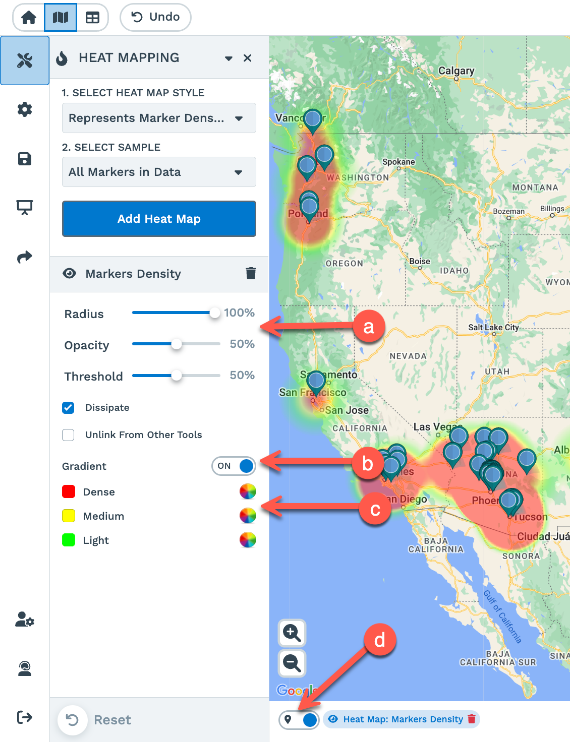
Open the Heat Mapping Tool and choose Marker Density to turn every case into a smooth gradient, or choose Represents Numerical Data and pick a case-count column so the heat weights by volume rather than raw points. Add Heat Map, then set the radius, intensity, and colors for a hot-to-cold read. Turn on Hide Map Markers to show the gradient alone, or leave the dots on top for both views at once.
-
4
Shade ZIP Codes or Counties by Rate
Open the Boundary Tool, pick ZIP Codes or Counties, and set the fill to My Numerical Data on your positivity-rate column, or use Marker Count to color by how many cases fall in each region. Load Boundaries and every area colors by that number, with a key of ranges. Fill Settings set the number of ranges and switch value ranges to percentage ranges, and Include Value prints the rate on each region.
Put Local Positivity on a Tablet
Start the 10-day free trial with no credit card and build the map on your own de-identified data. Plot the dots, add the heat map, shade the regions, then open a password-protected link or presentation view on a tablet so a vet sees positivity for their own county at the booth. Want a hand? A Maptive specialist will set up the first prevalence map with you.
No credit card required
Frequently Asked Questions
How do I map disease prevalence by area?
Upload a de-identified file of results with a ZIP code or address on each row, then build three views on the same data. The Grouping Tool colors each case as a dot by positive or negative result. The Heat Mapping Tool turns those points into a density gradient. The Boundary Tool shades ZIP codes or counties by positivity rate or case count, with a numeric range key. Layered together, the dots, gradient, and shaded regions show local prevalence rather than a single national figure.
Can I show local positivity rates on an interactive map?
Yes. Shade ZIP codes or counties by your positivity-rate column in the Boundary Tool, so each region colors by its own rate against a range key. Click any region and the pop-out reads back the count and rate for that area, and Customize Metrics adds more fields from your file. Because the map is interactive, a vet zooms from a state view down to their own ZIP code and reads the local rate, not an average that hides how common the disease is nearby.
How do I plot disease incidence as dots?
Open the Grouping Tool in Map Tools and pick your result column as the group, so positive and negative cases take separate marker colors and build a legend. Add a secondary group for test type if you want two attributes on one dot. For a numeric column such as case count, choose number ranges and set how many groups to show, with a standard bubble or a growing pin. Group Now applies the colors, and each dot appears on its geocoded ZIP code or address.
Can I add a heat map to show case density?
Yes. Open the Heat Mapping Tool and choose Marker Density to turn every case into a smooth gradient across the map. To weight the heat by volume, choose Represents Numerical Data and pick a case-count column, so a ZIP code with many cases reads hotter than one with a single result. Add Heat Map, then adjust radius, intensity, and colors for a hot-to-cold read. Hide Map Markers shows the gradient alone, and you can keep the dot layer on top for both at once.
How do I shade ZIP codes or counties by positivity rate?
Open the Boundary Tool, pick the ZIP Codes or Counties boundary set, and set the fill to My Numerical Data on your rate column. Load Boundaries and every region colors by that rate, with a key of numeric ranges and the total on each area. Fill Settings set the number of ranges and switch value ranges to percentage ranges, and per-range color and opacity. Marker Count is an option too, coloring each region by how many cases fall inside it rather than by a rate you supply.
Can I use this on a tablet at a trade show?
Yes. Share the finished map as a password-protected link or open presentation view, then pull it up on a tablet at the booth. A vet taps their own county or ZIP code and reads the positivity rate for that area against the color key, with the dots and heat map available on the same view. Because the map lives online rather than in a slide, you zoom, pan, and click to answer a question on the spot, then hand the tablet across.
Is de-identified case data safe to map?
Keep your file de-identified before upload, since the map needs only a location and a result, not any patient or animal identity. A row with a ZIP code, a result, and a test type is enough to plot the dot, weight the heat map, and shade the region. Maptive protects the account with 256-bit SSL, two-factor login, single sign-on, and role-based access, and a shared map can sit behind a password link so only the people you send it to open it.
Can I color dots by test type or result?
Yes. The Grouping Tool sets a primary group and an optional secondary group, so one dot can carry both its result and its test type. Pick the result column first for a positive-versus-negative color split, then add test type as the secondary group to tell assays apart on the same map. Each group takes its own color and marker style, and the legend updates so the key reads on its own.
What is the difference between the dots, heat map, and shaded boundaries?
The dots plot each case at its own location, so you see individual results and their test type. The heat map blends those points into a density gradient, good for a hot-to-cold read of where cases concentrate without counting pins. The shaded boundaries color whole ZIP codes or counties by a positivity rate or case count, with a range key for a region-by-region comparison. All three read from the same file, so you toggle between a case view, a concentration view, and a rate view.
Do I need GIS skills to build a prevalence map?
No. Every step is a menu choice on an uploaded file, with no code and no GIS training. The Grouping Tool, Heat Mapping Tool, and Boundary Tool each work from dropdowns, and geocoding places your rows from a ZIP code or address for you. Most people have dots, a heat map, and a shaded region view on their data in a first session. The US and Canada support team answers in under 15 minutes if you want a hand.








