


Shade a Choropleth Map by Your Own ZIP & County Data
Still right-clicking to shade each county by hand, one figure at a time? Maptive colors ZIP codes, counties, or states straight from a numeric column in your spreadsheet, so a whole choropleth map fills in from one upload.
No credit card required
- Upload sales, premium, membership, or claims numbers from Excel, CSV, or Google Sheets, then shade ZIP codes, counties, or states by that column.
- Pick how each region rolls up its rows, with Sum, Average, Max, or Min.
- Let Maptive build the color key and print the name and total on every region.
- Set the number of ranges and choose a color per range, from value ranges to percentage ranges.
- Print one number in the color and a second number on the label of the same region.
- Retire the hand-shading habit and color a national map from one upload, with no GIS skills.
Trusted by teams at









Color the Map by the Numbers You Already Track
I can finally visualize my business geographically and make sense of my data in different ways. There is a variety of tools and it is easy to use.
Building It in Maptive
-
1
Load Your Spreadsheet and Open the Boundary Tool
Upload your Excel, CSV, or Google Sheet, and Maptive geocodes the addresses and fills in missing ZIP codes. In Map Tools, open the Boundary Tool and pick a boundary set, from US States and counties to ZIP codes or census tracts.
-
2
Set the Fill to My Numerical Data
Choose My Numerical Data as the fill type, set the Function to Sum, Average, Max, or Min, and pick the numeric column you want to map, like Sales, Premium, or Members. Click Load Boundaries and every region colors by that number, high to low.
-
3
Read the Key and the Totals
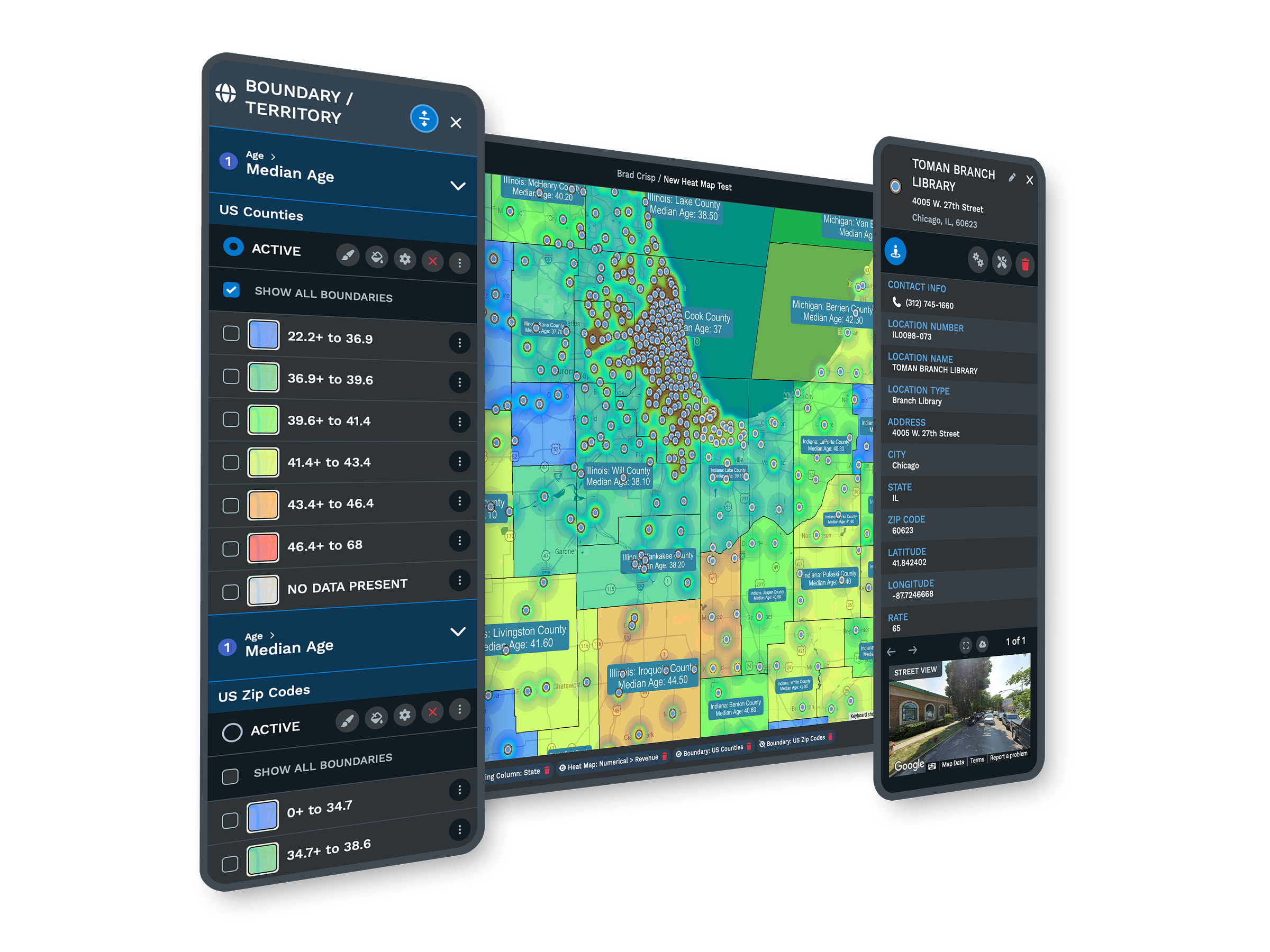
A color key of numeric ranges appears, and each region shows its name and total. This is the choropleth a manual right-click-and-shade routine was trying to build, drawn from your column in one pass instead of county by county.
-
4
Tune the Ranges, Colors, and Labels
Open Fill Settings and Customize Fills to set the number of ranges, switch value ranges to percentage ranges, and pick the color and opacity per range. Turn on Include Value or Include Legend so each region prints its number, or use Custom Value to print a different metric than the one in the color.
Shade Your First Map This Week
Start the 10-day free trial with no credit card and no GIS skills. Upload your own sales, premium, or membership file, open the Boundary Tool, and shade ZIP codes or counties by that column in a few minutes. Want a hand? A Maptive specialist will set up the first choropleth fill with you and tune the ranges for your data.
No credit card required
Frequently Asked Questions
How do I shade ZIP codes by sales volume?
Upload your sales file, then open the Boundary Tool in Map Tools and pick the ZIP Codes boundary set. Set the fill type to My Numerical Data, set the Function to Sum, and choose your sales column. Click Load Boundaries and every ZIP colors from high volume to low, with a key of ranges and the total printed on each area. Your accounts stay on top, so you read the shaded volume right around them. Nothing installs, and the whole map fills from one upload.
Can I color counties by my membership data?
Yes. Pick the Counties boundary set in the Boundary Tool, set the fill to My Numerical Data, and choose your membership column with the Function set to Sum. Load Boundaries and each county fills by its member total, with a color key you can adjust. If you would rather see an average per county, switch the Function to Average and reload. You can also plot the members themselves as markers on top, so the county color and the points read together on one map.
What is a choropleth map, and can I make one in Maptive?
A choropleth map shades each region, like a ZIP code or county, by a number, so darker or brighter areas carry more of whatever you are mapping. Maptive builds one from your own column. Open the Boundary Tool, set the fill to My Numerical Data, pick a numeric field, and Load Boundaries. The map colors every region and adds a legend of ranges. You control the number of ranges and the color per range in Fill Settings, so the finished thematic map matches how you want to read your numbers.
Do I need to shade each county by hand?
No. Hand-shading a county map one right-click at a time is the manual habit Maptive replaces. Set the fill to My Numerical Data, pick your column, and Load Boundaries, and every county colors at once from the same field. If your numbers change, reload the fill and the colors update, rather than recoloring each area yourself. A national map that took an afternoon by hand fills in one pass from your spreadsheet.
Can I upload my numbers from Excel or a CSV?
Yes. Maptive reads Excel, CSV, and Google Sheets, and you can paste rows straight in. On upload, it geocodes your addresses and fills in missing ZIP codes, so a messy file still maps. Any numeric column in that file, like sales, premium, eligibles, or claims dollars, becomes a fill option in the Boundary Tool. You pick the column when you set the fill to My Numerical Data, so the map shades from the same figures you already track in your sheet.
How does Maptive decide the color ranges?
Maptive gives you two ways to split your numbers into color ranges. Value Ranges put an equal number of regions in each band, and Percentage Ranges split the regions by a high-to-low share. You choose which one in Fill Settings, along with the number of ranges and the color and opacity for each band. That lets a small set of ranges read at a glance or a wider set show finer steps. You can reload the fill as often as you want until the map reads the way you need.
Can I shade by an average instead of a total?
Yes. The Function control in the My Numerical Data fill sets how each region rolls up its rows. Sum adds every value in a boundary, Average gives the mean, and Max and Min color by the largest or smallest number in each area. So you can shade counties by total premium one moment and by average premium the next, without changing your file. Reload Boundaries after you change the Function and the colors update to match.
Can I show sales in the color and a different number on the label?
Yes. The color always follows the fill you set, but the label can print a second figure. In Boundary Settings, turn on Include Value to print the fill number, or use Custom Value to print a different metric on each region. So a county can be colored by total sales while its label shows the member count or the average premium. Include Legend adds the key to the map, so a shared view reads on its own without the side panel open.
Can I shade states, counties, and ZIP codes on the same map?
You shade one boundary set at a time, but you can add more fills and move between them. Color states by summed sales, then add a county fill and a ZIP fill of the same number, and use the active-fill indicator to switch levels. Only one fill shows at a time, so the map stays readable as you change scale. Start wide with states to compare regions, then drop to ZIP codes to see how one part of a metro differs from the next.
Will my shaded map stay put while I filter my markers?
Yes. A fill colored by your own numbers can change when you filter the markers underneath it, so Maptive includes an Ignore Filters toggle in Boundary Settings. Turn it on and the choropleth holds steady while you filter the points on top, which lets you show a shaded county map and a filtered set of accounts at the same time. Turn it off when you want the fill to recalculate from the filtered rows instead.








