


Compare Two Markets Side by Side for Site Selection
Which of two towns holds more of your target population, and which one is closer to the hospitals and universities you want to be near? Maptive drops a ring around each candidate market, reads the demographics inside, and pins the nearby points of interest, so you compare the two pop-outs number by number.
No credit card required
- Draw a matching radius around each town and read both areas at the same scale.
- Pull population, median household income, and age into each ring with Customize Metrics.
- Compare two pop-outs side by side, one field at a time, not from a table.
- Pin nearby hospitals and universities from your own list and count what falls near each town.
- Shade the whole region by a census metric so the stronger market shows in color.
- Swap a radius for a drive-time area when reach, not distance, is the question.
Trusted by teams at









Read Two Candidate Markets on One Map
Maptive helps us drastically with compliance, marketing, and itinerary planning.
Building the Comparison in Maptive
-
1
Drop a Radius on Each Candidate Town
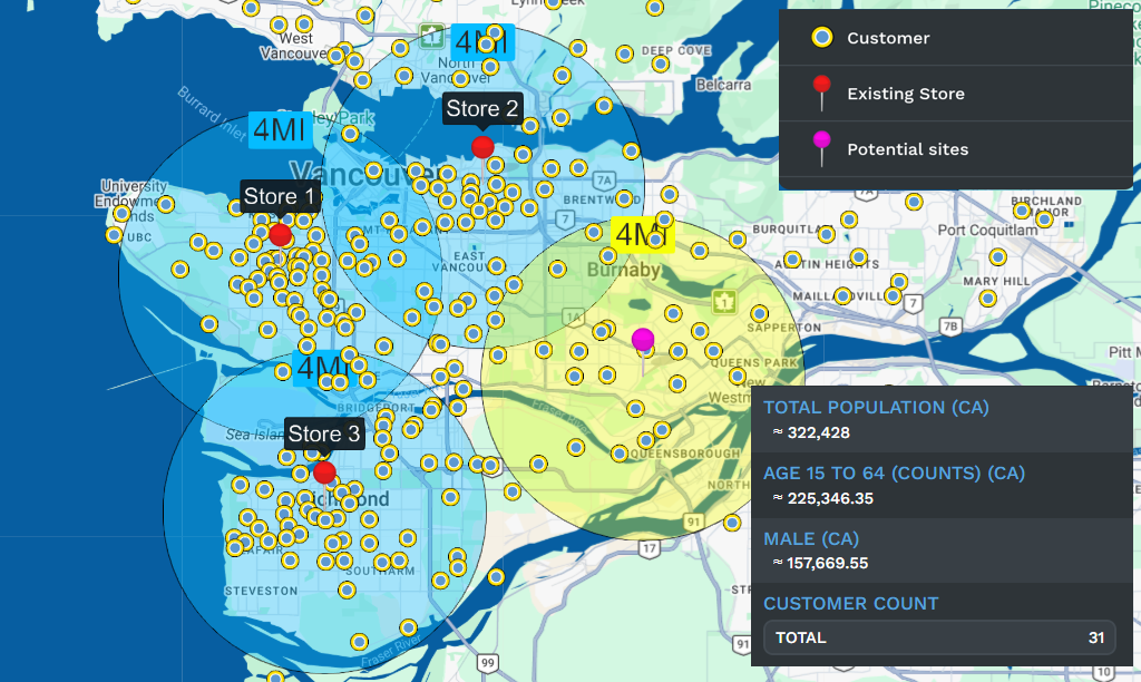
In Map Tools, open Distance Radius Circles. Center the first ring by typing the town address or clicking the map, set the Proximity Within size in miles or kilometers, and click Add Proximity Radius. Repeat with the same size for the second town so both areas match. Give each ring its own color and name so the two markets read apart.
-
2
Add Demographics to Both Pop-Outs
Click the first radius, open its pop-out, and choose Customize Metrics. Under Demographic Data, set the region to the U.S. or Canada, pick the demographic group, and add population, median household income, and an age field with Add to Proximity Details. Because editing one radius updates every radius, the second ring shows the same fields the moment you click it, and you compare the two pop-outs field by field.
-
3
Pin the Hospitals and Universities Nearby
Upload your list of hospitals and universities as its own set of markers, then open the Location Finder to surface the nearest of those points to each town center. The panel lists what is closest to each candidate, so you count how many hospitals and universities fall near one market versus the other rather than eyeballing the pins.
-
4
Shade the Region to Confirm the Winner
For a wider read, open the Boundary Tool, pick ZIP codes or counties, and set the fill to Demographic Census Data. Choose a metric like income or population and click Load Boundaries, and the map colors every region by that number. The stronger market shows in a deeper range on the key, which backs up what the two radius pop-outs already told you.
Start Comparing Your Markets Free
Begin the 10-day free trial with no credit card and load your own candidate list. Drop a radius on each town, add the census fields you care about, and read the two markets side by side in one session. Want a hand? A Maptive specialist will set up the first comparison with you and show you where the pop-out numbers live.
No credit card required
Frequently Asked Questions
How do I compare two markets' demographics?
Drop a Distance Radius around each town in Map Tools, then click the first ring and open Customize Metrics in the pop-out. Under Demographic Data, add population, median household income, and age with Add to Proximity Details. Because the fields carry across every radius, the second town shows the same metrics as soon as you click it. Keep both rings the same size so the numbers cover equal ground, then read the two pop-outs one field at a time to see which market comes out ahead.
Which town has more of my target population?
Draw a matching radius on each town and add population through Customize Metrics under Demographic Data. The pop-out for each ring lists the people inside it, so you compare the two totals directly instead of guessing from a spreadsheet. If your target is narrower than a headcount, add an age band or a household field to both rings and read those numbers side by side. For a regional view, shade ZIP codes or counties by population in the Boundary Tool so the denser market shows in a deeper color on the key.
Can I compare towns by income?
Yes. Add median household income to each radius through Customize Metrics, and both pop-outs list the income for the area inside the ring. Keep the two rings the same size so the figures are comparable, then read one against the other. To see income across the whole region, open the Boundary Tool, pick ZIP codes or counties, set the fill to Demographic Census Data, and choose an income metric. The map colors each area by income, and the stronger town lands in a higher range on the legend.
How do I count hospitals and universities near each market?
Upload your list of hospitals and universities as markers, then open the Location Finder and center it on each town to surface the closest of those points. The panel lists the nearest locations to each candidate, so you count what falls near one market against the other. You can also draw a radius around each town and read how many of those POI markers sit inside the ring. Either way, you compare access to the same set of hospitals and universities across both candidate markets.
What is the difference between a radius and a drive-time area here?
A Distance Radius is a straight-line ring of a set mile or kilometer size, which is best when you want both markets measured on the same even scale. A Drive Time Polygon covers the area reachable within a set number of minutes from a town center, based on perfect driving conditions rather than live traffic. Use the radius when the question is raw distance, and the drive-time area when the question is how far people can actually travel to reach a site. Both read demographics the same way through Customize Metrics.
Can I compare more than two towns at once?
Yes. Add a radius for each town you are weighing, give every ring its own color and name, and the demographic fields you set through Customize Metrics carry across all of them. Click each ring in turn to read its population, income, and age, then line the pop-out numbers up against each other. For a shortlist of several markets, the Boundary Tool fill is the faster read, since it colors every ZIP code or county at once and lets the shortlist sort itself by shade.
Do I need GIS skills to run a market comparison?
No. Drawing a radius is a click on the map, and adding demographics is a set of menu choices under Customize Metrics, so you build the comparison without GIS training or code. Upload your candidate list as an Excel file, CSV, or Google Sheet, and the geocoder places the towns and fixes messy addresses for you. The Location Finder and Boundary Tool run the same way, from dropdowns rather than scripts, so most people have two markets compared in their first session.
How current is the demographic data behind the comparison?
The population, income, and age figures come from the U.S. Census Bureau and Statistics Canada and are built into the platform, so you read the official published numbers without importing or updating anything. A growing library of market data adds spending and household detail alongside the census figures. Because the data is built in rather than sitting in your file, every radius and every shared view reads from the same source, so a comparison you send a colleague shows the same numbers when they open the link.
Can I compare a U.S. town against a Canadian one?
Yes. Customize Metrics has a region toggle between the United States and Canada, so you set one radius to read U.S. Census data and another to read Statistics Canada data on the same map. The pop-out fields line up, so you compare population and income across the border from one workspace. The Boundary Tool covers both, with U.S. boundary sets and Canadian FSAs for a color-shaded regional read.
How do I share the comparison with my team?
Once both markets are on the map, share it with a password-protected link, a public link, or a one-line HTML embed, or present it in presentation mode. Export the map as a PNG or PDF, up to a large poster size, to drop into a deck. To hand over the raw numbers, export the locations inside each radius to Excel, CSV, or TSV.








