A spreadsheet filled with location data is hard to interpret quickly. Addresses, sales figures, and customer distributions require significant effort to analyze at a glance.
If you give a client data in this raw form, attention drops. Show it instead as a custom-styled map, and understanding comes quickly as patterns reveal themselves, leading to greater engagement.
This shift from raw data to visual representation forms the foundation of effective client communication. By making geography visible, the gap between what you know and what your client understands closes rapidly. Custom map styles do more than display information. They frame it, emphasize it, and make it memorable in ways that tables cannot.
Table of Contents
The brain processes visuals far faster than text. This speed gives your message impact when time is limited, as in a 30-minute strategy presentation.
Retention rates follow a similar pattern. According to SHIFT eLearning research, people retain only 10-20% of written or spoken information after three days. Visual information, by contrast, stays with them at rates approaching 65%. When your presentation ends and the conference room empties, the maps you showed will remain in memory while the accompanying bullet points fade.
An additional study found that illustrated text was 83% more effective than plain text in improving comprehension when tested after a delay. For presentations that aim to influence decisions made days or weeks later, this retention advantage becomes a practical asset rather than an abstract benefit.
Most business data carries a location component. Bacha Software reports that up to 80% of business data contains geographic elements. Sales territories, customer clusters, supply chain routes, competitor locations, and market expansion targets all exist somewhere on a map. Presenting this information without geographic context forces your audience to do the spatial reasoning themselves, which few will bother to do.
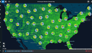
Custom maps make geography clear, revealing relationships and patterns. With a heat map, clients immediately see where density occurs, while spreadsheets require more effort to interpret.
Maps translate complex data into visuals, making trends and patterns easily identifiable and highlighting information often missed in tables.
Presentations that include strong visuals perform measurably better than those that rely solely on text and speech. Visual Hackers cites research showing that presentations with visuals are 43% more persuasive than those without. This percentage carries weight when your goal is to convince a client to approve a budget, select a location, or commit to a strategy.
INK PPT cites a study in the Journal of Business Communication that found that relevant graphs in sales presentations increased the persuasiveness of arguments by 43%. Presentations with tailored, data-specific graphics saw a 30% increase in engagement. Custom maps meet this need when geography is a key factor.
Customizing graphics to match specific data points and brand preferences can help presentations become more effective. For example, tailoring map visuals to a client’s brand colors and key regions makes the data more relevant and accessible than using a generic map style.

Organizations that prioritize data-driven decision-making outperform those that do not. McKinsey Global Institute research cited by Diwo found that data-driven organizations are 23 times more likely to acquire new customers, six times more likely to retain existing customers, and 19 times more likely to be profitable. Visualization tools form a core component of this capability.
Market Growth Reports show that 59% of companies gain better customer insights from visualization platforms, while 51% see faster decision-making. These benefits help build stronger client relationships. Presenting with well-designed maps enables clients to process information quickly and understand it more clearly, leading to faster, more informed decisions.
The market for these tools continues to grow. Mordor Intelligence projects the data visualization market to reach $10.92 billion in 2025, rising to $18.36 billion by 2030. More than 83% of organizations now rely on dashboards for decision-making, and over 68% of businesses integrated visualization tools into their business intelligence strategies in 2024.
Quality visuals in your presentation demonstrate professionalism and attention to detail, building credibility. Clients notice when maps appear polished instead of using default formats.
Audiences trust well-designed visual information. Custom map styles demonstrate thoughtful presentation and reinforce the quality of the analysis.
Most people in your audience learn best through visual means. VideoScribe reports that 65% of individuals fall into this category. When you present geographic data through custom maps, you align with how the majority of your clients naturally process information.
SHIFT eLearning research confirms that 90% of information transmitted to the brain is visual. This neurological reality explains why geographic visualizations create immediate comprehension and engagement. Your client’s brain is already optimized for spatial information. Custom maps leverage this built-in capability.
Business-to-business presentations carry specific requirements. WebFX reports that over 50% of B2B professionals identified charts and data visualization as the most used visual content in their work. Statistics reveal that a chart can enhance comprehension by 80% within B2B content.
Simplified visuals boost retention. Clients reported 50% better comprehension with clear, focused information. Custom maps let you control details to suit your point.
Harvard Business Review noted that creating innovative data visualizations has become a necessary skill for managers, as it is often the only way to make sense of their work. Decision-making increasingly relies on data that arrives with overwhelming velocity and volume. Abstraction becomes necessary for communication.
Maps naturally distill data into a single, easily interpreted image. Custom styling ensures that what clients see directly supports your core message.
When your client leaves the meeting, what remains? If your presentation relied on spoken explanation and text-heavy slides, retention will be low. If it featured custom maps that visually highlighted key insights, those images persist in memory. This persistence matters when your client presents your findings to their own stakeholders or when they return to the decision weeks later.
The 65% visual retention rate cited earlier means that two-thirds of your geographic insights may remain accessible to the client long after the meeting ends. This extended influence gives your work more impact over time.
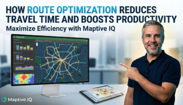
Maptive provides cloud-based mapping software that lets users create interactive maps by importing data from spreadsheets, CRM systems, and other sources. The platform offers route optimization, territory mapping, and heat mapping features that serve professionals across sales, marketing, logistics, and real estate.
Maptive’s platform creates custom maps that improve client presentations by transforming complex location data into compelling visuals that engage audiences and drive decisions. The software produces full-resolution, presentation-ready maps with poster-size printing up to 2048 x 2048 pixels. A built-in presentation mode supports professionals who prefer to stay on a single platform during client meetings.
Most teams begin creating maps within 30 minutes of starting. Sign up for a free 10-day trial today and see how professional custom map styles can elevate your client presentations from ordinary to memorable.
Fred Metterhausen is a Chicago based computer programmer, and product owner of the current version of Maptive. He has over 15 years of experience developing mapping applications as a freelance developer, including 12 with Maptive. He has seen how thousands of companies have used mapping to optimize various aspects of their workflow.