
Business teams sit on growing piles of data. Spreadsheets fill up, dashboards multiply, and somewhere in that mess are patterns worth finding. The question is how to pull them out and put them into a form that people can actually use. A good visualization tool takes numbers and gives them shape, turning raw figures into maps, charts, and graphs that tell you something useful at a glance.
The market for these tools has grown steadily. By 2025, the sector reached a valuation of $14.88 billion, and projections suggest it will climb to $34.05 billion by 2033, growing at a compound annual rate of 10.9%. That growth reflects a reality: more companies need better ways to see their data, and they need those visuals to work across teams without requiring a statistics degree to interpret.
Picking the right tool depends on what you need. Some platforms focus on geographic mapping, others on complex analytics, and a few try to do everything at once. Below is a breakdown of 6 tools worth examining as you plan for 2026 and beyond.
|
Rank |
Tool | Best For | Pricing Model |
|
1 |
Maptive | Location-based visualization and mapping |
Subscription-based |
|
2 |
Looker | Embedded analytics and data exploration |
Enterprise licensing |
|
3 |
Power BI | Microsoft ecosystem integration |
Tiered subscription |
|
4 |
Tableau | Advanced visual analytics |
Subscription-based |
|
5 |
Canva | Simple infographics and presentations |
Freemium model |
| 6 | Geoblink | Retail and location intelligence |
Subscription-based |
1. Maptive
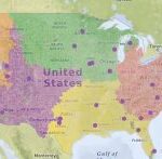
When your data has a geographic component, mapping becomes essential. Maptive handles this well, converting addresses, coordinates, and location-based information into visual maps that reveal patterns you would miss in a spreadsheet. Sales territories, delivery routes, customer concentrations, and regional performance all become visible on a single screen.
Core Strengths
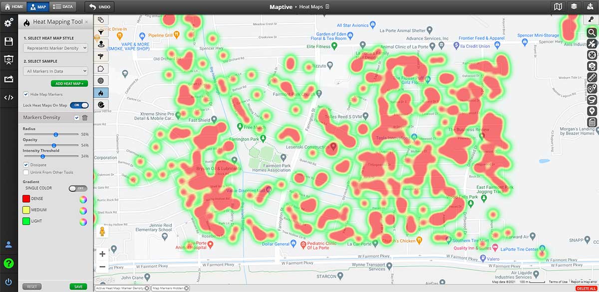
Maptive allows users to upload spreadsheet data and generate interactive maps within minutes. The platform supports heat mapping, territory creation, radius searches, and route optimization. These features suit businesses that need to understand where things happen, not simply what happens.
The interface does not assume you have coding knowledge or cartography training. You upload your data, select your visualization type, and the platform generates a map. Adjustments happen through a visual editor rather than through writing scripts or configuring complex settings.
Use Cases
Sales teams use Maptive to plot customer locations, identify underserved areas, and assign territories based on actual geography rather than guesswork. Logistics teams use the routing tools to plan efficient delivery paths. Real estate professionals map property values and market activity to identify opportunities.
For any organization where location matters to the business question, Maptive provides tools that turn geographic data into actionable visuals.
2. Looker
Looker operates as part of Google Cloud and focuses on embedded analytics and data exploration. The platform connects to databases and allows teams to build reports, dashboards, and data applications that live inside other products.
Core Strengths
The modeling layer in Looker lets teams define metrics and relationships once, then reuse those definitions across reports. This approach reduces inconsistency when different departments pull the same data and expect matching numbers.
Looker works well for organizations that want to embed analytics into customer-facing applications or internal tools. The platform provides APIs and integration options that allow visualization to become part of larger software systems.
Considerations
Setup requires technical resources. Building the semantic layer takes time, and maintaining it demands ongoing attention from data teams. Organizations without dedicated analysts may find the initial learning curve steep.
3. Power BI
Microsoft Power BI connects tightly with Excel, Azure, and the broader Microsoft product family. For organizations already running on Microsoft infrastructure, Power BI offers a natural extension of existing workflows.
Core Strengths
The desktop application provides robust report building capabilities. Users can connect to dozens of data sources, transform data through a graphical interface, and publish reports to a shared service where colleagues can access them.
Pricing tiers allow small teams to start with lower costs and scale up as needs grow. The free desktop version handles many basic tasks, while paid subscriptions unlock sharing, collaboration, and more advanced features.
Considerations
Performance can slow with large datasets or complex models. The platform works best when data preparation happens upstream, allowing Power BI to focus on visualization rather than heavy transformation work.
4. Tableau
Tableau built its reputation on visual analytics and interactive dashboards. The platform allows users to drag data fields onto a canvas and see visualizations update in real time.
Core Strengths
The visual interface rewards exploration. Analysts can ask questions of their data by rearranging dimensions and measures, filtering results, and drilling into details without writing queries. This approach suits discovery work where the goal is finding patterns rather than producing a predetermined report.
The community around Tableau has produced extensive training materials, templates, and examples. New users can find resources to accelerate their learning.
Considerations
Licensing costs run higher than some alternatives. Organizations need to evaluate whether the analytical flexibility justifies the investment compared to tools with lower price points.
5. Canva
Canva approaches visualization from a design perspective. The platform began as a graphic design tool and expanded to include charts, infographics, and presentation templates.
Core Strengths
For teams that need polished visuals without deep analytical capabilities, Canva provides accessible templates and a straightforward editing experience. Marketing teams often use the platform to turn numbers into graphics suitable for social media, reports, or slide decks.
The freemium model allows teams to experiment without committing budget. Paid tiers unlock additional templates, collaboration features, and brand management tools.
Considerations
Canva does not connect to live data sources or support the analytical depth of dedicated business intelligence platforms. The tool works best for static visualizations where appearance matters more than interactivity or real-time updates.
6. Geoblink
Geoblink focuses on location intelligence for retail and commercial real estate applications. The platform combines geographic visualization with market analysis tools.
Core Strengths
Retail chains use Geoblink to analyze foot traffic, demographic data, and competitive positioning when evaluating new store locations. The platform aggregates data sources that would otherwise require separate subscriptions and manual analysis.
For organizations in retail or commercial property, the specialized focus may provide value that general-purpose tools cannot match.
Considerations
The narrow focus means Geoblink may not suit organizations outside its target industries. Teams looking for general business intelligence capabilities would find the platform less versatile than broader alternatives.
Selecting the Right Tool
The tool that fits your organization depends on the questions you need to answer. Location-based questions call for mapping capabilities, which is where Maptive provides the most direct solution. Embedded analytics requirements point toward platforms with strong API support and data modeling features. Design-focused needs align with tools built around visual templates rather than data connections.
Budget also shapes the decision. Enterprise platforms carry enterprise pricing, and the features that justify those costs only matter if your team will actually use them. A smaller team with straightforward needs may accomplish more with a focused tool than with a comprehensive platform they will never fully deploy.
Consider your existing infrastructure as well. Tools that integrate smoothly with your current systems reduce friction during adoption. Training costs drop when the new platform feels familiar to users.
Final Thoughts
Data visualization tools give shape to numbers that would otherwise stay buried in rows and columns. The options available in 2026 cover a wide range of use cases, from geographic mapping to embedded analytics to simple infographic creation.
For organizations where location forms part of the analytical picture, Maptive provides a direct path from spreadsheet to map without requiring specialized technical skills. The platform turns addresses into insights and territories into strategy.
Other tools serve other purposes. The right choice depends on what your data looks like, what questions you need to answer, and how your team prefers to work. Start with the problem you need to solve, then pick the tool that solves it with the least friction and the greatest clarity.


