
Data visualizations are used by reporters, researchers, and companies to explain information clearly. When done well, a good visualization gets shared widely on social media and other platforms.
This makes data visualization useful for businesses that want their content seen by more people. But building an effective visualization takes time and planning. To do it well, the creator needs to:
- Pick the correct chart or graph
- Keep it clear and focused
- Give enough background so the data makes sense
- Use color to make patterns easier to see
- Label important parts
The most important step is choosing the right type of chart or graph. Below is a set of recent examples that were widely shared and reached large audiences.
Top 25 Data Visualization Examples for 2026
The following examples show how recent data visualizations have helped people share information clearly. Each one uses a different format to explain complex data in a simple way.
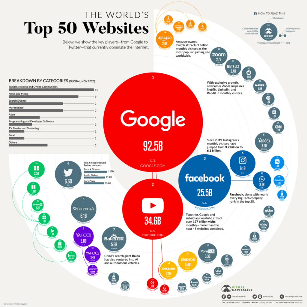
Best Bubble Chart Visualization
This chart shows which websites have the most traffic worldwide. The size of each bubble shows how large each site’s audience is. A smaller bar chart inside the main image shows the main industries for these websites.
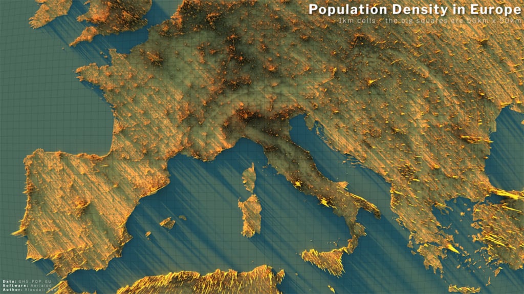
Best Geospatial Visualization
Some of the most effective data visualizations use public data. This one by Alasdair Rae uses population data from the European Union. It shows how population density changes across Europe using a clear geospatial layout.
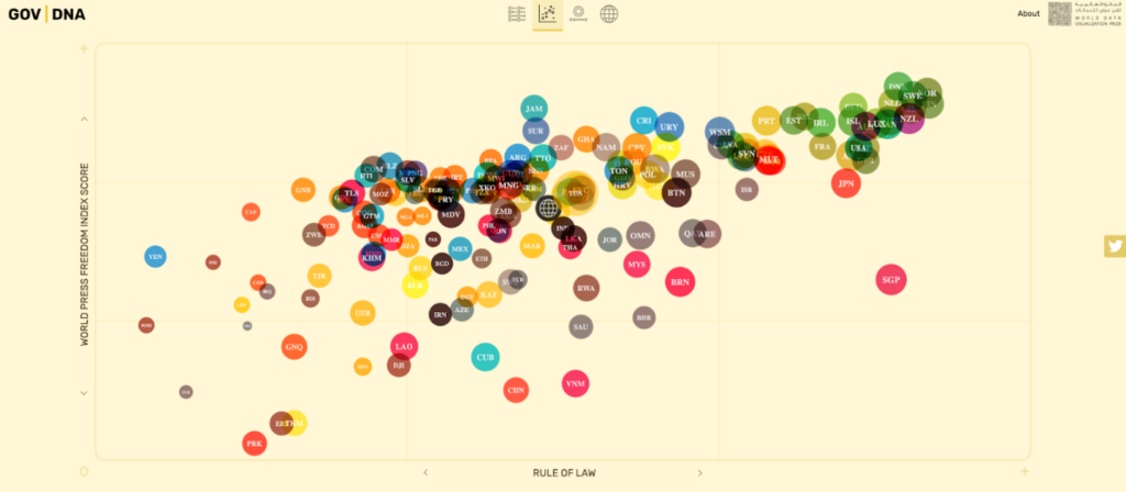
Best Scatter Plot Visualization
A scatter plot can help explain how governments function in different countries. This example compares how involved governments are in people’s lives. It lets viewers see patterns across nations and understand different approaches to governance.
Most Beautiful Visualization
Since 1977, Star Wars films and shows have introduced a wide range of characters. Kirell Benzi created a visualization called The Dark Side and the Light that maps how these characters interact. It shows the links between major and minor characters across different parts of the series. The chart is clear and well-organized.

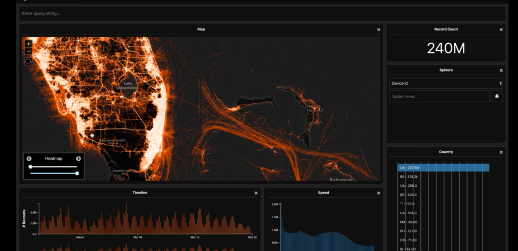
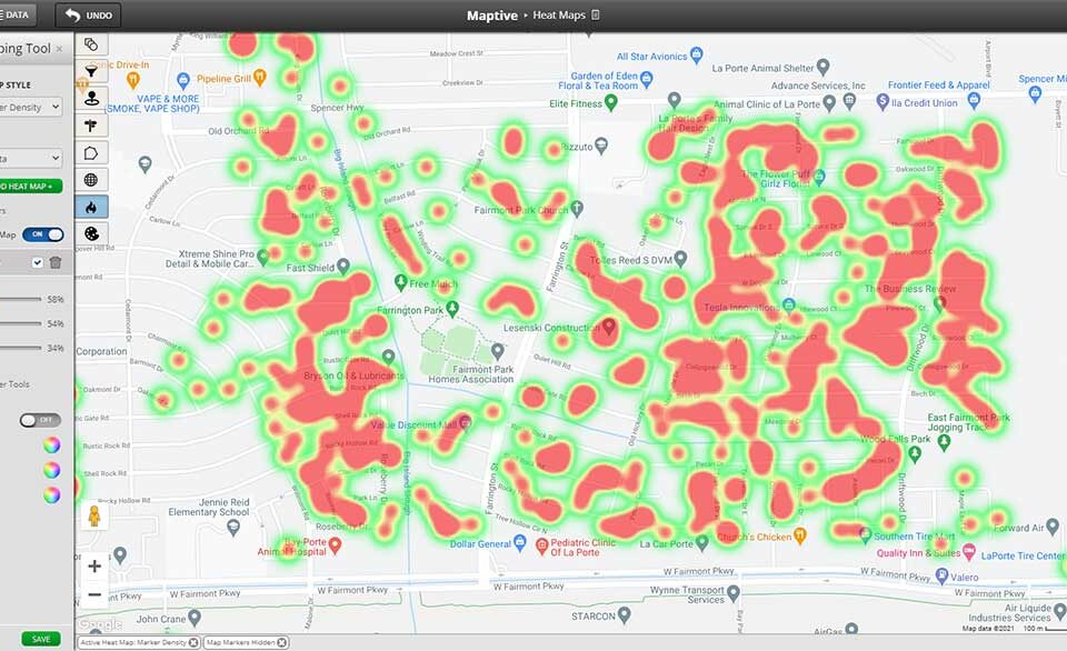
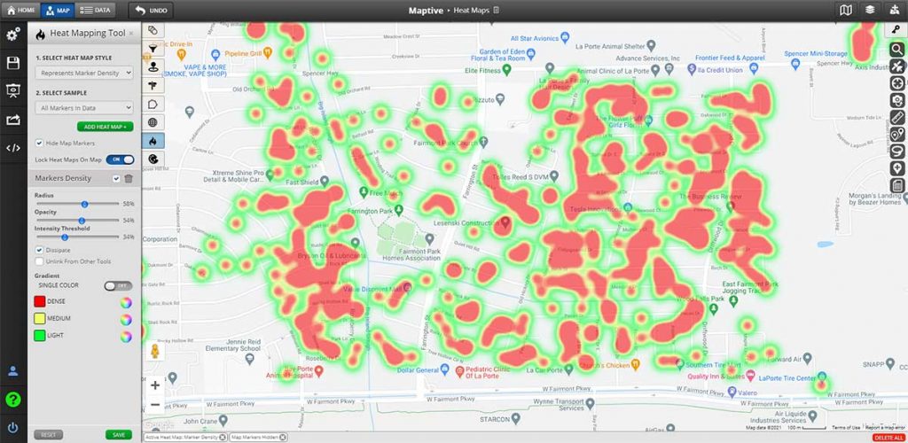
Best Heat Map Visualization
Researchers have used data visualizations to study how COVID-19 spread. One example is a video from Tectonix GEO. It shows a heat map built from Outlogic data that tracks the movement of spring break visitors in Fort Lauderdale. The map shows how these trips helped spread the virus to other parts of the country.
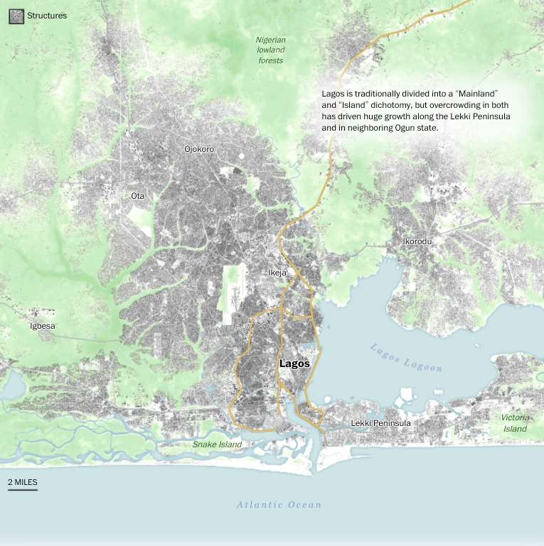
Best Journalism Visualization
Many major publications now use data visualizations to support detailed reports. One example is a long-form article on cities in Africa. It includes clear, well-made charts that help explain the topics covered in the story. These visuals make the data easier to understand and more useful for readers.
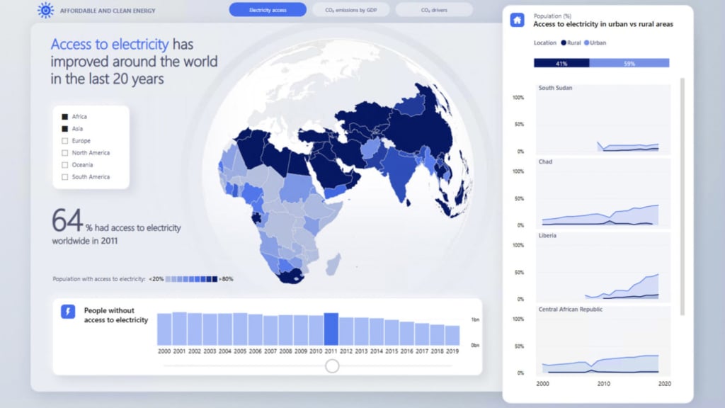
Best Data Visualization for Business Intelligence
Data only helps if people can understand it. Many software tools now make it easier to turn spreadsheets, databases, and cloud data into interactive charts.
Microsoft Power BI is one of the most widely used tools for this. It lets users build dashboards that show live data and visuals. The example shown here uses Power BI to present global access to electricity in a simple, shareable format.
Best Infographic Visualization
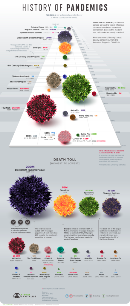
COVID-19 has received global attention since 2020, but other major pandemics have shaped history as well. This infographic shows the largest pandemics across centuries. It gives a clear timeline and helps viewers compare their scale and impact.
Best Interactive Visualization
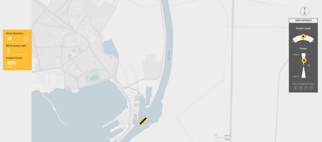
In 2021, a cargo ship blocked the Suez Canal and halted traffic in a key trade route. CNN created an interactive chart that lets users see how difficult it is to steer a ship through the canal. It shows the challenges of navigating large vessels in narrow spaces.
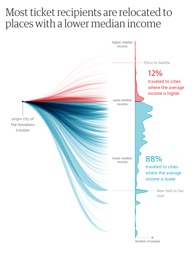
Best Distribution Chart
Best Animated Unit Visualization
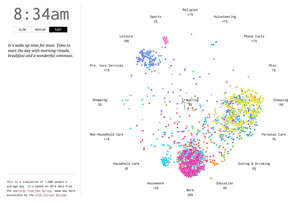
How do Americans spend their time? This animated unit visualization is based on data from the American Time Use Survey, and it conveys in time-elapse fashion what people are generally doing at different times of the day.
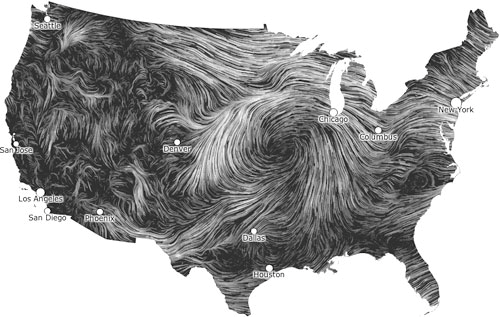
Best Wind Map Visualization
Wind holds the power to create energy and to destroy cities. These wind map visualizations share how the wind typically moves around us at any given time. While the data visualizations are meant to provide basic meteorological information, the maps are collectively a beautiful homage to the power of nature.
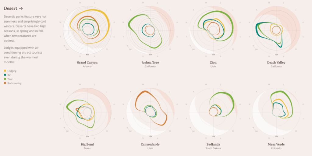
Best Radar Chart Visualization
What’s the best way to stay overnight at national parks in the United States? Let data visualizations make recommendations for you. These radar chart visualizations help viewers better understand how national park visitors traditionally spend the night during certain times of the year.
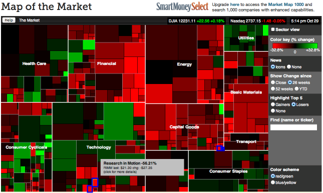
Best Tree Map Visualization
Wall Street investors are always looking for ways to get an edge on the competition. SmartMoney provides a so-called “map of the market” that allows anyone to track more than 500 stocks at the same time — visually. The tree map visualization is simple: green indicates a stock going up, and red indicates a stock going down.
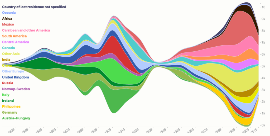
Best Alluvial Chart Visualization
Alluvial chart visualizations are helpful when exploring how proportions change over time. For example, this visualization of 200 years of immigration to the United States shows how the proportion of immigrants from different parts of the world has changed through the years.
Best Line Chart Visualization
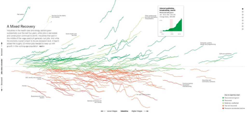
While some experts expect an even worse recession to happen in 2024, we all remember the so-called “Great Recession” of 2008-2009 far too vividly. It took about 5 years for the economy to regain the 9 million jobs it had lost, but each sector was affected quite uniquely.
The New York Times used this data visualization, including several informative line charts, to demonstrate how that economic crisis reshaped industries and the jobs that are available more than a decade after the Great Recession.
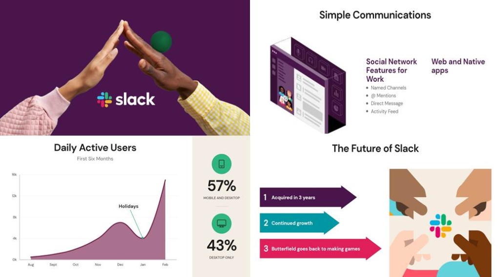
Best Visualization for Business Presentations
Presentations are the closest most of us get to creating visually pleasing assets on a day-to-day basis. Now, thanks to AI, we can get a lot closer to building presentations that are graphically beautiful, including graphs and charts that engage our intended audience.
As an example, Beautiful.ai is a cloud-based presentation software that uses AI technology to help users create visually stunning and engaging presentations quickly and easily. Below is an example of how it is able to combine design elements such as icons, images, and typography to create professional-looking presentations.
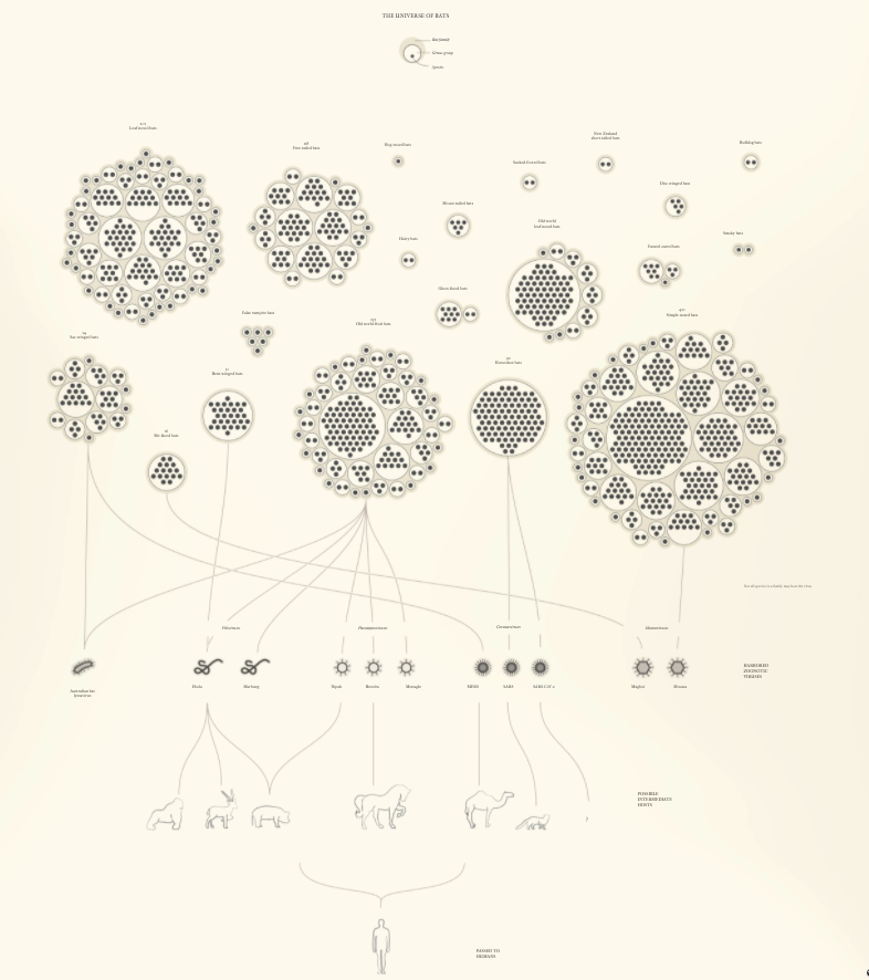
Best Flow Chart Visualization
One of the most interesting COVID-19-related data visualizations to come out of the pandemic is this flow chart below, created by Reuters, which shares how viruses move from different bat species to other animals and then to humans.
Best Motion Graphic Visualization
Where does a raindrop in any portion of the United States finally end up? This fun motion graphic visualization lets you choose the exact place of rainfall, and then it takes you on an adventure to where the raindrop meets its final resting place.
Best AI Visualization
One of the newest developments in AI includes tools like DALL-E2, with the ability to generate surreal and creative images from textual descriptions. Even though it is still a relatively new tool, it has already found practical applications in areas such as interior design, fashion design, and product design.
DALL-E2 combines deep learning techniques, including generative adversarial networks (GANs) and transformers, to create images that match the text descriptions provided to it. For example, if given the prompt “an armchair in the shape of an avocado,” DALL-E can generate an image of an armchair that looks like an avocado, as you can see in the example below.

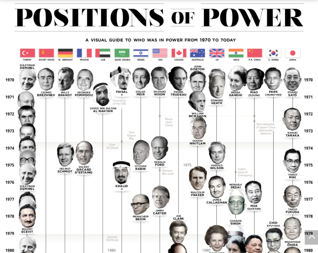
Best Timeline Visualization
Heads of government around the world have a profound influence on global events and history. This timeline visualization provides details on who has led the world’s largest and most important nations and on whom world leaders have led alongside.
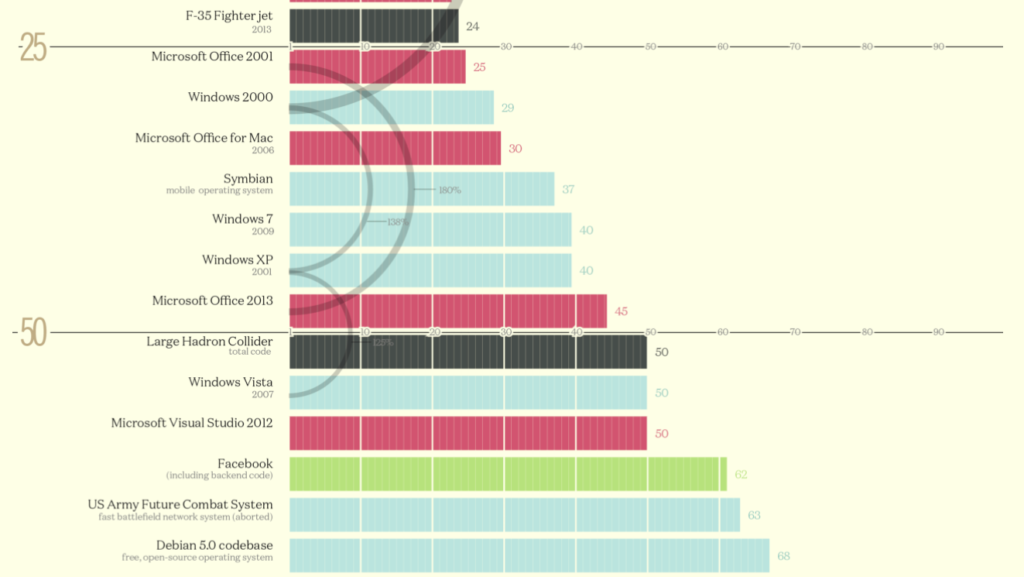
Best Bar Graph Visualization
How many millions of lines of code are included in different codebases? This elegant bar graph conveys the information at a glance. When you’re working with data that reaches into the millions of millions, this type of data visualization helps you break things down into a more easily digestible graphic.
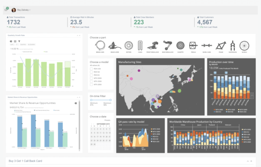
Best Visualizations for Custom Apps
If you are trying to make sense of multiple sources of business data, one visualization alone is probably not going to cut it. To solve that, software like Domo allows users to connect to multiple data sources, transform data, and create custom visualizations to gain insights and make data-driven decisions.
Domo’s visualizations are designed to be highly customizable and interactive, allowing users to quickly and easily explore data and discover insights. In the example below, you can see a dashboard consisting of multiple visualization cards that come together to tell a story.
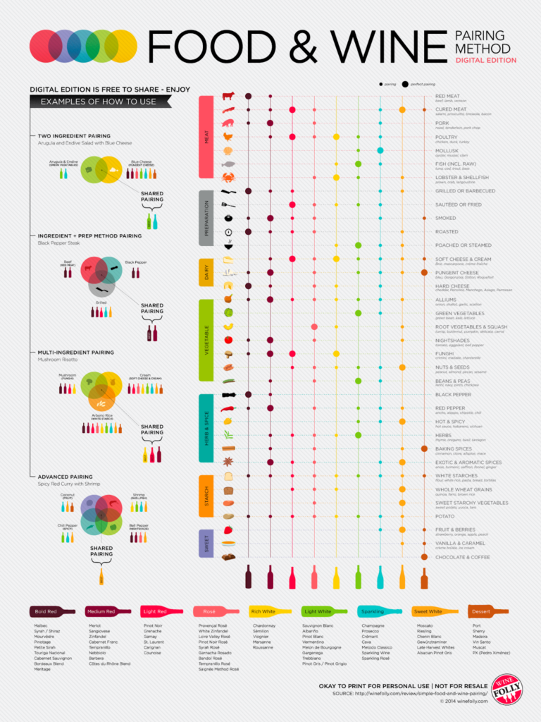
Best Table Visualization
You likely know that certain foods pair better with certain wines than others. But few people have committed to memory exactly what food-wine pairings work best. This table visualization perfectly captures the best pairings for easy reference when you’re entertaining or otherwise trying to piece together a menu.
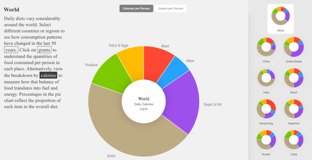
Best Donut Chart Visualization
Our dietary preferences have changed greatly in the past few decades, including a marked rise in meat consumption and the use of vegetable oils. This donut chart visualization lets you explore different countries during different time periods to see exactly what people were eating.
What are the Best Tools for Creating Data Visualizations?
As seen in the examples above, different types of charts require different tools. The best option depends on the kind of data you have and what you want to show.
Using the right tool makes it easier to build a clear and useful chart. The wrong tool can make data harder to understand. Below are tool suggestions based on use case.
- For map-based visualizations: Use Maptive to turn spreadsheet data into maps. It’s simple to customize and works quickly.
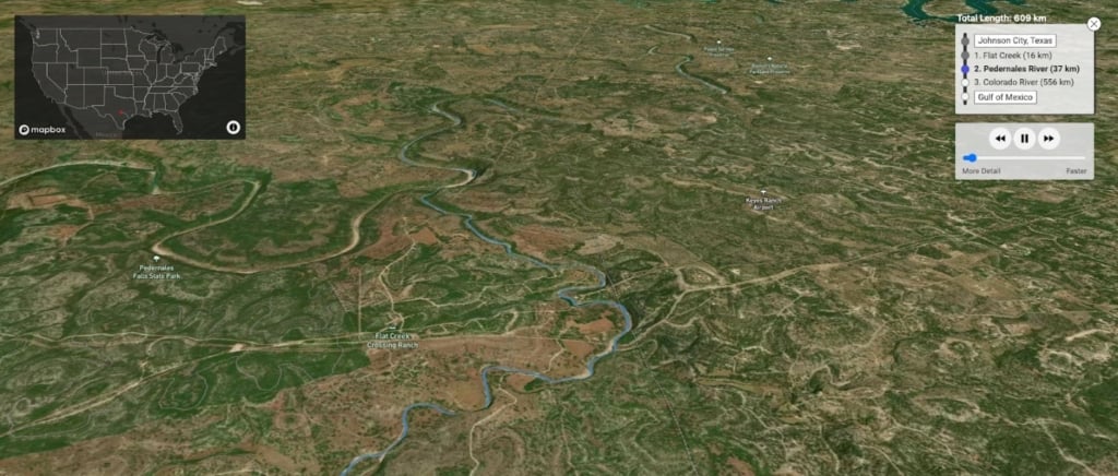
- For live data: Mapbox provides location tools for developers. It helps display data in real time with accuracy.
- For large datasets: Tools like Maptive, Tableau, FusionCharts, and Grafana handle large amounts of data. They let you build visuals that show key points clearly.
- For CRM data: Salesforce and Tableau are good choices. Maptive will offer a Salesforce integration in mid-2024 to link customer data with maps.
- For data analytics: Google Looker Studio is free and works well for most reports. Google Charts is another simple option.
- For AI-generated visuals: Use DALL·E 2, Midjourney, or Dream.ai to create visual content with AI. Beautiful.ai is useful for making clear presentations from business data.
Why Use Data Visualization?
Charts and maps help people see patterns and act on them. This applies in research, media, and business. Startups can also use visuals to explain ideas fast and clearly.
Want to try Maptive? Start a free trial to see how your data can be shown on a map.


