
As we’ve noted before on this blog, visuals are a powerful way to convey messages, present information, and persuade audiences. In a previous post we published titled, “6 Powerful Reasons Why Your Business Should Visualize Data,” we provided a handful of stats on the power of visuals. We think they are worth sharing again, so here they are:
- The brain can see images that last for just 13 milliseconds.
- Our eyes can register 36,000 visual messages per hour.
- We can get the sense of a visual scene in less than 1/10 of a second.
- 90% of information transmitted to the brain is visual.
- Visuals are processed 60,000X faster in the brain than text.
If you’re in the process of trying to build a story, persuade a group of people, or better understand your data, consider creating some sort of visual representation to guide your thoughts or the thoughts of others.
Need a little inspiration? Take a look at these 8 great examples of complex data visualized:
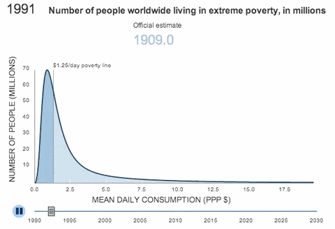
1. The Dwindling of Extreme Poverty from The Brookings Institute
This interactive graph presented by the Brookings Institute illustrates how poverty has changed worldwide over the last century. It’s a great example of using data to tell a story. The interactive data graphic was comprised using data included in a report titled, “The Final Countdown: Prospects for Ending Extreme Poverty by 2030.” The purpose of the visualization is described in the following way:
“To better understand the challenge of ending poverty, we look at the pattern of poverty reduction in terms of the movement of poor people across the poverty line. In this figure, the area under the curve represents the population of the developing world arranged according to individuals’ level of daily consumption. The height of the curve at any given consumption level reflects the number of people who meet that exact standard of living. Thus the area under the curve to the left of the vertical poverty line (at $1.25) captures the number of people living in poverty.” — The Brookings Institute, Source
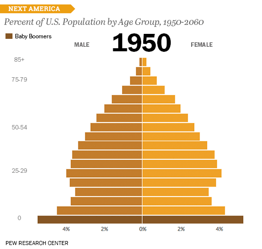
2. The U.S. Age Pyramid from The Next America
In this visualization the Pew Research Center aims to help illustrate how our nation is changing over time in an effort to forecast the challenges we may face in the near future. The chart is described in the following way:
“Each bar represents a five year age cohort; with those ages 0-4 on the bottom and those ages 85 and older on the top. In every society since the start of history, whenever you broke down any population this way, you’d always get a pyramid. But from 1960 to 2060, our pyramid will turn into a rectangle. We’ll have almost as many Americans over age 85 as under age 5. This is the result of longer life spans and lower birthrates. It’s uncharted territory, not just for us, but for all of humanity.” —Pew Research Center, Source
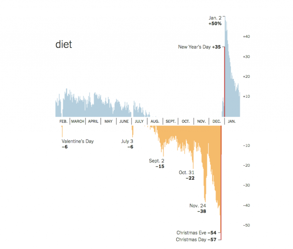
3. The Word “Diet” from Google Search
This resource paints and interesting picture about the behaviors and attitudes of people before, during, and after the holidays. The example highlighted below is showing daily volumes of searched for the word “diet” throughout the year. As you can see, there is a significant drop in the weeks and months leading up to the holiday season, followed by an almost immediate spike once New Year hits. It’s an interesting trend that might not have been as compelling without the visualization that was created.
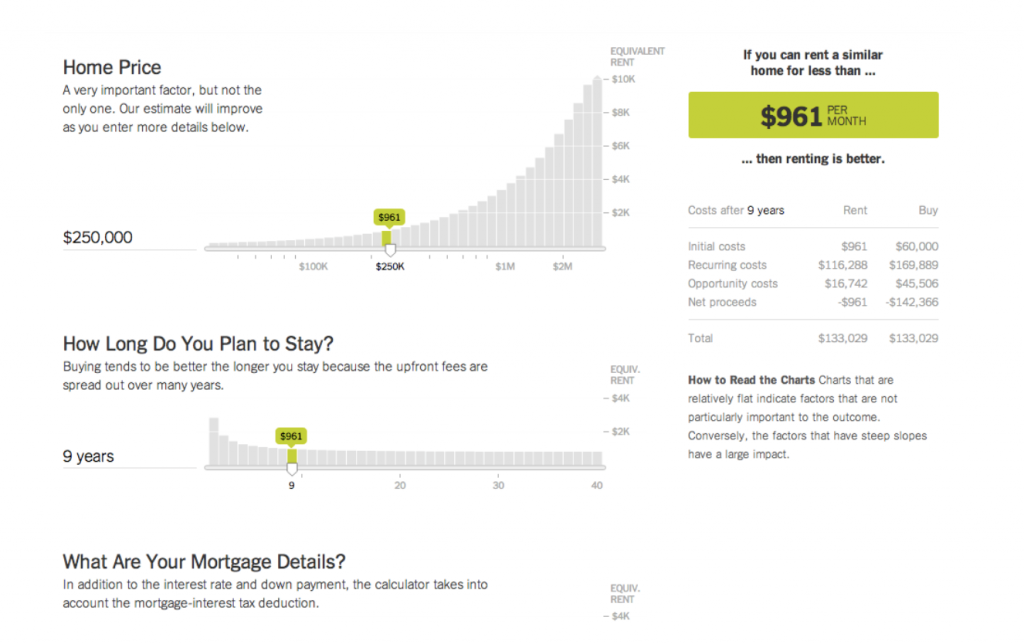
4. Renting vs. Buying from The New York Times
This resource from the New York Times is a great example of what you can do to make complex data more digestible. It’s an interactive, education-based tool that helps visitors understand and decide whether they should rent or buy. It’s described in the following way:
“The calculator keeps a running tally of the most common expenses of owning and renting. It also takes into account something known as opportunity cost — for example, the return you could have earned by investing your money instead of spending it on a down payment. The calculator assumes that the profit you would have made in your investments would be taxed as long-term capital gains and adjusts the bottom line accordingly. The calculator tabulates opportunity costs for all parts of the buying and renting situations. All figures are in current dollars.” — The New York Times, Source
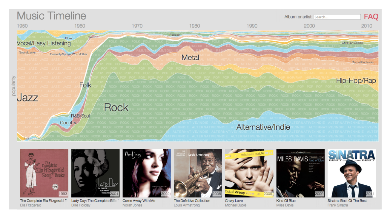
5. The Music Timeline from Google
This fun visualization from Google illustrates the popularity of different music genres over time. It’s described in the following way:
“The Music Timeline shows genres of music waxing and waning, based on how many Google Play Music users have an artist or album in their music library, and other data (such as album release dates). Each stripe on the graph represents a genre; the thickness of the stripe tells you roughly the popularity of music released in a given year in that genre. (For example, the “jazz” stripe is thick in the 1950s since many users’ libraries contain jazz albums released in the ’50s.) Click on the stripes to zoom into more specialized genres.” — Google, Source
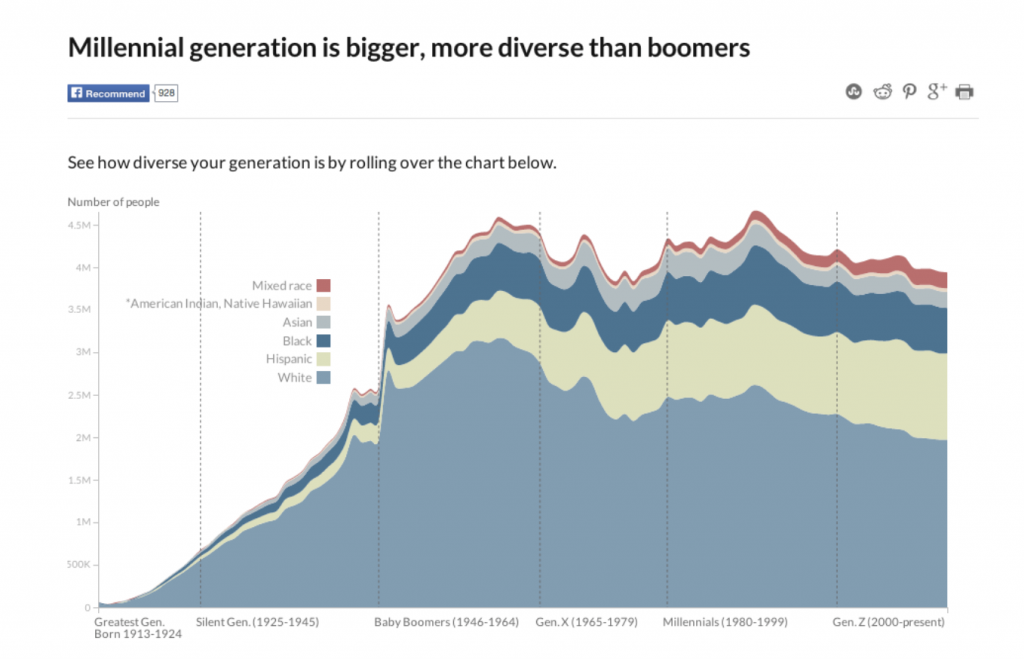
6. Millennial Generation Diversity from CNN
This visualization is showing the size and amount of diversity that exists among different generations. Specifically, it’s showing that the Millennial generation is bigger and more diverse than the Baby Boomer generation.
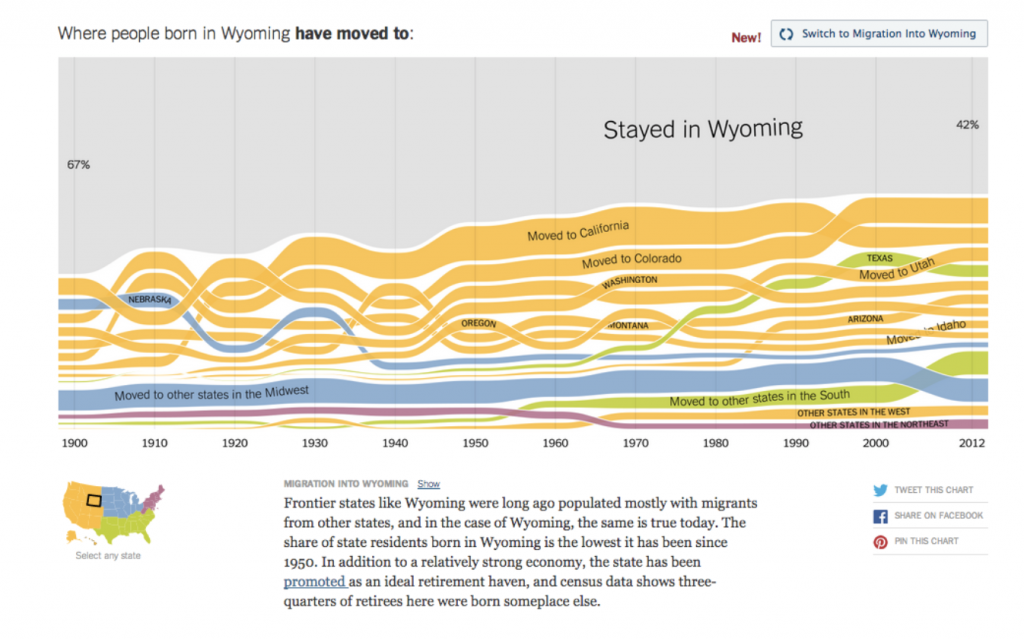
7. U.S. Migration Patterns from the New York Times
In this visualization, the New York Times illustrates how Americans have moved around the country since the 1900s. It breaks down migration state by state, as described below:
“Frontier states like Wyoming were long ago populated mostly with migrants from other states, and in the case of Wyoming, the same is true today. The share of state residents born in Wyoming is the lowest it has been since 1950. In addition to a relatively strong economy, the state has been promoted as an ideal retirement haven, and census data shows three-quarters of retirees here were born someplace else.” — The New York Times, Source
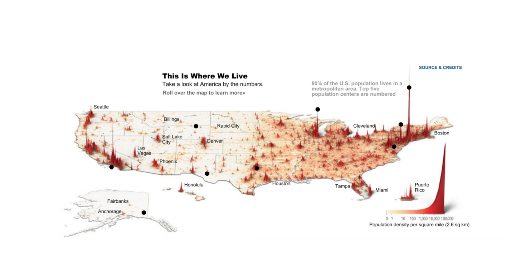
8. Where America Lives from Time
This final visualization from Time is a simple, but incredibly effective presentation of how population differs across the country. Thanks to this 3D-style map, it’s easy to see the areas where population is dense (metropolitan areas), and where it is more sparse (the open country).
What other great examples of data visualization have you come across? Share the links in our comments section below!


