Mapping data in Excel is a great way to track and analyze your geographical data. Map data visualization can help you see patterns and trends you might not have noticed before. This article will show you how to map data in Excel using the Map Chart feature and how Maptive can help you create more powerful maps using your excel data.
Why Use Microsoft Excel for Mapping Data?
There are lots of reasons why you might want to map your data in Excel. Sometimes, it’s helpful to see your information differently so you can understand it better. Mapping your data can also help you track patterns and trends, which can be really useful when making decisions or trying to solve a problem. Additionally, mapping data can be a great way to present your findings to other people. It can help them understand your information better and make decisions based on what you’ve found. Finally, mapping data can be used for research purposes – for example, if you’re studying how something changes over time, Excel maps can be really helpful in analyzing that data.
What You’ll Need
Before we get started, there are a few things you’ll need to have in order to map your data. First, you’ll need to have a recent version of Microsoft Excel installed on your computer. Next, you’ll need to make sure that your spreadsheet data is in a format that can be mapped. Finally, you’ll need to decide what type of map you want to create.
Creating Your Data Map in Excel: Step by Step
Step 1: Select the data you want to map
The first step in mapping your data is to choose the information you want to include on your map. You can select all of the data in your spreadsheet or just a portion of it. For this example, we will select all of the data in our spreadsheet.
Step 2: Format your data
After you have selected the data you want to include on your map, the next step is to format it. This step is important because it will ensure that your data is ready to be mapped. To format your data, you’ll need to do two things:
First, you’ll need to make sure that each column in your data is labeled. You can do this by adding a header row to your spreadsheet.
Second, you’ll need to make sure that each row in your data contains only one piece of information. For example, if you have a column for “City” and another column for “State,” each row should contain only the city and state for one location.
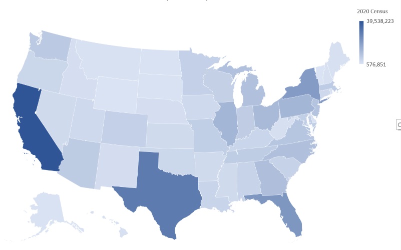
For example, your data might look something like this:
State, Population
New York, 19,510,000
California, 39,350,000
Illinois, 12,720,000
etc.
Excel can map the following types of data:
- Latitude and longitude coordinates
- Zip codes
- City names
- State names
- Country names/codes
If your data doesn’t fit into one of these categories, don’t worry – you can still map it. We’ll show you how to do that in a later step.
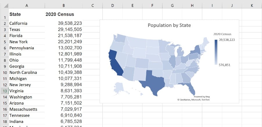
Step 3: Create a map
After you have formatted your data, the next step is to choose the type of excel map chart you want to create. There are two main types of maps: Map Charts and Geography Maps.
Create a Map Chart in Excel
Map Charts are the easiest and simplest way to map data in Excel. Here are the steps to map your data in a fillable map:
1) Highlight the data you want to map
2) Click on “Insert” and select “Maps” in the Charts group of excel.
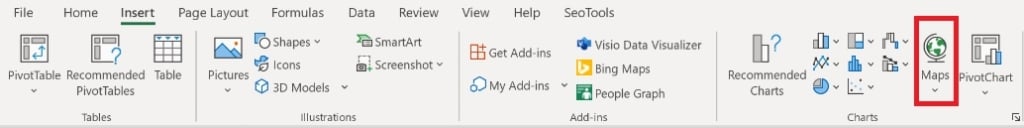
3) Select “Fillable maps” from the drop-down window.
And Voila! That’s all there is to it. You will now see your data displayed on a map.
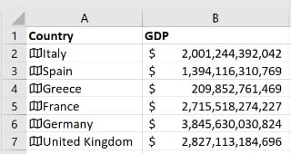
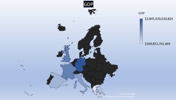
Geography Data Types to Add Data to Your Tables
Use Geography Data Types to add additional information to your maps. Excel’s Geography Data Types allow you to add information like population, area, GDP, fertility rate & tax rate to your excel sheet. For a geography map, you simply need to select a column containing the list of countries you would like data for, and Excel will allow you to select from a list of available data.
Here are the steps:
1) Highlight the cells containing the names of countries.
2) Go to the “Data” menu in excel and select “Geography” from the Data Types tab.
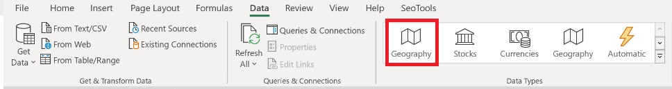
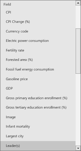
3) Select the type of data you would like to see.
Thats it! You should now have a table of data that looks like the image below. You can now map this data using a map chart using the steps described in the previous section of this article.
Step 4: Customize Your Map
After you’ve created your map, you can customize it to make it more informative and visually appealing.
To add a title to your map, click on the “Chart Title” text on the top of the map, highlight the text that is there, and then type in your own title.
To show a legend to your map, click on the “+” button on the right side of the map and then select “Legend.” You can do to same thing to show Data labels as well.
To change the colors of your map, click on the ” Chart Design” tab and then select “Change Colors.”
And that’s it!
Maptive Mapping Software for Data Mapping
What if you want to customize your maps further or do more advanced analysis than what Excel can provide?
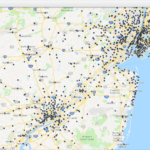
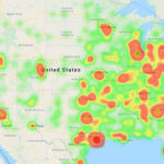
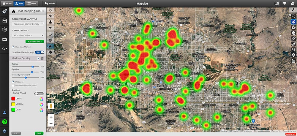
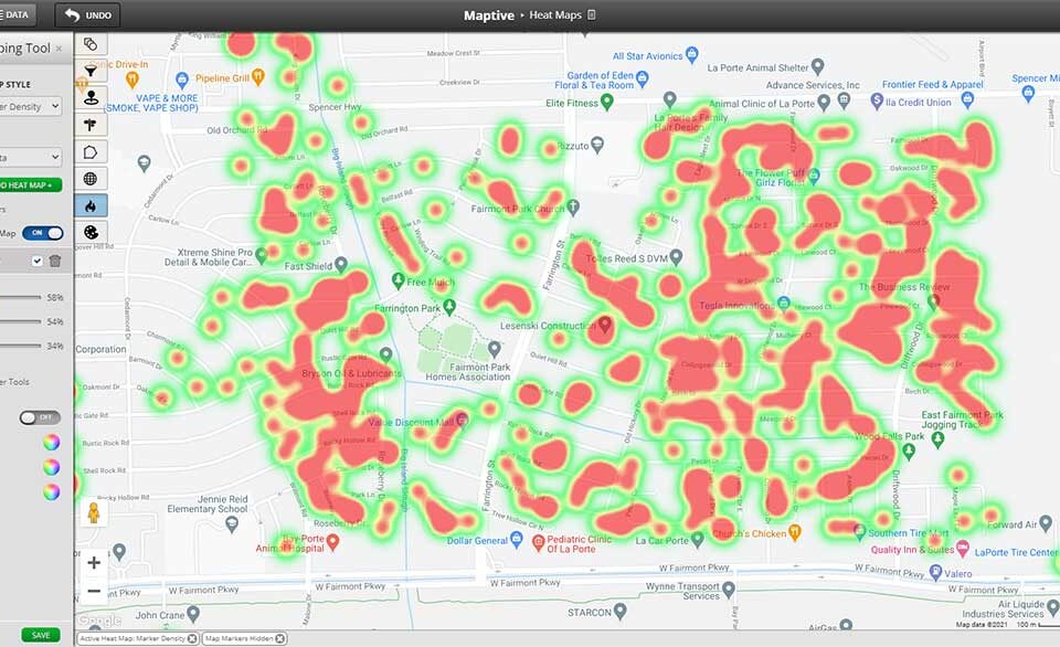
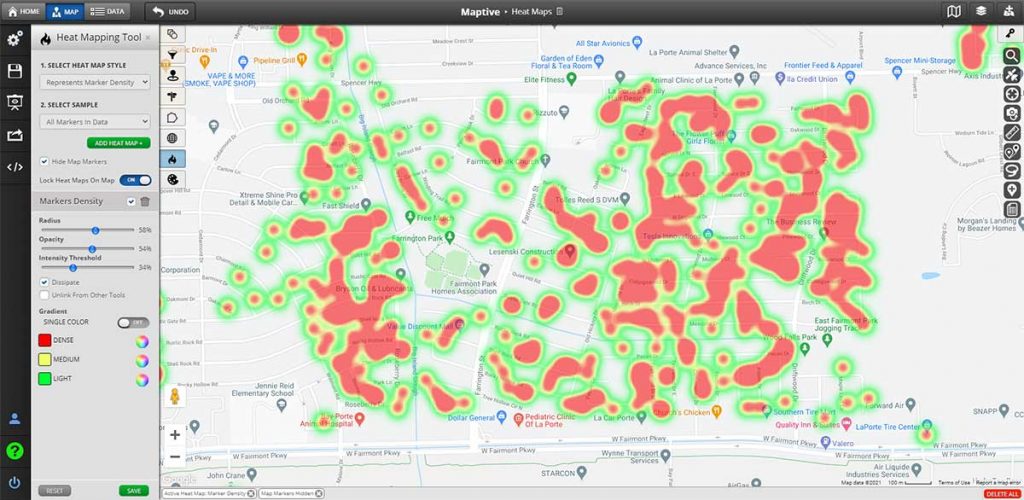
Maptive mapping software was built for business owners and individuals looking to gain more insight from their location data. Maptive allows you to quickly and easily create maps from your excel data in only a few clicks. Maptive offers tools and features that are designed to help businesses get the most out of their location data. Full map customization, robust sharing options, and advanced mapping tools. Create all kinds of data visualizations, including heat maps, color-coded maps, geographic boundary maps, drive time maps, territory maps, plan your business routes, and more. Filter and view your map data however you want, and create color-coded maps based on your data in only a few clicks.
If you need more sophisticated mapping capabilities than what Excel offers, Maptive is the solution. Maptive was designed with business owners’ needs in mind and offers the most complete toolset for business mapping.
Want to give Maptive a try? Sign up for FREE and try all our risk-free tools for 10 days!


