Learn how to get major insights in little time by heat mapping with Maptive. You can even experience the countless benefits of geographic heat maps yourself—for free. Start your no-risk, free 10 day trial of Maptive now.
What is a geographic heat map?
Geographic heat maps are a type of visualization that displays the geographic distribution of data, typically using color or shading. Heat maps are generally used to represent data where the geographic location of items is important. They are used by organizations to show where their customers live, where they have stores and other types of geographic data. There are a few different types of heat maps, so in this blog post, we will go over the different types of heat maps to give you an idea about how these tools can be used.
What are the different types of geographic heat maps?
There are many different types of geographical heat maps and each has its own unique uses. By understanding how these tools work, businesses, governments, and individuals can make better decisions based on geographic data. Learn more about them below.
Choropleth Maps
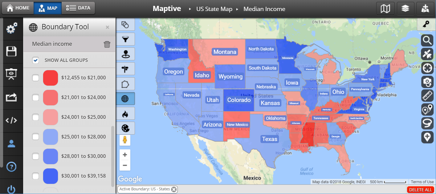
One popular type of heat map that you’ve probably seen before, but likely didn’t know the name of, is the choropleth map. A choropleth map shades or colors each area on a map based on the value of a statistic that is assigned to that area. For example, if you wanted to create a choropleth map of the United States showing the population density for each state, you would shade the cities, counties, or states with more people darker than those with fewer people.
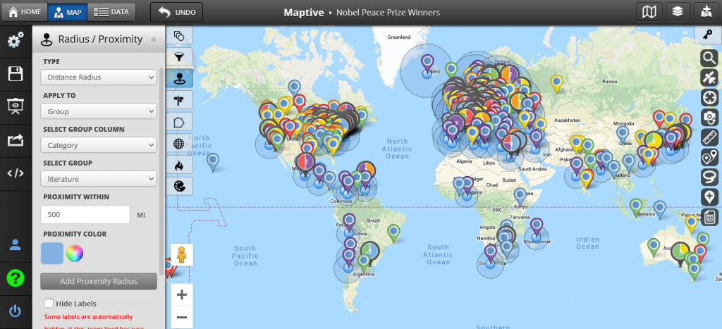
Proportional Symbol Maps
Another type of geographical heat map is known as a proportional symbol map. These maps use symbols that are representative of actual objects, like circles or squares to show where things occur on an area-by-area basis. For example, if you wanted to create a proportional symbol map of the world that showed the number of Nobel Peace Prize Winners in each country, you would use circles to represent the locations of all the Nobel Peace Price Winners. The size of the circle would be proportional to the number of winners in that particular location.
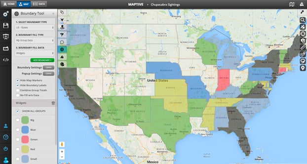
Regional Heat Maps
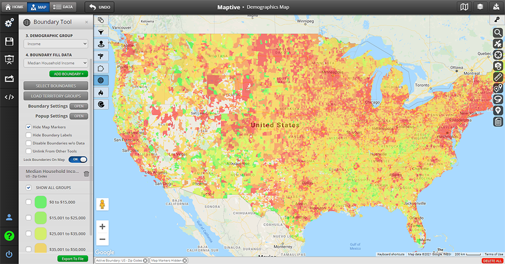
Also known as boundary heat maps, regional heat maps visualize either the average or aggregate value of a dataset by predefined boundaries. They’re typically used to compare ranges in data over a large regional area, like vaccination rates in all 50 US states, or county-by-county volume of sales.
Regional heat maps are “area-based,” meaning they measure data by geographic boundaries, including:
- Country
- State
- County
- Zip Code
- City
Regional heat maps are a type of choropleth map. Like Choropleth maps they show different groups of data by highlighting borders between different regions on the map. For example, if you wanted to create a regional heat map of Canada’s census divisions (groups created for statistical purposes), you would highlight the borders between each division with a different color. This would allow you to see which divisions have the highest population density.
Create your regional heat map for free with Maptive today.
Free, no-risk 10-day trial. No credit card is required.
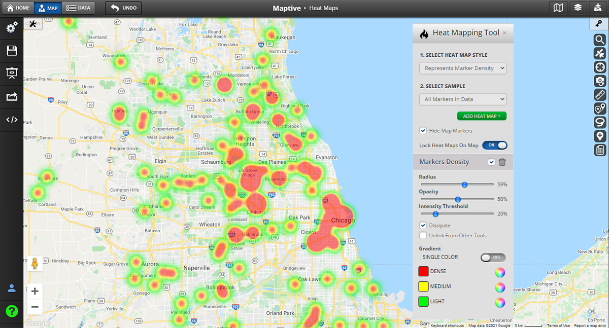
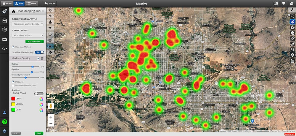
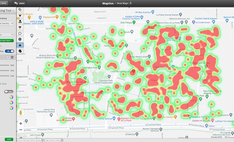
Hot Spot Maps
A Hot spot heat map (also known as a density heat map) is what usually comes to mind when people think of heat maps. Instead of visualizing values by boundary, hot spot maps measure the density of data points within the radius of certain geographic locations. They are often used for qualitative analysis, like population density or the concentration of active COVID-19 cases.
Since hot spot maps aren’t limited to boundaries, people use them to:
- Discover trends
- Track performance across sales areas
- Identify where to focus resources
- Identify clusters of important data points, like customer density
- Reveal sales patterns
- Spot new opportunities
- And more
Hot spot maps are another type of heat map that is similar to proportional symbol maps because they use symbols, but the difference is that hot spot maps show which areas have high values instead of showing where things occur. For example, if you wanted to create a heat map of California land value data by county, each county would be represented with circles sized according to its average market value per acre. The circles would be colored according to the value range, with red being the highest and blue being the lowest.
See what hot spot maps can do for you. Try Maptive free now.
Free, no-risk 10-day trial. No credit card is required.
How do you make a geographic heat map?
Making a geographic heat map with Maptive is a breeze. All you need is your location data and a few clicks of a button. Our software will handle the rest.
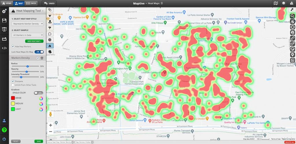
Here’s how to make a hot spot heat map in 7 easy steps:
- Sign up for your free trial of Maptive.
- Click “Create a New Map.” Name your map, write a description, and click “Continue.”
- Upload your Excel Spreadsheet, Google Sheet, or CRM data. You can also either enter it by hand or copy-and-paste it. Click “Map Now.”
- Click the tools icon in the upper left-hand corner of the screen and select “Heat Map Tool.”
- Under “Select Heat Map Style” choose whether you want to measure marker density or the density of your numerical data.
- Under “Select Sample” decide whether you want to measure all markers or just a specific group of them.
- Click “Add Heat Map” to create your map.
And presto! You have a beautiful interactive heat map. From here you can customize everything, including radius, opacity, density, and color theme.
To create a regional heat map (or choropleth) use Maptive’s boundary mapping tool. Use Maptive’s radius tool and marker grouping feature to create proportional symbol maps.
How can I make a geographic heat map in Google Maps?
The cherry on top? Maptive is built on Google Maps, giving you the best of both worlds.
Get the reliability, security, and global coverage of Google Maps, boosted by Maptive’s wide range of powerful features, full customization, and presentation-ready shareability. Available anywhere with an internet connection.
Can you create a geographic heatmap in Excel?
Creating a heat map in Excel is possible, but very cumbersome—and even more limited. Luckily, Maptive makes it easy to upload your Excel data and extract major meaning from it.
How are geographic heat maps used? Here are some examples.
The applications are endless, for almost every industry or type of data. For example:
Geographic Heat Maps for COVID-19 Density
Upload a spreadsheet of COVID-19 test results by zip code to pinpoint outbreaks and identify places where spreading is an urgent risk.
Measure Customer Location Density
With Maptive, the applications of customer data are endless. Plan new locations where customers are concentrated, optimize sales territories, get demographics, and more.
Identify Crime Hot Spots
Whether you’re a public official, sociologist, or concerned citizen, you can upload crime records to visualize areas of high crime. You can even filter data by crime with Maptive’s custom fields.
Visualize Vaccination Rates by County
Public health officials, analysts, and government leaders can plot COVID-19 vaccination rates for every county in a state to increase outreach, create policy, and focus vaccination efforts.
Present Voting Rates by County
In election season, journalists, educators, canvassers, and campaign managers alike benefit from the county-by-county voting insights gained from a simple yet data-rich regional heat map.
Start Geographic Heat Mapping Today
Ready to get amazing density insights from your location-based data? Sign up for a free trial of Maptive and start mapping today.


