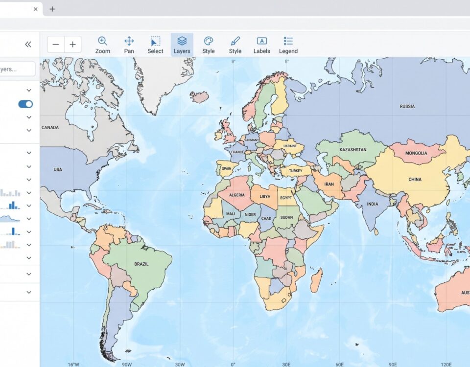
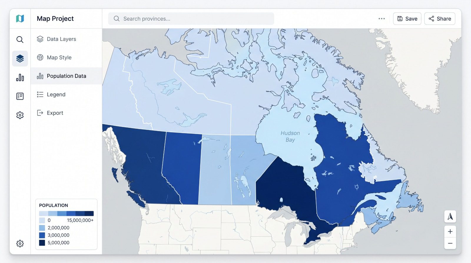
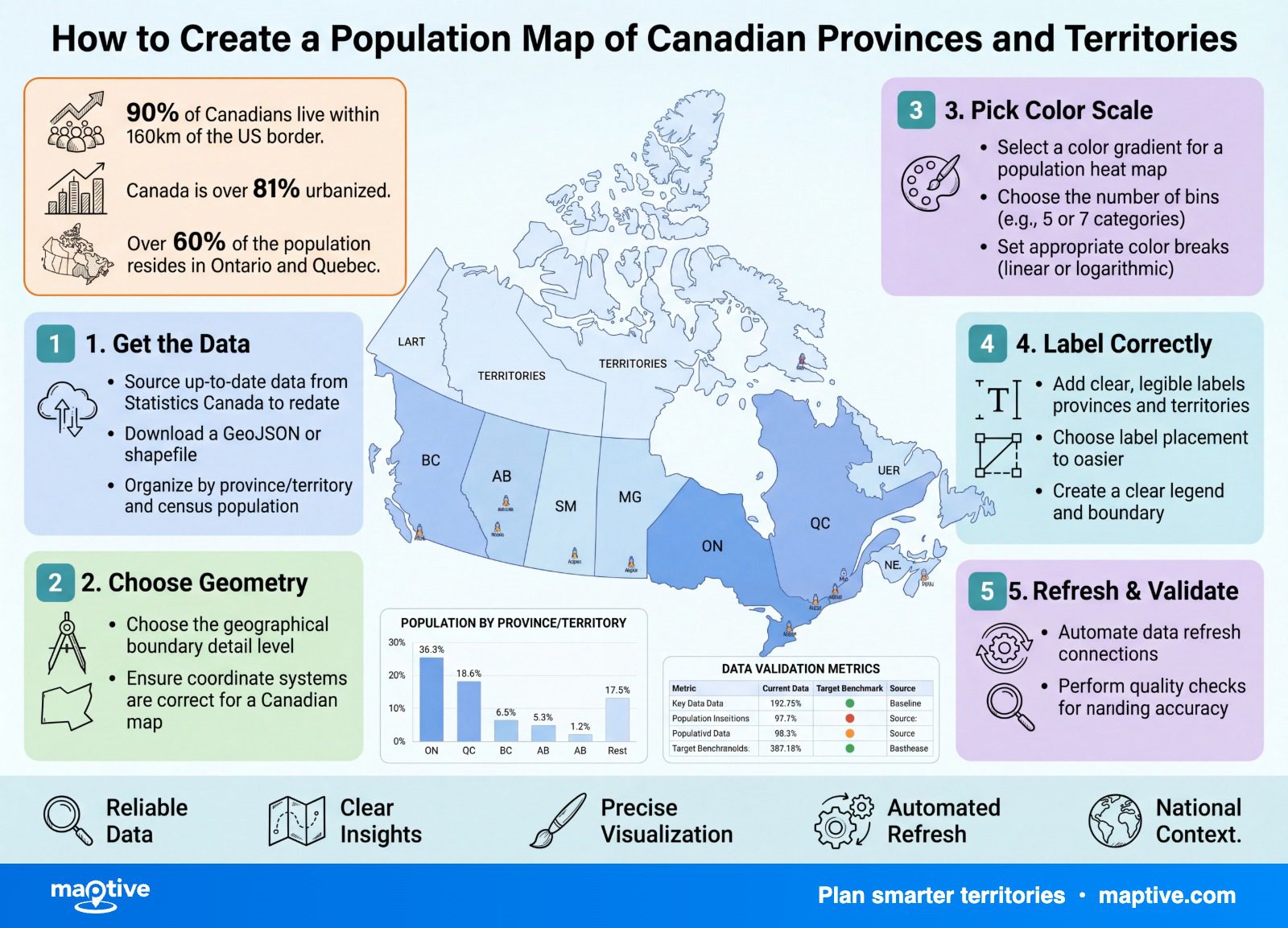
A population map of Canada joins a population figure for each province and territory to its boundary, then shades each region by that value or plots it as a sized symbol. The figures come from Statistics Canada, which estimated the national population at 41,417,056 on April 1, 2026, a slight decline from the start of the year. Which figure you put on the map is what decides whether it tells you anything. Shade the provinces by headcount and the map only redraws a ranking every Canadian already knows, while the same numbers shaded by density reorder the provinces entirely.
Population Count Versus Population Density on a Map
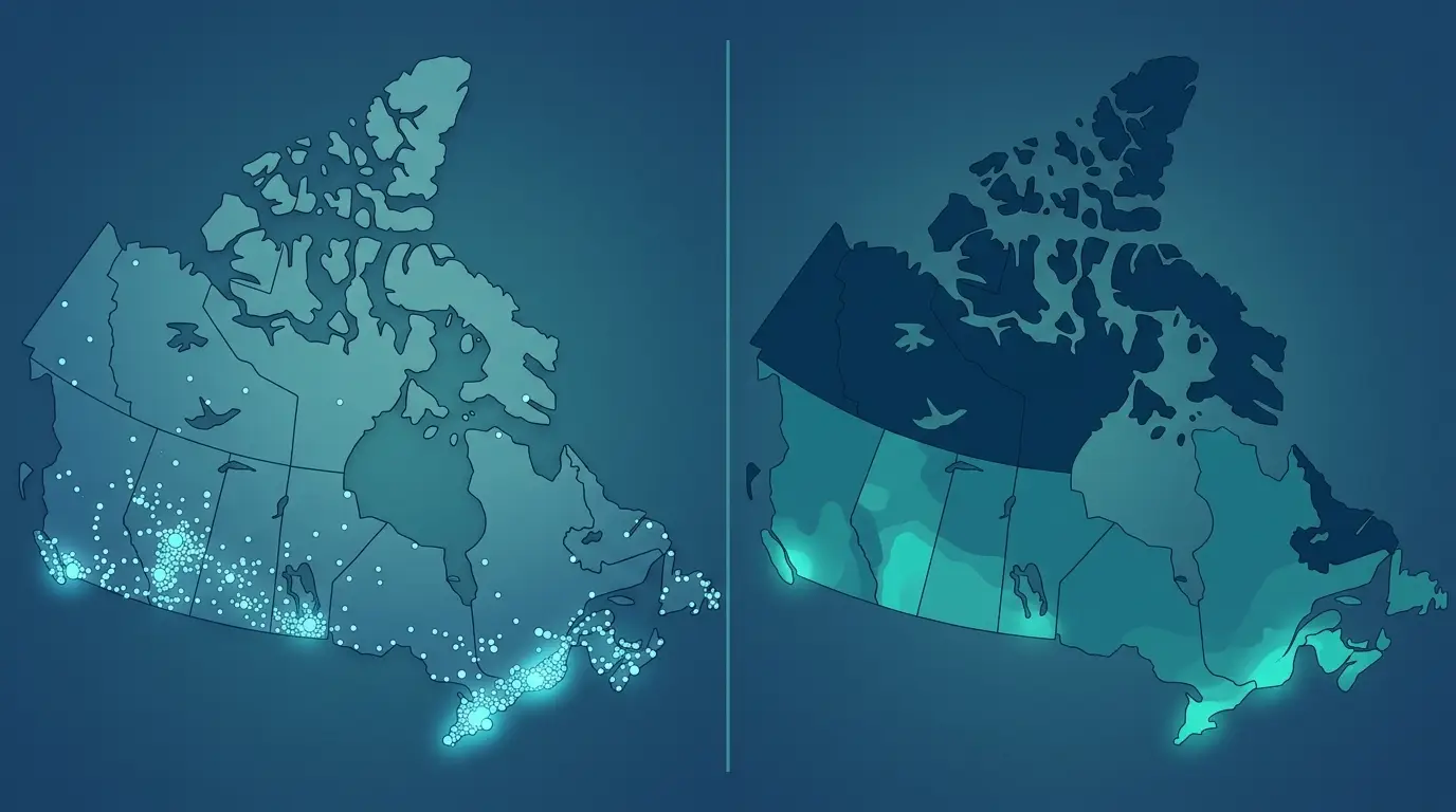
Most people reach first for a map colored by how many people live in each province. That map looks finished and tells you almost nothing, because it only re-draws a distribution you already know. Ontario comes out dark, the three territories stay nearly blank, and you have confirmed what every Canadian could have told you without a map. The fix is to decide what the map is supposed to measure before you shade it, and to know that the same numbers shaded two different ways will rank the provinces in two different orders.
Canada makes this trap unusually vivid, because the geography and the population pull in opposite directions. The three territories together have well under 1% of the country’s people, so a map shaded by headcount leaves that whole northern third nearly white while Ontario alone, with around 38% of all Canadians, soaks up the ink. Color by area-weighted count and the empty north looks like a finding rather than the expanse it is. Ask which of the two questions you are answering before you shade, because the answer changes the map.
When to Use a Count Map
Count maps answer how many, and that is the right question when you want raw reach, the number of potential customers or accounts inside a region, and when the size of the number is the point. Ontario has 16.1 million people as of the April 1, 2026 estimate, more than 7 million ahead of second-place Quebec at 9.0 million, and that gap is real information for anyone weighing two markets against each other.
The catch is in how you draw it. Filling whole provinces with color to show a count over areas of wildly different size pulls the eye toward the big dark shapes and misleads about concentration. A count is better shown with proportional symbols, where a larger circle marks a region with more people, or by plotting the underlying points directly, which leaves the region fill free for the rate.
This count also arrives with a date that matters more than usual right now. The April 1, 2026 estimate is a rare quarterly decline, which Statistics Canada attributes mainly to a drop in non-permanent residents and a quarter with more deaths than births, alongside a 20% year-over-year fall in permanent immigration. A map built on this number is a snapshot of a distribution that is still moving while you map it, so the reference date belongs on the map.
When to Normalize to a Rate
Density answers a different question, how concentrated the people are, and this is where the reversal pays off. Prince Edward Island is the smallest province by population, 181,715 people, and the densest by a wide margin, 27.2 people per square kilometer at the 2021 Census. Saskatchewan and Manitoba each have far more people than the Atlantic provinces, yet are near the bottom on density. Shade the map by people per square kilometer and the provinces reorder themselves, which is exactly the signal a raw count hides.
Normalizing means dividing your value by something, by land area for density, or by population for a per-capita rate, and then shading by that result. Canada’s national density of about 4 people per square kilometer is one of the lowest in the world, but the number is misleading on its own, because the mostly empty territories pull the average down. That is the same distortion a naive count map creates, in one national figure.
The 10 Provinces and 3 Territories on a Canadian Map
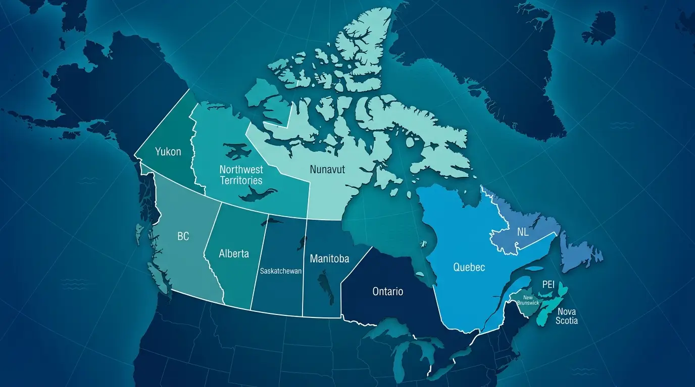
Canada has 10 provinces and 3 territories, and the difference between the two is worth respecting on the map rather than treating as a label. Provinces draw their authority from the Constitution Act of 1867, with their own elected legislatures and premiers and jurisdiction over areas such as health care and education. The three territories, Yukon, the Northwest Territories, and Nunavut, are governed under powers delegated by the federal Parliament.
For a population map, the territories matter for their scale set against their people. Together they cover roughly a third of Canada’s land area and have 0.32% of its population, about 136,500 people across all three. That single imbalance is why a land-area view of Canada and a population view look almost nothing alike, and why the north distorts any measure built on area without announcing it. Before you map a rate, decide on purpose whether the vast, near-empty north belongs in your denominator, because it will move the answer either way.
How to Build the Map From Statistics Canada Data

Once the value question is settled, the build is short and follows the same path every time. You gather the numbers, join them to the province outlines, and render the value you chose. The order matters more than the tool.
Pull the Population Figures With Their Reference Dates
Statistics Canada is the source for both kinds of number you might use, and they are not interchangeable. The quarterly estimates, in Statistics Canada Table 17-10-0009-01, are modelled figures revised every few months, which is where the 41.4 million April 1, 2026 figure comes from. The census counts, in the 2021 Census Profile, are firm enumerated totals, which is where the 36,991,981 national count comes from. For market sizing, the latest quarterly estimate is usually the right number. For fine demographic or sub-provincial detail, the census is richer. Both are free, and both should travel with their reference date stamped on the map, because the estimate moves every quarter and in 2026 it edged down rather than up.
Join the Numbers to Province Boundaries
A population map is a join between two things, a population value for each province or territory and the boundary polygon that value belongs to. You do not hand-draw Canada for this. Statistics Canada publishes free 2021 Census Boundary Files for provinces and territories, and for finer levels below them, and those outlines are what the mapping community joins its numbers onto as a matter of course. Tools differ mainly in how much of the join they do for you. Some keep a stored set of province keys and match your column automatically, while others ask you to supply or align the geometry yourself. This is also where the built-in map charts in a spreadsheet often stumble, since their geocoder can mismatch or silently drop a province whose name is ambiguous, filling only a few regions and leaving the rest blank. A dedicated mapping platform is steadier on the province match, and that is most of why people reach for one here.
Shade by Rate or Plot the Count
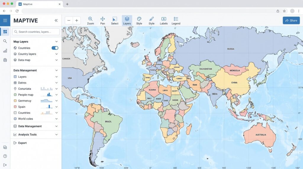
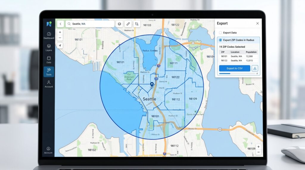
With the join done, you render the value the question called for. Color-code the regions by a normalized rate when the point is concentration, or plot proportional symbols and points when the point is a raw count. In Maptive you can upload your province and territory rows, or your own account data, color-code by population or by whatever metric you brought, draw regional territories and drag their boundaries to adjust them, export the in-map data back to a spreadsheet, and share a view-only link with the people who need to read the map but not edit it.
The Market Sizing Decision at the Metro Level, Not the Province

This is the destination the whole exercise was pointed at, the moment an analyst reads the finished map and makes a call. What separates a useful territory plan from a wasteful one is whether the territories are sized on market potential, population, income, and target-customer counts, rather than on surface area. In Canada that principle does almost all the work, because sizing a single Northern Canada territory by land area would hand one rep a third of the country and almost no customers.
Read the map first for proportion. Ontario, Quebec, British Columbia, and Alberta together account for 86.5% of Canada’s population, so any population-driven plan is mostly a question of how to split those four provinces. They dominate, and the map should make that obvious quickly so you can move past it.
That split is not frozen, which is worth holding in mind when a map informs a multi-year plan. Ontario and Quebec together have fallen from roughly 80% of Canadians at Confederation to about 60% now, the western provinces have climbed from almost nothing to more than 30%, and Statistics Canada projects Alberta to pass British Columbia for third place in almost every scenario it models. A population map is a reading of where people are this quarter, so treat it as the current frame of a picture that keeps moving, and the ranking it shows is only the current one.
The second read is the harder half of the reversal. A province map answers which provinces, but it cannot answer where, and where is usually the decision you came to make. 66% of Canadians live within 100 kilometers of the United States border, and eight of the ten largest cities sit in that southern band, among them Toronto, Montreal, Vancouver, Ottawa, Quebec City, Winnipeg, Hamilton, and London, with only Calgary and Edmonton notably north of it. The people cluster into a thin populated ribbon and a handful of metros, so the real boundaries get drawn at the metro or postal level, not at the province fill. Layer your own accounts, sales volume, and reps on top of that population base, and the map finally compares potential against the coverage you already have.