


Most people think of data visualization as something that only experienced data analysts, and business professionals use. However, the truth is that anyone can benefit from data visualization tools – even beginners.
Data visualization can help you to see relationships between pieces of data that you might not be able to see just by looking at numbers. Seeing the relationships between data points can help you to understand the data better, and make better decisions.
Not quite sure how data visualization can help you? Don’t fret. We’re giving you the 411 on all things data visualization, from how you can benefit to why you should start using it today. You can also use these free Google Data Studio templates for beginners as a starting point.
However, if you are collecting customer data, you may wish to use secure survey software to protect their confidential information.
What is Data Visualization?
Data visualization is the process of creating visuals, such as charts, and graphs, to represent data. This can be used to examine data sets to find trends, and patterns.
Data visualization makes it easier to understand large data sets by converting them into visuals that can be more easily interpreted.
Let’s say you work in sales, and want to see how your team performs. You could simply look at a list of numbers, giving you some information, but it would be difficult to see any patterns. However, if you were to create a graph that showed the sales figures for each person on your team, you would be able to more easily see who is performing well, and who might need some help.
Data Visualization Types

There are many different types of data visualization, but some of the most common include:
● Bar charts: Bar charts are one of the most common types of data visualization. They are used to compare different data sets side-by-side.
● Line graphs: Line graphs are used to track changes over time. You can use them to show how a particular metric has changed over many days, weeks, months, or even years.
● Pie charts: Pie charts can show how a data set is divided into different parts. They often show the percentage of people who fall into different categories.
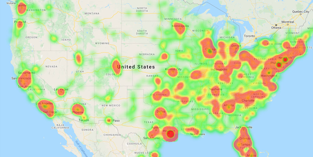
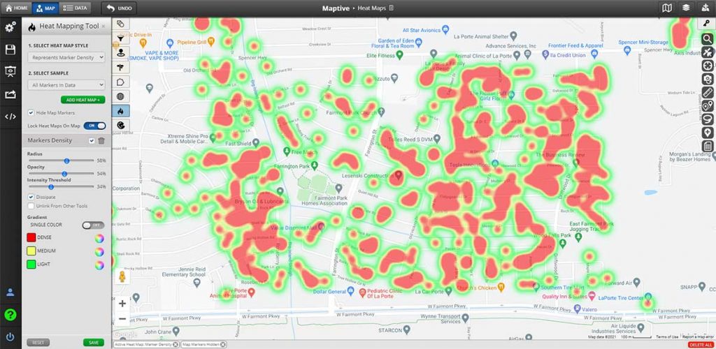
● Maps: Maps are another great data visualization example showing data distribution across a geographical area.
● Infographics: Infographics are a combination of visuals, and text used to convey information in an easy-to-understand way.
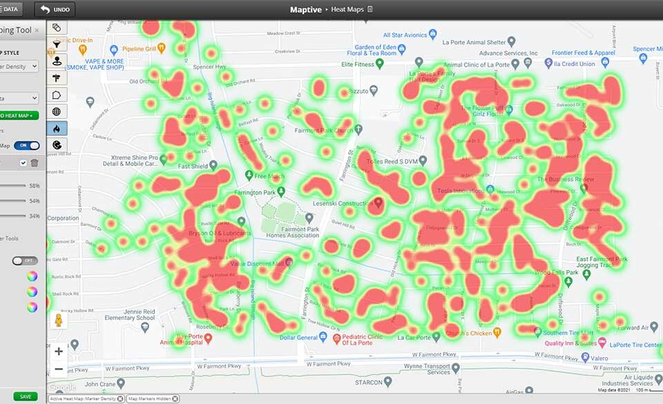
● Dashboards: Dashboards are a type of data visualization that allows you to see multiple visuals in one place. This can help see trends, and patterns across different data sets.
What makes a good data visualization?
Several factors can make a data visualization effective. However, the best data visualization is:
Easy to understand:
Data visualization aims to help you understand data sets more efficiently. This means that the visualization should be easy to interpret. Charts and graphs should be labeled clearly, and any colors or symbols used should be easy to understand.
The most effective type:
The type of visualization you use should be based on the data set you are working with, and the questions you are trying to answer. For instance, bar charts are better for comparing different data sets side-by-side, while line graphs are better for tracking changes over time.
Simple & easy to digest:
Data visualizations should be kept as simple as possible. This means using the fewest colors and symbols possible, and avoiding unnecessary information. The visualization should only include the information necessary to answer the questions you are trying to answer.
Maintains data integrity:
It’s essential to ensure that the data you are using is accurate, and up-to-date. Any errors in the data can lead to incorrect conclusions being drawn from the visualization. Maintaining data integrity is especially important when creating dashboards, and infographics, as they often include data from multiple sources.
Benefits of Data Visualization
There are many benefits of data visualization, but some of the most notable include:
1. Helps you to see relationships between data points
As we mentioned before, one of the main benefits of data visualization is that it can help you to see connections between different pieces of data. This can be helpful in many different situations.
Let’s say you have been asked to create a document called “Dialpad’s guide to enterprise collaboration.” In this document, you want to show how different factors – such as the number of employees, the company size, and the location – can affect collaboration within a company.
You would need to collect data on these different factors to do this. Then, you would need to visualize that data to make it easy to see relationships. For example, you might create an interactive color-coded map that shows how different company sizes affect collaboration. Or, you might create a bar chart that compares the number of employees in other locations.
2. Helps you to make better decisions
Data visualization can also help you to make better decisions. If you have a company and want to scale business operations, data visualization can help you by giving a clear picture of what is working, and what is not.
Doing this allows you to focus on the most successful areas, and make changes to the areas that are not performing well. As a result, you can save time, and money while increasing your chances of success.
Assume your meeting notes from the past year show that attendance has been declining. You might surmise that this is because people are not interested in the topic of your meetings.
However, if you were to visualize the data, you might notice that attendance is highest when the meeting is held in the morning, and lowest when it is held in the evening. This would give you a different perspective on the situation, and help you to make a more informed decision.
3. Helps beginners to better understand data
Data visualization can be a helpful tool if you are new to data analysis. This is because it can help simplify more complex data.
Where data analysts have years of experience and training, they can understand data processing engines, RDD sets, and can quickly see data patterns. However, for beginners, this might not be the case. For beginners who can’t yet understand the RDD process or see patterns in data, data visualization can be a huge help.

4. It helps to communicate data more effectively
Another benefit of data visualization in business is that it can help you to communicate data more effectively. If you are trying to explain a data set to someone, it can be much easier to do with visuals rather than just numbers.
Let’s say you are trying to explain how a new marketing campaign is performing to your boss. You could give her a list of numbers showing the campaign results. However, it would be much easier (and more effective) to show her a graph that illustrates the results. For example, a line graph can help you show trends over time.
5. Can be used to tell a story
Data visualization can also be used to tell a story. In some cases, the data might not be enough to explain what is happening on its own. However, when you add visuals, it can help to give context, and paint a fuller picture.
For example, if you wanted to present a catchment area analysis for a school, you might use a map to show where the students live. This would help to tell the story of where the school’s catchment area is, and how it has changed over time.
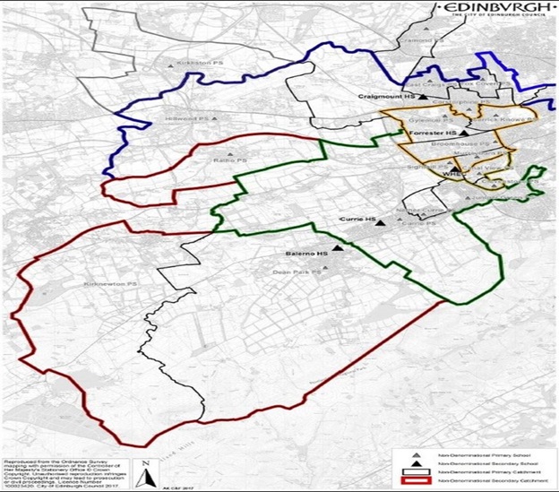
Image Sourced from BBC regional data
6. It can save you time
Another benefit of data visualization is that it can save you time. This is because it can help you to quickly see patterns, and relationships that would be difficult to notice if you were looking at raw data.
For example, let’s say you’re handed a task management guide from Process Bliss that contains a list of tasks, their deadlines, and the people responsible for them. If you were to understand this data without visualization, it would likely take you a long time.
However, if you were to visualize the data, you would be able to quickly see which tasks are due soon, who is responsible for each task, and whether any deadlines are approaching. This would save you a lot of time, and allow you to focus on other tasks.
Final Thoughts
So there you have it. These are some of the key benefits of data visualization in business. Data visualization can help you to understand data better, communicate data more effectively, tell a story, and save time.
Now is the time to start if you’re not using data visualization in your business yet. You might be surprised at how helpful it can be.
Good luck, and happy visualizing!
Grace Lau – Director of Growth Content, Dialpad

Grace Lau is the Director of Growth Content at Dialpad, an AI-powered cloud communication platform and customer experience management software for better and easier team collaboration. She has over 10 years of experience in content writing and strategy. Currently, she is responsible for leading branded and editorial content strategies, partnering with SEO and Ops teams to build and nurture content. Grace Lau also published articles for domains such as Causeartist and DivvyHQ. Here is her LinkedIn.


