To be successful in business, you need to identify sales and customer trends. Where are your products and services popular? Are there any areas where you’re failing to make an impact? These are the questions you have to answer if you want to grow your business.
One of the analytics tools leading companies to use to gather this information is a heat map. By creating a graphical representation of their data, new insights emerge. This gives businesses the intel they need to adapt their strategies and maximize their profits.
So, what are heat maps, and how can you use them to optimize your business? Keep reading to learn everything you need to know about this valuable data visualization tool.
What are Heat Maps?
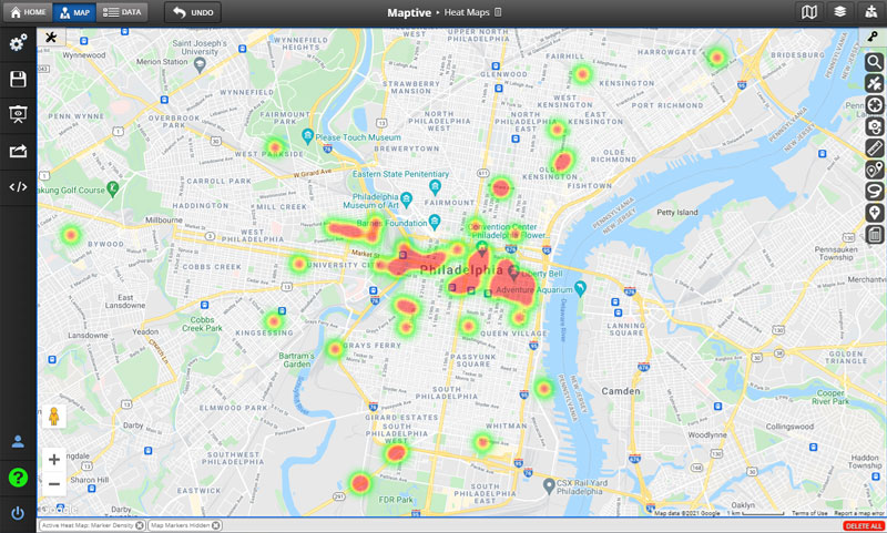
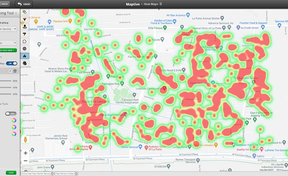
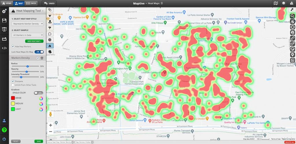
Heat maps measure the density of data in a given area. Colors represent density, with red and orange generally used for higher density and blue for lower density (although you can customize your color-coding however you like).
For example, if you wanted to measure what geographic areas your sales are coming from, a sales heat map is the perfect way to accomplish this. You would start by plotting the locations of all your sales; then, you’d apply a heat map to analyze your data better. Red areas would represent the areas you’re generating most of your sales from, and blue areas would be where your sales are lacking.
While other types of maps can perform this task, heat maps are cleaner and more pleasing to the eye. For example, a pin map also measures density by marking each datapoint with a marker. But these maps can quickly get messy and overwhelming to look at.
By representing density with colors, heat map data easily identify areas where sales and other information are most prevalent. This allows you to spot important patterns and make the appropriate changes.
Because of this, heat maps are by far the most popular way to measure the geographical density of data.
How are Heat Maps Used for Business?
Heat maps have many different purposes in business. They’re a great way to determine where data is present and where it isn’t, which provides companies with valuable insights.
First and foremost, heat maps are used to measure a business’s performance in a given area. This could include several different metrics, such as:
- Sales
- Customers
- Revenue
- Deliveries
- Service calls
Using sales as an example, heat maps tell companies where their products are most popular. This feedback helps when deciding what areas to target with online advertising. If you know conversion rates are high in a certain area you’re more likely to drive sales there.
Conversely, if an area isn’t generating sales, it might signify that your products don’t resonate with that population. However, it could also represent an opportunity. Maybe you’re not generating sales there because you haven’t been giving it enough attention. If you boost your advertising in that area, you might find new customers.
Heat maps are also used for planning and strategy. By plotting your sales reps and locations, you can see where your coverage is strong and where it’s lacking. This allows you to fill gaps with new locations to serve your customers better.
Finally, heat maps are an important tool for research. They’re perfect for measuring a wide range of demographic data, including:
- Population
- Income
- Housing
- Gender
- Race
- Age
This information is important for identifying where your ideal customers are located, planning marketing campaigns, and choosing new sites for your business locations.
Different Types of Heat Maps
Since heat maps are highly customizable, they come in many different forms. However, generally speaking, there are three types of heat maps:
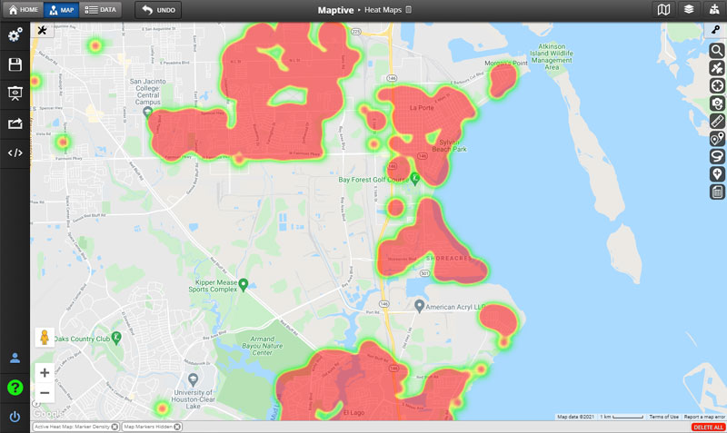
- Traditional: With a traditional heat map, data points are represented as color-coded circles and given a radius of influence. The densest areas of these circles are usually colored red and fade to blue or green as the data becomes more sparse. But as mentioned earlier, color-coding is customizable to suit your preferences.
- Point-Based: This type of heat map is similar to a dot density map. Data is represented on the map as points. Larger clusters represent high-density areas, and more sparse clusters represent lower-density areas. Color shades are also added to illustrate further where the most data is present.
- Area-Based: You may want to compare data between different geographic areas, such as zip codes, counties, or states. If that’s the case, you can use an area-based heat map. With this type of map, geographic areas are colored based on the amount of data located there. For example, if sales were high in California, you would color that state red, and if sales were low in Nevada, you would color that state blue. This gives you a quick overview of the data from each region.
What Type of Heat Map Should You Use?
Depending on your project, one type of heat map might be more appropriate than another. So, feel free to experiment with a few different types to see which one suits your needs.
That being said, area-based heat maps are better for comparing larger regions against one another. For example, if you wanted to see which state you’re generating the most sales in, choose an area-based map. They’re also good for comparing the performance of your sales territories.
However, if you want to see how your data is spread across a given area, a traditional or point-based heat map is best. This will tell you what areas of a city or county have the most data and where data is lacking.
Primary Benefits of Heat Maps
It’s clear that heat maps are handy tools, but how exactly will they help your business? Here are five benefits you’ll enjoy while using heat maps:
- Measuring Performance: To grow sales, you need to know which areas of your business are performing and which areas aren’t. Heat maps let you see where you’re hitting your targets and where you’re lagging. Use them to compare business locations and territories to identify the best-performing regions.
- Uncover Hidden Trends: There’s a lot of valuable information hidden in your data. But depending on how you’re looking at it, some of it might go unseen. Numbers in a spreadsheet don’t tell the whole story. By visualizing your data using a heat map, trends will emerge that may have otherwise been missed.
- Improve Communication: People are visual creatures. This is proven by a study performed by Kissmetrics, which showed that infographics are 30 times more likely to be read than text. So, it makes sense that when you’re sharing important data with your team, it’s beneficial to present it in a visual form. Not only will it be easier to understand, but your team members will also pay more attention.
- Understand Your Market: Heat maps are excellent at helping you learn more about your local area. By measuring various demographic information, you’ll better understand who your customers are and how to appeal to them. You can also use heat maps to analyze potential new markets for expansion.
- Improve Your Decision Making: All of the above benefits result in a better understanding of your business. This increased knowledge allows you to make more data-driven decisions.
Businesses and Industries that Benefit from Heat Maps
Virtually all industries can benefit from using heat maps. Here are a few ways different industries might gain value from this tool:
- Sales: Measuring sales performance in a given area, determining where sales coverage is lacking, and measuring demographic data for market research are just a few of the ways sale businesses might utilize heat maps.
- Franchises: These businesses can use customer heat maps to find areas for new franchise locations.
- Healthcare: Medical professionals often used heat maps during the recent pandemic to identify areas where COVID outbreaks had occurred.
- Finance: Investment professionals may use heat maps to identify the location of high net-worth individuals. They can then target those areas with advertising.
- Service Businesses: These companies utilize heat maps to see where service calls are occurring more often. This allows businesses to double down on areas that use their services most and identify regions that might be under-served.
- Delivery Businesses: Using heat maps to see their customers’ locations, they can strategically place their distribution centers.
- Real Estate: Heat maps are useful for evaluating the demographics of different neighborhoods. This is crucial when pitching a home to potential buyers.
- Governments: Using heat maps to measure population, age, income, housing, education, and more helps inform government decisions around social programs and infrastructure.
No matter what industry you’re in, chances are heat maps can help you in one way or another.
Business Mapping with Maptive Heat Maps
Maptive makes creating heat maps for your business extremely easy, thanks to our sophisticated software and user-friendly interface.
To create a heat map with Maptive:
- Sign up for your free trial.
- Upload your data from a spreadsheet, copy and paste it into Maptive, or enter it manually.
- Create your map to automatically plot your data.
- Select the heat map tool from the tools menu.
- Customize your color scheme, radius, opacity, and intensity threshold.
- Generate your heat map.
Heat Map Tools
Once your heat map is exactly how you want it, share it with your colleagues. You can save it as an image, email a link to team members, or embed it on a website. Plus, since Maptive is a cloud-based platform, your heat map is available wherever you access the internet. View your map on any device and make changes while you’re on the go.
Additional Features
The great thing about using Maptive is that it’s more than just a heat map generator. Our platform offers a complete suite of mapping tools that will help you grow your business:
- Pin Maps: Plot the locations of key people and locations. Customize the shape and color of your pins to create a unique map.
- Filter Your Data: Too much data can clutter your map. Use the filter tool to decide what information to display and what to hide based on the project you’re working on.
- See What’s within Driving Distance: Drivetime polygons let you see which locations are reachable in a given amount of time. Use this tool to assign customers to sales reps or to assign team members to certain business locations.
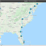
- Route Optimization: Generate optimized routes in seconds. Enter your starting location and an unlimited number of stops. Maptive will then create the quickest route between all your locations to optimize your navigation.
- Create Sales Territories: Use the boundary tool to build territories based on zip codes, counties, or states. Or draw your own custom territories based on the needs of your business.
- Customize Your Map: Choose from 15 different base maps, including satellite images, to create your ideal map.
- Built Using Google Maps API: Our maps use the same industry-leading technology as Google Maps. Plus, we offer all the advanced features you need to analyze your data.
- Security and Privacy: Maptive is licensed with Google’s enterprise-level mapping services. All our data is secured using 256-bit SSL encryption.
Start Heat Mapping Today
Are you ready to build advanced heat maps for your business in seconds? Sign up for a free trial of Maptive and start mapping today.


