Last month you may have seen that we launched a new series where we share our favorite news stories and articles about mapping from around the globe. If you missed our edition from last month, check it out here.
As we mentioned in that first post, we created the series to celebrate our love of maps—and to highlight the fact that maps are literally all around us. They are everywhere. Why? Because maps create the opportunity to present extremely complex data in a way that most people can digest and understand. Maps tell stories. They persuade. They change minds. They lead people to act. They inform.
A new month has passed and we have a whole new batch of stories to share with you. Here are the 8 most interesting mapping stories from November:
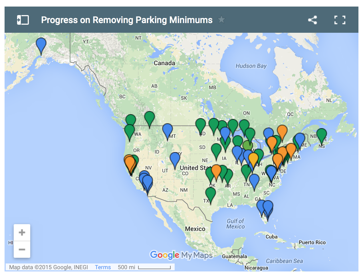
1. Mapping America’s Fight Against Excess City Parking
This article highlights an existing fight to end parking minimums all over the country. According to the article, parking minimums (city laws that require developers to create at least certain amount of parking spaces and options around the city) are creating big problems for cities. The authors claim that these minimums affect things like increases in rent, congestion issues, and more. Here’s what the image below represents:
It’s a great example of what can be done with a little help from the public (i.e. crowdsourcing!).
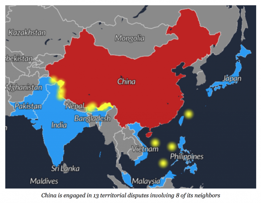
2. Mapping the World’s Territorial Disputes
In this article, the Huffington Post has created a number of maps to illustrate territorial disputes around the world. Here’s a blurb from the article that explains more:
“The term territorial dispute brings to mind global-scale conflicts in famously contentious regions such as Palestine, Crimea, and Kashmir. But in reality, most territorial disputes are far more mundane, many characterized more by their seeming insignificance than by their importance in world geopolitics.”
In the visuals, every country colored in red represents a country involved in a territorial dispute of some kind. Yellow coloring represents disputed territories.
It’s a great example of how to use mapping to illustrate social problems or to see the bigger picture of a problem.
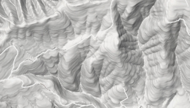
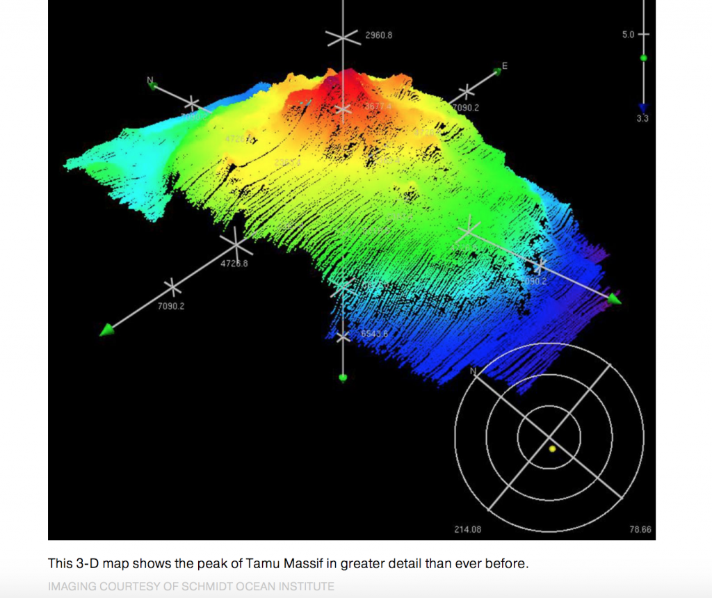
3. Scientists Are Mapping the World’s Largest Volcano
We love the following mapping example because it’s outside of our particular area of expertise (location-based mapping). In the visual below, you can see a 3D map of the world’s biggest volcano—known as Tamu Massif. What else makes this particular volcano so cool? It’s completely under water! To give you an idea of size, here’s how the National Geographic describes it:
“Tamu Massif lies about 1,000 miles (1,600 kilometers) east of Japan. It is a rounded dome, or shield volcano, measuring 280 by 400 miles (450 by 650 kilometers). Its top lies more than a mile (about 2,000 meters) below the ocean surface and is 50 times larger than the biggest active volcano on Earth, Hawaii’s Mauna Loa.”
Definitely a great example of how mapping can help us make new discoveries.
4. Uber Signs Digital Mapping Deal With TomTom
Uber made big news earlier this month by announcing a partnership with mapping giant TomTom. According to the article, “Uber will license TomTom’s mapping and traffic management services in the more than 300 cities where it operates.”
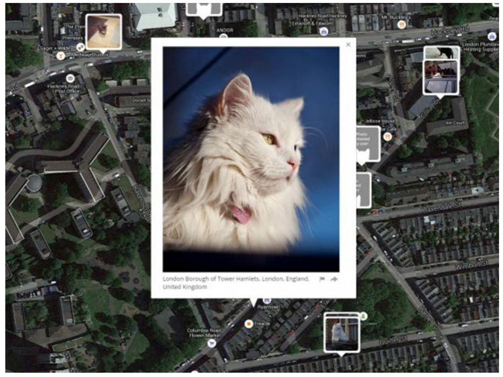
5. I Know Where Your Cat Lives (Mapping Cat Locations)
This article might win the award for oddest story we’ll ever include in this series, but it’s a powerful example of how integrated maps are into our daily lives. According to the article, a U.S.-based professor recently created and launched a website in order to highlight the issue of internet privacy. Here’s what makes it so odd: according to the article, the website maps pictures of cats posted on social media by their owners to within eight meters, using publicly accessible geographical location data.
The project is intended to raise awareness about how easy smartphones and the internet have made it to access an individual’s geographic information in real-time.
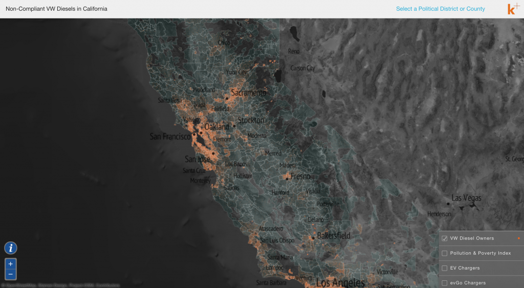
6. Mapping Regions Polluted by Rigged VW Diesels
The best way to explain this next article is to simply share a blurb from the website where the interactive map is hosted:
“In California alone, Volkswagen has sold over 193,000 “clean diesel” cars since 2009. It has been reported that these vehicles actually emit more than 40 times the authorized amounts of NOx and particulate matter. This interactive map helps tell the story of how these non-compliant VWs are affecting California’s environment, air quality, and communities.”
This opinion piece from the New York Times goes deeper into the data and helps illustrate how vast the problem really is for California and the U.S.
According to the article, the map shows a view of the air pollution from the 193,000 Volkswagen diesels sold in the state of California between 2009 and this year with rigged software masking high emissions. The orange dots represent Volkswagens.
7. A Sizable Challenge: Mapping Alaska
This article explains why the federal government is finally taking the time to map the entire state of Alaska, and how they’re doing it.
8. We Mapped the Uninsured. You’ll Notice a Pattern.
The final article we’re highlighting this month illustrates the amount of people who are currently still uninsured in the U.S., despite being two years into the implementation of the Affordable Care Act. It’s a great example of using data visualization to illustrate trends.
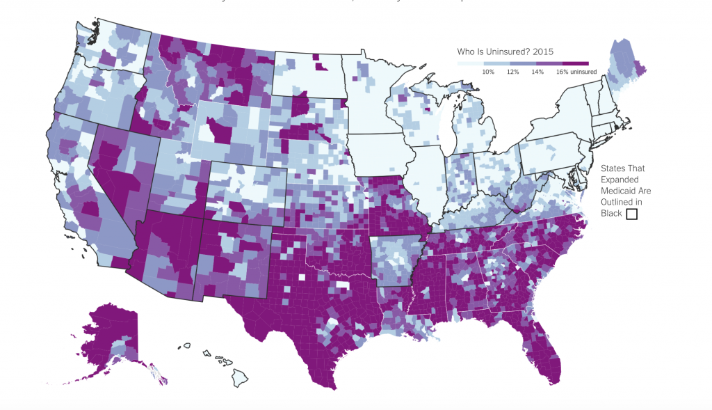
Image Source: The New York Times
What other stories did we miss? Leave a comment for us below.
Want to see what mapping can do your business? Start a free 10-day trial today.
Fred Metterhausen is a Chicago based computer programmer, and product owner of the current version of Maptive. He has over 15 years of experience developing mapping applications as a freelance developer, including 12 with Maptive. He has seen how thousands of companies have used mapping to optimize various aspects of their workflow.