As we’ve mentioned before on this blog, visuals can be a pretty useful tool when it comes to telling stories and getting your point across. If you haven’t noticed already, one of our favorite visuals is the map. Why do we love maps so much? Because they give you the opportunity to present extremely complex data in a way that most people can digest and understand. Maps tell stories. They persuade. They change minds. They lead people to act. They inform.
To celebrate our love of maps, we’re introducing a new series where we share our favorite news stories and articles about mapping from around the globe.
Table of Contents
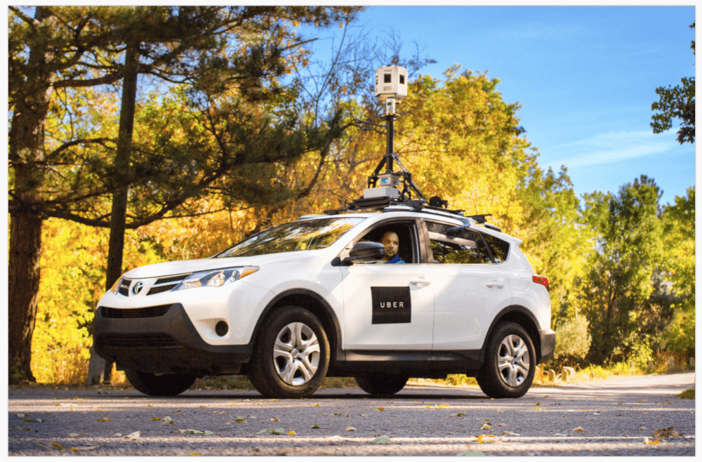
Image Source: TechCrunch
According to a recent report by TechCrunch, ride-hailing app Uber now has a fleet of cars equipped with mapping technology. According to TechCrunch writer Josh Constine, Uber acquired “assets” from the Microsoft mapping team earlier this year. According to an Uber spokesperson, the mapping cars are being used to improve the Uber experience by optimizing routes and ETA calculations. Others, however, wonder if Uber might also be preparing to test driver-less vehicles!
In a somewhat related story, Mashable reported this month that Tesla is on a mission to vastly improve the current state of GPS by creating high precision maps that basically map out every lane on earth. Why? According to Tesla, the existing GPS technology isn’t powerful or accurate enough for the autonomous self-driving car. There are a lot of companies fighting to be the top dog when it comes to GPS technology, but here’s what’s interesting about Tesla’s approach, according to the article:
“Tesla stands apart from the others is the way it’s acquiring this data: through drivers. Every Tesla Model S, with Autopilot or not, is connected from the cloud; the company is constantly connecting data from each of its cars. Tesla is using the data it has, and will continue to collect, to develop its maps.”
So how long before the self-driving car is ready and safe for the roads? Just three short years, according to Elon Musk!
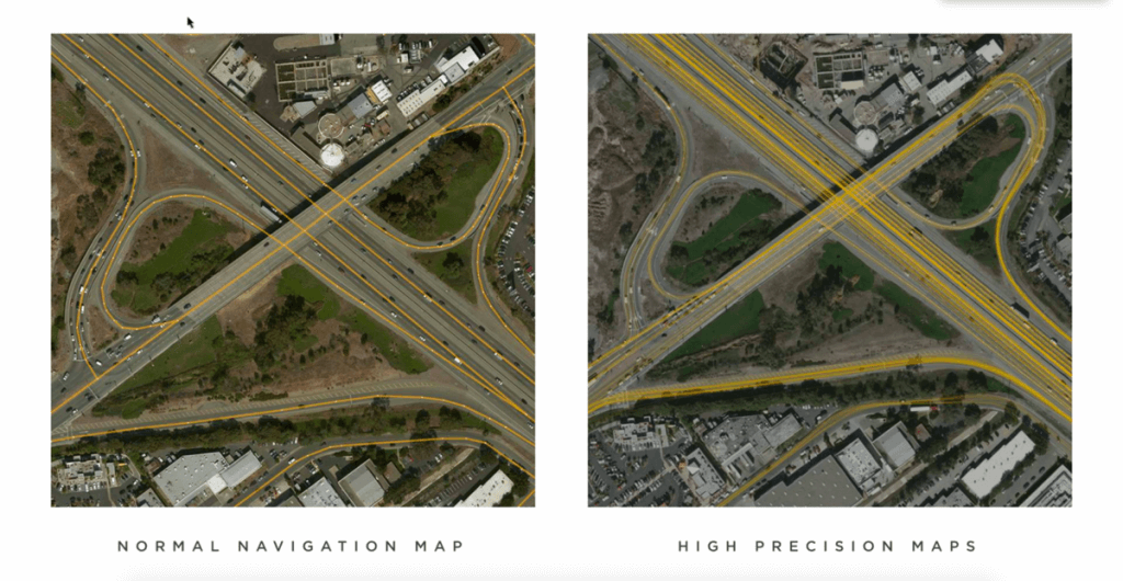
Image Source: Mashable
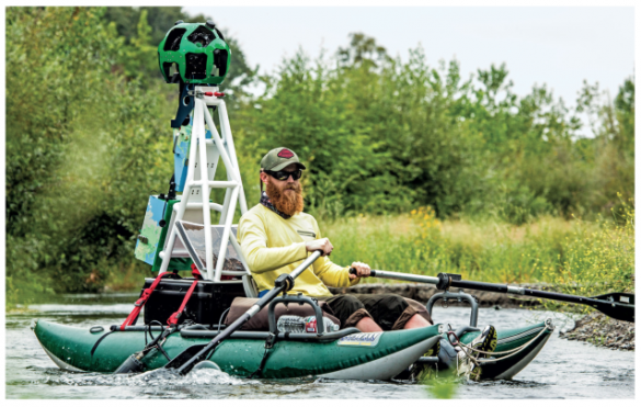
This story follows Freshwater Trust president Joe Whitworth, who is on a mission to fix America’s broken watershed. According to the story, “The U.S. Environmental Protection Agency classifies 79 percent of freshwater lakes, rivers, and streams as threatened or imperiled because of pollution, excess quantities of nitrogen or phosphorus, or water that’s warming too much for fish. The Freshwater Trust has joined with Google to take the first step toward a solution, using its advanced cameras to more quickly survey waterways.”
The Kayak you see in the picture below is using a Google Trekker, a raft-like version of what you’re probably used to seeing on the roads. Definitely worth a read!
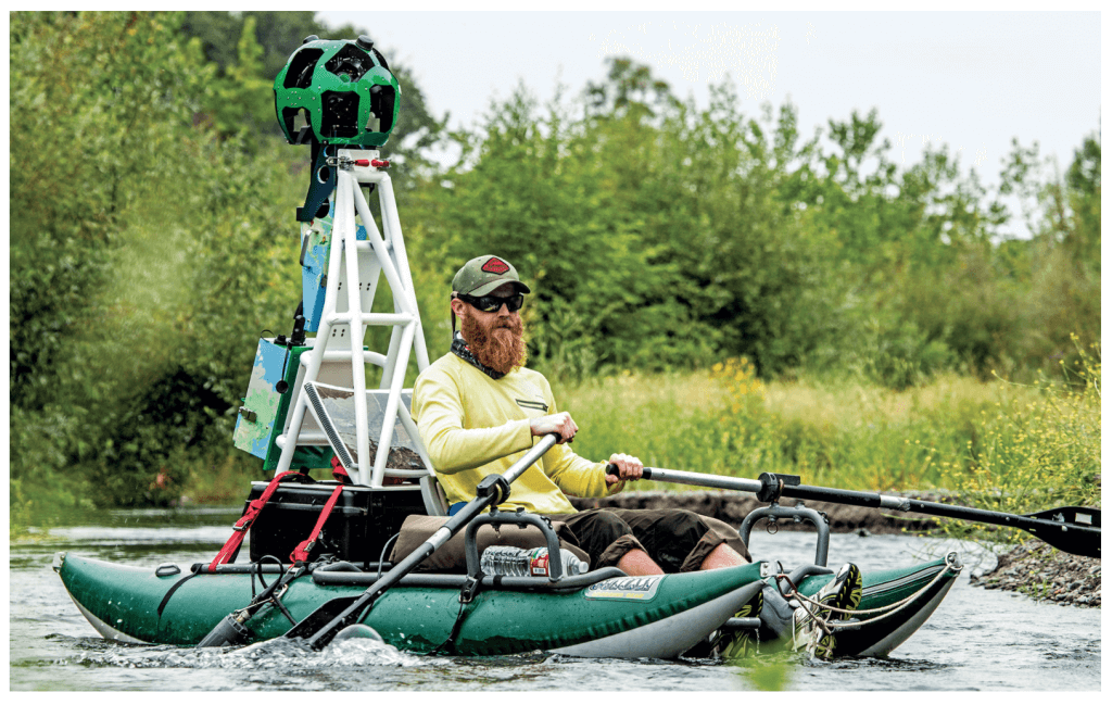
Image Source: Bloomberg
In an effort to catch up with Google, Apple has reportedly bought 11 map startups (most within the last two years). This story highlights their acquisition of HopStop. According to the article, Apple is shutting the service down (which makes sense since using their latest update— iOS 9— offers non-third party information on subway routes and entrances and providing schedules for trains, buses, subways and ferries—which is essentially much of what HopStop provided to users. The article is an interesting read as it touches on the company’s constant struggle to catch up to Google and other leading mapping companies.
A bit less technological than the other stories in this digest, this article follows the story of Robin Boustead, a man who is mapping the Great Himalayan Trail. An short, but inspiring story of someone who is seriously passionate about mapping.
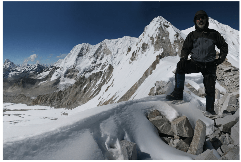
Image Source: Red Bull
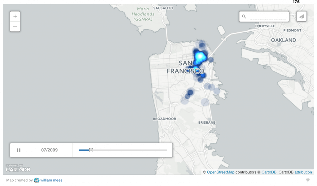
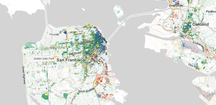
The visual below is a snapshot of an interactive presentation that shows where human waste has been reported in San Francisco over the past seven years. According to the article, you can check any month since mid-2008 and get a snapshot of where human excrement was spotted around the city. As you may or may not know, the city has been dealing with waste problems for some time now that it has only recently started trying to seriously address. Another story that illustrates how powerful mapping can be!
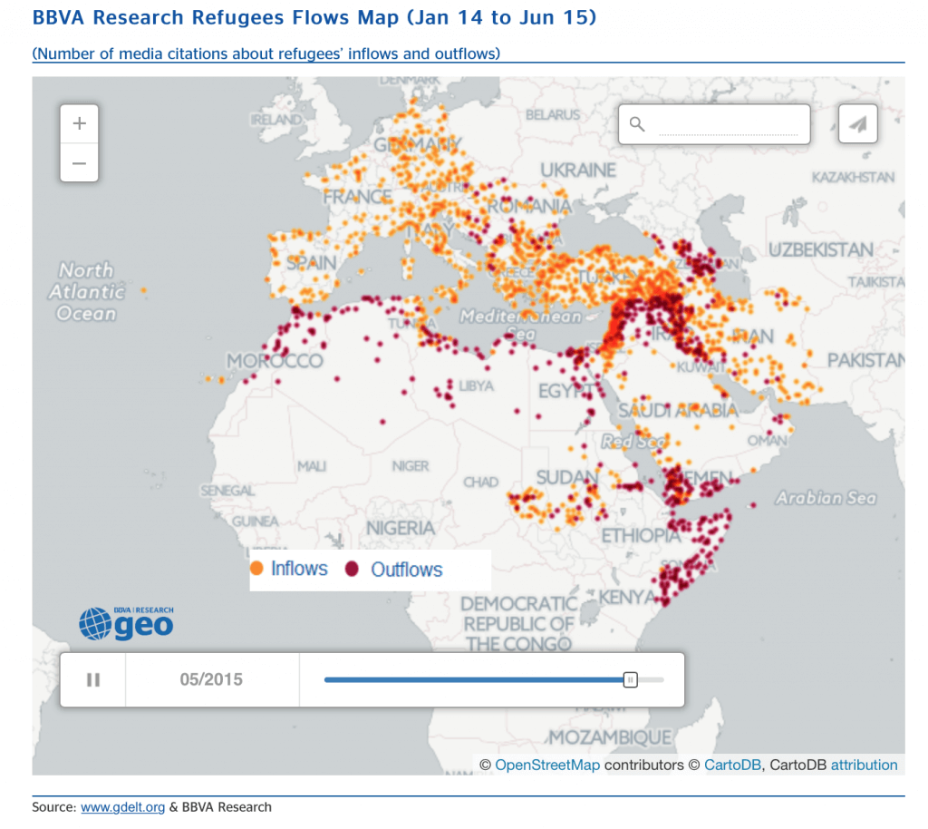
Perhaps the most timely news story in this list, this article visualizes the movements of migrants from the middle east to other parts of the world. Here’s a quote from the Forbes story that explains more: “The research staff at Banco Bilbao Vizcaya Argentaria (BBVA)’s Cross-Country Emerging Markets Unit recently published a report “The Refugee Crisis: Challenges for Europe” that used global news media coverage from my GDELT Project to track the flow of refugees throughout North Africa, the Middle East, and Western Europe. The animation below, from their report, shows refugee inflows (orange) and outflows (red) reported in news coverage from January 14 to June 15, 2015.”
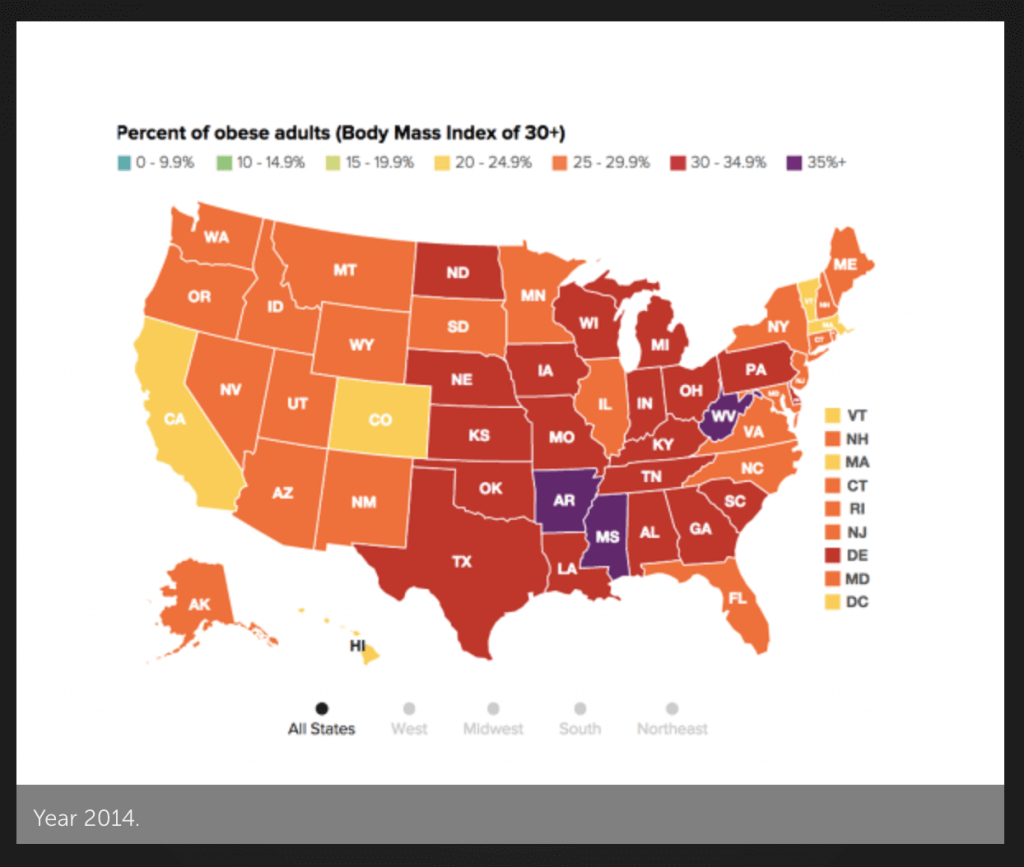
This Fast Company article illustrates the findings from a new report from the Robert Wood Johnson Foundation and the Trust for America’s Health. In it, you’ll see how Amerca’s BMI has changed over the past few decades. To see a great interactive version of the findings, go here.
Last but not least, we wanted to share this article from Fast Company. Although, not technically published in October, we felt it was worth including anyway because it’s another great example that we came across this month of extremely complex data visualized in an easy-to-digest way. It shows every single job in America from 2010. Take a look, and join us in geeking out over how cool mapping can be!
Any other stories we missed? Add them below!
Fred Metterhausen is a Chicago based computer programmer, and product owner of the current version of Maptive. He has over 15 years of experience developing mapping applications as a freelance developer, including 12 with Maptive. He has seen how thousands of companies have used mapping to optimize various aspects of their workflow.