
Map charts are indispensable tools for decoding information through a geographical lens, and are poised to play a bigger and bigger part in the location intelligence sector.
The demand for location-based insights is growing worldwide, according to industry research, with the global location intelligence market size valued at $18.52 billion in 2023 and projected to grow up to 15.6% from 2023 to 2030.
Map charts are the perfect answer to industry demands, as they solve the needs of analysts and decision-makers alike. They efficiently communicate intricate data patterns, trends, and relationships by harnessing a wealth of geospatial data.
Notably, the surge in availability of geospatial data as open data, driven by contributions from public and private organizations, has enabled users to access this valuable resource freely through open standards. This, in turn, has heightened the significance of map charts, making them the ideal tool to display demographic data, sales performance, and other location-dependent metrics.
This is also because, by their very nature, map charts accomplish so much more than traditional charts. They enhance understanding by connecting data points to real-world locations, making it easier for users to grasp spatial relationships. Plus, map charts facilitate better decision-making by providing a comprehensive view of regional variations, something that is becoming increasingly valuable as organizations look for richer insights from their data.
Types of Map Charts
By definition, a map chart is a visual representation of data that links information to specific geographic locations. Popular map chart types include:
Choropleth Maps
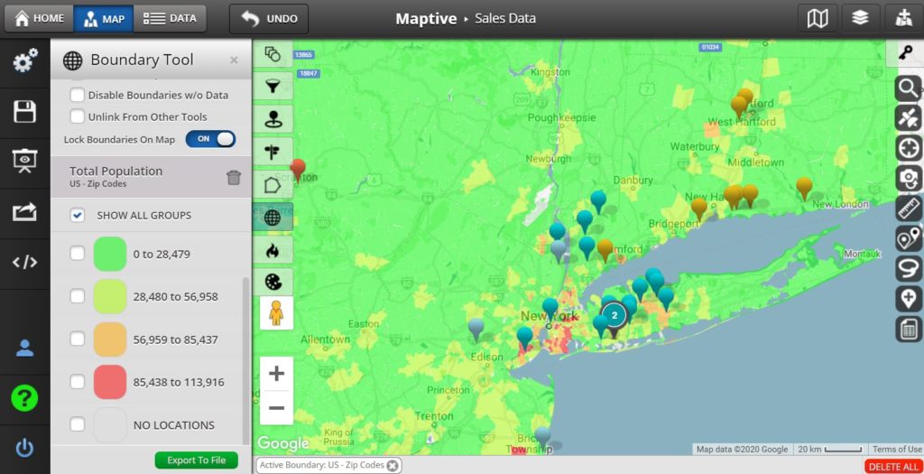
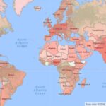
Choropleth maps use color variations to represent data values within predefined geographical regions. These types of map charts are ideal for showcasing regional variations, such as population density, election results, or income levels.
Point Distribution Maps
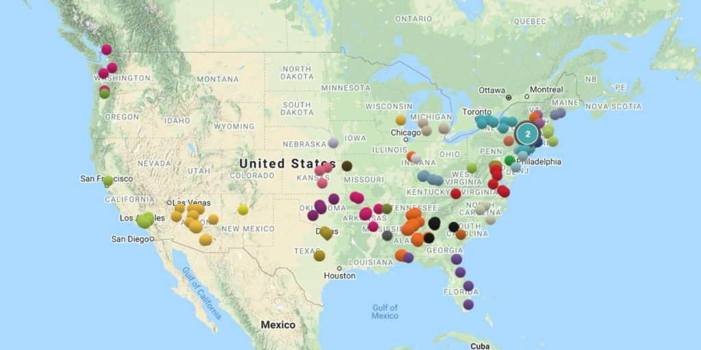
Point distribution maps pinpoint individual data points on a map, illustrating the location of specific events or objects. These map charts are great for visualizing the distribution of stores and customers.
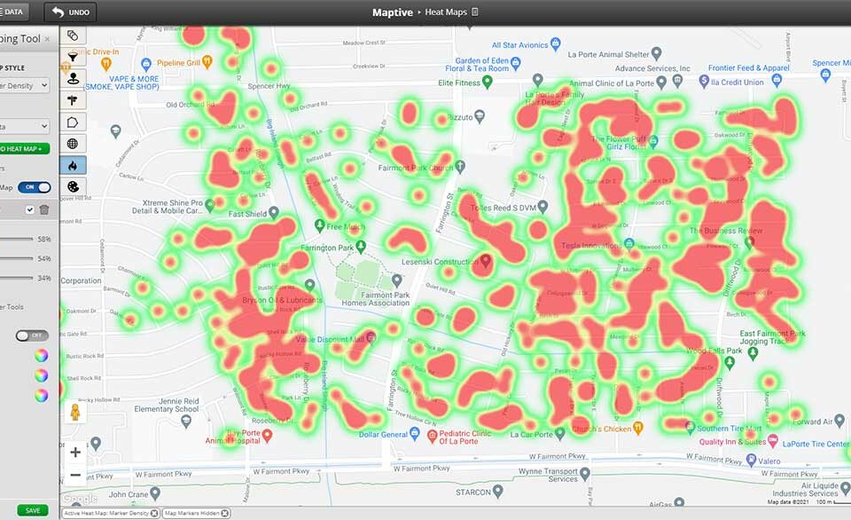
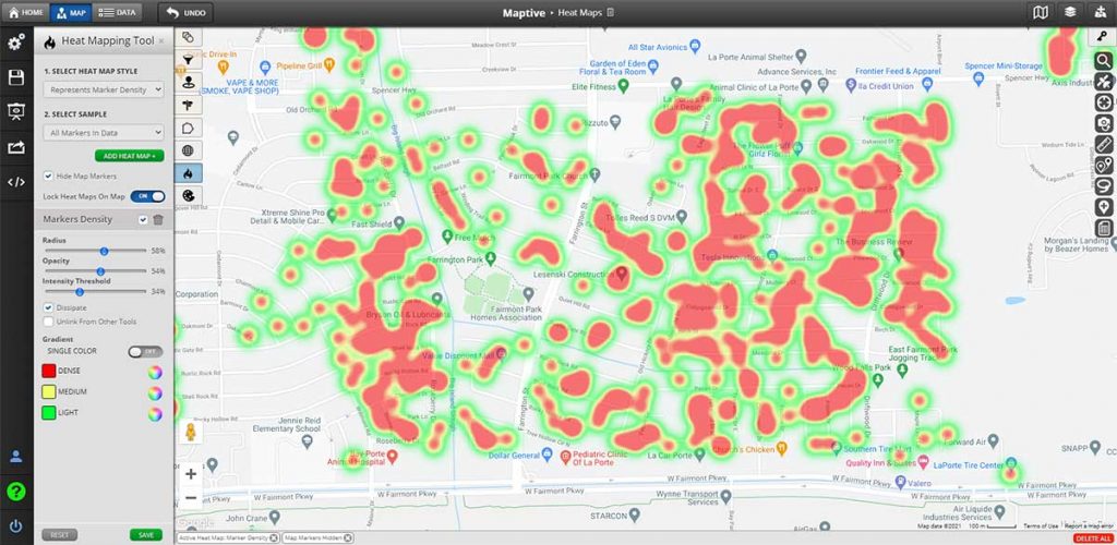
Heat Maps
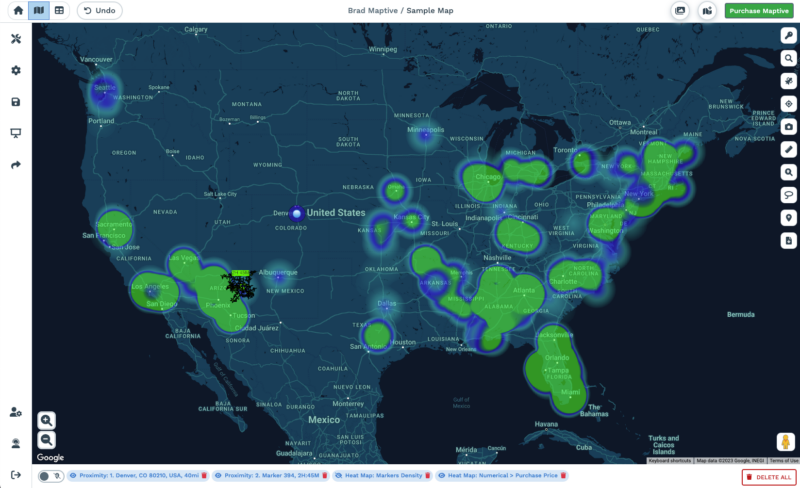
Heat Maps display the density of data values through color gradients. This type of map chart is really intuitive for viewers to understand and is often used to highlight the concentration of traffic hotspots, crime rates, or other critical data.
Flow Maps
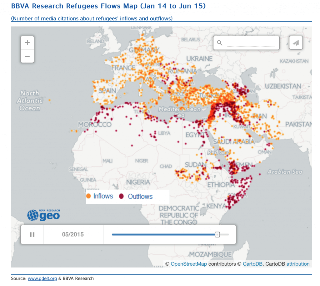
Flow maps visualize how objects or information move between locations. They are perfect for illustrating migration patterns, trade routes, or even communication networks.
Proportional Symbol Maps
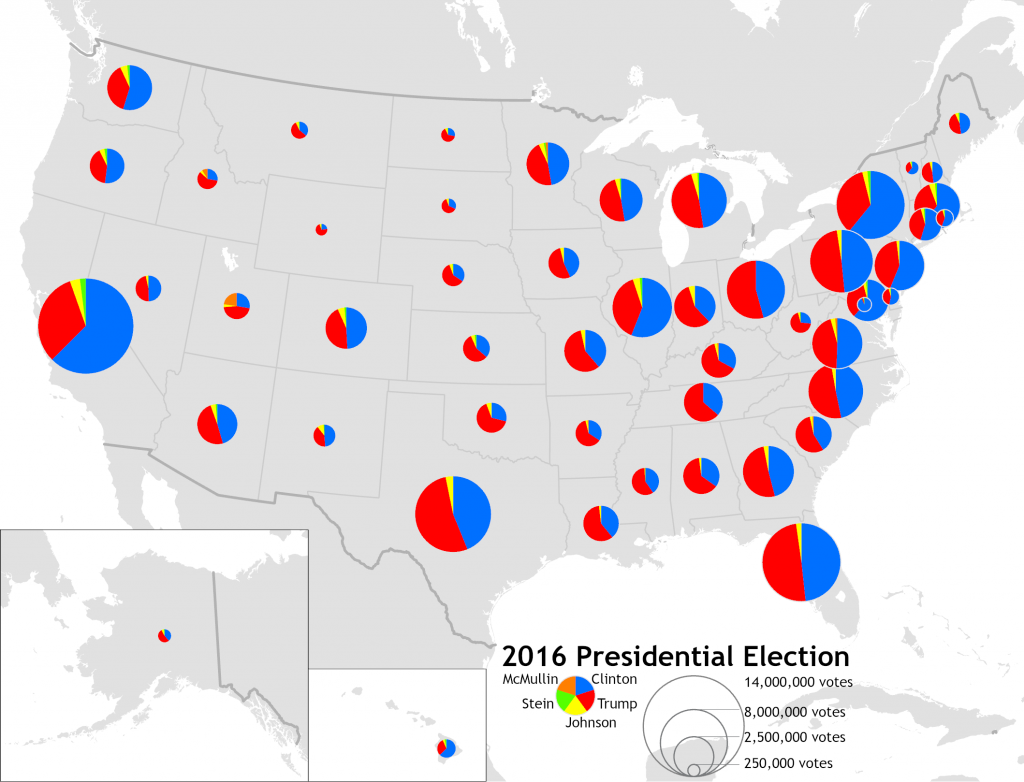
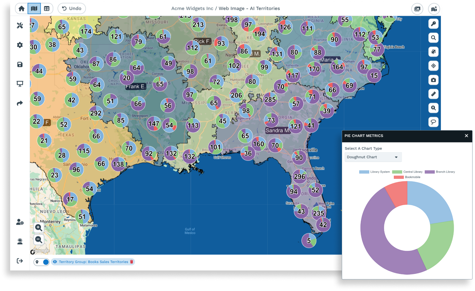
Proportional symbol maps use symbols of varying sizes to represent the quantity of a specific element in different locations. This type of map chart is useful for comparing data like sales volume or disease prevalence across regions.
Bubble Maps
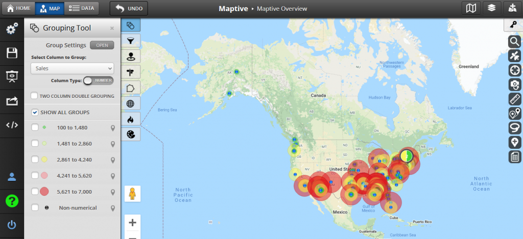
Bubble maps are a type of proportional symbol maps. In bubble maps, data points are represented not just by size but also by their precise locations on the map. This type of map can be used, for example, to evaluate production rates across different locations, where varying sizes of bubbles represent the scale and significance of manufacturing in each facility.
Beyond the map charts highlighted above, other variations and combinations exist, catering to specific data scenarios. As technology advances, more types of map charts are sure to be created to track market dynamics or analyze social trends. The adaptability of these types of visualizations ensures map charts remain at the forefront of data visualization.
Why Use Map Charts?
We’ve already established that a map chart can convey a wealth of information while also displaying data in a topographical or spatial context. What else can a map chart do?
- Unveil Spatial Distribution: unlike traditional charts, a map chart showcases how data points are distributed across different locations, adding a layer of spatial context. For example, businesses looking to expand might add a marker layer to a map chart to visualize competitors and uncover areas they should avoid or pursue.
- Compare Data Across Regions: whether it’s sales figures, demographics, or resource allocation, a map chart can enable quick comparisons, revealing disparities or opportunities across postal codes, chain store locations, and different geographical regions.
- Spotlight Patterns and Trends: one of the fun visual characteristics of a map chart is that clusters, outliers, and hotspots become very easy to spot. If you work in finance, for example, this might help you pinpoint anomalies that can give you an edge when investing. And if you add interactive shapes or an animated feature layer, you can even watch how trends evolve over time.
A map chart can benefit a wide range of users, depending on what they’re trying to visualize. Sales and marketing professionals often draw market distribution map charts to plan their targeting strategies, while business owners might create a market capacity map or use a map layer with geographical data to improve their supply chains.
How to Create a Map Chart in Maptive
Maptive’s intuitive interface makes creating a map chart very straightforward for users with various levels of expertise. Here’s a step-by-step guide on how to create a map chart in Maptive:
- Access Maptive and either sign into your account or sign up for their free 10-day trial to get started.
- Click on the “Create a New Map” button.
- Import your data by uploading an Excel spreadsheet, connecting to Google Sheets, or manually inputting data. Make sure that you include geographical data or location information, such as addresses or latitude and longitude coordinates.
- After importing your data, Maptive will automatically generate a map based on the location information in your dataset. At this point, you can have fun customizing your map by adjusting settings such as map type, colors, and markers.
- Choose a map style that suits the type of data you are visualizing. Maptive offers different base maps, including terrain, satellite, and street views. You can also adjust the color scheme to make your map easy to interpret or align with your brand’s colors.
- Add data point markers and even image layers to your map chart to represent key points on your data visualization. Layers can help organize and categorize your data. For example, you can have different layers for sales data, customer locations, or regional offices.
- Use filters to display specific subsets of your data on the map. This is helpful when you might have too many data points and you want to focus on particular regions, time periods, or categories.
- If your map chart is extensive, or if you are using a lot of different markers, you might want to add some tooltips to provide additional information when users hover over a data point on the map.
- Once you are satisfied with your map chart, save your work. You can export your map as an image or share it as an interactive map with collaborators or stakeholders. Maptive has a built-in collaboration feature that allows multiple users to work on a map simultaneously so you can make sure your team is on the same page.
- Analyze the data on your map by leveraging Maptive’s reporting and analytics features. You can gain insights into patterns, trends, and relationships within your dataset. Whether you are visualizing sales territories, analyzing customer distribution, or mapping out locations for strategic planning, Maptive can become your competitive edge for location intelligence.
Conclusion
We have not only answered the question “what is a map chart” but we have also established that they have become indispensable tools to visualize data within the context of geographic coordinates.
With their ability to communicate complex data patterns, compare information across regions, and identify clusters, map charts are essential tools for anyone looking to uncover new insights. As businesses and professionals navigate an era of increasing data complexity, embracing map charts can be the key to simplifying how socioeconomic data, critical indicators, sales revenue, and other specific metrics come alive on the world map.
Consider integrating these visualizations into your everyday business operations and you could unlock insights and transform data into actionable intelligence.
For those looking to embark on this journey, platforms like Maptive offer user-friendly solutions. Explore Maptive’s map chart functionality and leverage its resources for further learning. Embrace the transformative potential of map charts in your data storytelling, and chart a course toward more informed and impactful decision-making.
Map Chart FAQ
- What is a map chart?
- A map chart is a visual representation of data linked to specific geographic locations. It helps you understand complex data patterns.
- Why are map charts important?
- Map charts are crucial for decoding information through a geographic lens. The growing demand for location-based insights makes them increasingly valuable, with the global location intelligence market projected to reach $18.52 billion.
- How do map charts improve understanding?
- Unlike traditional charts, map charts connect data points to real-world locations, making it easier to draw insight from your data.
- What types of map charts exist?
- Popular map chart types include choropleth maps, point distribution maps, heat maps, flow maps, and proportional symbol maps. Each type caters to specific scenarios, like showcasing regional variations or visualizing movement between locations.
- What insights can map charts provide?
- Map charts visualize spatial distribution, enable comparisons across regions, and spotlight patterns and trends. Data visualization map charts are particularly effective in identifying clusters, outliers, and hotspots.
- How can map charts benefit different industries?
- Map charts cater to a wide range of users:
- Sales & Marketing: Analyze market distribution and target strategies.
- Businesses: Optimize supply chains and analyze regional performance.
- Finance: Pinpoint anomalies for strategic investment decisions.
- Map charts cater to a wide range of users:
- Why choose Maptive for map charts?
- Maptive offers an intuitive interface, diverse features, and customization options, making it ideal for users of all expertise levels. It simplifies the process of creating impactful map charts and fosters collaboration.


