The best and easiest way to understand the true power and usefulness of mapping is to look at real examples from everyday life. Believe it or not, hundreds of thousands of maps are being created each and every week by businesses, nonprofits, and media organizations in an effort to sell an idea, persuade a group of people, or tell a story.
Mapping is everywhere. Why? Because visuals are extremely powerful tools. The fact is, most people can’t look at a spreadsheet filled with hundreds of rows and columns of raw data and easily understand what it all means. Data is complex. It can’t tell stories in the same way that visuals can.
If you didn’t take advantage of the power and value of mapping in 2015, this year is the year to do it. As we’ve written before on this blog, there are a number of reasons why you should be visualizing data for your business.
If you’re still not fully convinced of the power and usefulness of maps, take a look at the following real-world examples from 2016. These are the best mapping stories that have been published this year so far:
1. Britain mapping agency creates map of Mars
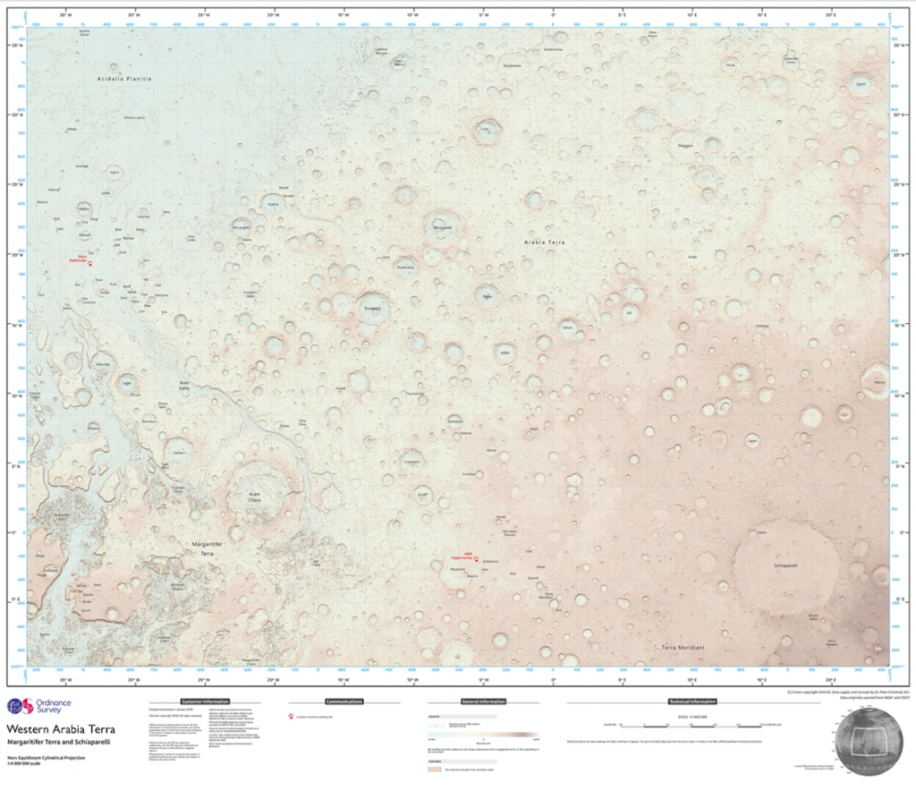
This month it was reported that one of Britain’s top mapping agencies had used NASA open data to make a 1:4,000,000 scale, 2,281X1690 mile (3672×2721 km) map of the Martian surface. The map was created by the Ordnance Survey in an effort provide further insight and understanding into a world that could one day be inhabited by humans.
It’s a fantastic example that highlights the importance and value of visualizing complex, raw data in order to better educate large groups of people with varying levels of education and knowledge of a subject.
2. 7 Ways Local Governments Are Getting Creative with Data Mapping
A recent article published by Government Technology highlighted the various ways in which local governments are leveraging data and mapping in order to communicate with citizens, solve problems, and improve their cities. Here’s a summary of the stories that were mentioned in the article:
- The District of Columbia and Iowa used mapping to help inform citizens about snow removal progress in real-time.
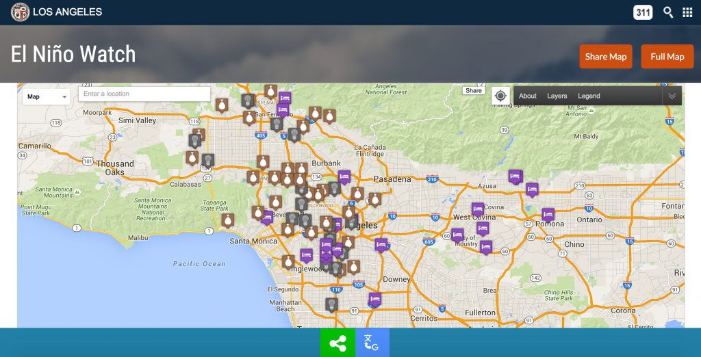
- Los Angeles published a map that allows users to track weather patterns, traffic, power outages, and more.
- California published a map that tracks air pollution in different areas around the state in an effort to raise awareness and identify high-risk areas.
- The city of Manassas, Virginia created a map to help educate residents about about municipal curbside pickup services.
- Chicago launched a map that lets users search for certain data like food inspection reports, street closures, potholes and more.
- Houston launched a service that maps and tracks 311 service requests in real-time.
These are all great examples that illustrate how mapping can be used to identify trends and opportunities, solve problems, educate people, and improve lives.
3. Drones Offer Innovative Solution for Local Mapping
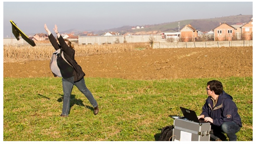
The World Bank published a story in January that introduced a plan to start using drones to offer quick mapping for local communities in need around the world. The author of the article explains that due to previous conflicts, a lot of people in communities around the world “do not have formal registration to their land or homes which prevents them from using their land as an effective economic asset.” In addition, the author explains that land surveying is difficult and costly for a lot of communities.
Here’s a blurb from the article that explains the solution the World Bank is providing:
“The World Bank is implementing a $12 million Real Estate and Cadastre Project to assist the government in producing a national cadastre system and geospatial data infrastructure. The team has begun to use new technology and methods to improve the effectiveness of the project. Unmanned Aerial Vehicles (UAVs), more commonly known as drones, have come to the rescue. These commercial drones are small and feather-light. They offer a turnaround mapping service from planning to product in a matter of days or weeks rather than months or a year and at a fraction of the cost of conventional aerial surveying using manned aircraft.”
It’s a great example of an organization that was able to identify a problem and leverage mapping technology in order to provide a solution that will ultimately make a lasting impact on the lives of hundreds of thousands of people around the world.
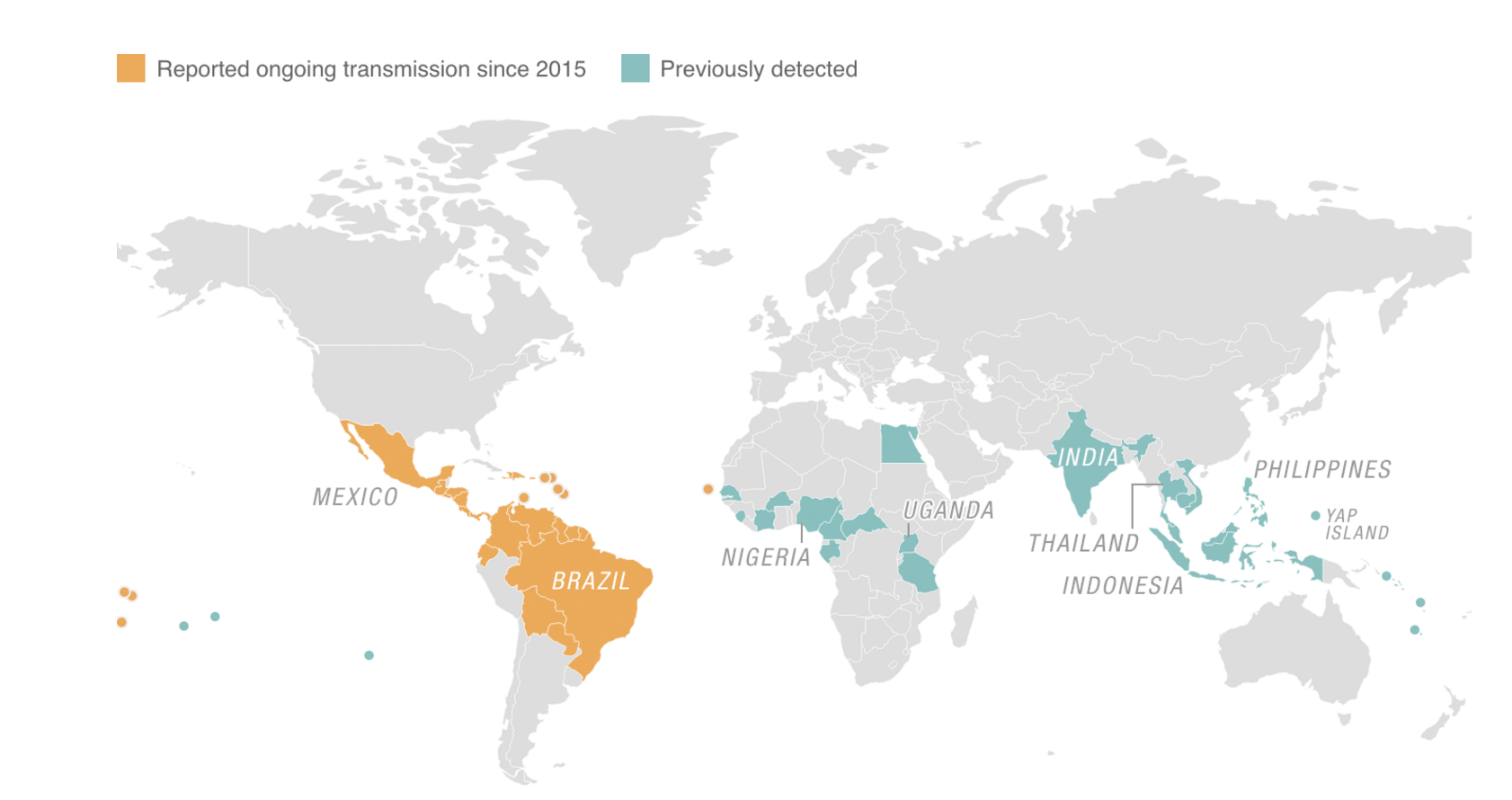
4. Mapping Zika: From A Monkey In Uganda To A Growing Global Concern
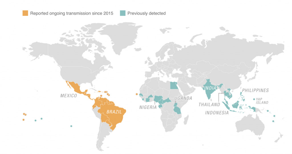
In early February, NPR published a story that aimed to provide a timeline of the Zika virus, from, as the author puts it, “obscure disease to an international public health emergency.”
In the story, the author provides a map (shared above) that visualizes the locations of reported ongoing Zika transmissions since 2015 and previously detected transmissions around the world. Due to the fact that the general public has little knowledge or understanding of the Zika virus, it’s an incredibly useful visual representation of raw data. According to the article, “the virus has reached more than 20 countries and territories in the Americas. In Brazil, there have been 500,000-plus cases.”
This is a strong example of an organization that is using mapping to simplify complex data in an effort to better educate the public.
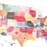
5. The Reach of Lead in Flint’s Water Supply
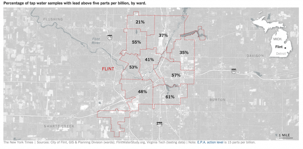
This final example highlights another major issue that has been widely reported in recent weeks—the water pollution crisis currently occurring in Flint, Michigan. In this story, the author provides a background of the issue at hand, and also includes a helpful map (shared above) that illustrates the “percentage of tap water samples with lead above five parts per billion, by ward.”
It’s another example of an attempt by an organization to use data visualization and mapping to inform people about issues that affect them.
Wrapping Up
As a business, you can’t expect to persuade people, educate individuals, or highlight trends, problems, or opportunities using raw data alone. In order to be effective, you have to simplify data and present it in a way that people can understand. One of the best and easiest ways to do it is by creating data visualizations.
If you think you can benefit from creating and sharing more maps for your business in 2016, give Maptive a try. It’s incredibly easy to use, full of powerful features that allow you to build and customize maps to your liking, and it’s free to try. Sound interesting? Start your free trial now.


