

Maps are extremely powerful and useful tools when they’re used correctly. However, we’ve all seen maps that are too cluttered, hard on the eyes, and didn’t have a clear point.
With all the tools available on mapping platforms, it’s easy to get overwhelmed when creating your map. What features should you use? What data should you focus on? How should you make it look?
While it’s never been easier to create a beautiful interactive map there are also a lot of traps to fall into that will ruin it if you’re not careful.
With that said, here are seven common map mistakes to watch out for when building your map.
1. Creating a Map that’s Not Visually Appealing
This is especially important for maps being posted online where there’s plenty of other content to compete against. If your map isn’t visually engaging people are going to scroll right past it.
So, how do you create a map that will make users stop and take notice? Follow the same rules you would when creating a website.
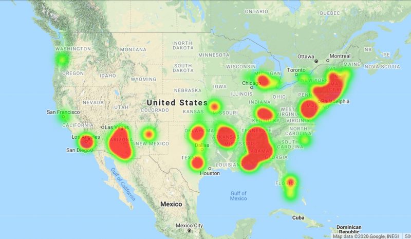
To start, use a clean and simple design that’s easy to understand. Use bright colors to catch people’s attention and make sure your text and labels are easy to read. Google Maps is a great example of this.
While maps shouldn’t be judged completely on their looks it’s often what will draw people in, so don’t overlook these important points.
2. Including Too Much Data
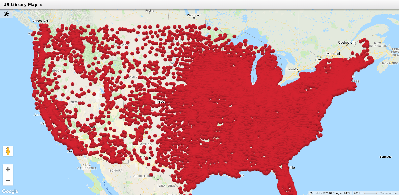
If you’re like most businesses these days you collect a lot of data. That’s great, just don’t include all of it on the same map.
When people are faced with too much information they can get overwhelmed and often just shut down. That’s not the effect you want your map to have.
Instead, identify the most important data points and cut out any information that isn’t absolutely necessary.
3. Not Having a Clear Message
This an extension of our last point, but it’s an important consideration. For the best results, define a clear message that you want your map to convey.
Including interesting data is great, but what insight do you want people to walk away with when they’re finished with your map?
Don’t try to cover too many topics at once. Narrow it down to one key point and build your map around that. Once you settle on a message the other elements of your map should fall into place.
4. Not Using the Right Data
Another common mistake is choosing the wrong data. This can be the difference between your map really making an impact on your audience or falling completely flat.
When creating maps a lot of people simply copy other people’s work. For example, let’s say you’re measuring sales within the United States. Most other maps might just focus on total sales. But don’t be afraid to explore different options.
Think carefully about your message and what data will work best. Maybe the average sales price or total revenue will better support your case.
You likely have a lot of information, databases, and resources to draw from, so don’t get stuck using the same two or three data points. Explore all your options and select the ones that will make your point with the highest degree of accuracy.
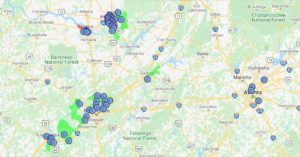
5. Using Too Many Elements
With so many tools and options available it’s easy to get a little carried away when building your map. Features like map markers, heat maps, and radii are great on their own, but on the same map, the combination of elements can make things very confusing for the user.
As you’ve probably noticed there’s a common theme here: keep it simple. Don’t clutter your map with unnecessary elements and features.
Identify one or two tools that will work best and stick with those to make things nice and easy for your audience.
6. Choosing the Wrong Type of Map
There are so many maps to choose from: heat maps, choropleth maps, radius maps, and more. All of them have their pros and cons so it’s important to choose the right one for your project.
Too often people get comfortable with one kind of map. But if you branch out a bit you may find another map does a better job of making your point.
Make sure to experiment with a number of different options to make sure you’re utilizing the best type of map for the job. You can always show people a few designs and collect their comments to see which version works best.
7. Not Including a Legend
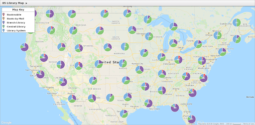
Your map might make perfect sense to you, but you need to consider your audience as well. They weren’t involved in the creation process so it might not be obvious to them what you’re trying to say.
A simple and clear legend lays out what different colors and symbols represent and basically walks users through how everything works.
Make sure to include a legend on all your maps so your audience can quickly understand the story you’re telling.
Create Clear and Effective Maps with Maptive
Now that you know which map mistakes to avoid, you are ready to start building your own interactive maps! Sign up for a free trial and start creating your maps today.


