
The human brain can process an image in just 13 milliseconds, say MIT neuroscientists. This speed explains why a chart communicates faster than a paragraph of text. Numbers in tables are hard to interpret until turned into shapes and colors. Once visualized, data helps people decide more easily.
Mordor Intelligence projects the data visualization market to reach $10.92 billion in 2025 and $18.36 billion by 2030. These figures show a clear need: organizations must present information for quick understanding. In 2024, over 68% of businesses added visualization tools to their strategies. This growth proves that results drive demand.
An effective visualization is more than attractive graphics. It is essential for understanding and acts as a tool for decision-making. Certain core principles ensure that visualization highlights the right insights, making your data easy to understand and remember, not just beautiful to look at.
Why Visuals Work Better Than Text
Your brain can recognize what you see about 30 times faster than a blink. A blink takes 300 to 400 milliseconds; recognition happens in just 13. This quick response shapes how people take in information during meetings, presentations, or reports.
Retention rates show a similar pattern. After 72 hours, people remember about 10% of what they hear, but 35% of what they see. When visuals and audio combine, recall jumps to 65%. VideoScribe research finds visual learning is 83% more effective than text alone. Adding graphics can improve learning by up to 400%.
These numbers matter for anyone creating reports or dashboards. A table with 50 rows can overwhelm your memory, but a heat map using color gradients makes the same data easier to understand.
The Business Case for Getting Visualization Right
PwC surveyed over 1,000 executives and found that data-driven organizations are three times more likely to improve decision-making than those relying on intuition. McKinsey reports that these companies are 23 times more likely to gain new customers, nine times more likely to retain them, and 19 times more likely to be profitable.
Small and medium businesses benefit as well. McKinsey data shows that smaller companies using data-driven methods can earn 6% higher profits than their competitors. Over time, these gains make a difference.
Still, there’s a gap. Even with all the evidence, 62% of executives favor personal experience and advice over data. This is both a challenge and an opportunity. Organizations that show data clearly have an advantage over those that bury insights in spreadsheets.
Maximizing the Data-Ink Ratio
Statistician Edward Tufte introduced the data-ink ratio. The idea is simple: every mark on a chart should support the data. Decorative borders, extra gridlines, repeated labels, and 3D effects add clutter but no value.
A cluttered chart forces you to hunt for the main point. A clean chart lets you see the information at a glance.
Sticking to this principle takes discipline. Most software adds flashy features that make charts harder to read: excess gridlines, repeated legends, or drop shadows. Each one distracts from the message. Remove them. What’s left tells the story.
Choosing the Right Format
Maps are best when your data relates to geography. A table of sales by state lists the numbers, but a map shows where sales are highest. Patterns that take minutes to find in tables become clear in seconds on a map.
To compare regions, find clusters, or spot gaps, maps work better than most formats. Pie charts show spatial relationships when the number of slices is small. With several slices, differences can blur. Bar charts handle larger numbers more clearly.
Line charts are good for showing changes over time. Scatter plots reveal relationships between two variables but don’t imply causation. Maps show geographic patterns that tables can’t.
Choose the format based on your question. Use bar charts to compare categories and line charts to track trends. If you use the wrong format, the chart might look good, but it won’t answer the right question.
Sometimes, combining charts helps. For example, a dashboard with both a map and a bar chart shows where sales are highest and how regions compare. This mix gives you more insight than one chart alone.
Color as a Communication Tool
Color sends a message without words. Red means warning, green means approval, and blue suggests neutrality. These meanings are strong and can help or confuse viewers.
Keep color choices simple. Too many colors overwhelm; too few blend categories. Use enough colors to separate points, but not so many that they distract.
Highlighting is important. One accent color draws attention to the key number or trend. If you highlight everything, nothing stands out. Use color to guide, not just decorate.
Accessibility matters. About 8% of men and 0.5% of women have some form of color blindness. If you only use red and green, some may miss the message. Use patterns, shapes, and labels as backup when color isn’t enough.
Real-Time Demands and Modern Tools
People now expect fast visualizations. Market research shows 77% of organizations want real-time visuals. In logistics, finance, and emergency response, dashboards must update automatically.
In 2024, cloud-based tools accounted for 63.45% of the data visualization market and are projected to grow at 12.65% annually through 2030. This shift to the cloud meets the need for easy access. Teams in different places need to see the same data at the same time.
Artificial intelligence is now part of data visualization. By 2025, 47% of visualization tools will use machine learning or automated insights. These features can spot unusual data, suggest chart types, and create summaries to accompany the visuals.
Research shows that 59% of companies say visualization tools help them better understand customers, and 51% say they make decisions faster. These results come from the same idea: when data is shown clearly, people use it.
Whether these new features help depends on how they are used, but the trend is toward greater automation. The same idea remains: when data is shown clearly, people act on it.
Turning Location Data Into Visual Insight

Some data is tied to geography. Sales by region, delivery routes, customer density, and demographic details all relate to real places. Spreadsheets can store this information, but they can’t show it visually.
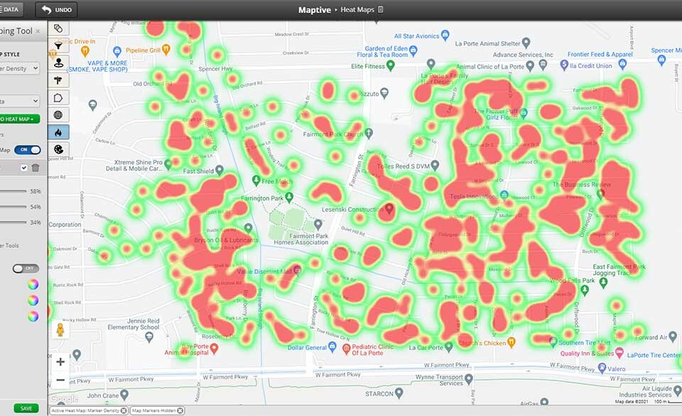
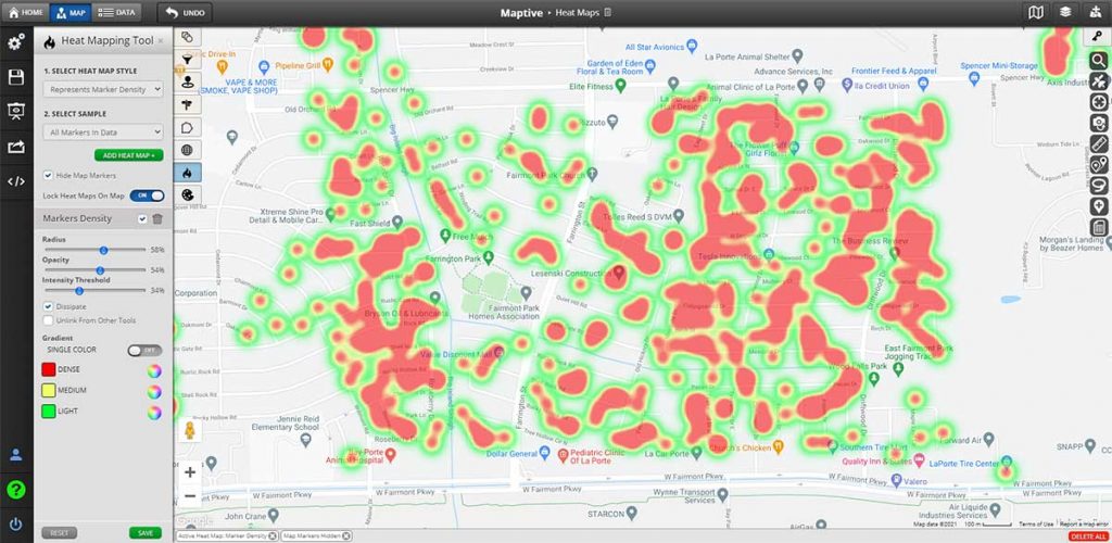
Maptive provides tools designed for location-based visualization. The heat map tool shows where activity is concentrated based on your location data. The boundary tool lets you mark areas such as countries, states, counties, cities, or districts, and group your data by these regions. Once you set the boundaries, you can see what your data reveals about each area.
The platform connects directly to U.S. Census demographic data. You can add layers such as population density, age, income, race, and education to your maps without additional uploads. This saves time and gives more context to your data.
Our platform uses Google Maps, so you get familiar navigation. After you analyze your data, you can use the same map to plan routes or find locations. This way, you move from analysis to action all in one place.
We support different industries and goals. Sales teams can map territories, logistics managers can study delivery routes, and market researchers can compare demographics across regions. Our customization options fit your needs instead of forcing your data into a set template.
Putting Effective Visualization to Work
A good visualization should be built to answer the main business question, not to impress with design. Otherwise, unclear formats and unnecessary details distract from insights. Choosing the proper format, level of detail, color usage, and layout all support turning data into action.
These principles apply to any tool. Show as much data as possible, pick the correct chart, use color wisely, and remove distractions.
If you work with location data and want to see these principles in action, try Maptive today. Sign up for our free 10-day trial and demonstration to discover how geographic visualization can transform your raw numbers into actionable insights for you and your team. Start making better decisions with more precise data now.


