

By visualizing information, we turn it into a landscape that you can explore with your eyes, a sort of information map. And when you’re lost in information, an information map is kind of useful. ―David McCandless
As a business owner, entrepreneur, or manager of a team, you can’t afford to try to persuade or educate people using raw data alone. It’s just not an effective way to get a point across. Instead, you need to present your data in a way that people can quickly examine and understand. You need data visualization.
Fortunately, there are many data visualization and business intelligence tools available to you at very little cost. It’s never been easier to create beautifully compelling visuals from raw data.
Here’s the problem: it’s not always easy to know where to start. Making a data visualization can be a bit intimidating for some—making a compelling, persuasive map requires a certain level of creativity and an eye for beauty, simplicity, and function.
Thankfully, there are a lot of examples out there that can help get your creative juices flowing. See the 2022 version of our Data Visualization Examples post.
Here are 20 impressive data visualization examples you need to see:
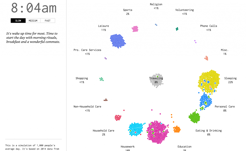
1. A Day in the Life of Americans
This data visualization from FlowingData analyzed and illustrated microdata from the American Time Use Survey from 2014. The dots you see below actually move to different areas in the diagram based on time of day. Each dot represents a person and each color represents the activity.
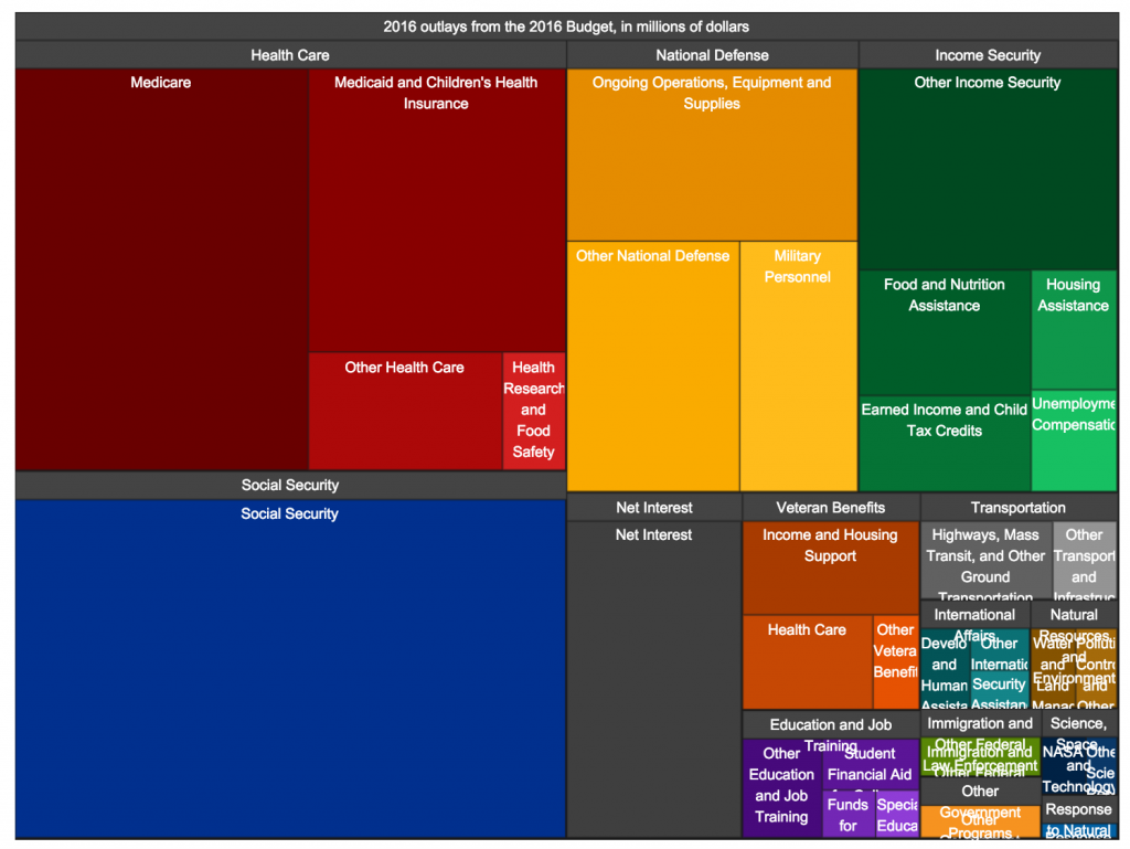
2. Interactive U.S. 2016 Budget
This data visualization represents where your tax dollars would go and to see what portion of the Federal budget is dedicated to different program areas under President Obama’s proposed budget for 2016. You can use the interactive parts of this visualization to see total amounts proposed for individuals sections and to learn more information about each section.
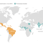
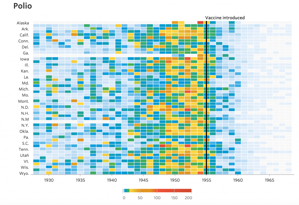
3. Infectious Diseases and The Impact of Vaccines
This data visualization from the Wall Street Journal illustrates how the introductions of vaccines impacted the prevalence and widespread presence of certain infectious diseases. The visualization uses measurements from over 70-some years and across all 50 states.
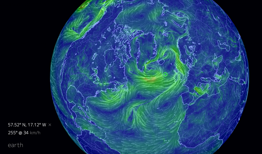
This animated presentation shows wind, weather, and ocean conditions across the globe. It’s a forecast made by supercomputers that is updated every 3 hours. To learn more about where the data comes from, click here.
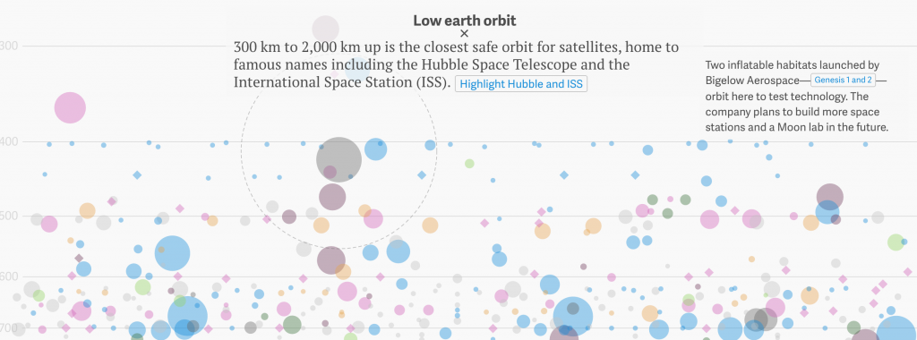
5. Every Active Satellite Orbiting Earth
According to Quartz, there are more than 1,300 active satellites orbiting the Earth at any given time. This data visualization was made using data compiled by the Union of Concerned Scientists. In the visual below, the satellites are sized according to their launch mass and are colored by their country. The visualization shows satellites in low earth orbit, medium earth orbit, geostationary orbit, and high earth orbit.
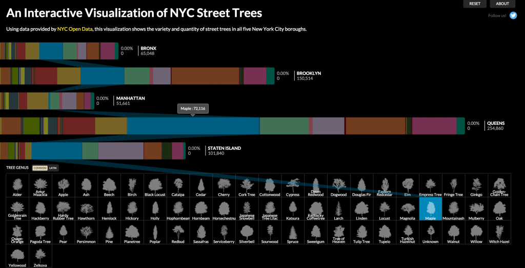
6. Interactive Visualization of NYC Street Trees
This data visualization was created using data provided by NYC Open Data. It shows the variety and quantity of street trees in all five New York City boroughs. The creators made the visualization because they wanted to find out which trees were more and less common across the five boroughs of New York City.
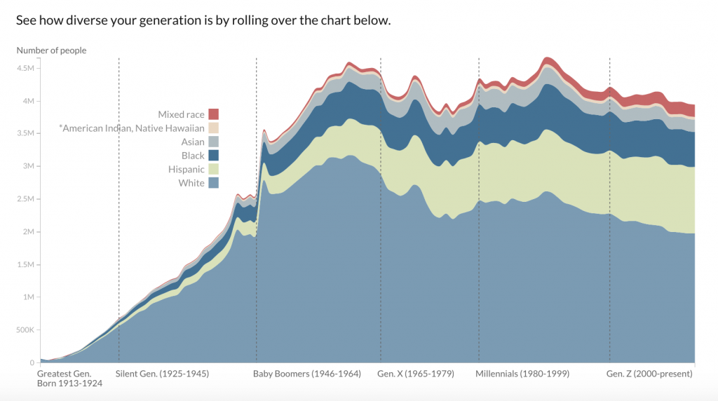
7. Interactive Millennial Generation Diversity Map
This data visualization shows how diversity changes across different generations. According to the article, here are the three most important takeaways from this visualization:
- The most common age in America last year was 22. There were more 22 year olds, than any other age group.
- Looking at a true median shows the middle age in America was 37.6 years old. Exactly 50% of Americans were younger, while the other 50% were older.
- Today’s babies mark the first generation where whites make up only 50% of the population. The Census Bureau predicts white kids will no longer make up a majority in just a few years.
[Source]
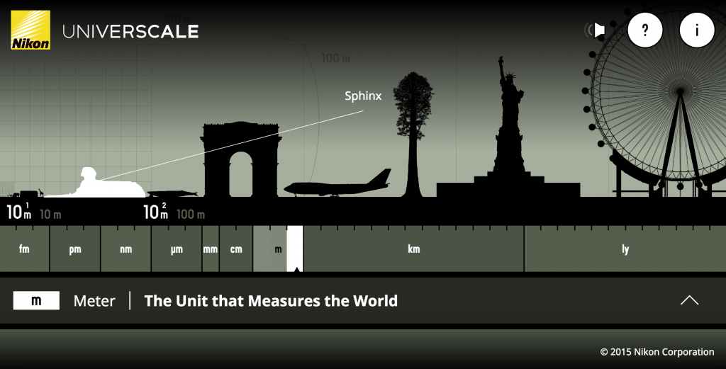
In this presentation from Nikon, we see the relative sizes of objects arranged on a single scale. The creators made the visualization in order to help people get a better grasp on the true size of objects that cannot be compared side by side in the real world.
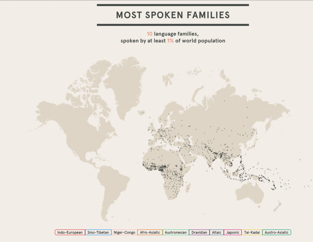
This data visualization illustrates an analysis of the current linguistic situation in the world. It leverages data from WALS, which according to the resource is, “The World Atlas of Language Structures (WALS) is a large database of structural (phonological, grammatical, lexical) properties of languages gathered from descriptive materials (such as reference grammars) by a team of 55 authors (many of them the leading authorities on the subject).”
10. The Next America
In this visualization the Pew Research Center aims to help illustrate how our nation is changing over time in an effort to forecast the challenges we may face in the near future. It’s a fairly meaty presentation of data The Pew Research Center compiles from public opinion surveys and demographic and economic analyses. Check out our interactive demographic map.
11. Visualization Explorer for Every Major Film 2008-2015
This data visualization illustrates data compiled from over 1000 major Hollywood films of the last eight years. This resource can be used to see and compare things such as worldwide gross budget vs. budget and actual budget recovered.

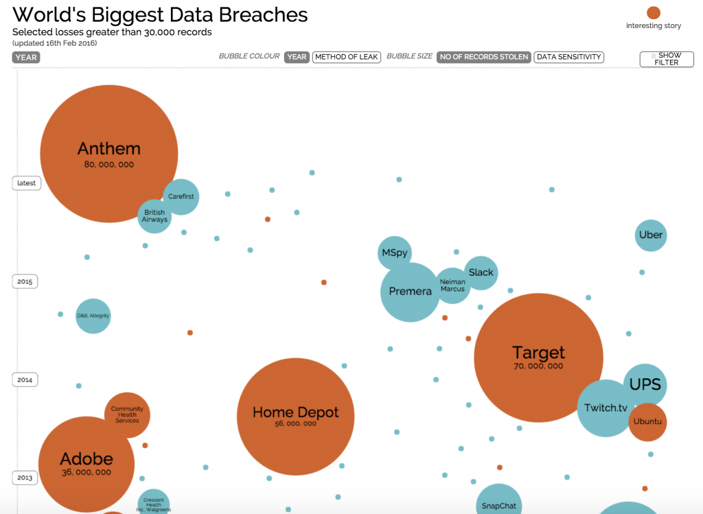
12. World’s Biggest Data Breaches
This data visualization compiles information related to the world’s biggest data breaches across a wide range of industries. It is an interactive resource that can be used to show how breaches occurred, how many records were lost or compromised, and the type of organization.
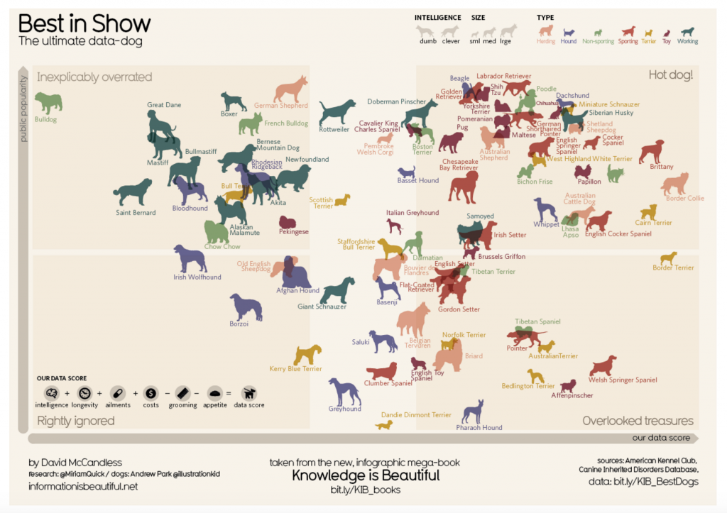
13. Most Popular Dogs Based on Data
To create this data visualization on dog popularity, the makers “examined data on intelligence, longevity, genetic ailments and other markers to create a “data-score” and then plotted it against public popularity of various breeds, according to the American Kennel Club.”
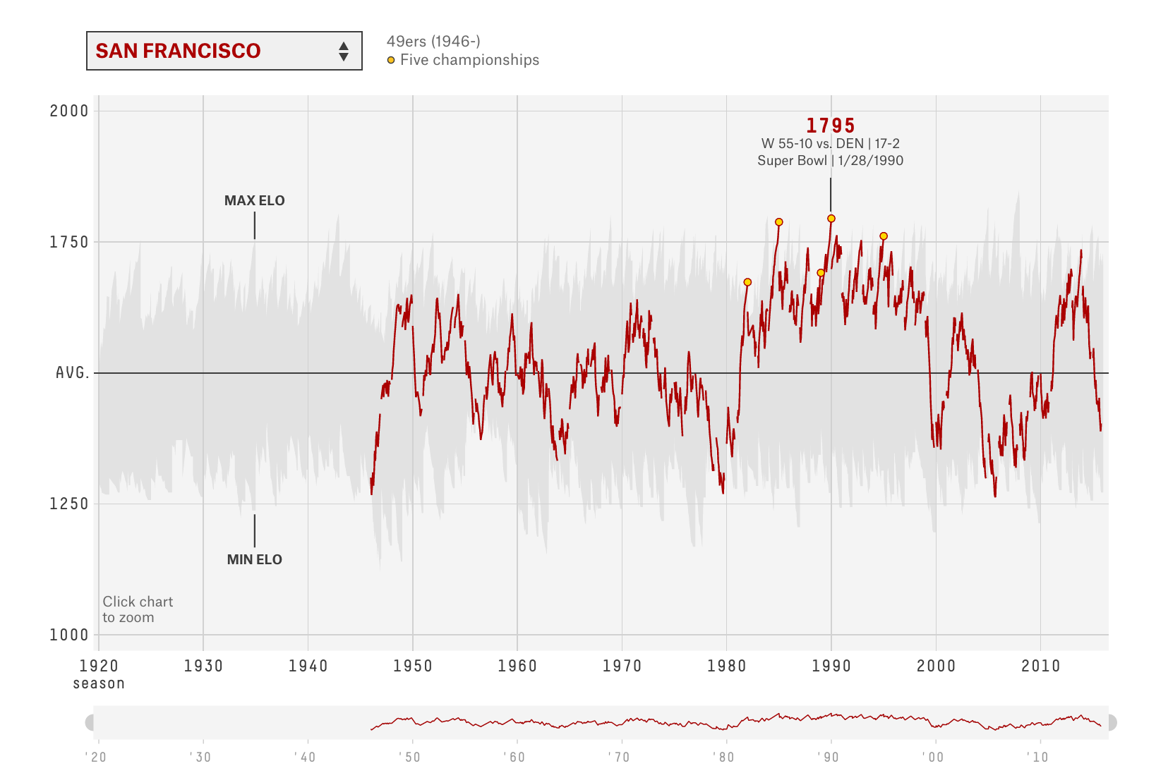
14. The Complete History Of The NFL
This data visualization from FiveThirtyEight shows the history of the NFL by teams. The makers rated the team based on Elo, a measure of strength based on game-by-game results. The makers calculated Elo ratings for every game in league history — over 30,000 ratings in total.
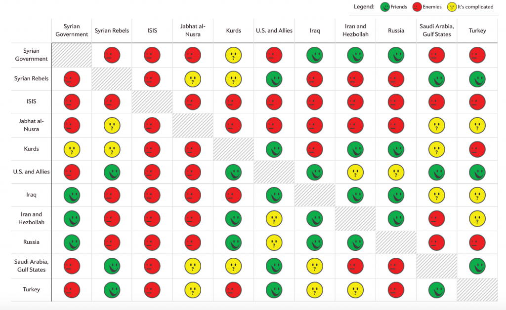
15. A Guide to Who Is Fighting Whom in Syria
This data visualization from Slate provides a quick look at the complex relationships between countries and groups fighting in Syria. The green faces represent friends, the red represent enemies, and the yellow represent the gray areas. To learn more about how this chart was created, click here.
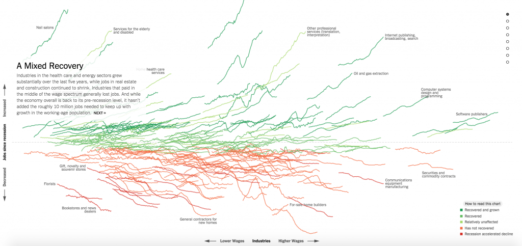
16. How the Recession Reshaped the Economy, in 255 Charts
This data visualization from the New York Times presents a comprehensive and detailed look at how the Recession reshaped the economy. The creators made charts that track how the Recession impacted various industries and job markets.
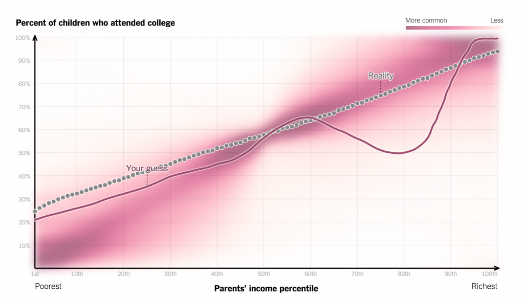
17. How Family Income Predicts Children’s College Chances
In another data visualization from the New York times, we get a glimpse of how family income can predict the likelihood of a child from that family attending college. In the visual below, each dot – a single income percentile – represents nearly 100,000 children who were born in the early 1980s.
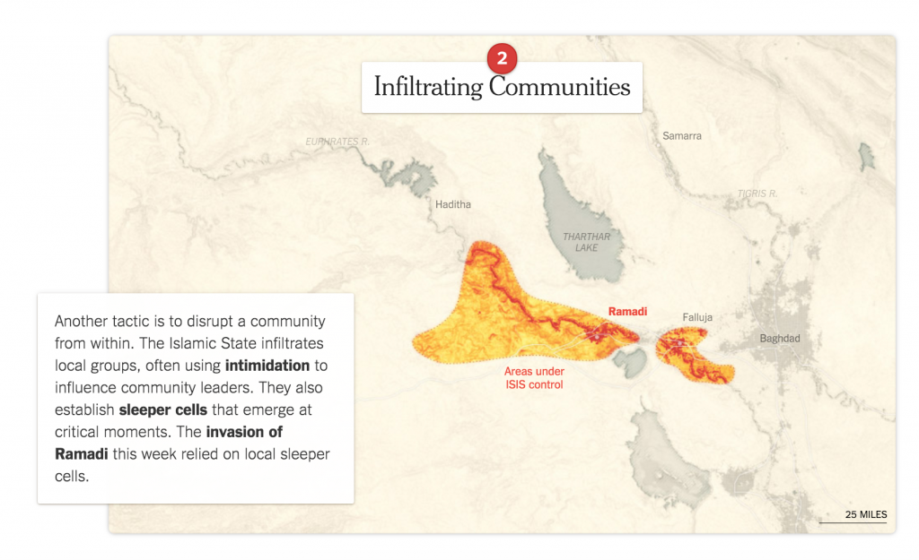
18. How ISIS Expands
This data visualization shows the presence and expansion of ISIS in the middle east. Specifically, it illustrates how ISIS is able to expand, citing factors like community infiltration, government control over certain oil-rich areas, and the absorption of other groups around the world.
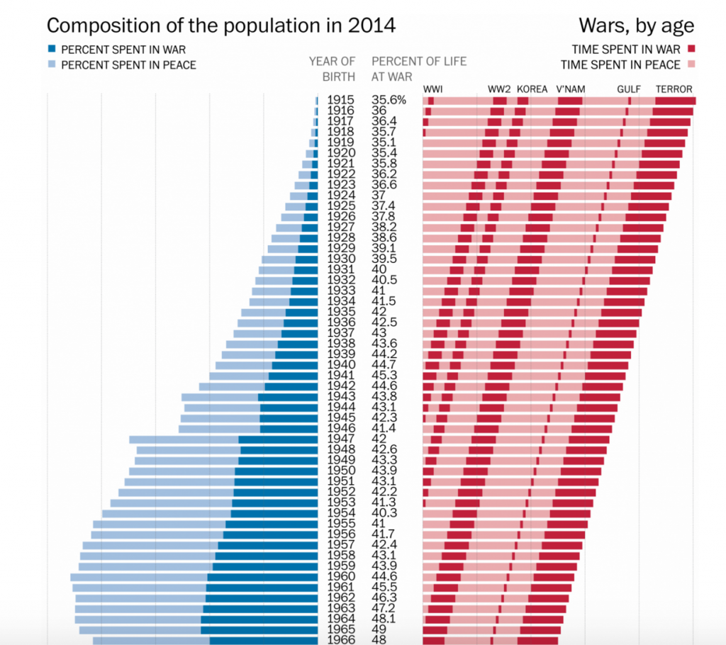
19. How Much of Your Life the United States Has Been at War
This data visualization from the Washington Post shows how much of your life the U.S. has been at war, and which wars the U.S. has been fighting during your lifetime. The dark blue represents percent spent in war, the light blue represents percent spent in peace, the dark red represents time spent in war, and the light red represents time spent in peace.
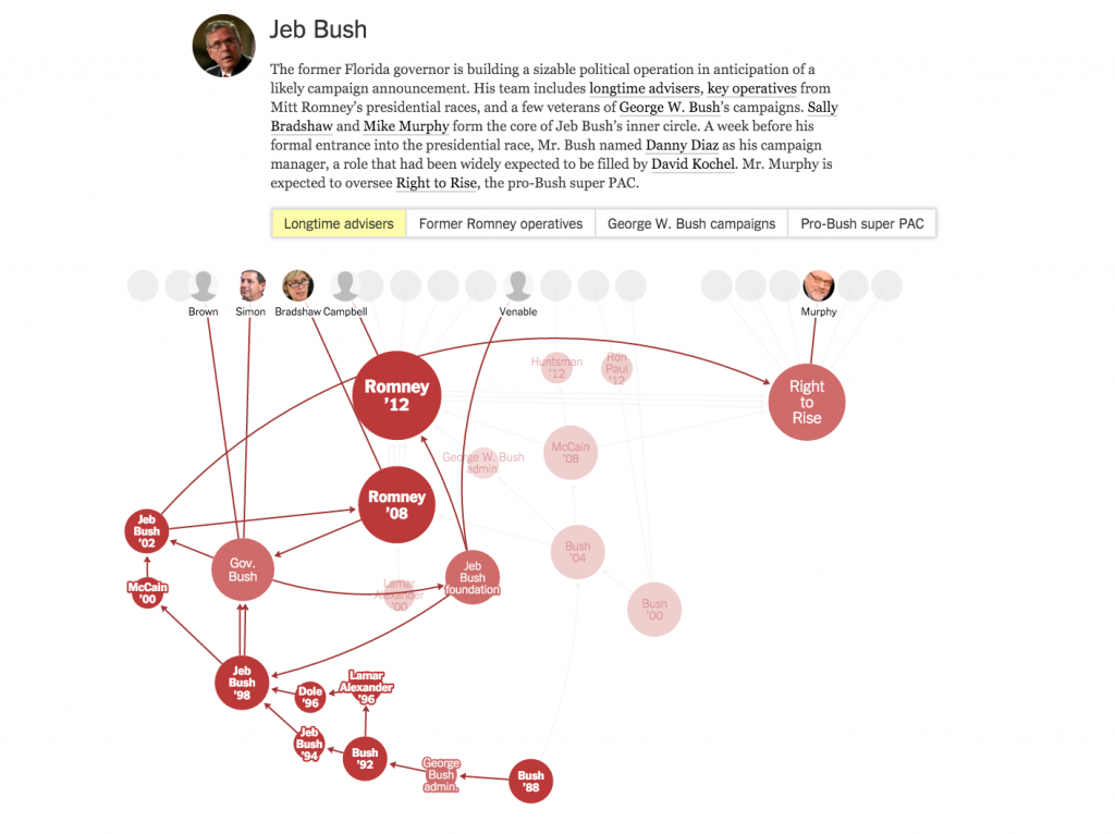
20. Connecting the Dots Behind the 2016 Presidential Candidates
This data visualization shows the complex networks behind the 2016 presidential candidates. As you can see from the visual below, the visuals for each candidate show relationships that stem back decades related to previous campaigns, administrations, and other organizations.
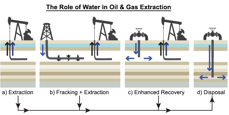
21. Setting the Record Straight on Fracking and Earthquakes
The science of fracking has been butchered by politicians on both sides.
Claims from the right denying the connection between fracking and earthquakes are just silly. Just as silly are claims from the left singling out fracking as the cause.
In this visualization, Max Galka shows that wastewater disposal is the root cause of most induced earthquakes, not fracking.
Do you know of another data visualization that should be on our list? Let us know in the comments section below.
Want to make your own customized Google map with pins using location data from your business? Try Maptive free today.


