Marker Grouping Tool
The Map Filter Tool pares heavy spreadsheet data down to only the rows you want plotted on the map, with 5 filter types fitted to how each column was built.
Marker Groups Built From a Column
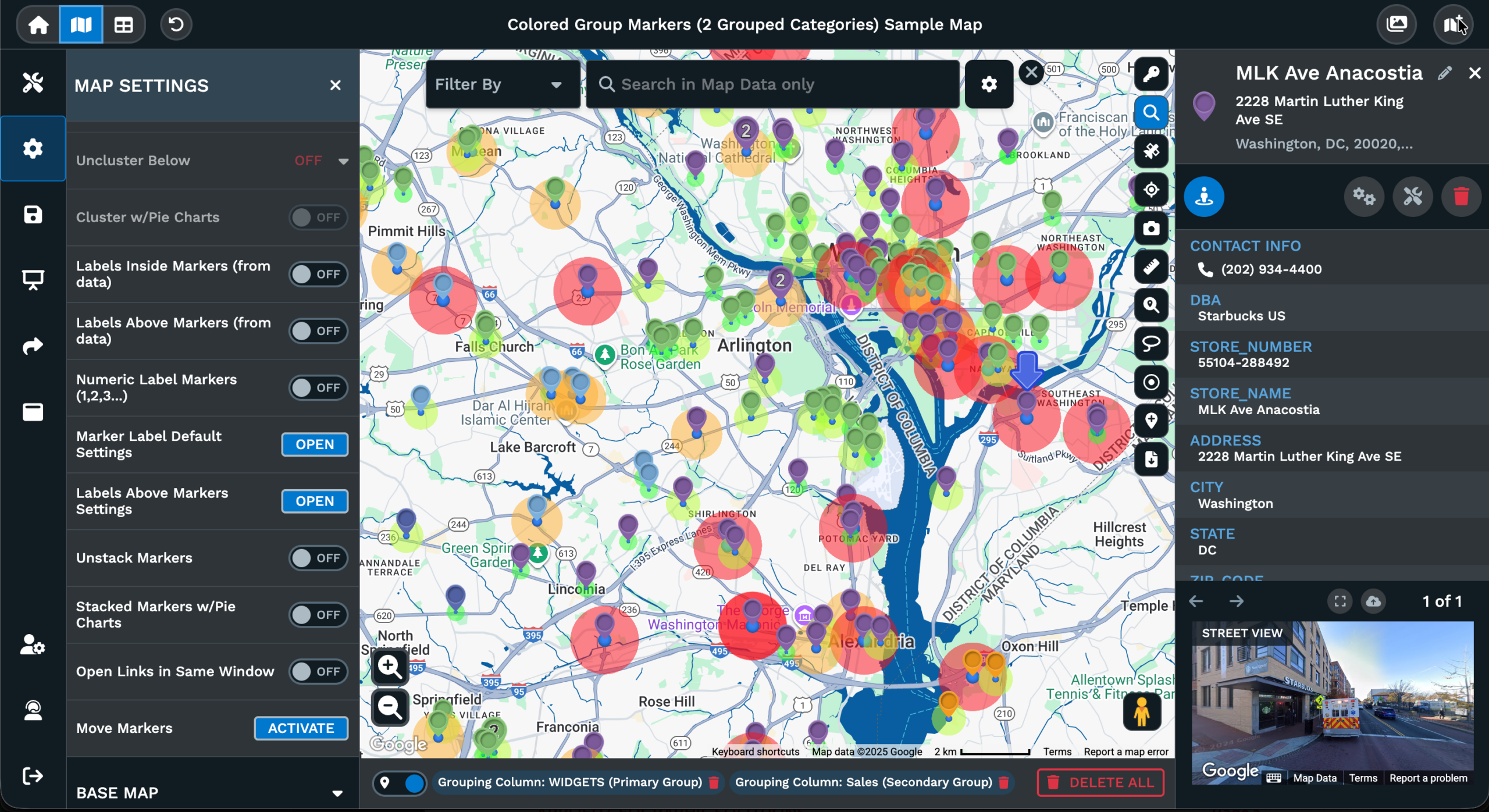
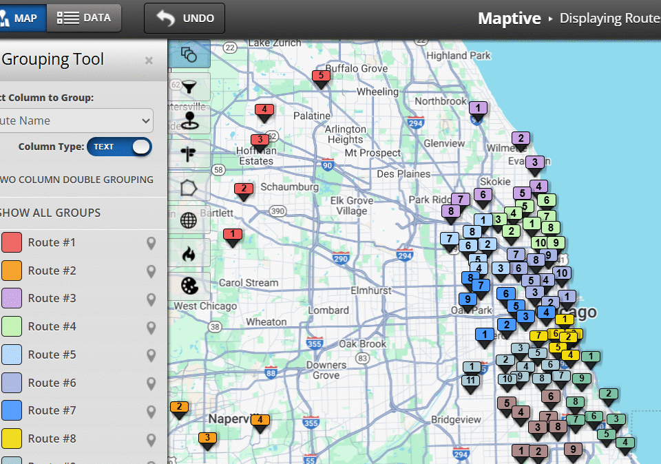
Primary Group setup: Pick a column from your data set as the Primary Group, and Maptive splits every pin into a group per unique value across the matching rows on the map.
Secondary Group layer: Add a second column as the Secondary Group on the same view, so each pin carries a pair of group signals without re-running the tool from scratch.
Numeric range groups: Switch a number column to Numeric and the popup lets you pick how many ranges to use, group by percentages or by number ranges, plus a marker style.
Per-group settings panel: Click the small white icon to the right of a group to open the picker and set the marker style for that group across every pin tied to the value.
Legend group toggling: Select or deselect any Primary or Secondary group from the panel to hide or show that slice on the map and isolate the rows you want at a glance.
Group filter on map: Untick a group in the panel and Maptive removes that slice from the map view while the rest of the grouped pins stay across the same data set you ran.
Group Your Pins in 3 Steps
1
Open
Open Map Tools from the side panel of your Maptive map, then click the Grouping Tool / Colored Pins Tool from the list.
2
Pick
Pick a column from your data set as the Primary Group, so Maptive splits the pins into a group per value across the map.
3
Read
A grouped map plus a clickable panel shows up, so you can read each slice by value and toggle a group off to drill in.
Segments From a Column
Pairing 2 Columns
Focus on a Slice
Settings Per Group
Ranges On Numbers
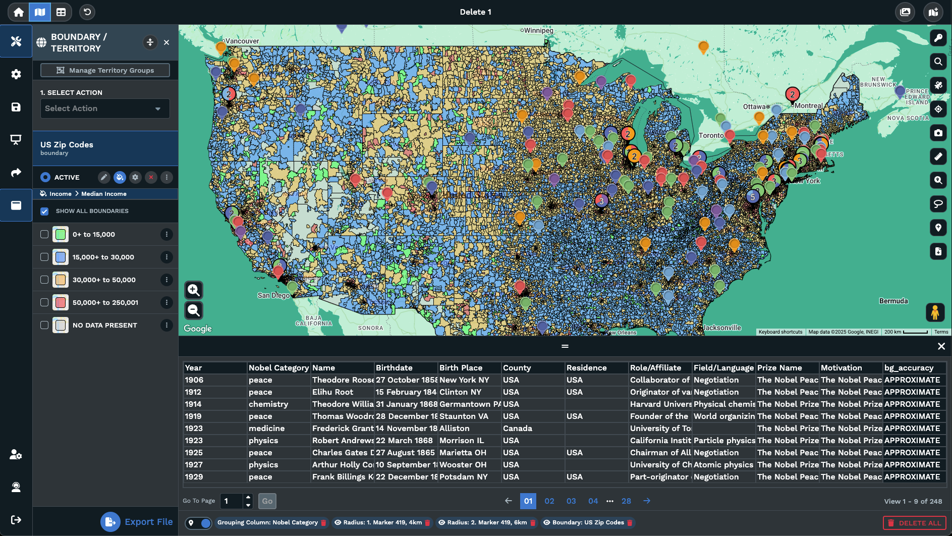
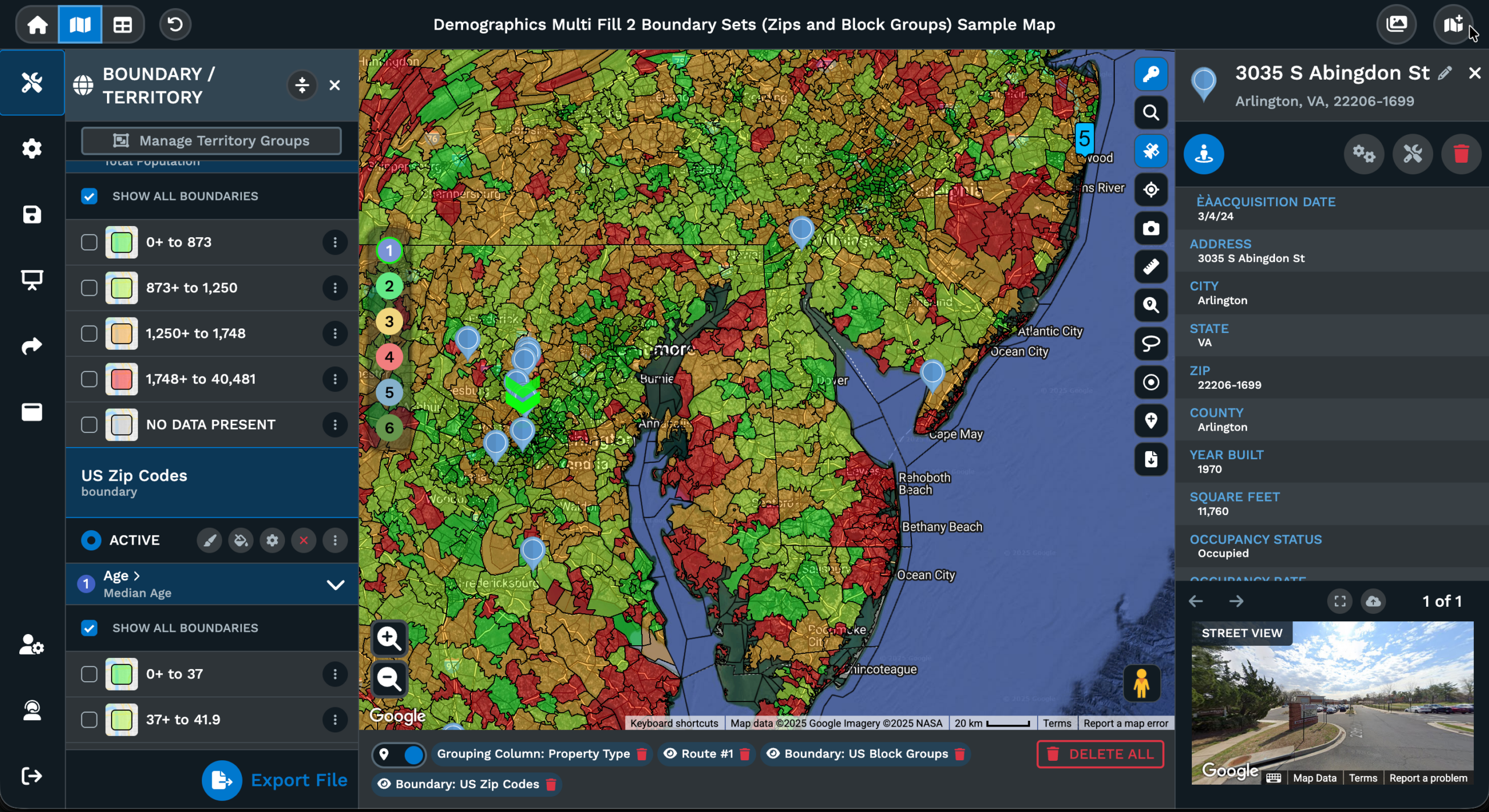
Compare 2 Groups
Marker Grouping on a Map
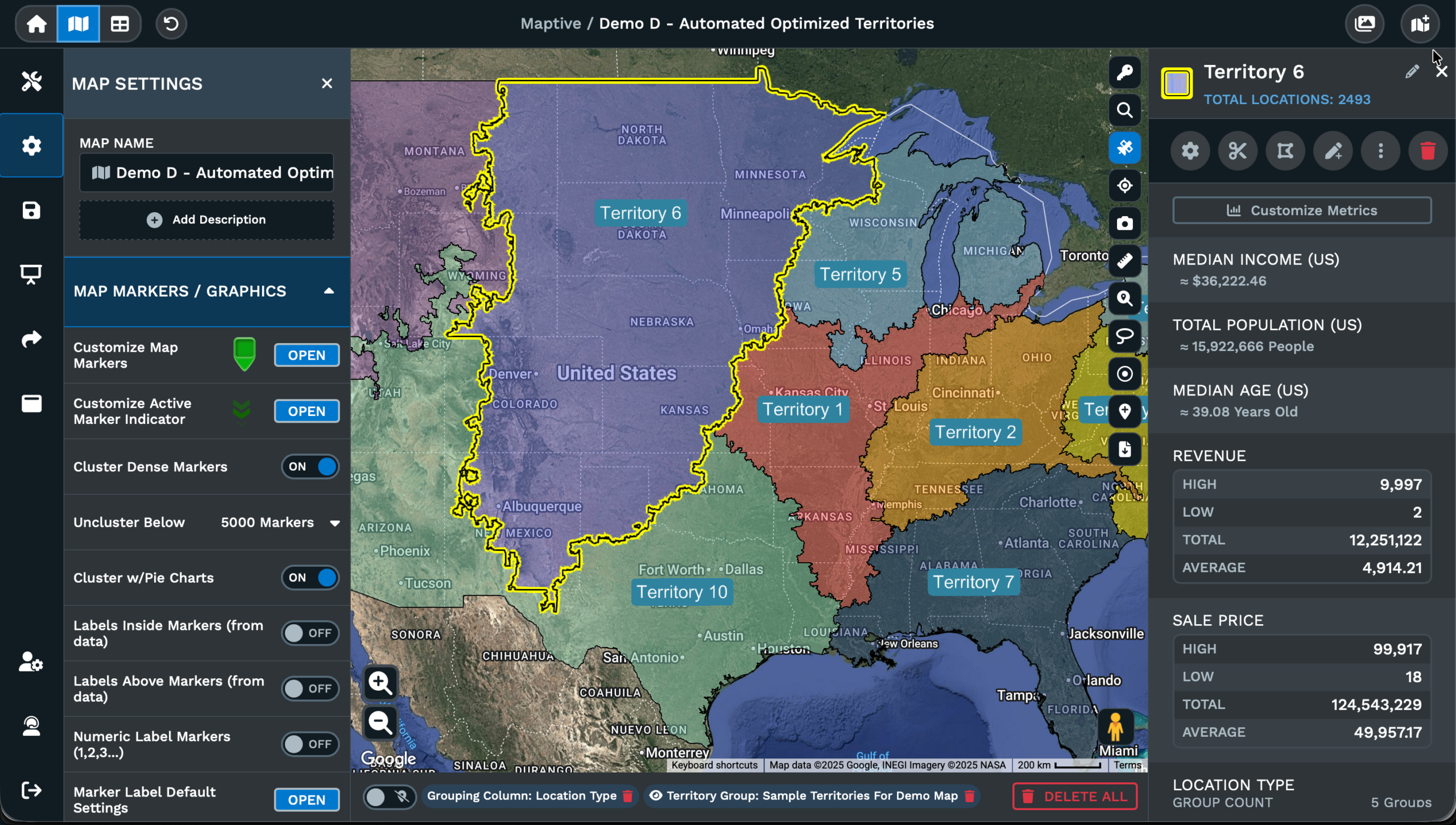
Grouping Splits a Map
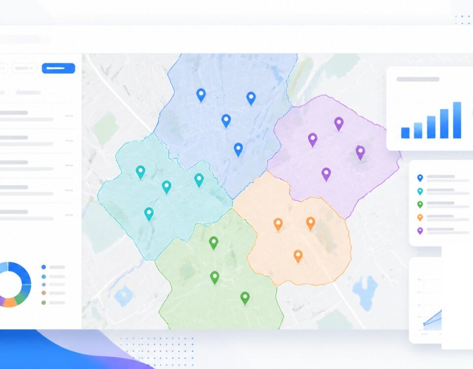
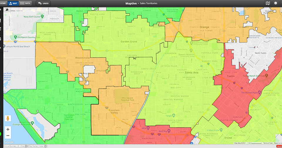
A pin map with every row in the same marker style answers a single question across the rows. Where do the rows fall on the map. Adding a second question to the same map, what value each row carries from a column in your file, is what the Grouping Tool does on a Maptive map. The work covers the routine job of turning a flat pin map into a segmented view by any column you choose at run time.
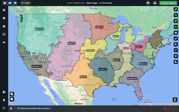
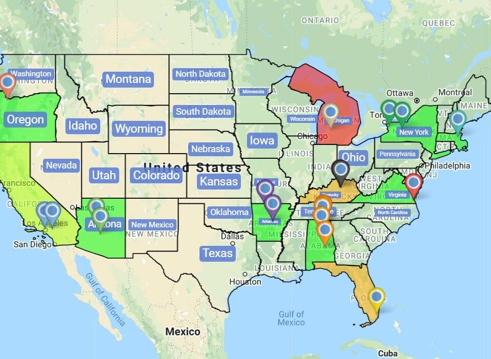
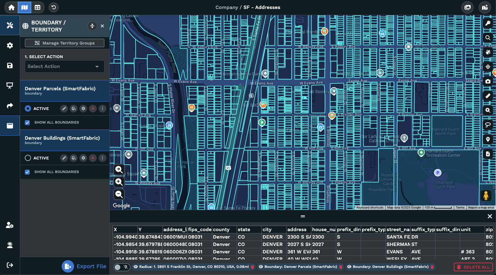
The mechanic is small. Pick a column. Each unique value in the column becomes its own group. Every pin tied to a row with that value joins the group on the map. A panel lists each group with the value it represents and a small white icon next to the group for marker settings. The same map can be re-grouped by switching the Primary Group column inside the panel any time, without a re-upload of the underlying file.
Reading the grouped map is the payoff for the small setup work. Slices that cluster across a part of the map signal a regional pattern by that column. Pins that sit alone in a slice signal an outlier worth a closer look from the team. Empty zones in a slice signal a coverage gap that the planning view has missed across the data. A row column becomes a map column the moment you pick the column.
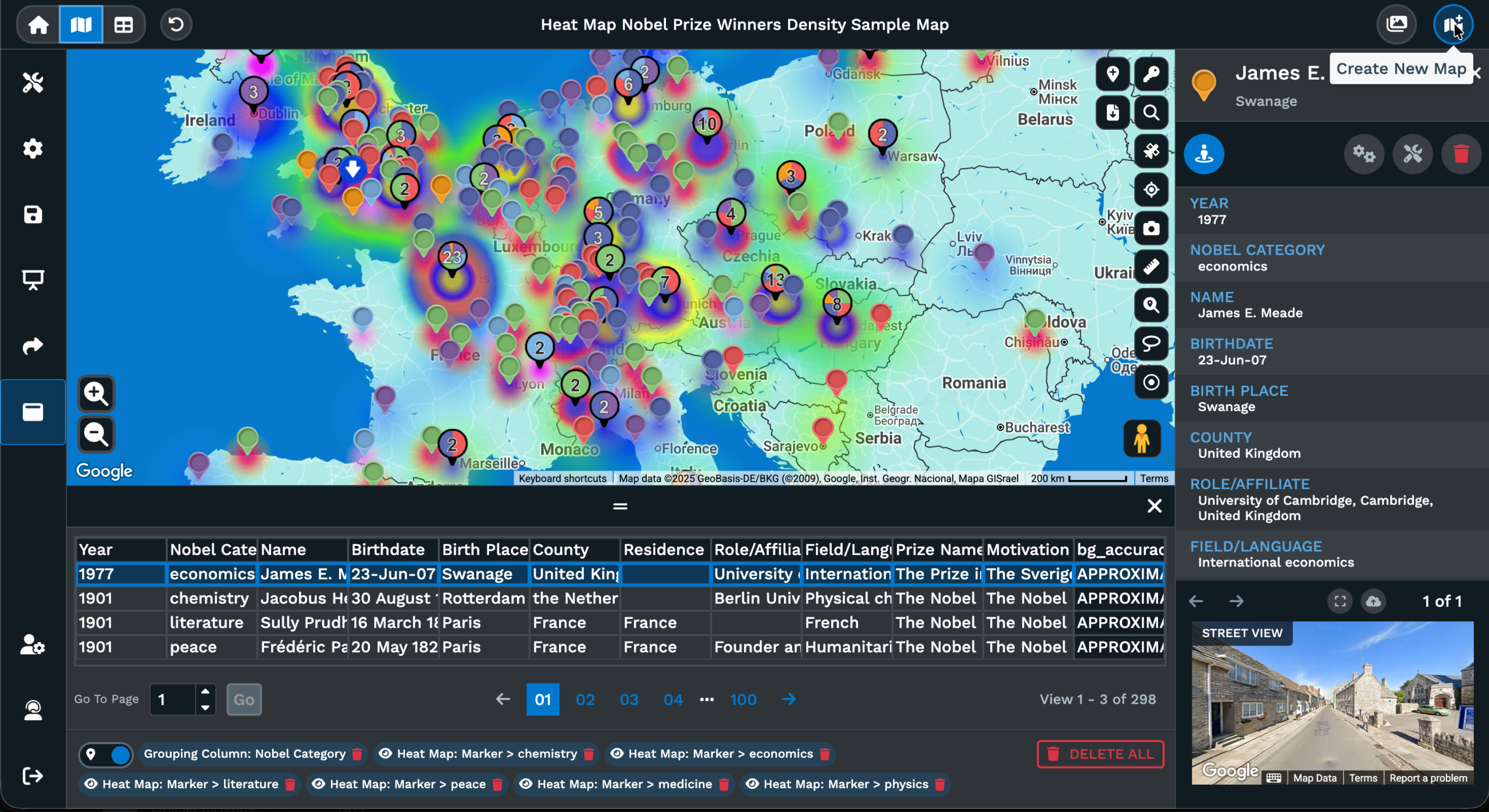
Primary and Secondary Groups
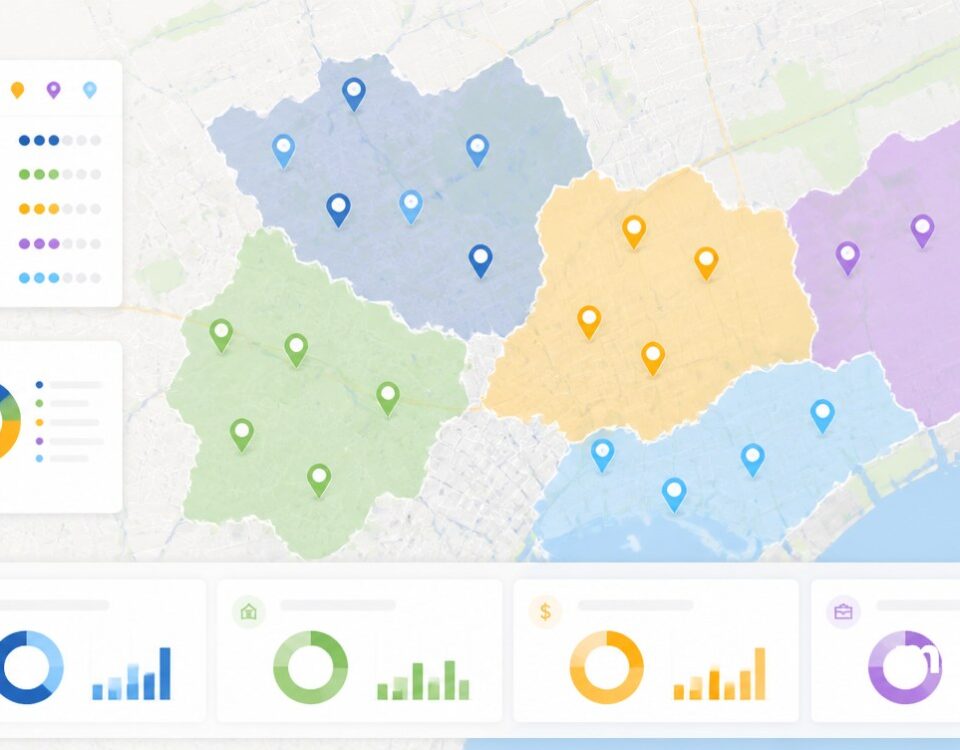
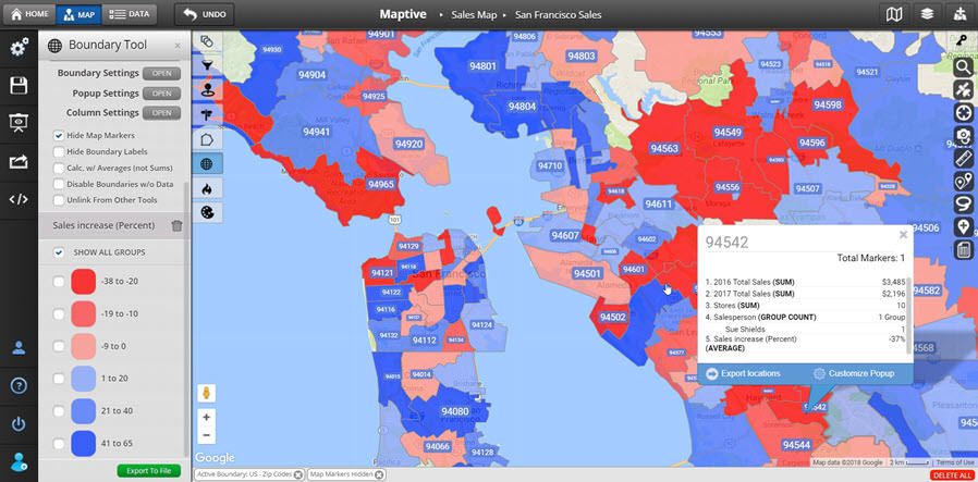
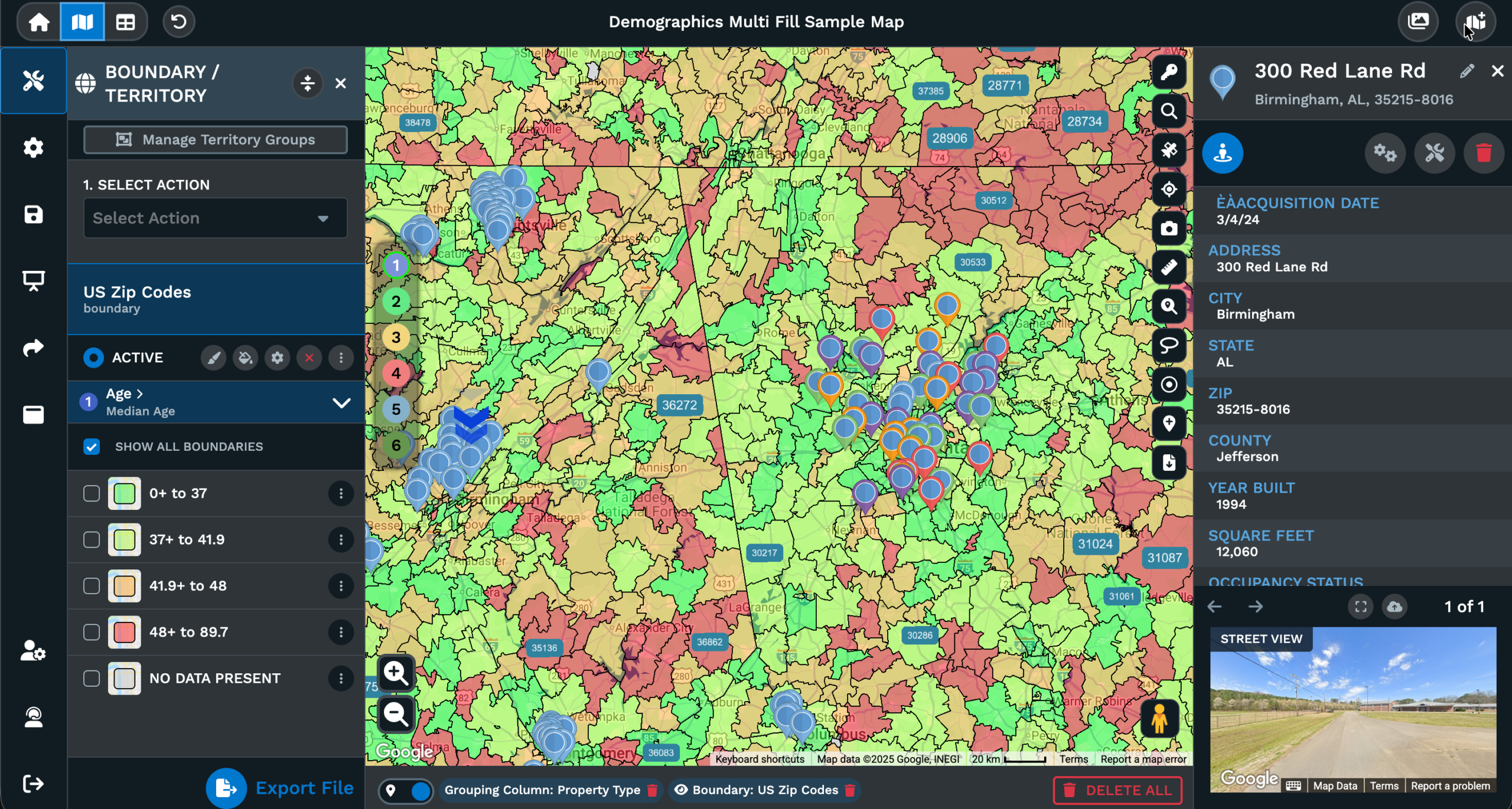
A single grouping column does the work for a question on the map. Pick the column as the Primary Group inside the Grouping Tool and Maptive splits the pins into a group per value across the map. A category column gives a slice per category value. A number column can switch to Numeric and split into ranges by percentages or by raw number ranges from the popup that opens after the swap.
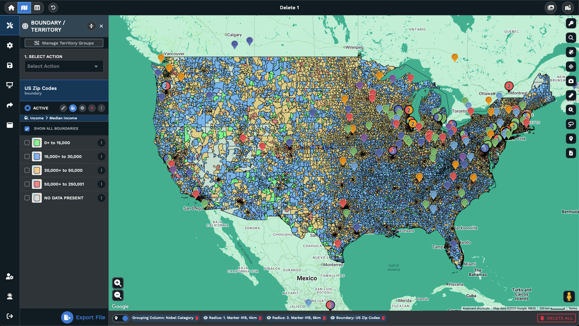
A second column on the same map adds a second signal to every pin tied to the data set. Pick another column as the Secondary Group inside the same panel of the Grouping Tool, and Maptive layers a second marker tied to that column on each pin. The doc notes that the secondary grouping works well for numeric data, since it uses bubble markers that show the magnitude or range of those values.
Reading 2 groups at the same time is what the pair is built for. The Primary Group answers the category question for each pin while the Secondary Group answers a magnitude question on the same pin. A region column and a sales column together show which regions hold the bigger values without a separate map view. Each group can be selected or deselected from the panel, so you can drop a signal and read the other on its own.
Group Filters and Settings
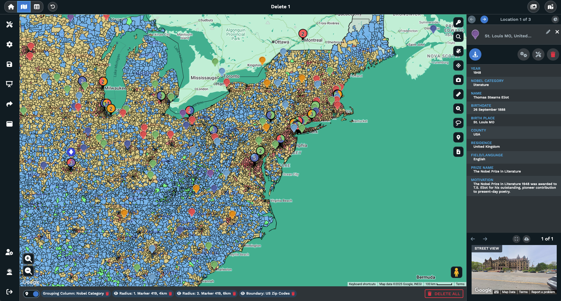
A grouped map carries every slice on screen by default. Reading a single slice across the map calls for a filter, and the panel inside the Grouping Tool acts as that filter without a separate filter step at all. Each group sits in the panel with a checkbox tied to it, and the checkbox controls the visibility of every pin in the group across the same view on the map you are working with at the time.
Toggling a group off in the panel hides the pins tied to that value across the map view, while the rest of the grouped pins stay in place across the data set the tool runs on. Toggling the group back on returns the pins to the view on the map. Selecting and deselecting any Primary or Secondary group from the panel is a way to read a specific slice for insights, comparisons, and display on the same map.
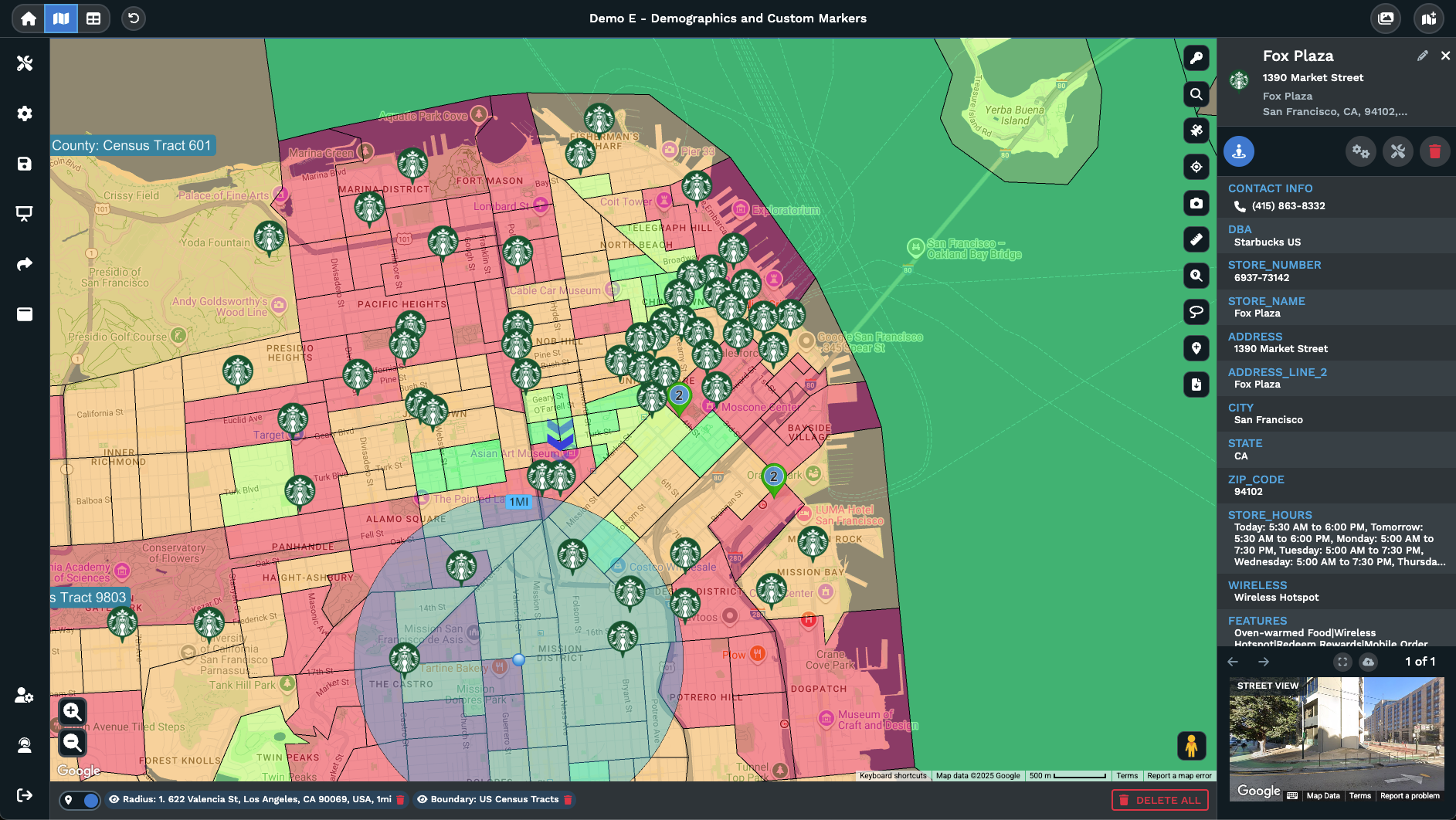
Per-group settings sit next to each row in the panel through the small white icon to the right of the group. Click the icon to open the picker, set the marker style for that group, and the choice ties to every pin in the slice from then on. The pair of features, the toggle for visibility and the icon for marker settings, runs the per-group work on a grouped map without an extra reload of any file.