Map Filter Tool
The Map Filter Tool pares heavy spreadsheet data down to only the rows you want plotted on the map, with 5 filter types fitted to how each column was built.
Filtered Map Views From a Column
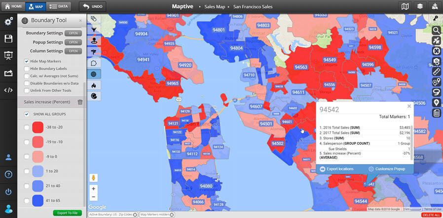
Group filter: Choose this for any column that holds categories, like region or status. The menu lists every value it finds in the column so you can keep or hide any value.
Text filter: Pick this for a column where you want to search inside the values, like store number or notes. You type a term and the map narrows to rows containing a match.
Number filter: Reach for this when the column holds numeric data only. The slider sets a low and high end from the lowest and highest values that the column contains.
Attribute filter: Use this for cells listing items inside a column, separated by semicolons. Maptive splits each entry into its own group you can toggle in the panel.
Date filter: Apply this to a date column to view rows inside a given date range. The control runs from the earliest date in your column to the latest date found there.
Per-column checkbox: Every column you set up gets its own checkbox in the panel. Uncheck to turn a filter off without losing the setup, recheck to bring it back to work.
Filter Your Map in 3 Steps
1
Open
Inside the map, click Map Tools, then pick the Filter Tool from the panel that opens up on the right side of the screen.
2
Build
Click Create Filters, find the column header you want to filter, open the pull-down beside it, and pick a filter type.
3
Read
The map now shows only the rows passing every filter you set, so you read the focused subset of points on your base map.
Filter Wins for Crowded Maps
Read a Crowded Map
Rank by Number Column
Search Inside a Column
Split Multi-Value Cells
Hold a Date Window
Toggle Without Tearing Down
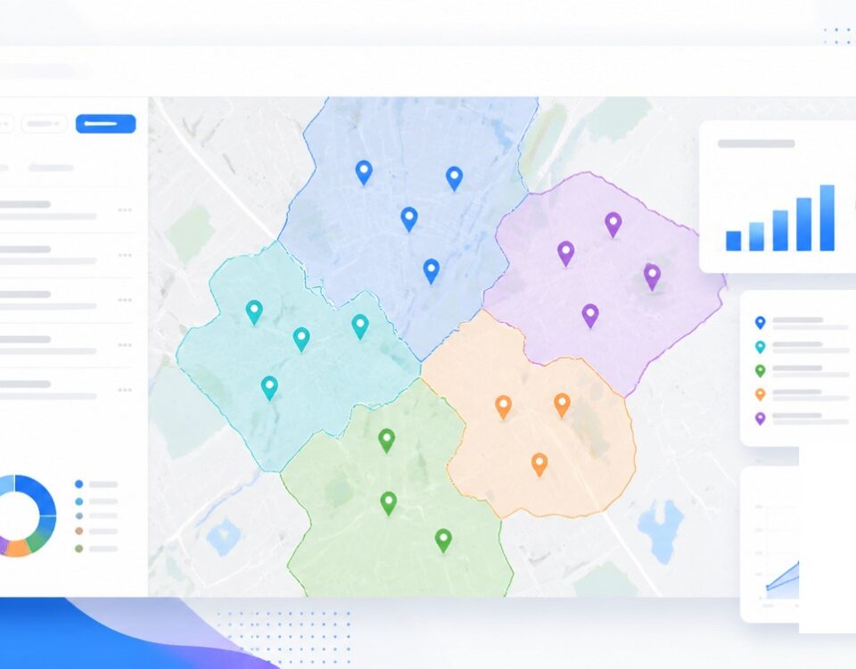
Filtering Map Data to Subsets
Why Filtering Pays Off
A map plots every row you upload by default, which is helpful at the start and noisy past a point. Once your data set carries thousands of rows across a dozen columns, the map turns dense and reading a segment off of it gets harder than it should be. The Filter Tool inside Maptive iQ pares the visible set down to only the rows you currently care about, working off the column headers already inside your data without any extra setup.
The wins come from the column-by-column setup. You pick a column, you pick how that column is built, and the right type of control loads in the panel for you. A category column gets a Group filter with an entry per value found in the column itself. A numeric column gets a slider that runs between the lowest and highest values inside that column. A date column gets a date range. A text column gets a search box. A multi-value column with semicolons gets the Attribute split.
The result is a map that holds every row in memory but plots only the rows passing the filters you have on at that moment. You read the focused subset against the same base map you started with, then toggle filters off through the per-column checkbox to bring rows back into play instantly.
The 5 Filter Types
Maptive supports 5 filter types, and each is built around a different kind of column you might have on your sheet. The Group filter is for category columns, where the values repeat across rows and you care about which categories you want plotted. The Text filter is for any column where you want to search inside the value itself, like a store number, a name, or any string you can spell out by typing.
The Number filter only works on numeric data, and it gives you a slider with the lowest value found in the column at the low end and the highest value at the top end. You drag the handles to set a low end and a high end. The Attribute filter is for cells that hold multiple items separated by semicolons, and Maptive splits those entries into their own groups inside the panel so you can keep some on and turn others off.
The Date filter rounds out the set. It reads the earliest date in your date column and the latest date in the same column, and it lets you set a date range between those endpoints. Each of the 5 types loads in the same panel through the pull-down beside the column header, with a checkbox that turns the rule on or off without removing the setup behind it.
Filtering With Other Tools
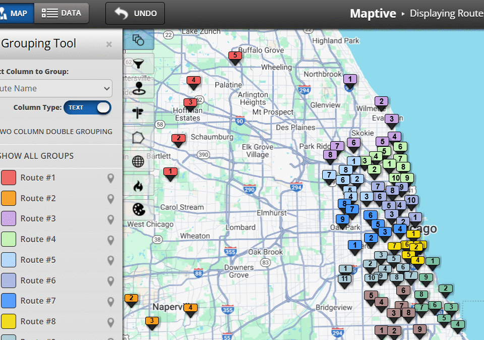
The Filter Tool lives in Map Tools, and it shares its panel with the Grouping Tool once filters or groups are in play on a map. After the first time you set a filter, the entry point switches from the Create Filters button over to the gear icon, and the same gear opens the Grouping Tool when grouping is active on the same map. Both tools sit side by side inside a shared panel.
The pair work on the same column headers but answer different questions. Filtering pares the visible row set down to a subset that fits a column rule, while grouping bundles plotted rows into named groups that you style and read together. You filter to a region, then group the surviving rows by status. You filter to a date range, then group the surviving rows by sales rep. The pairing keeps your map readable as the data set grows.
The per-column checkbox makes the pairing safe to play with. Uncheck a filter and the rows return without you rebuilding the rule from scratch. Recheck the same box and the rule applies again from the same panel. The setup carries through the session, so you compare a filtered view against the full data set, switch back to grouping, and read both views without losing work between passes.