There’s a common misconception out there that data is boring. It’s a fair opinion to have, and here’s why: no one likes the idea of going into a meeting or presentation and being inundated with rows upon rows of spreadsheet data. Likewise, no one likes listening to someone verbally spew out statistic after statistic in a futile effort to make a point or change a point of view. Not only is it an ineffective way of presenting data and persuading someone to change their mind, it’s boring for most people to experience.
That’s where data visualizations can help. Data visualizations allow you to take complex information that most people don’t have the skills, time, or attention span to comprehend, and transform what you have into easily digestible, enjoyable, visually-focused presentations. They can be incredibly effective tools for informing or getting a point across. Why? Because humans are inherently visual. Our brains can literally process and store visual information faster than text.
Data visualizations help make data less boring. Less intimidating. Less complex.
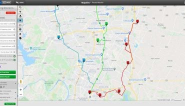
To prove this point, take a look at the 7 interactive maps below. Each example takes a huge amount of raw data and transforms it into a visual presentation to make it less boring to review and a lot easier to understand.
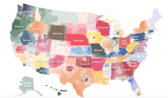
This interactive map from the New York Times presents a visualized representation of college football loyalties by demographic location across the country. It’s an intriguing map to look at and review because it illustrates the fact that not all fans root for their home teams. In Minnesota, for example, you can see that some parts of the state gravitate more toward cheering on Wisconsin, while other parts prefer to follow North Dakota teams. According to the article, the data was collected and compiled “using estimates of team support based on each team’s share of Facebook “likes” in a ZIP code.” Learn more about this map and give it a try here.

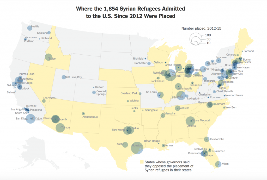
As you can see below, this map illustrates how many Syrian refugees have been admitted to the U.S. since 2012, and where they have been placed. The yellow coloring represents states whose governors have vocally opposed the placement of Syrian refugees in their states. It’s an incredibly interesting and timely map to view now, as the world continues to experience a surge of migrants fleeing Syria. When it comes to major political issues, people are bound to have strong opinions, feelings, and emotions. An effective data visualization like the example below can help people become better informed by proving them with real and accurate information. Take a look at this map for yourself.
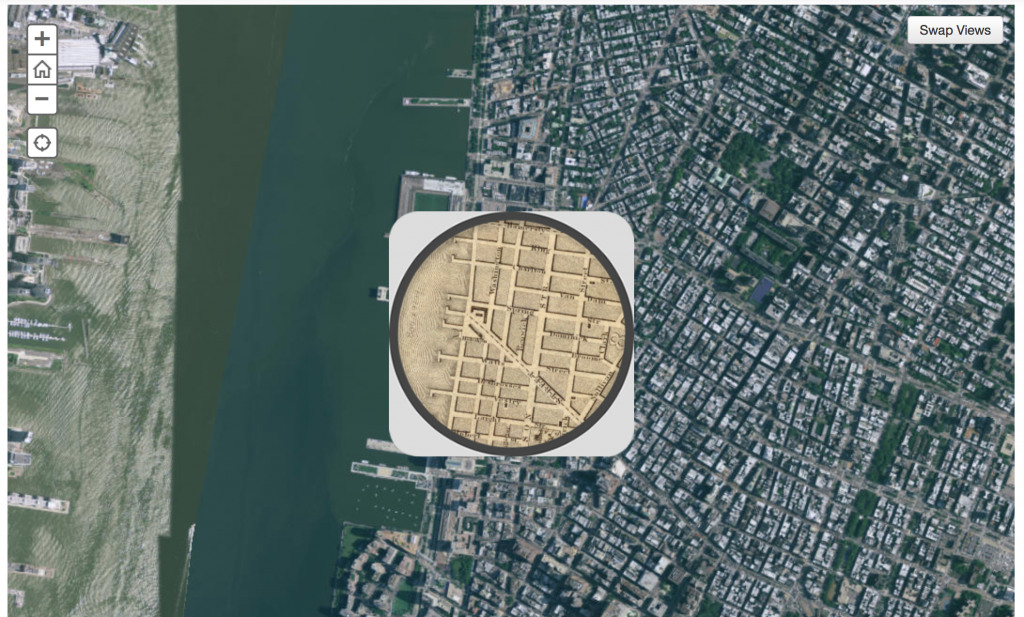
This interactive map is part of a bigger ongoing series by the Smithsonian that aims to show how various American cities have changed over time. The map below offers a satellite view of modern New York City. Within the map, you also have access to a spyglass that shows you a detailed map of what NYC looked like in 1836. This map is less focused on quantitative data, but it’s a fine example of the endless possibilities of data visualization nonetheless. Give the map a try here.
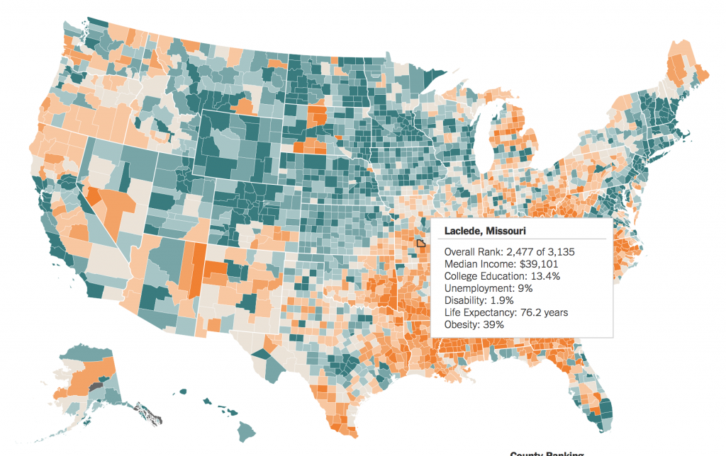
You might not be able to recognize it at first glance, but if you spent more time interacting with the map below, you would find that Clay County, Ky. is one of the hardest—if not the hardest—places in the U.S. to live. The analysts came to this conclusion by evaluating the following information by county: education, median household income, unemployment rate, disability rate, life expectancy and obesity. The deeper orange coloring you see represents areas that are doing worse; the deeper green/blue coloring represents areas that are doing better. Explore this map and see how your state/county compares to other areas in the U.S.
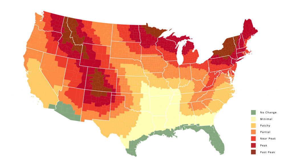
This map below is an example of how you can use heat mapping and color to illustrate trends and contrast. It’s an enjoyable map that you can use to determine when peak fall foliage occurs around the country. If you click here and explore the page where this map lives, you’ll notice that the creators are using it as an stepping stone to further education about the fall season.
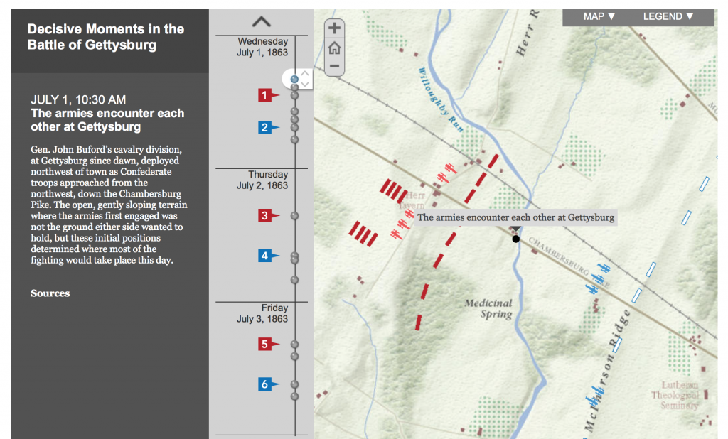
The map you see below re-examines and re-imagines one of the most important events in U.S. history: the Battle of Gettysburg. It was created in an attempt to better understand why certain strategic decisions were made by both sides and what limitations existed in terms of actual on-the-ground visibility (and lack of modern technology). Here’s what the creators said about the interactive map in their article:
“Our interactive map shows Union and Confederate troop movements over the course of the battle, July 1 – 3, 1863. Panoramic views from strategic viewpoints show what commanders could – and could not – see at decisive moments, and what Union soldiers faced at the beginning of Pickett’s Charge. You will also find “viewshed” maps created with GIS (Geographic Information Systems). These maps show more fully what was hidden from view at those key moments.”
Explore the map and learn more about the battle by clicking here.
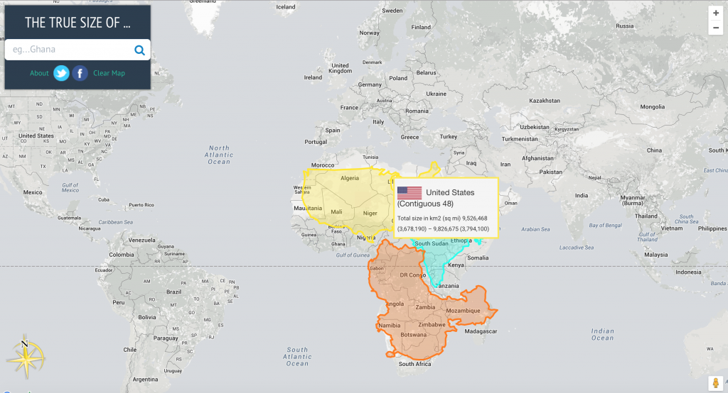
This map is a favorite because of its simplicity. As the Washington Post put it in their article, this map shows how wrong all other maps are. What does that mean exactly? A lot of our understanding of the geography of the world comes from maps. Most of the world maps you are familiar with were created with a method that aims to make navigation easier. It just so happens, however, that that same method significantly distorts the actual sizes of countries. For example, take a look at the size of the U.S. and how small it is compared to just a piece of Africa.
Without this visualization, you might not be able to as easily comprehend the size comparisons of various countries—you would be forced to look through raw data and probably have to do a few calculations in order to understand the point that is ultimately trying to be made. Explore this map for yourself.
What other maps should be on this list? Let us know in the comments below.